We all want a great place to cook and prepare meals for our family, friends and even for ourselves. And nothing beats being able to do that in our own space with a great and efficient kitchen design!
The kitchen is said to be the heart of the house. It is the favourite area of mothers and other family members who love to cook. From the cooking or food preparations to the dishwashing, this part of the house becomes the core of existence in our homes.
Having an efficient and effective kitchen helps manage and take care of a household as a whole. With that being said, this area should be one of the cleanest parts of the house. It needs to be well-designed and well-kept too in order for the people to function properly.
Our post here is a great guide for people who are planning to remodel, renovate or build a house and looking at cool kitchen designs. Read on for some kitchen tips and design inspiration everyone should know about!
Common Design Mistakes to Avoid for your Kitchen
When designing our kitchen space, we have to see to it that everything is in proper order for the kitchen. One of the main reasons being is that it is one area that is prone to accidents.
Remember that the activities we do here use fire, gas, electricity and even sharp objects. Plus our kitchen is where food is prepared and sometimes even stored in.
If you are currently working on your kitchen design, here are some points that you have to avoid which are common mistakes in kitchen design.
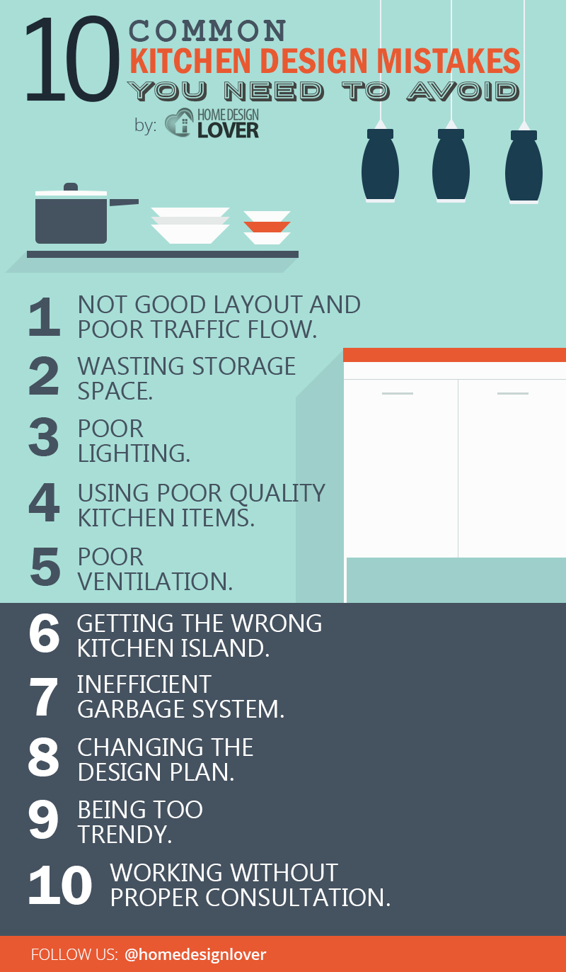
Not good layout and poor traffic flow.
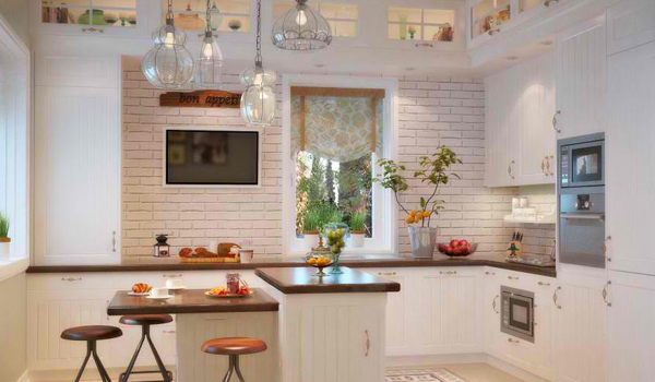
Ownby Design
It is important that you can access all the areas of your kitchen well so that you can work properly. In doing so, you need to choose the right layout for your kitchen.
When choosing the layout, pick the one that will work for your space and how you will use it. Don’t just apply a certain layout just because you think it looks good.
Everything is about your kitchen workflow and traffic. We’re sure you don’t want to bump into the stove while moving about.
Wasting storage space.
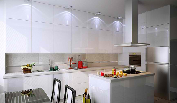
Inna Mihayskaya
With all the stuff you will be keeping, you would need lots of storage spaces. Keep everything organized to keep the area clean where you can perform work perfectly.
Have ample storage spaces and use the wall for hanging cabinets. It is a no-no to leave a space from the ceiling to the top of your vertical cabinet because this will just be a spot for the dust to settle.
Extra-long upper cabinets are best for small kitchens. You can add low cabinets too.
Poor lighting.
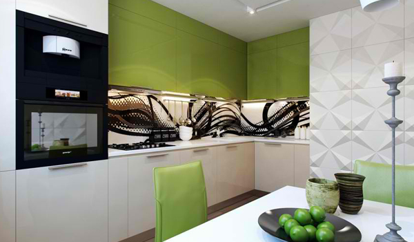
Artem Lazarev
We do many different tasks in the kitchen so you have to make sure that it is well-lighted.
Add direct lighting to all the working areas. You can also add some accent lighting that can add illumination and beauty to your kitchen.
But remember that your kitchen lighting isn’t about drama or aura. It is about safety and to ensure that you will be able to work well in it.
Using poor quality kitchen items.
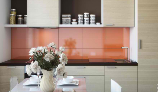
Maxim Lyubetskii
That oven is cheap and you bought it because it saved you money. But what happens to it after a long term usage?
It will be damaged and you have to get a new one.
Now you have cabinets with poor quality but it also saved you money.
You open it every day for a couple of times. It is exposed to humid air too. What happens?
It was also damaged after some time. The doors might fall off and the finish might peel.
Worse, your cabinet might disintegrate. A total failure indeed!
So, don’t be blinded to cheap items without checking its quality. Getting high-quality kitchen items will give your money some worth instead of junk after years of using it.
Poor ventilation.
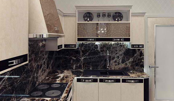
Alexander Simakov
It wouldn’t be nice to step inside a house and smell the fish being cooked in the kitchen all throughout the space.
We have been into some homes like this. This is the cause of poor ventilation or no ventilation at all.
Get an inexpensive range hood to let the air from cooking circulate. You can also add a window near your kitchen.
Some would add an exhaust too. Good ventilation could also help extend the lives of your appliances and will make you feel good about your home because you will never deal with stale air.
Getting the wrong kitchen island.
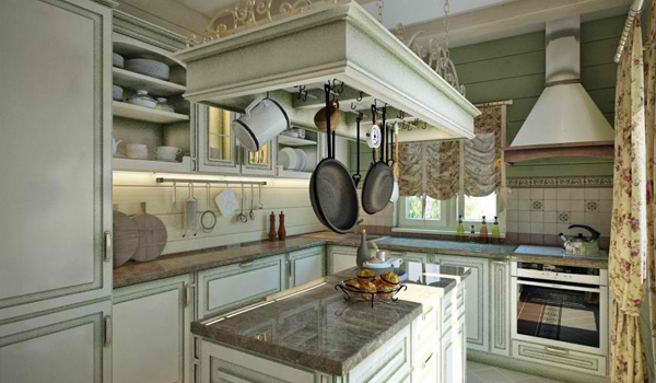
Valeria Ganin
Getting the wrong kitchen island or placing it in the wrong spot will cause you trouble. This may cause clutter and major hassles while you work.
Make sure that you get the right shape and size for your kitchen. In placing it, you have to see to it that it won’t obstruct the kitchen triangle and would allow good traffic.
If your kitchen is small, skip the island.
Inefficient garbage system.
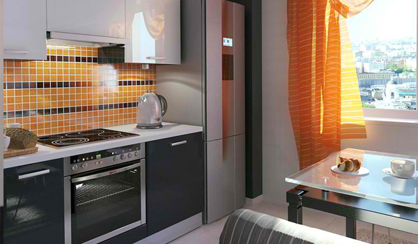
Eugene Zhdanov
We would be dealing with trash while we prepare food. If you don’t have good trash management, your kitchen will look dirty and might even smell foul. That is a totally bad thing for a place where food is being prepared.
So see to it that your garbage has a cover or it is inside the cabinet. Always throw it away. Don’t wait until the trash is overflowing from your bin.
Also, if you will recycle some items, allocate a separate cabinet for that.
Changing the design plan.
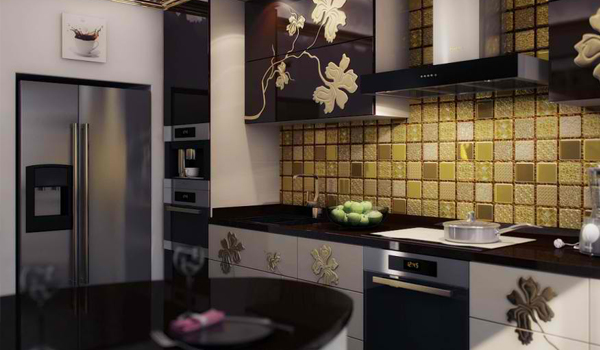
Alexander Simakov
So now you have finally decided on the design you want for the kitchen. Don’t keep on changing that.
Stick to the plan especially if the work has already started. Once you keep on changing your mind, you will spend more money on it.
So be sure that you have really chosen the design you like. It would be best if you let someone design your kitchen in 3D so you will see how it will look like in actual.
Being too trendy.
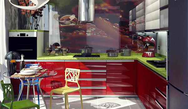
Alexander Simakov
Actually, it isn’t wrong to go with the trend but the thing is, once that kitchen trend is out, your kitchen will no longer look updated. Chances are, you might think of another kitchen redesign.
It is advisable to have a timeless kitchen design. This would also be necessary especially if you plan to move out and have the place rented or owned by someone else.
You might not share the same design preference and it could affect how long your house will stay in the market.
Avoid overspending on appliances too because you might just get it because it is the current trend. Always think of function and usage.
Working without proper consultation.
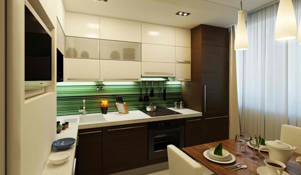
Hey hey hey! If you are not a design professional, do not do the work by yourself. You can actually save money and ensure safety if you hire some professionals to do it for you.
Or you can consult them for the kind of kitchen you want. If you really want to get the kitchen of your dreams, then hire those who are knowledgeable and I’m sure you will never regret doing that.
Aside from those mentioned, we should also take note of our budget and stick to that. If you get a highly sophisticated kitchen but your budget is low, you might end up with an unfinished kitchen.
So, create a budget and have someone design your kitchen that suits that.
Ideal Things to Consider to Make your Kitchen Safe
Now that we have discussed the common mistakes to avoid in designing a kitchen, we will discuss the things you need to consider to make it safe.
A kitchen with a good layout can help avoid undesirable incidents to happen. You should make sure that traffic in the kitchen is good so that you wouldn’t stumble on anything especially while cooking and while carrying some hot stuff.
If you really want to have a good kitchen, here are some tips to help you create an impeccable and safe kitchen. These tips could be your primary guide in creating your ideal kitchen.
Choose the right layout.
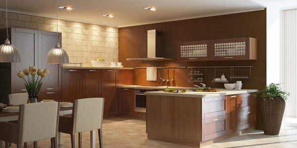
The layout is the key to a good kitchen. In doing your kitchen layout, take note of the ‘Golden Triangle’.
The ‘Golden Triangle’ is wherein you have to place your fridge, sink and oven or range close to each other positioned at the three sides of the triangle.
No matter how big or how small your kitchen is, you have to see to it that these three main work areas are not more than three meters apart.
You can’t just place these things anywhere. Be sure that it is easy to move around your kitchen.
Surfaces need to be smooth.
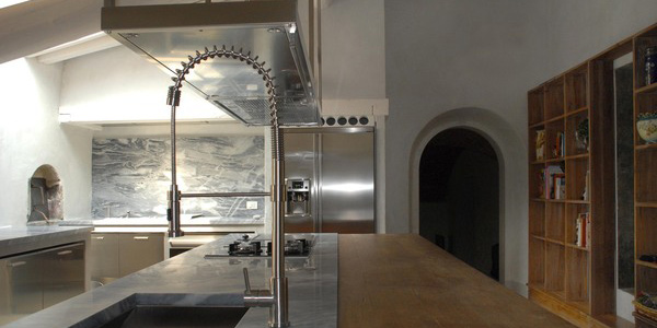
Make sure that surfaces in your kitchen are smooth and streamlined.
Sinks should be placed well. It would be better to use under-bench sinks so that its edges won’t be seen.
Cupboards should be installed in a manner that it reaches the ceiling. Make sure that your storage spaces are done in a way that it won’t accumulate dust.
Do not waste spaces.
Maximize storage space.
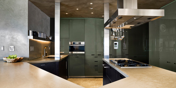
For a well-kept kitchen, you need to have good storage spaces. Use drawers for they maximize storage space. Have deep drawers for your pots and pans and shallow ones for your cutlery.
It is important to keep sharp objects especially if there are kids at home. Use hanging cabinets that reach the ceiling. For your handles, use finger pulls or stainless steel for a better look.
Have good lighting.
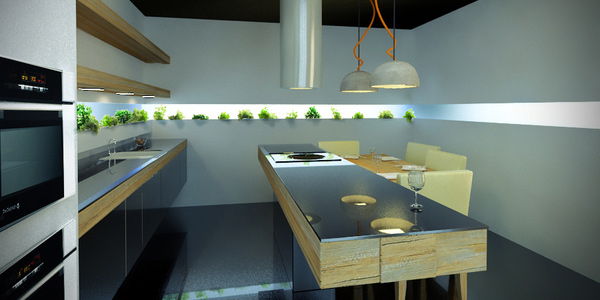
Make sure your kitchen is well lighted. You wouldn’t want to work in a dark kitchen.
You can put up some pendants, halogens and over-bench lights. To create a mood, you may use ceiling lights with dimmers.
Whatever you do with your lighting, just be sure to make the area bright especially in work areas.
Flooring choices.
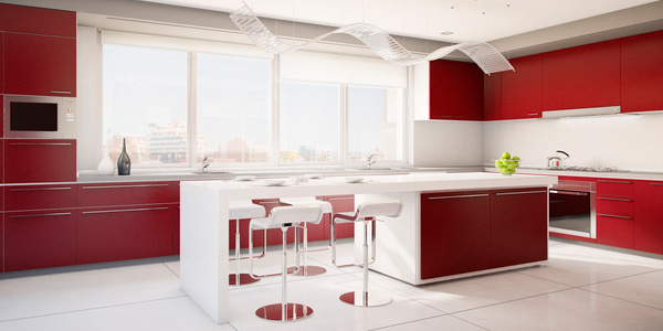
You can use cold flooring for your kitchen. Ceramic tiles, granite and marble can be used.
You may also opt for dark flooring if you want as long as your walls are light. Just make sure that your floor colour option matches your wall.
Make sure your floor is dry all the time to avoid accidents.
Conceal some appliances.
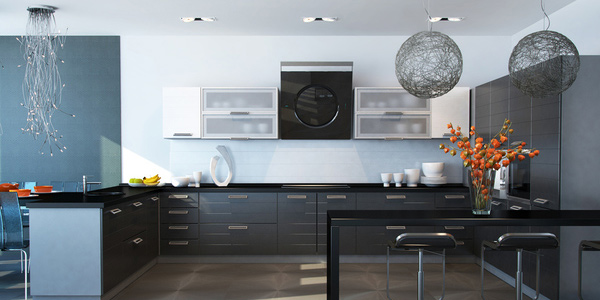
It is not impossible to do this. Your kitchen will look cleaner and neater if you conceal some of your appliances.
It can also help in ensuring the cleanliness of these valuable things. Place them behind closed doors.
Your fridge can be fitted well in a space in the kitchen that it will blend well with the rest.
This is the secret of a well-kept kitchen.
Choose a good splashback.
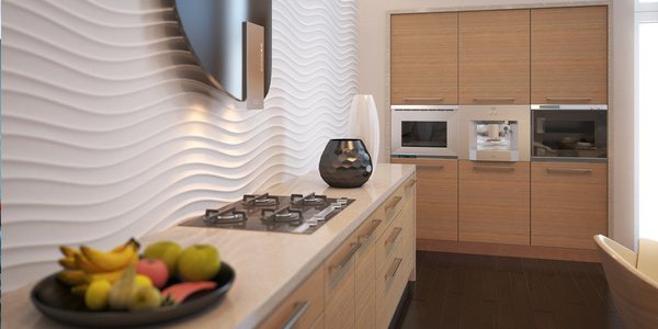
Splashbacks are mostly used in the kitchen these days instead of tiled countertops. Aside from giving a streamlined look, it can also make your kitchen look classier.
The good news is you can now choose different colours, patterns and designs for your splashbacks. You can even opt to use wooden, stone or steel.
Whichever is appealing to you and suitable to your kitchen, the important thing is you could get a smart splashback.
Have appealing benchtops.
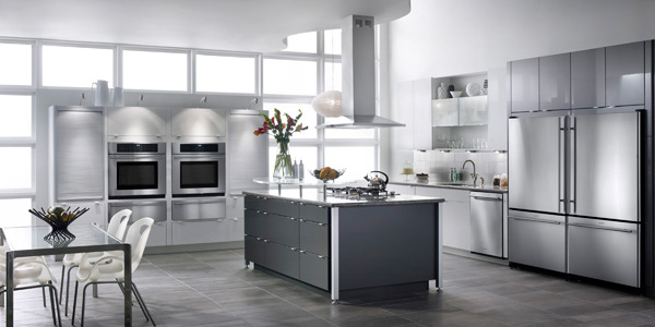
For your benchtops, opt for natural textures. You may want to use marble, granite, polished timber, or poured concrete.
Choose the one that suits the theme and colour of your kitchen. But you can create your own benchtop by applying thick edges to a thin slab.
Let it blend with the kitchen and get the kind of look you want. Make sure also that the edges are smooth.
Use an island.
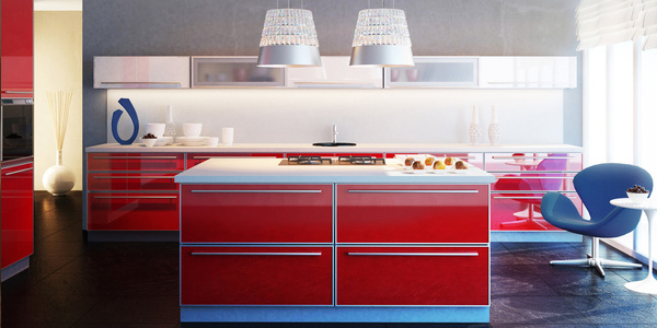
Make a good design for your island. It can be good for entertaining guests.
You may place a sink or a cooktop to it. This unattached counter will permit access from all sides and will give an added beauty to your kitchen.
An island can help in attaining a good layout in your kitchen.
Choose calm colours.
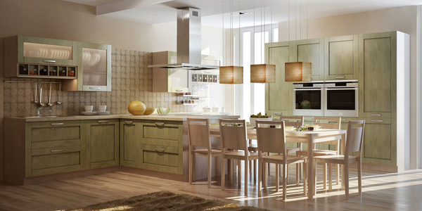
If you want a calm ambience for your kitchen, you can use neutral colours.
Most kitchens prefer white, cream, or pale grey for their kitchens which is the classic look. But these days, there are colourful kitchens especially with the availability of colourful smart splashbacks.
In choosing colours, see to it that you consider your space. Do not use dark colours if your place is small.
Use light colours for small spaces. You can opt for darker ones if your kitchen is big yet you have to make use of contrasting colours for some areas, too.
Everyone would want their kitchens to be safe, clean and in order. The design is not the only thing that matters. The safety of the people is the primary concern especially in the kitchen where there is easier access to sharp things, hot stuff and even fire.
Kitchen Design For Your Homes
When designing our kitchen, we look for ways to make it unique, fresh and would blend well with the rest of the house.
Sometimes, the number of designs can be overwhelming and we wouldn’t know where to start.
To help you, we have collected a massive kitchen inspiration to help you. Take a look around and enjoy browsing!
Modern Design
Modern Kitchens are sleek and clean. If you want this type of kitchen design, then below are examples of amazing interiors with this type of design!
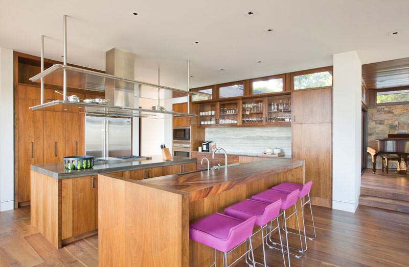
The Tower Grove Drive Residence is a modern wood and stone clad home with various outdoor spaces the you’ll love. Their kitchen in particular looks sleek with its woody interior. The pink stools add a splash of colour to the otherwise earth-toned room.
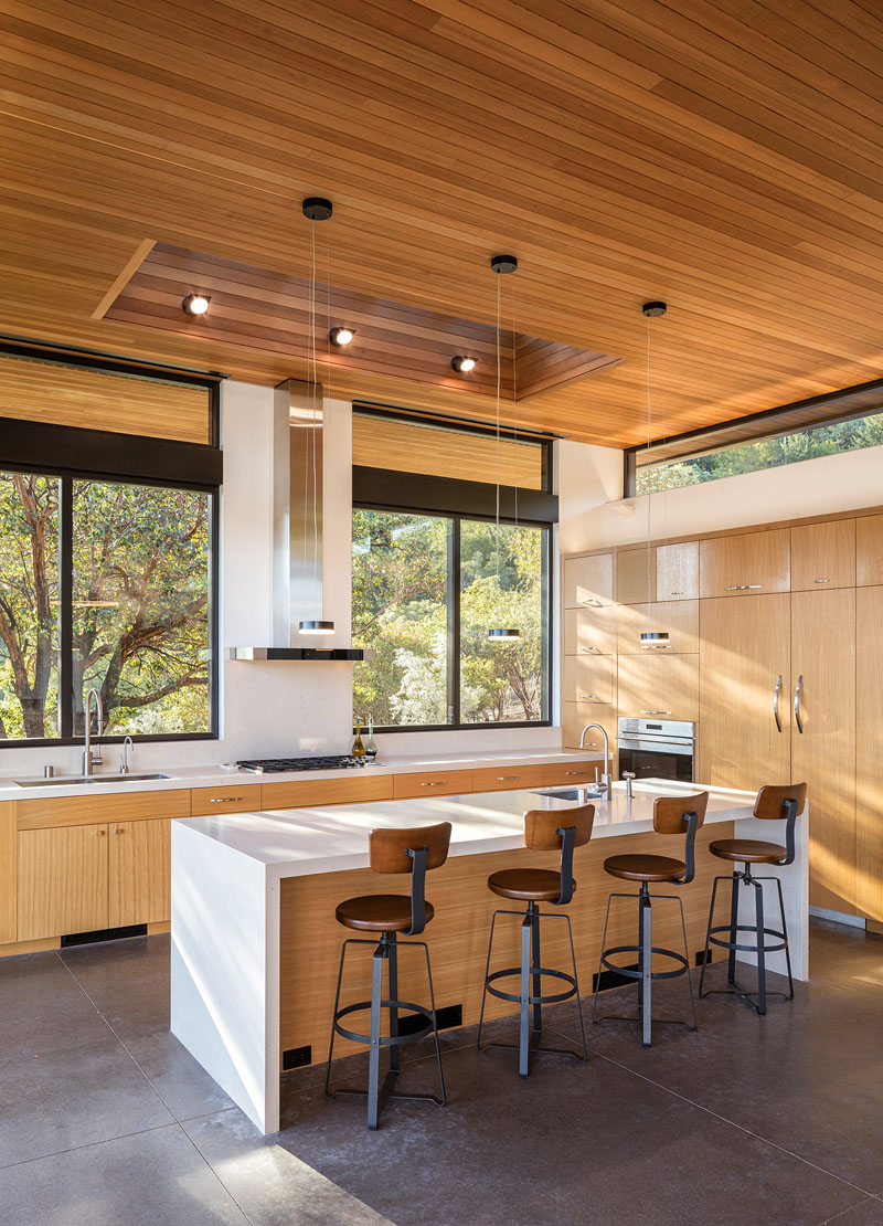
Dry Creek Residence’s kitchen is spacious with its high ceilings and open glass windows. The combination of wood and white on the countertops looks flawless and airy.
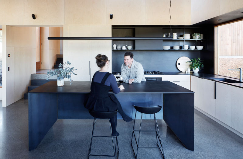
The kitchen at the Two Halves House Kitchen dark colours on the countertop and part of the walls are balanced by the white cabinets and ceilings. The large black island looks very spacious and a good place for preparing meals.
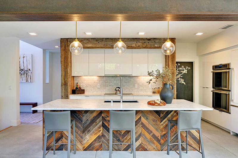
Capitol Hill 5-Star Built Green Home’s kitchen is a combination of modern and contemporary. The wood accents on the space are sleek and add a rustic and barnyard feel to the room. It’s lightbulb-shaped lighting also adds a nice touch to the room.
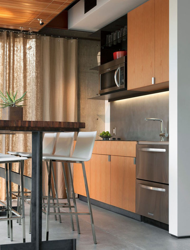
Barn Guest House’s kitchen is small yet packed with kitchen essentials. The combination of wood, steel and white makes the room sleek and modern.
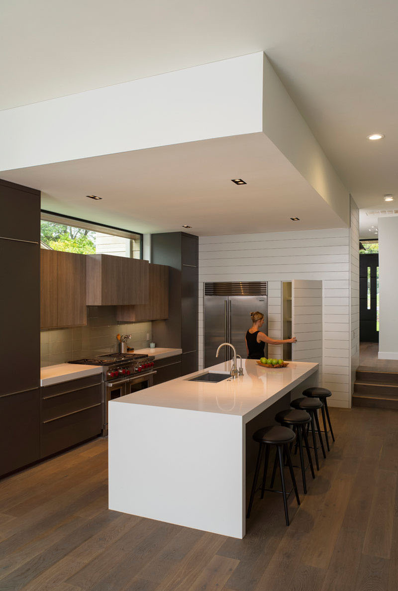
This modern kitchen from Palma Plaza Spec looks inviting with its big white island with bar stools. The hidden pantry is also a nice addition to the modern look of the room.
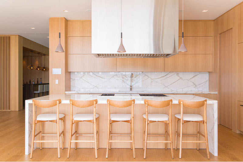
Hibiscus Island Residence’s kitchen is designed with light brown colours on the walls, cabinets, chairs and a portion of the island. The marble-like design of the countertops and a portion of the sink makes the room ultra-modern and sleek.
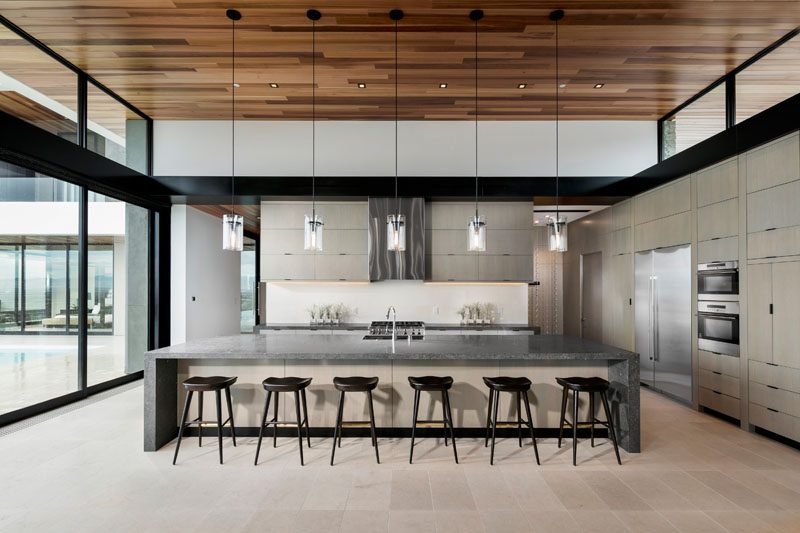
The kitchen at the Foothill Home is quite spacious with its large island that can accommodation up to 6 persons. The use of silver and white makes the room look spacious and clean.
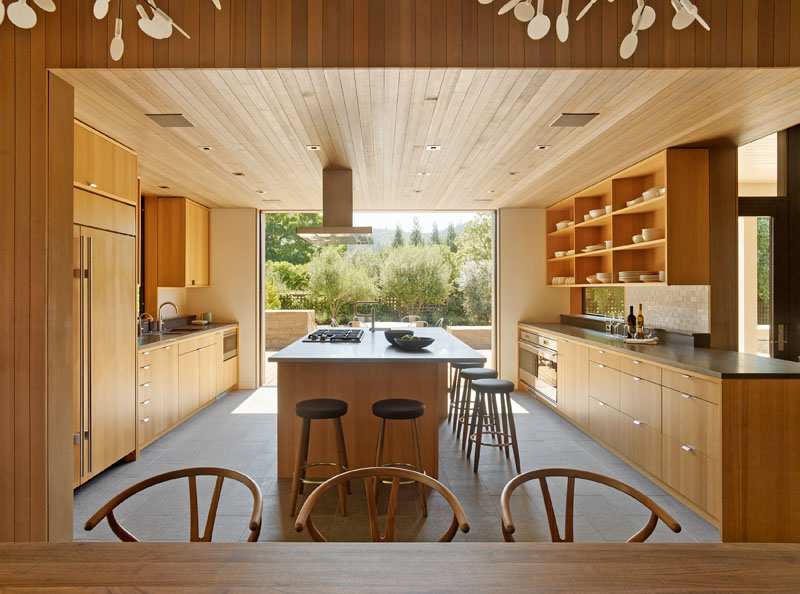
This kitchen is all wood and brown. The colours of the cabinets have complimented the ceilings and the rest of the furniture of the house. The black countertops and stool cushion adds a modern look to the room.
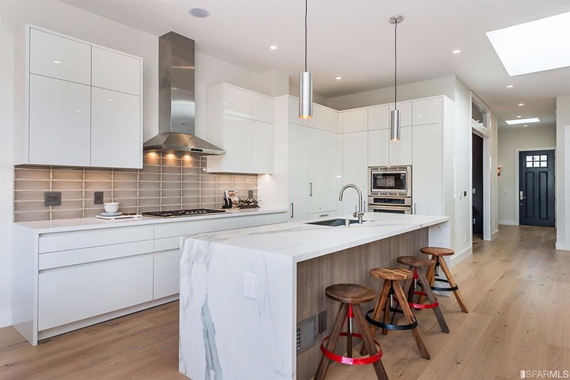
The kitchen in this modern home in Florida is all white combined with brown colours of the stool and a portion of the sink and the island.
The marbled counterpart combines the silver and white colours of the interior.
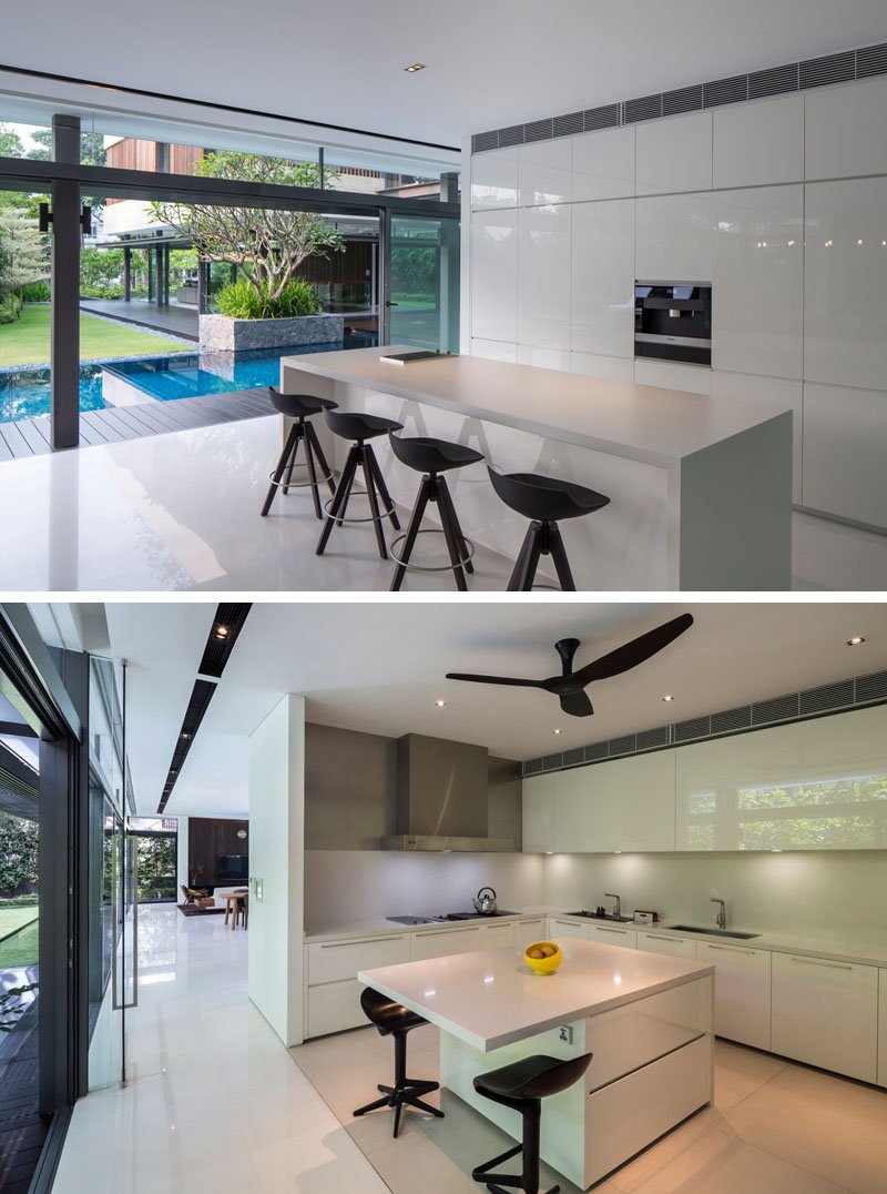
The Secret Garden House in Singapore has a modern kitchen that you will like. Its kitchen is divided into two areas (wet kitchen and dry kitchen).
Both of which are designed with a glossy white motif. The black chairs and ceiling fan adds a nice elegant touch to the room in general.
We also like how the rooms have open walls leading to the garden and the pool.
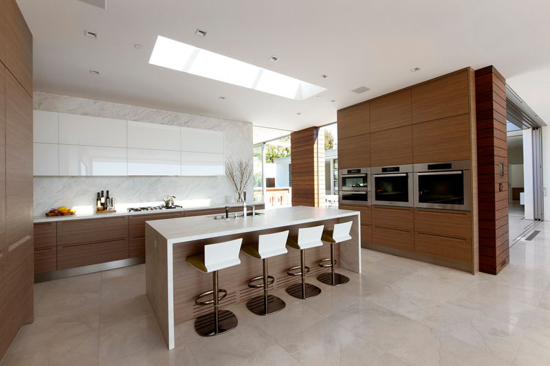
The kitchen at the McLeroy Residence is lovely and stunning. Its a combination of wood and white makes the room sleek and modern. The upper cabinets of the at the stove matches the White Island and its stool.
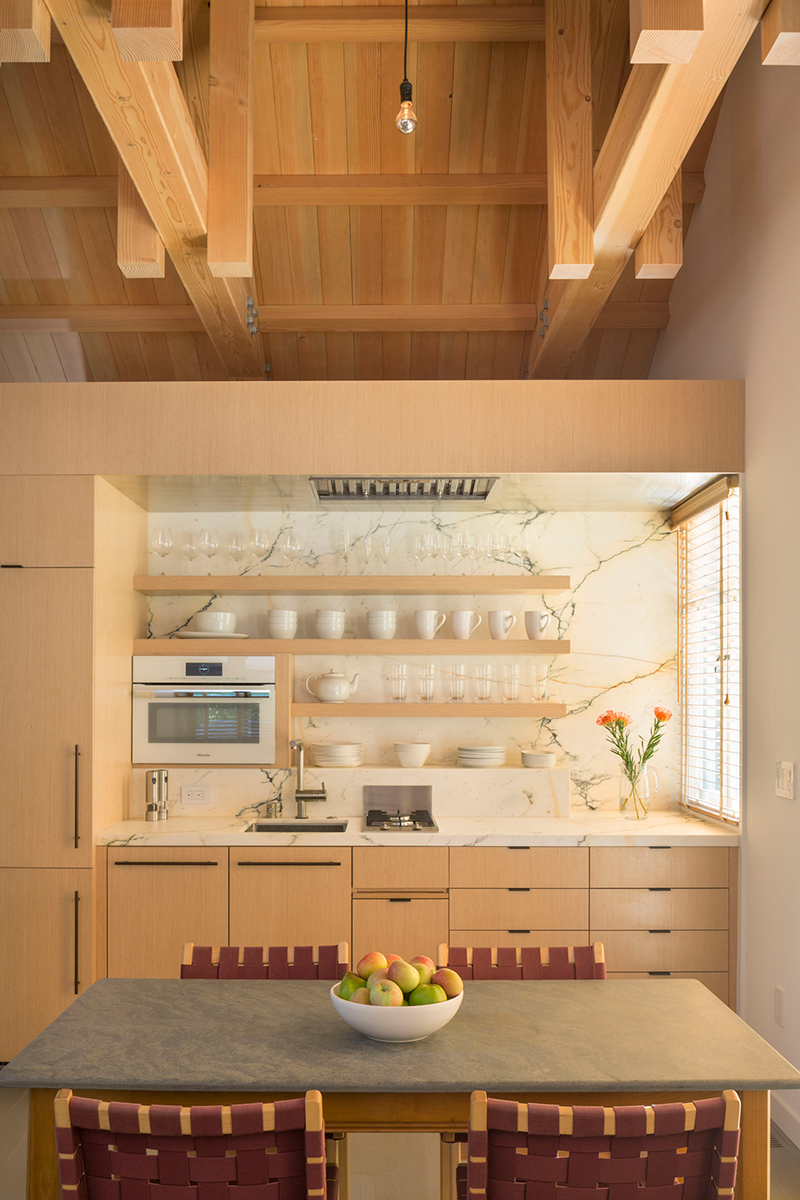
This kitchen from the Tiny House in Marine County is a combination of modern and contemporary. The use of brown and white to this kitchen space is cosy and clean.
The marble-like design of the wall and the sink brightens up the room. We rather like the small window at the side adds more light to space.
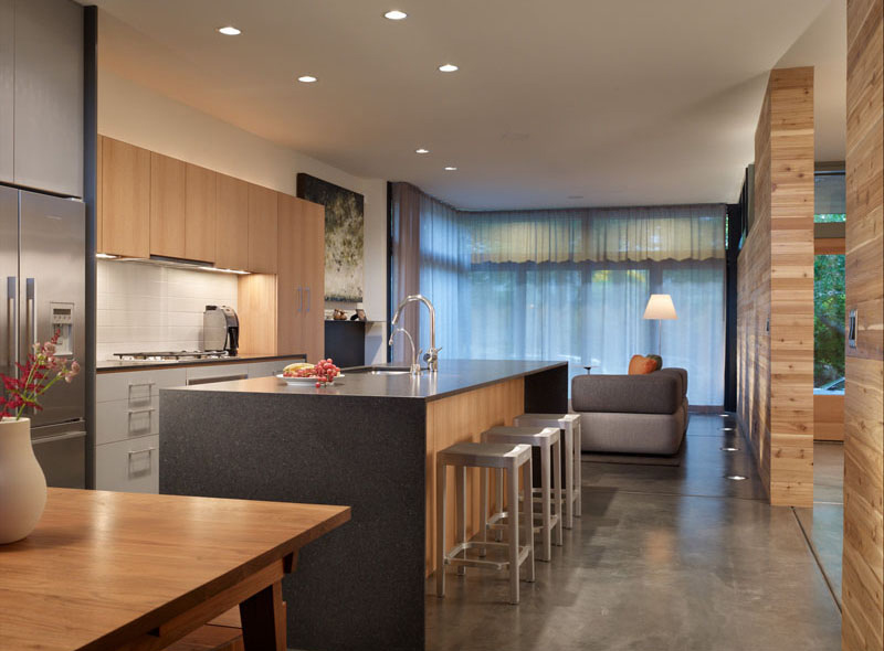
The kitchen at this Modern Wall House is cozy and sleek with its dark marbles island with silver stools. The light brown wood of the cabinets blend well with hotel light brown walls of the interior.
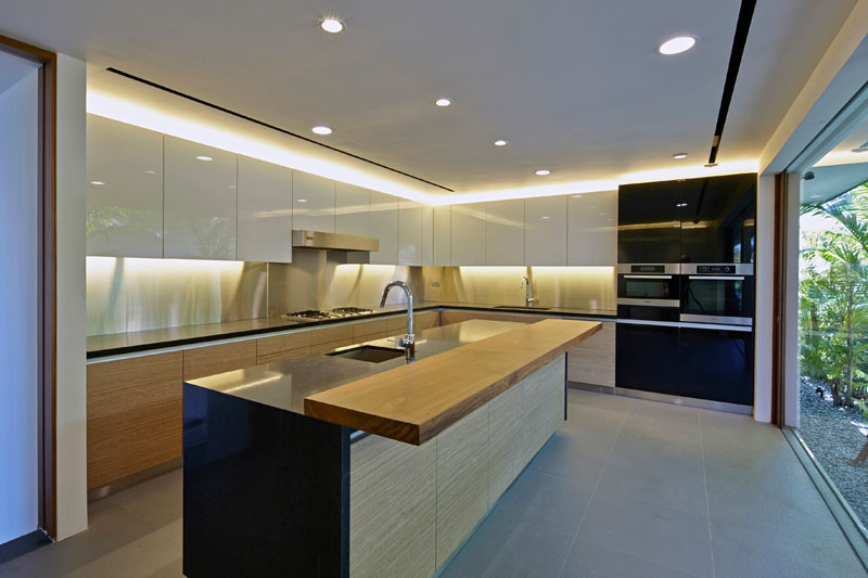
This kitchen from a Home in Sentosa Cove is gorgeous with its glossy cabinets and open glass wall. The room is further highlighted with its black and wood colours.
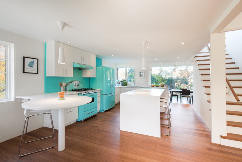
The kitchen from this 1930s Modern House in Ontario is cute and charming with its bright turquoise and white combination. The room looks very charming with its White Island and overall white interior.
Contemporary Design
Contemporary design usually features soft and rounded lines. If this is the design you want for your kitchen, we have the following collection for you:
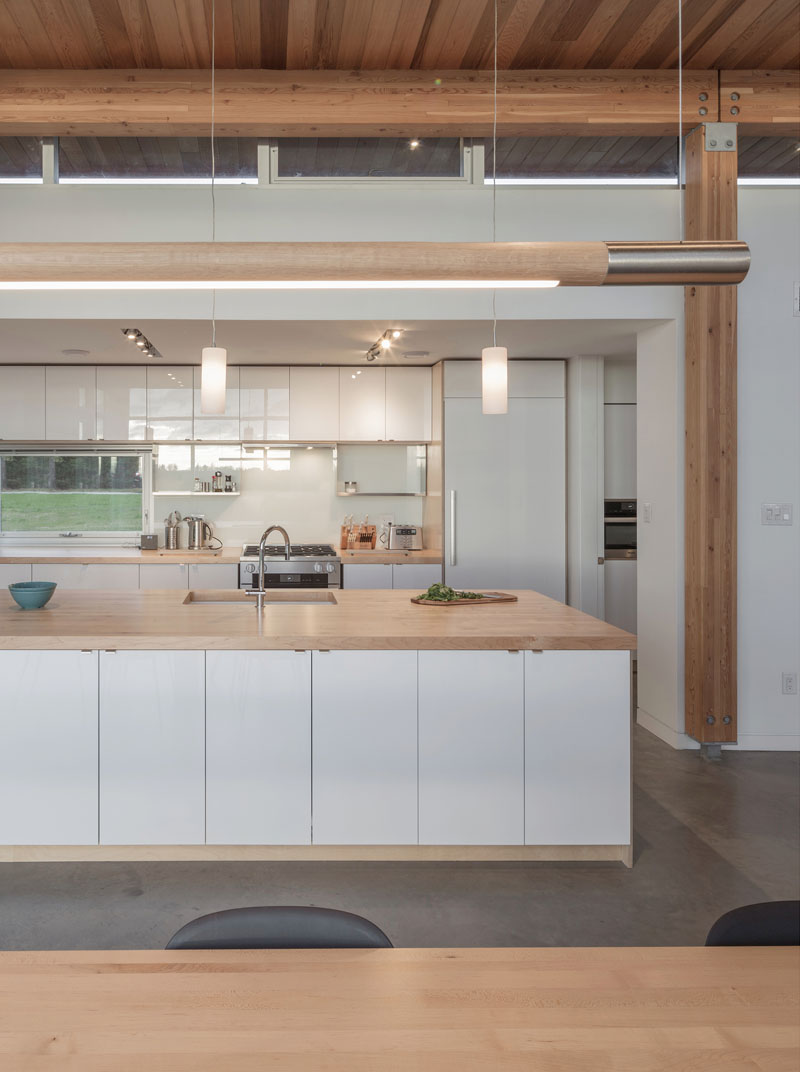
This kitchen from a House in Scotch Cove features a minimalist and contemporary design. The designer has used white cabinets and lights brown wood to accentuate the room.
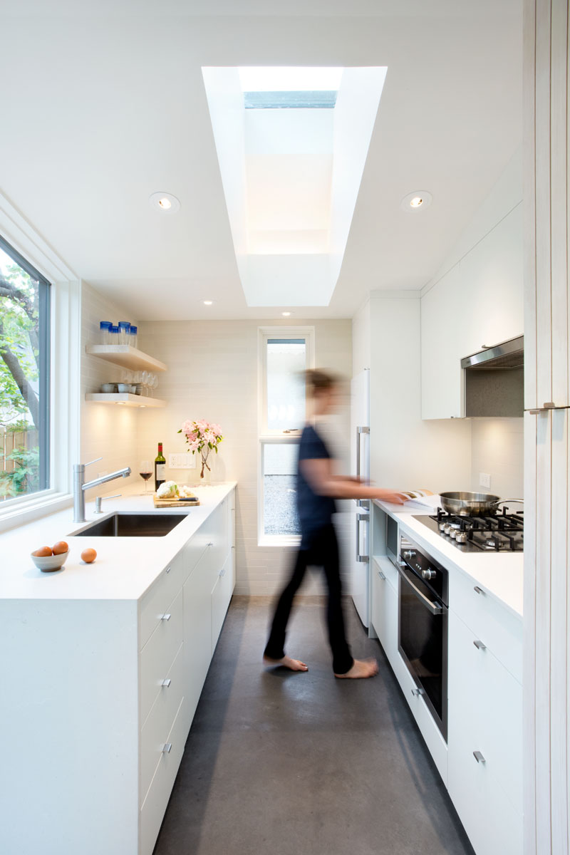
The Point Grey Laneway House kitchen may be narrow but it is well-designed to make it appear bigger than it actually is. Its designer has added a skylight to allow natural light to come in. Plus windows at the side and facing the faucet.
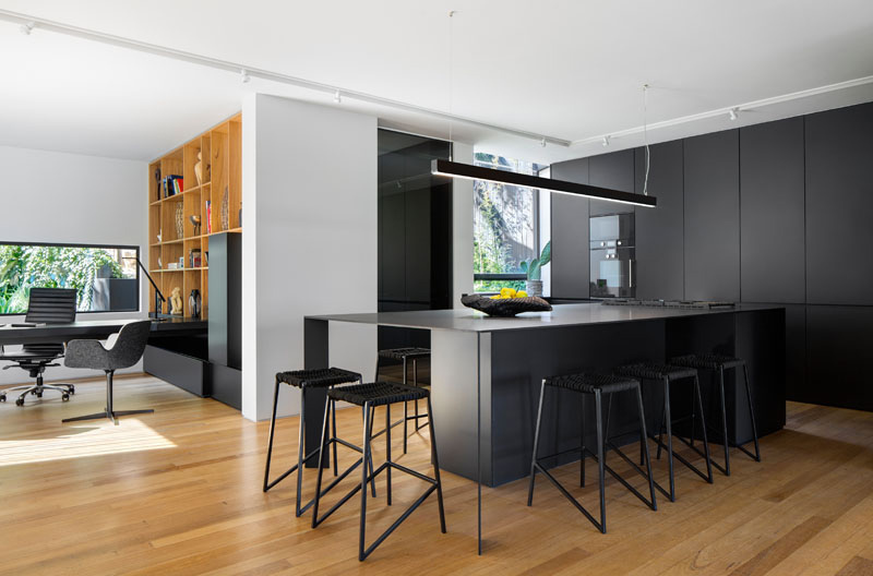
The kitchen from a Modern Home in South Africa is a combination of matte black cabinets, black island, black stool and black lighting fixture. Its dark colours are toned down by the light wood of the floor and the white walls and ceilings.
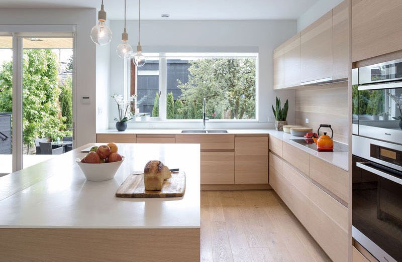
The design of the kitchen at this Mid-Block Contemporary House in Australia is a homey and comfortable. Its large window offers natural light to the kitchen. The combination of white and light wood is also great here.
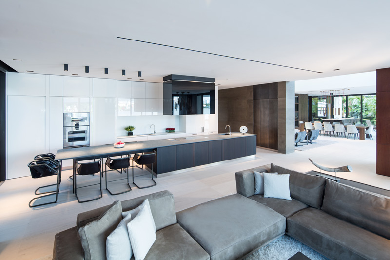
The spacious kitchen at the Casa Clara looks stunning with its grey and white colour combination. The large black island with dining space for 8 people is great too.
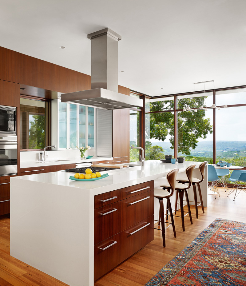
The kitchen at this Lakeview Residence is a combination of modern and contemporary. The dark brown colours of the cabinets, chains and the wood are brightened by the white island, ceiling and glass walls. The overlooking view looks stunning and makes a great background while dining or cooking.
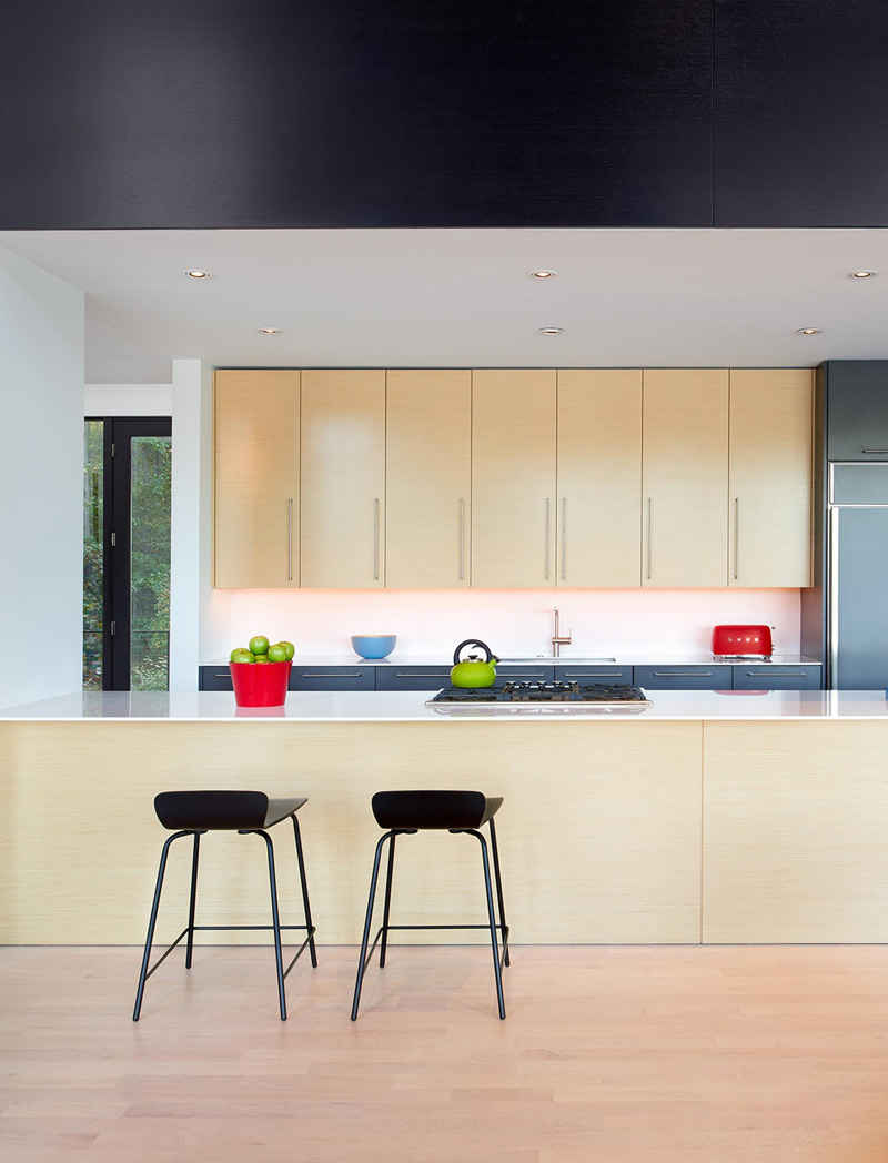
This modern and contemporary kitchen at a home in Maryland looks friendly and accommodating with the light colours of wood, white and silver.
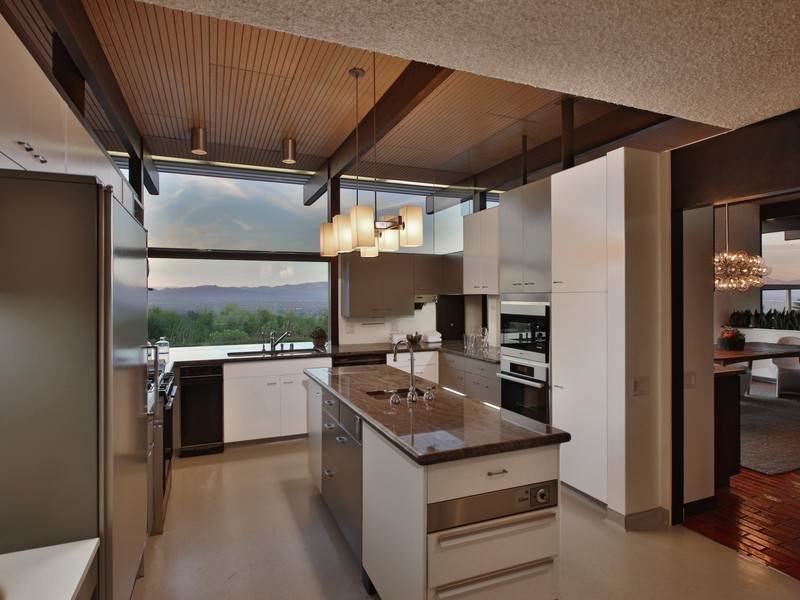
The kitchen at the La Montana Place is a combination of contemporary and industrial design. The exposed beams are pained in dark brown and complement the brown countertop and ceiling.
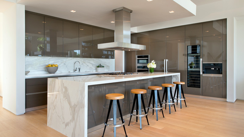
The kitchen at the Home on Di Lido Island has high-gloss cabinets with a large kitchen island with a marble-like countertop.
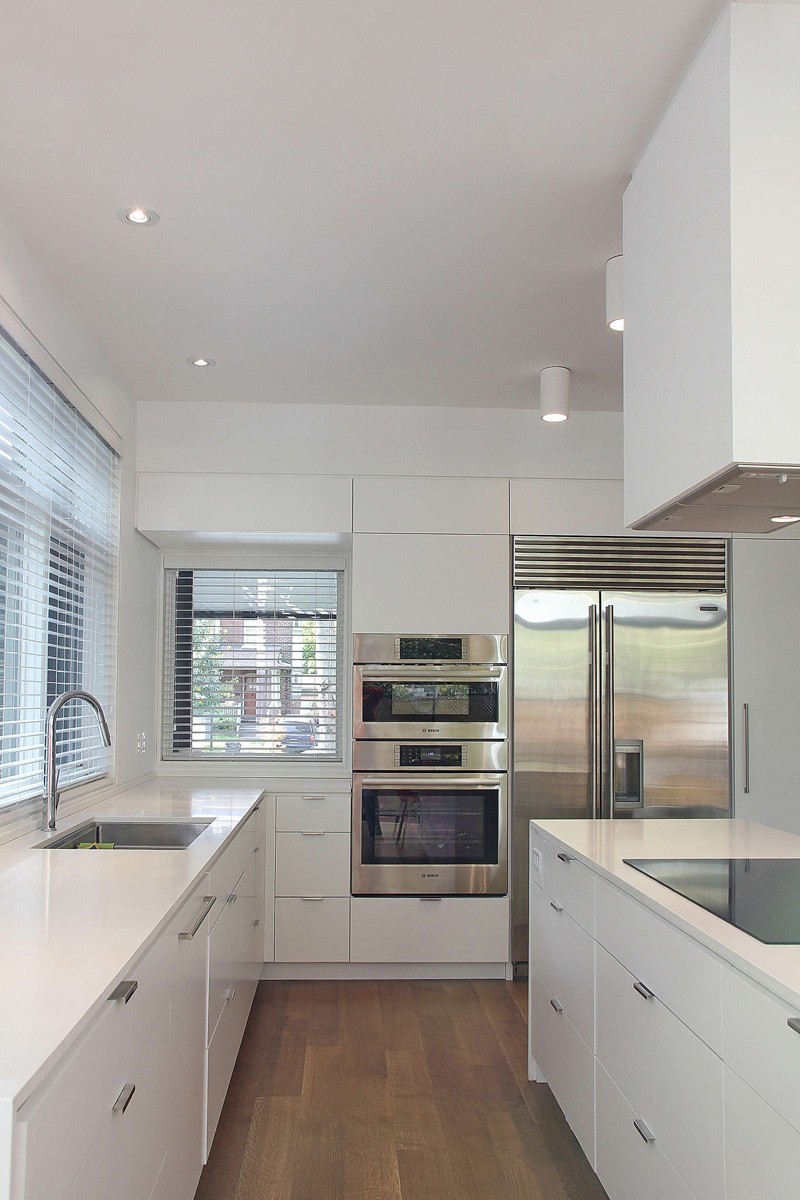
The design of the kitchen at this Edwardian Home in Toronto has a small kitchen with white cabinets, countertop and ceiling. Most of the appliances here has been arranged on the wall.
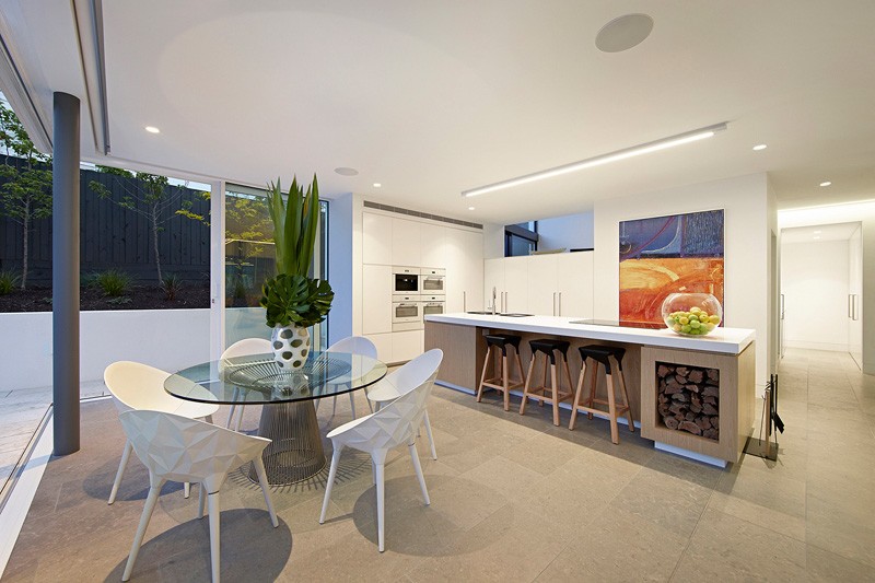
The kitchen at this home in Australia is small yet very welcoming with its colourful painting at the wall. The painting adds a splash of colour and serves as a focal point to the room. The combination of white and light brown is stunning.
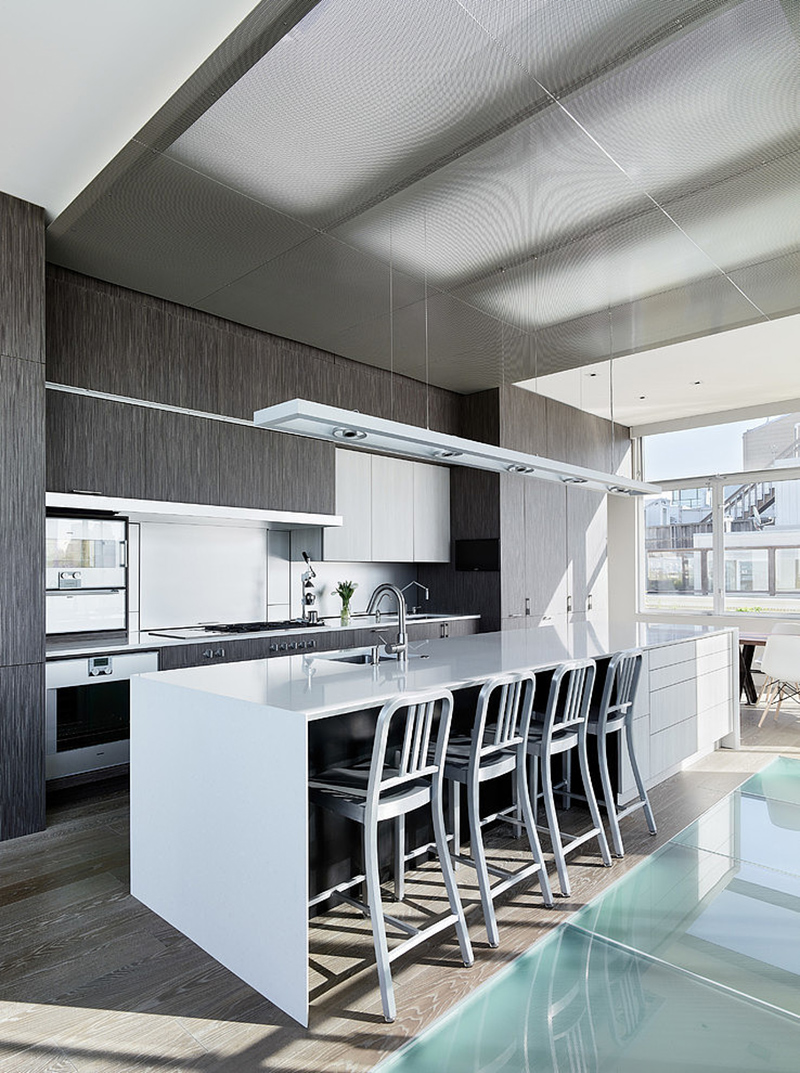
This kitchen design at the Telegraph Hill House is a combination of industrial and contemporary design. Subtle grey and white are used as a combination of the colours here. The sleek colours of the metal add an elegant feel to the room.
Minimal Designs
Minimal designs are perfect for people with limited space or just want a clean and spacious space. Below are some minimally designed kitchen spaces for you.
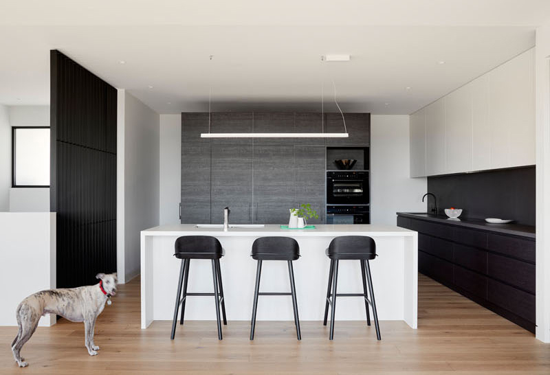
Glen Isla Home’s kitchen is minimal and modern with its black, silver and white theme. The designer has used a lard White Island to brighten the room and while cabinets.
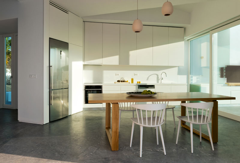
The kitchen at the House In Messaria is minimal with only the sink and cabinet present. The appliances have been fixed on the wall to allow more movement to the area.
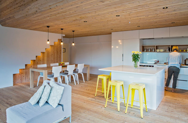
This kitchen design from a Back Country Home in New Zealand is calming with the combination of white and wood. The use of yellow stool also adds a splash of colour to this minimalist kitchen.
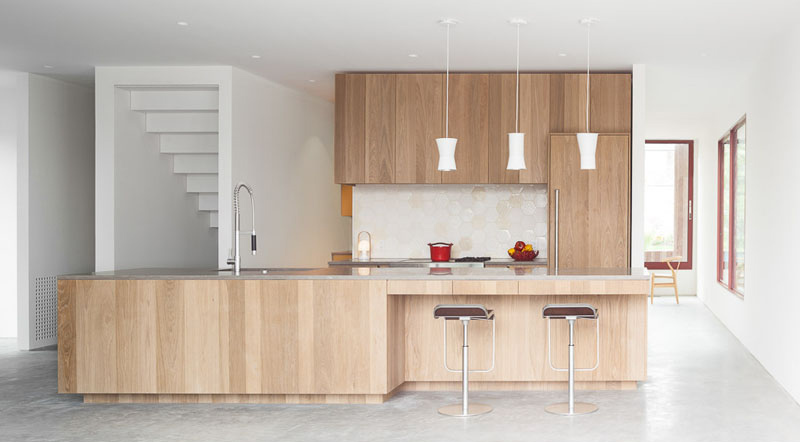
The kitchen at the Rough House in Vancouver is minimal with its wood cabinets and large island. There is also a hidden pantry and secondary kitchen hidden on the left.
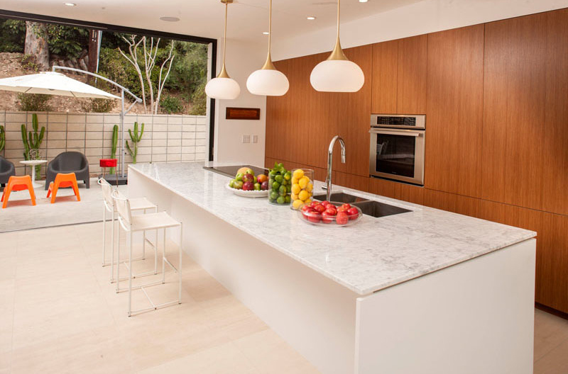
Lahaye Residence’s kitchen is impressive with its large brown cabinets that conceals the storage spaces. The large marble island gives a cool ambiance to the entire space.
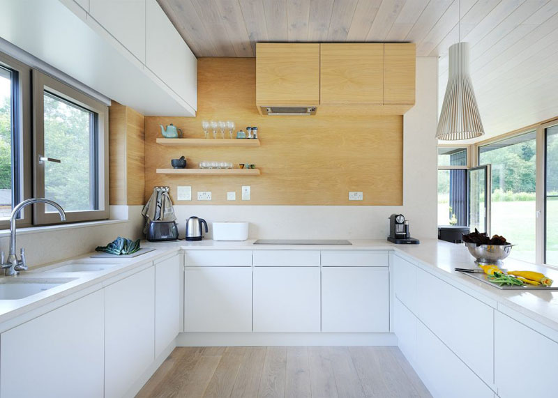
Forest Lodge’s kitchen is simple with its white cabinets and open windows on both sides. The light wooden cabinet and wooden wall adds a touch of colour to the entire space.
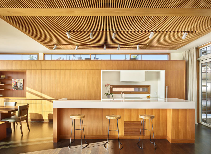
Floating House’s kitchen is unique with its wood cabinets, island and ceiling. The designer has used white countertops on the island and glass walls on both sides.
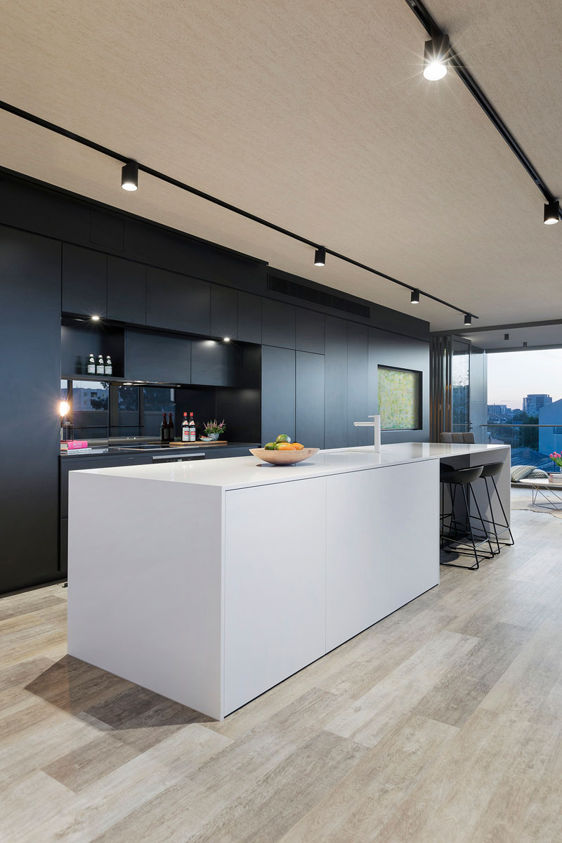
This kitchen from Vista Prahran is elegant with its black cabinets, stools and white island.
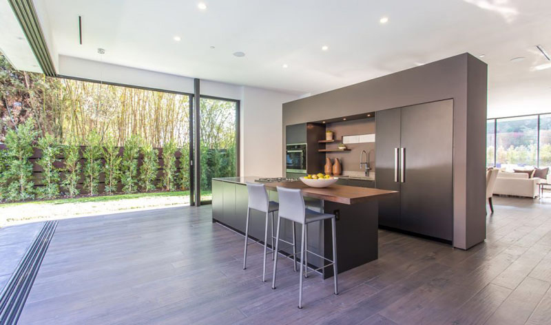
The kitchen from Rising Glen is minimal and modern with large cabinets on the wall to keep things hidden. The silver and grey colour of this space is elegant and sleek.
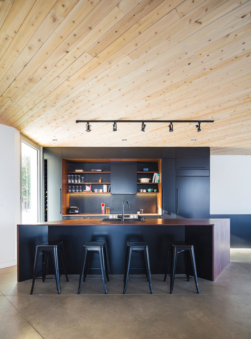
Le Nook’s kitchen is small yet modern looking. The dramatic black and dark wood kitchen are rather stunning. The light walls and woody colour of the ceiling brighten the space including the glass wall on the side.
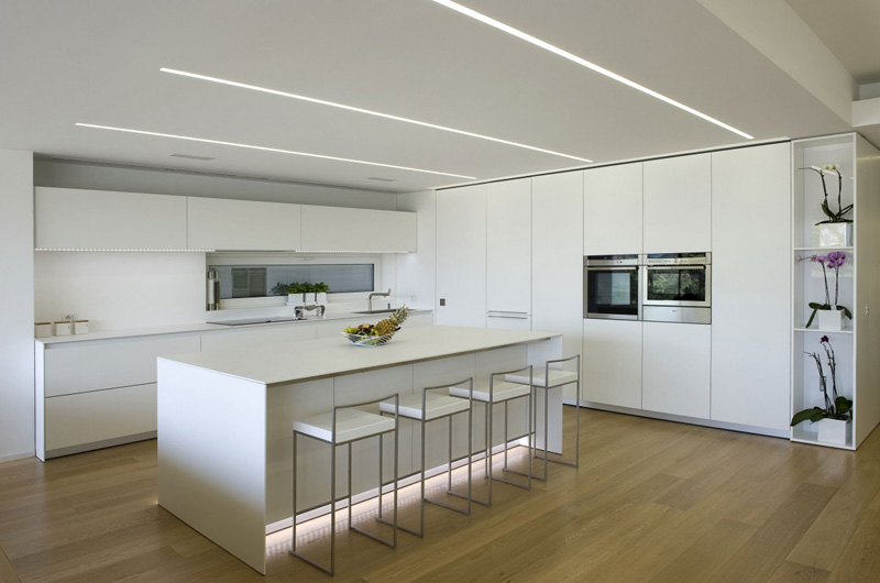
The design of the kitchen at this Casa NL_NF in Italy also uses fixed cabinets on the wall to help keep the space minimal. The white interior is accented by silver colours of the bar stool as well as the plants on the side.
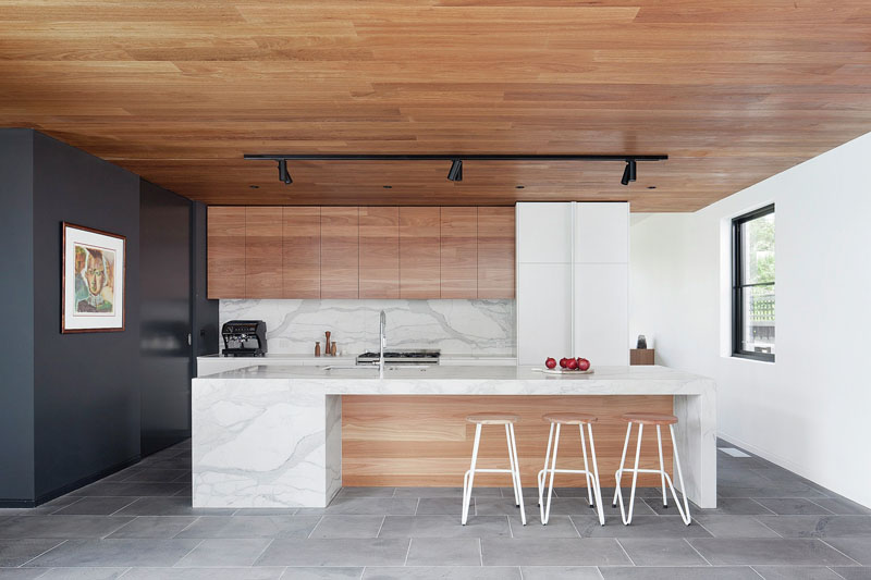
Stepping House’s kitchen is sleek and minimal with its Australian bluestone flooring and blackbutt timber materials. The kitchen space is minimal with spacious space to walk around.
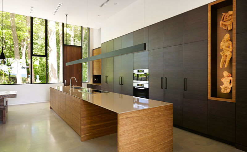
Fallsview Residence’s kitchen has plenty of storage space in its dark wood cabinet. The artwork at the wall adds a character to this minimal space.
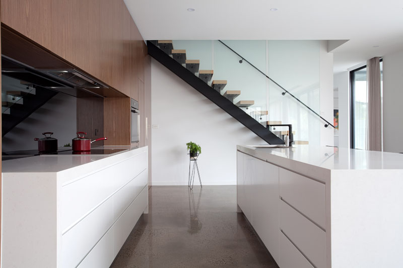
The kitchen at the home in Hayes Road is minimal with storage spaces in the white island and countertop.
Traditional Design
If you are more traditional, the below designs are more for you!
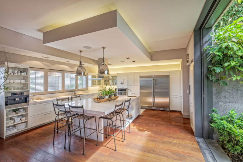
This kitchen at the Casa CSF in Mexico looks elegant and spacious. The silver fixtures add a classy look to the room.
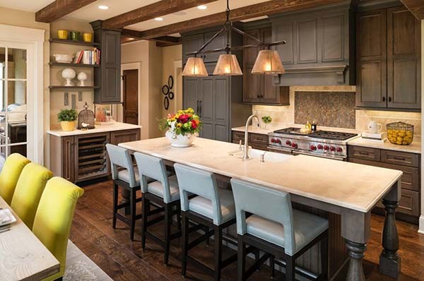
The kitchen at the Locust Hills Residence looks something from a storybook with its traditional wooden cabinets and brown colours. The spacious table/ White Island at the centre adds a nice charming look to space with its comfortable bar stools.
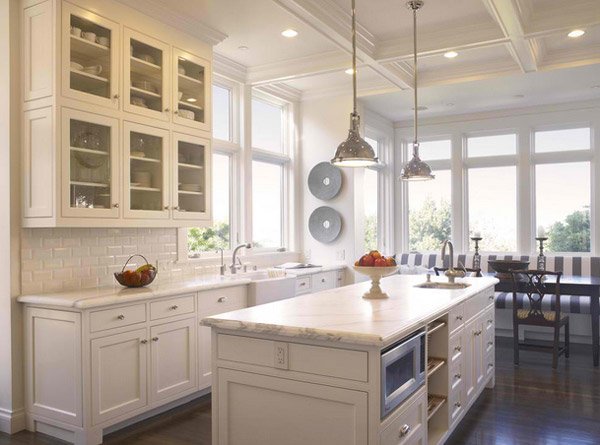
This kitchen is a combination of contemporary and traditional with its white colours and traditional accessories.
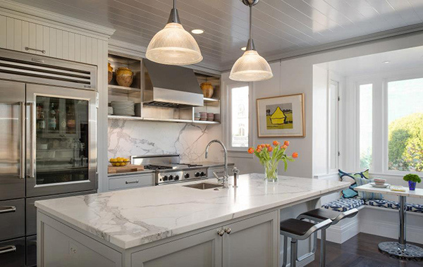
This kitchen from a home that was redesigned looks comfortable with its white and silver kitchen. The grey marble touches of the room blend perfectly with the interior.
Industrial Designs
Industrial designs are more leaning towards metals and steels. The design has an industrial spaces feel to it – think factories. If this is what you want, below are some design inspiration for you.
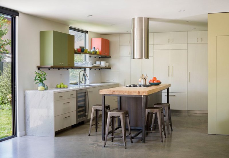
The kitchen at the Baldwin Duplex has a modern and industrial feel to it. Its cabinets are also on the wall, allows plenty of storage space. The chairs and the island is made from steel and wood with a tube-like exhaust at the centre.
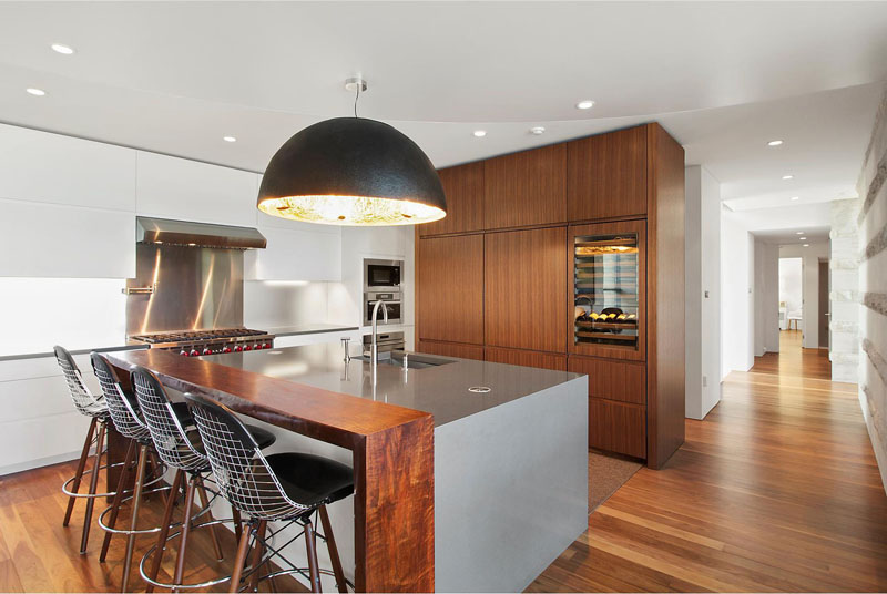
This kitchen at the Hamptons Residence is pretty unique with dark wood cabinet and silver island. The chairs are made from metal-wire with a large pendant light at the center.
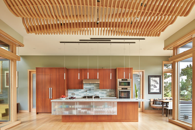
The contemporary and industrial design of this kitchen at the Deschutes River House is impressive and pleasing to the eyes. Its design used wood for the cabinets and a transparent island for storing of utensils.
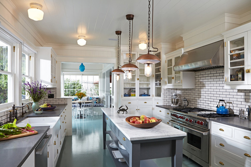
Luxe Family Home’s industrial designed kitchen used gray and white as its colour motif. The designer also used these cool light bulbs as pendant light for the island at the centre.
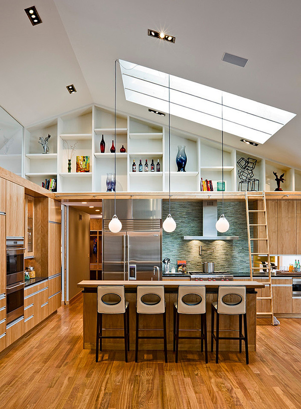
The kitchen from this Tyrol Hills Renovation is cozy and a combination of modern and industrial design. The designer has used light-bulb shaped lighting for its island in the centre of a room. A skylight has been added to welcome more natural light too.
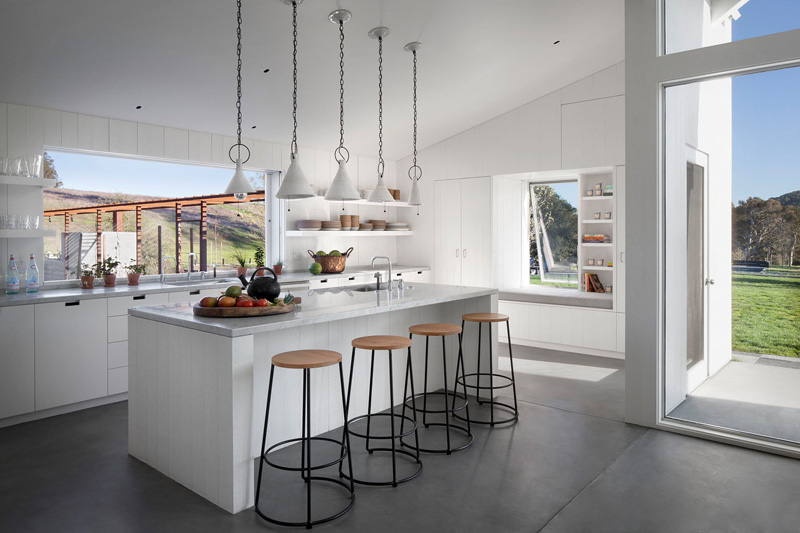
Hupomone Ranch’s uses stools and lamp-like lighting for a subtle industrial look. The open windows and wall add more light to the room.
Modern Wood Style
Wood material has been a very good part of any interior. In this below examples, we are showing off some great modern wood styles for your kitchen.
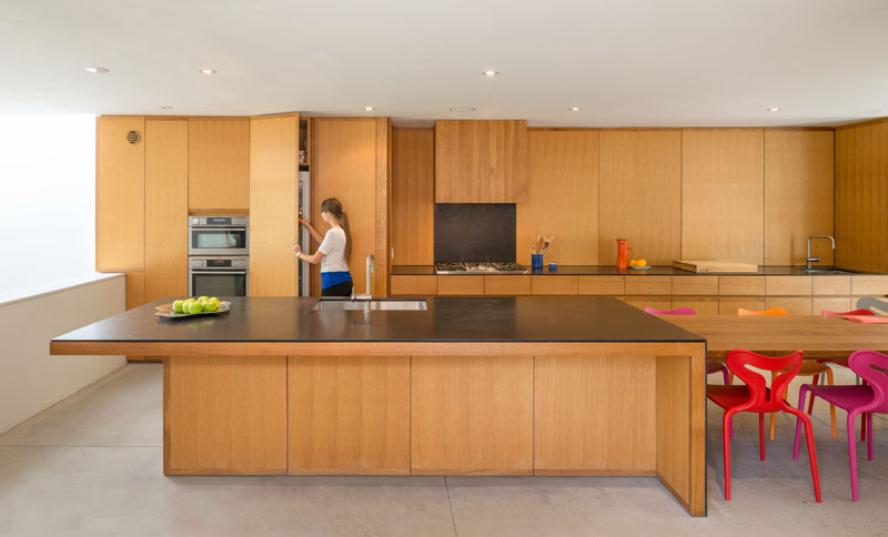
This woody interior of the F-5 Residence has plenty of storage space (which covers most of its wall). The large kitchen island is extended to a dining space with colorful chairs.
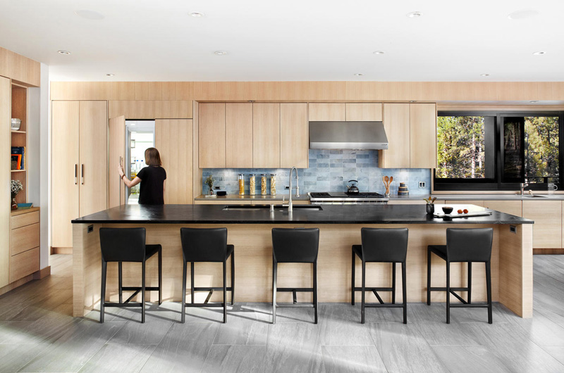
Martis-Dunsmuir House’s kitchen uses light wood to its cabinets and walls. The dark chairs and countertops, as well as the blue mosaic tiles in the kitchen sink, add a splash of colour to space.
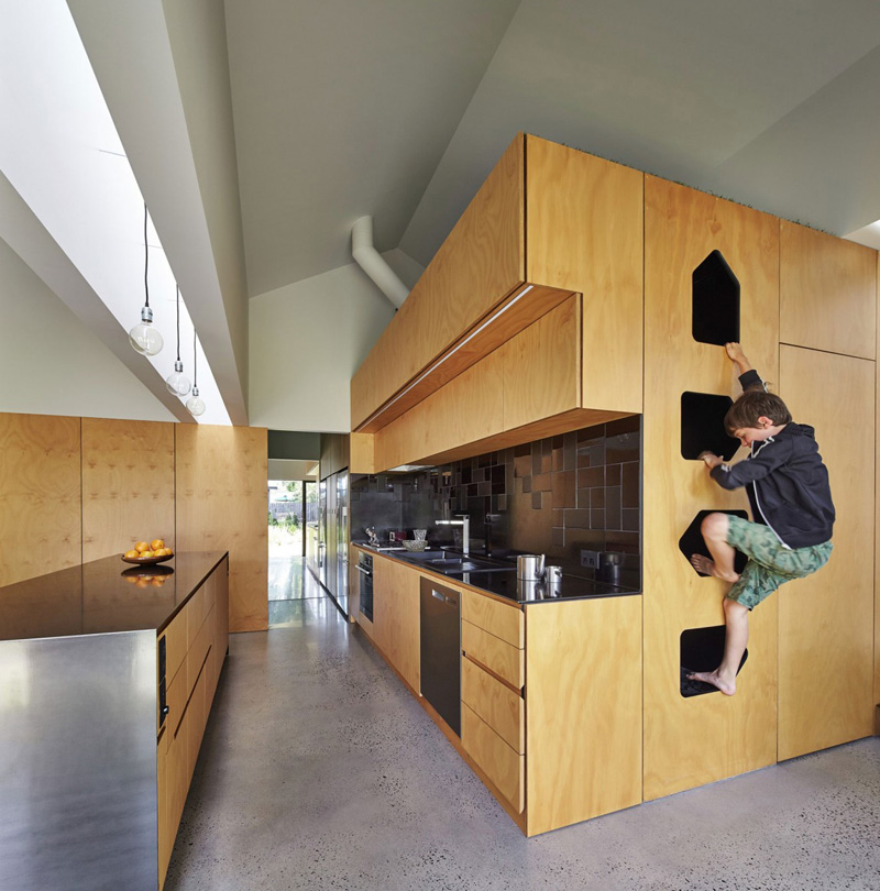
The kitchen at this Tower House in Australia is not only woody but multi-functional as well. The wood used in this space is light brown and accentuated by the black countertop and kitchen sink.
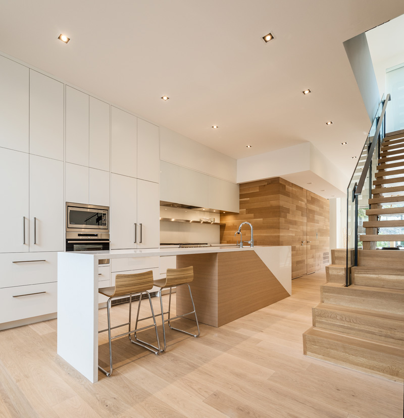
Relmar Houses’ kitchen has the sleek and minimal look of a modern kitchen. The brown colour of the kitchen island is enhanced by the white cabinets and ceiling.
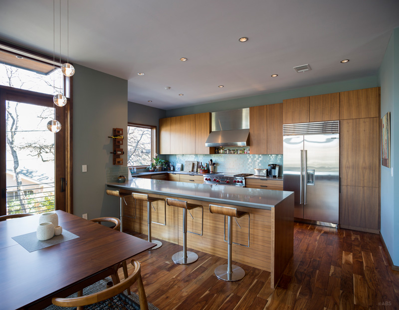
This kitchen of a Contemporary Home in Austin combines silver and wood for an elegant effect.
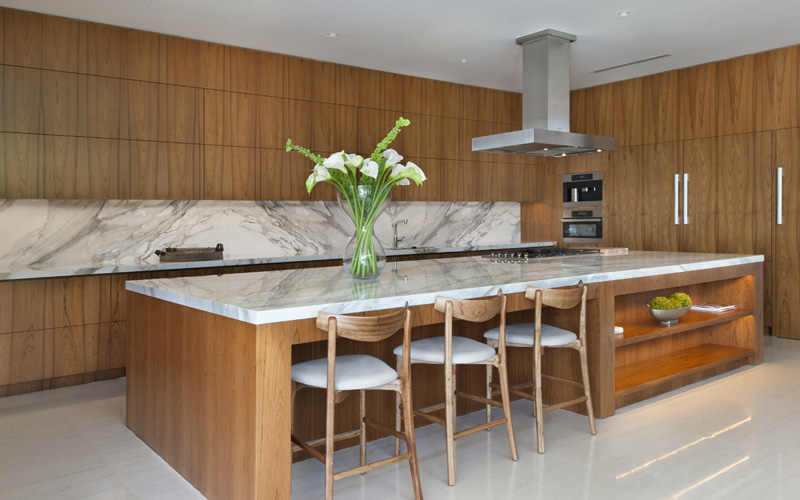
The kitchen in this Modern Miami Beach House uses dark panels of wood for its cabinet and kitchen island. The silvery colony of the exhaust tube and the grey marble of the countertop and kitchen sink adds an elegant feel to space.
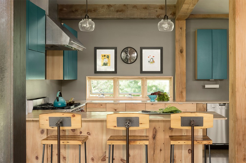
The kitchen at this New England Farmhouse is small yet charming. The use of wood on the beams, countertop and chairs are stunning with a bit of turquoise colour added in.
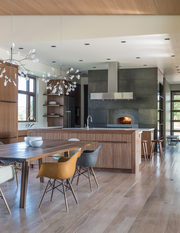
Shoshone Residence’s kitchen is sleek and elegant. The designer has used dark marble for the furnace or oven on the wall and added dark brown cabinets to fill out space.
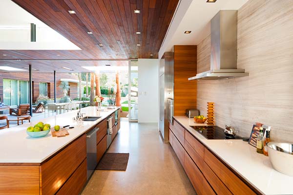
The kitchen at this Modern F-5 Residence uses neutral travertine wall to compliment the light hued sofa and natural walnut dining table and chairs.
Dream Kitchen Ideas
These Dream Kitchen Ideas are photos from wonderful homes that you would actually like, and maybe eventually love.
From traditional homes to contemporary ones and even the modern ones, we are quite sure that you’d like this collection may hope that maybe share them with your friends.
Camelia Court
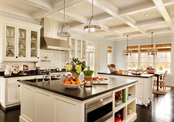
This lovely white kitchen is indeed one charming space. From the white walls, ceiling and cabinets, we see how clean this space will turn out every time. The absolute black granite used for the counters added beauty to space.
Chancellor Street Residence
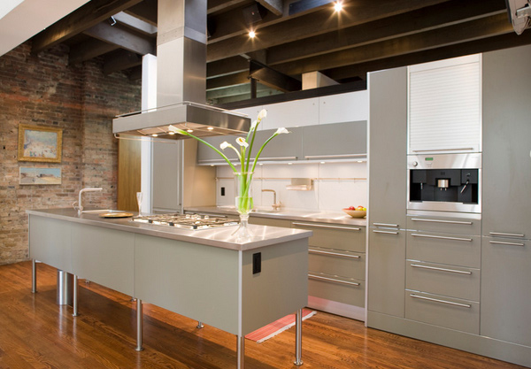
This gorgeous kitchen is extremely modern and really classy! Even the vintage 1880’s pine flooring speaks of beauty!
Dandelion House
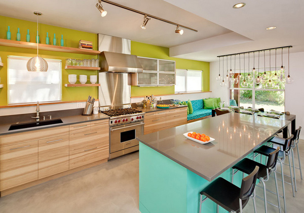
loop-d
This remodelling of a two-storey home in South Austin made the entire first floor open up. They have also an enlarged the kitchen and upgraded it to be able to meet the demands of the homeowners who obviously loves to cook.
French Colonial Style Kitchen
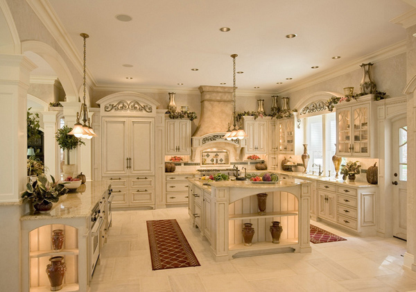
According to HGTV, this kitchen was designed for efficient cooking, and it looks fabulously French doing it.
Designed to evoke the French Colonial period, its 10-foot ceilings, emblematic arches and intricate woodwork would have made Louis XIV proud.
A decorative armoire, topped with iron pieces imported from Italy, hides the refrigerator. A two-tiered Madura Gold granite island features a wet bar and two integrated white ovens. The island also features a raised seating area perfect for gatherings
Glamorous Four Square
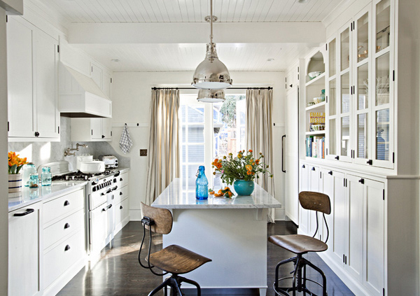
Jessica Helgerson Interior Design
The designers gutted the small and dysfunctional kitchen and used up the under-utilized back pantry and mudroom, they were able to create a large cooking space and a dining space.
Gold Coast Kitchen
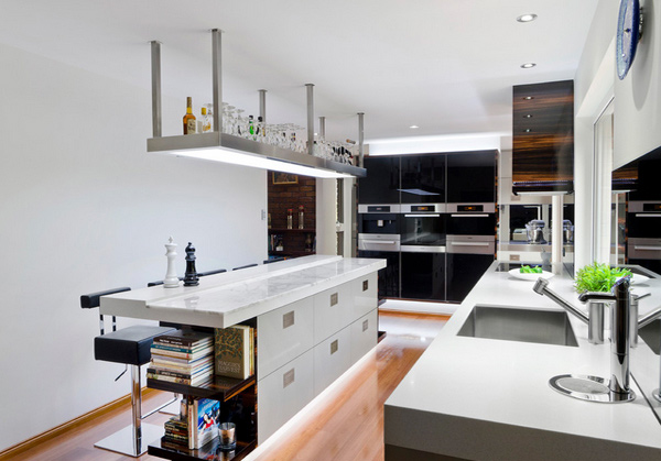
Darren James did a good job in designing and building the dream kitchen of the homeowners. They wanted premium quality in every detail: design, materials, workmanship and finish and they sure got it.
Kohi House
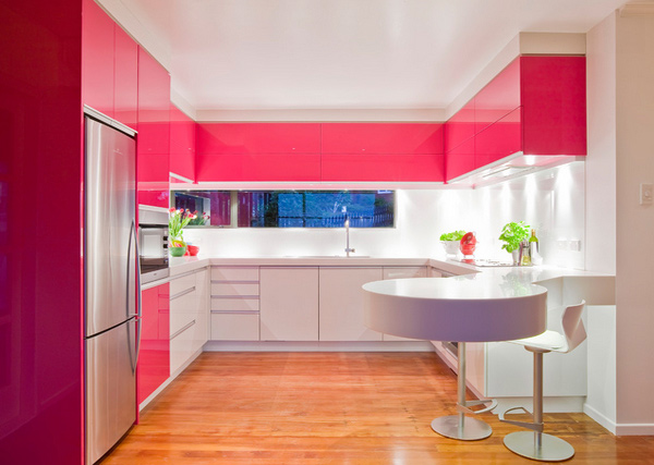
Pretty chic kitchen with acrylic two-toned cabinets, white swivel bar stools and eat-in kitchen design. Any girl would love to live in this space! Seriously.
LEED Gold – Houston
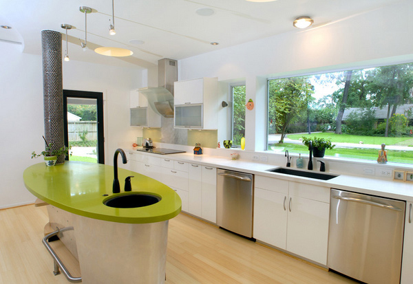
This area has a custom-designed island with formaldehyde-free cabinets. Notice the structural steel column wrapped and tiled in black penny rounds.
Los Angeles Modern Kitchen
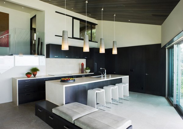
Brushed travertine slab was used for the counters and did a magnificent job for the entire space. Even the brushed limestone slabs made the flooring spectacular!
Maui
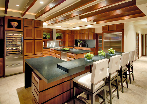
Arri-Lecrom Design Association
Just by looking at this kitchen, we can imagine how spaces in movies look as stunning as these. A few things that make this special is the custom-made airy bar stools and the unique wine fridge.
Miami Home
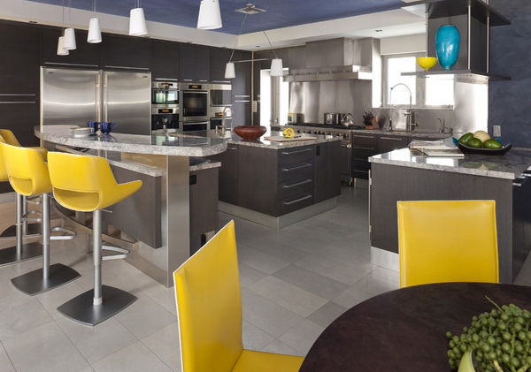
Architectural Design Consultants, Inc.
An elevated granite countertop accents this lovely area, matched with dark wood cabinets. In this example, we are able to see that grey and yellow is a great combo – the subtleness of grey makes the yellow really stand out.
Modern Kitchen Contemporary Kitchen
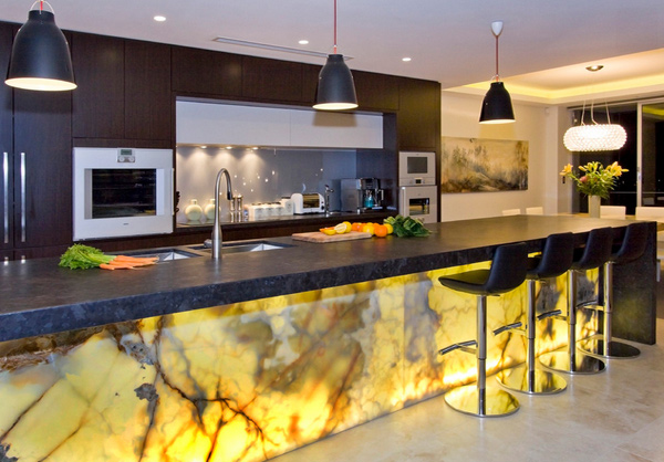
This has the best backlighting we have ever seen. Just looking at the onyx breakfast bar, we can definitely say that it’s colour and look matches everything that was put together, both by the owner and the designers.
Orinda Residence
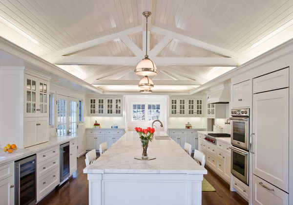
For this beautiful hilltop home, the couple who owned the space wanted to make sure that the heart of this home would be the kitchen. The designers made sure to fulfil just that. A lovely kitchen made with white cabinets, drawers, beams and even the counters!
Papyrus Home Design
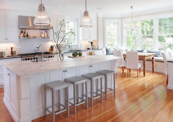
White kitchen spaces are definitely a favourite for kitchen lovers. Who wouldn’t like seeing how gorgeous one white space can be, especially when matched with the right decors and furniture. We really love the pendant lights made of brushed nickel.
Paris Kitchen
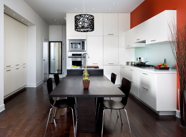
With the colours used in this kitchen space, it is pretty obvious how the dark hardwood floors worked with the white cabinets. Accents like the black tapestry for the pendants made the look complete.
Sublime Kitchen
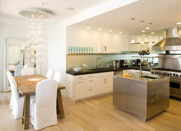
The Ether pendant light by the dining area is a sure hit! It basically made space look more pretty than it already is. The goal was to create a sleek and elegant space, it was indeed achieved. The frosted glass backsplash and the stainless steel island was just a plus!
Russian Hill
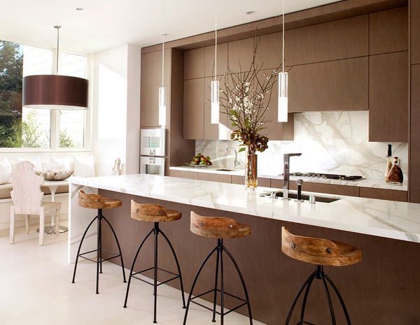
Looking at this, we can throw in a few words like a banquette, breakfast bar, ceiling lighting, marble kitchen counters, modern fixtures, neutral colours – just a few things that make this space work it altogether.
The Brunswick
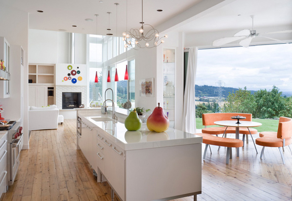
This area is definitely a charmer – the porcelain slab used for the counters look really terrific. It matches the white walls, cabinets and the ceiling.
Upper Montclair
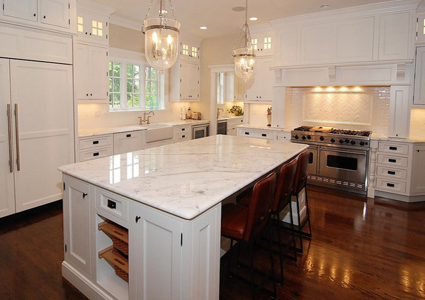
Notice the herringbone tiles by the range which looks pretty with the white woodworks around it – along of course the stunning white marble countertop and fab pendant lights.
Vail Residence
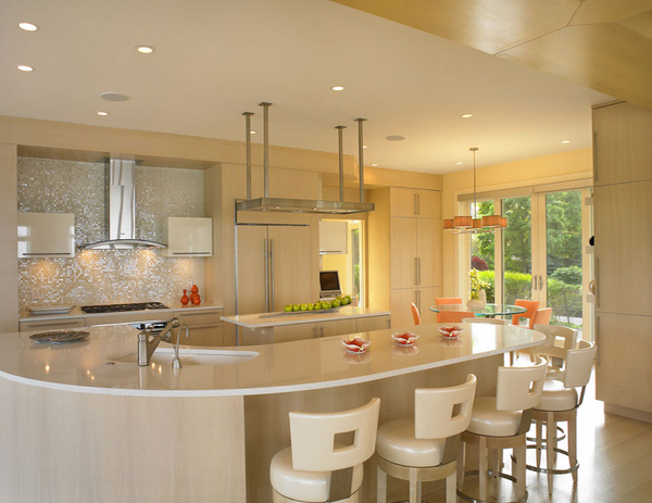
Jorge Castillo Design Inc.
We loved how the blonde wood looked really great in this space. From the breakfast nook to the counter stools and glossy cabinets, who would not love this kitchen?
More Design Ideas for your Kitchen
There are different choices for different angles and space requirements to consider finally deciding what type of kitchen to get. Below are more examples of design ideas for your kitchen.
Orange Hues
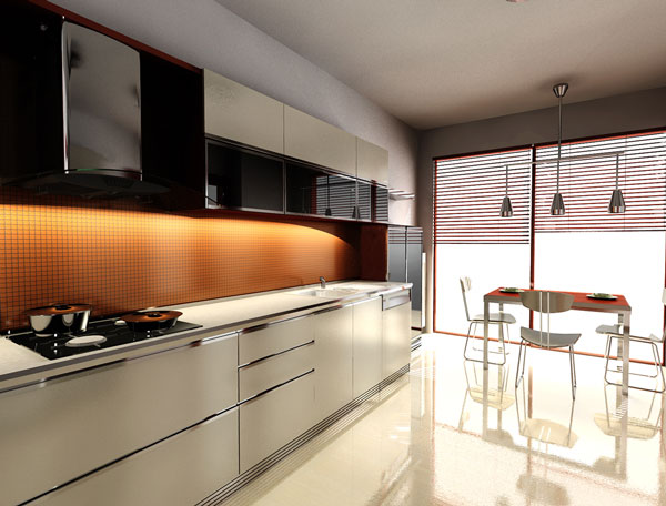
The kitchen will have to be spacious depending on the furniture and appliances the owner would like to keep. The orange colour on the wall and the table adds a splash of colour to space.
Clean Kitchen
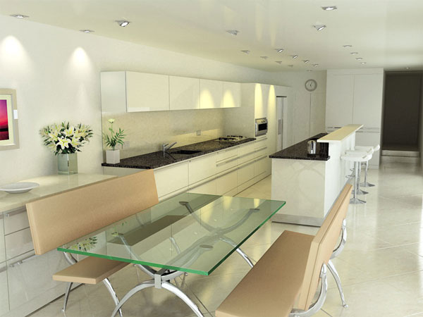
The photo shows a modern kitchen scene rendered using 3Ds max and Vray. We like how clean and organise everything is and how the grey countertop is in contrast with the light interior.
Modern Kitchen Space
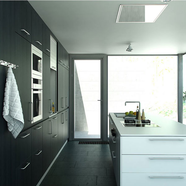
The ambience of the kitchen will have to be considered also. Some would prefer a well-ventilated area for food preparation, just like the design above. There is a large space on the kitchen counter and plenty of storage space on the wall cabinet.
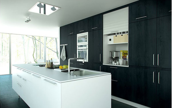
Above photo shows another angle of the kitchen design.
Photorealistic Interior
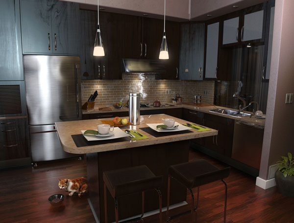
When space is limited especially for pads or condominiums, a dining table for two becomes an addition. We love how the pendant light illuminates the entire space.
Green Space for Cooking
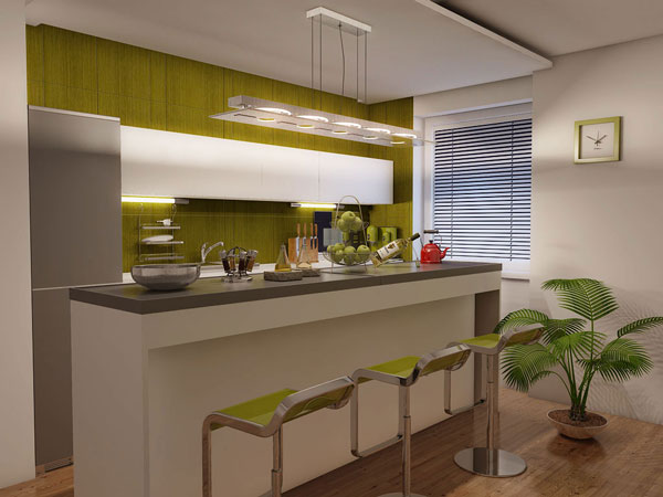
This is a kitchen scene taken from Evermotion Archinteriors. The design has been rendered using Maya 2011 with Mental Ray. The chairs’ colour is in harmony with the green colour of the wall in the kitchen. The potted plant in the corner adds a nice touch to space.
Spacious Kitchen Samples
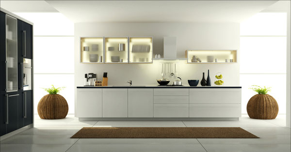
Kitchen colours may become an issue if not harmonised together. In the photo shown above, the wall cabinets’ doors are made of glass and look elegant too. The cabinets below the sink are simply white.
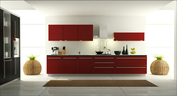
This design created by Elisey Stolyar looks nice too with wood as cabinet doors painted red.
Kitchen with Ebony Wood
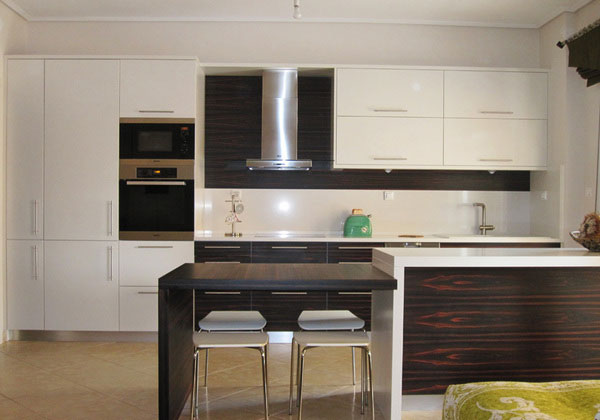
This design shows the types of furniture in place that could be good for the desired kitchen.
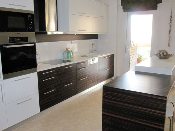
The photo shows the way to kitchen’s back door which can be an option too especially for country-themed kitchens.
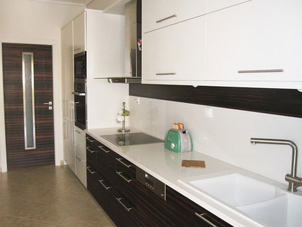
The use of ebony wood in this design shows designer Christianna Aggeli’s nice taste for colour matching.
Interiors Roble House Kitchen
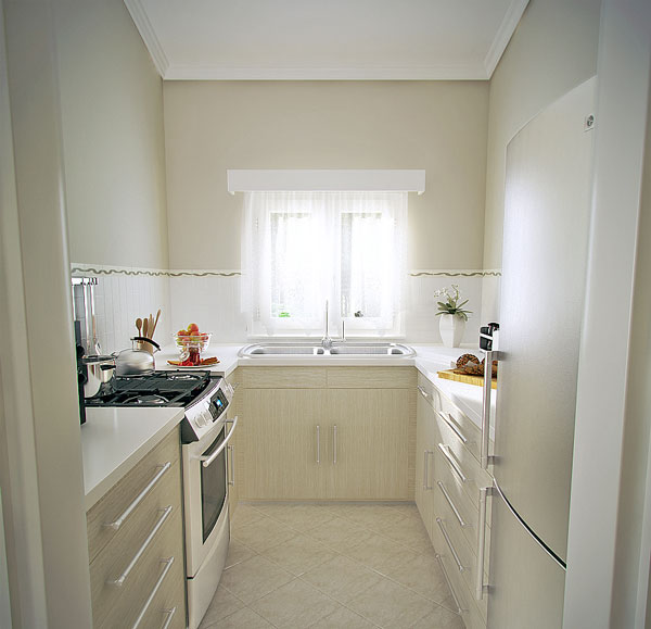
There’s nothing much to worry when there’s too limited space. One can still move around and just make sure that stuff is placed in an organized manner. Though of course, limitations are applied.
3D Visualization Kitchen Sosnovo
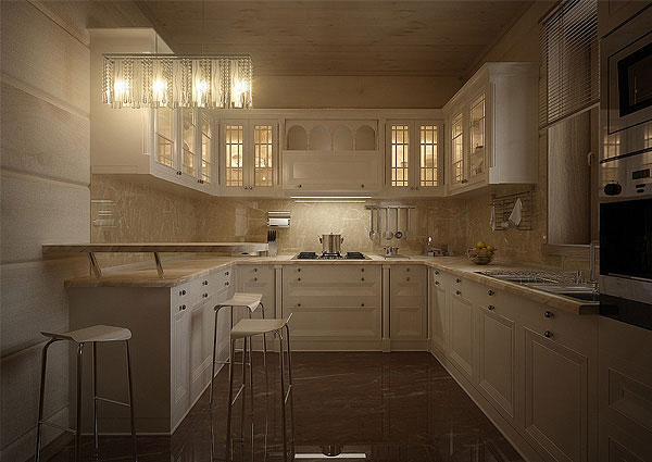
The lights that Nickolai Yegorov chose bring out the best in this kitchen design even when you have just chosen an intimate white touch on it.
Proyecto Concurso De Dietrich
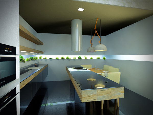
An eco-sustainable kitchen where large materials like wooden sleepers, organic touches like a garden.
The maximization of natural light combined with the highest technology that De Dietrich provides has been used in this particular design idea. This came from the creative mind of Nicolas Robertson.
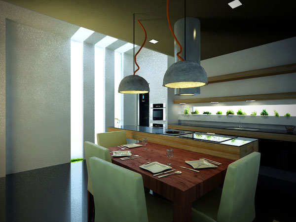
The photo shows an up-close angle of the kitchen space.
PhotoDirection SLG Euro
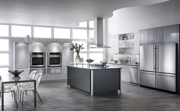
An example of Jodie Miller’s design where the tone has been nicely considered.
Red Kitchen 3D Visualization
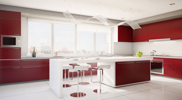
The design has been inspired by Blacksmithstudios. It was the client who provided the cabinet layout where the designer worked on its design including the colours and the lighting.
Kitchen Granite Island and Sitcom Stools
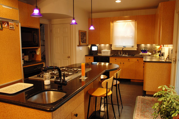
A kitchen looks as appealing as this especially when the area is maintained clean.
Warm Earth Tone Design
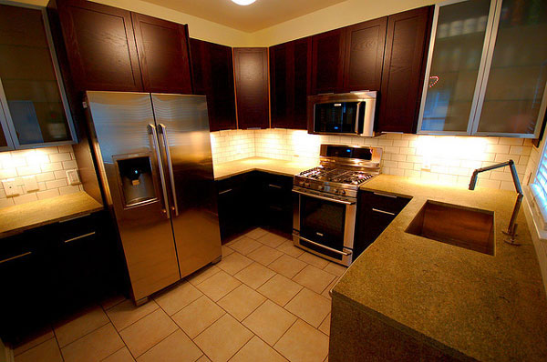
A wide angle view of a newly finished kitchen space. The warm earth tones are used here. Lights at the corner of the counter have been used too to brighten the area.
Seabee Lane 3
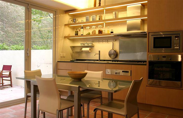
Here goes an example of a spacious kitchen with enough lighting since the sliding door is made of glass.
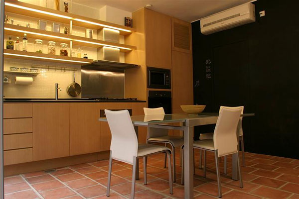
The photo shows another angle of the kitchen. The wall on this side is darker than the rest of the interior.
There is just so many design inspiration you’ll come across with. But it’s still best to consider the many factors that could affect the ideal style you have been craving for.
It could take time, money and effort to finally finish the conceptualization but it’s worth it.
After all, a kitchen is the key to healthy living. Have you come across a kitchen design lately that you really liked?