For most homes, renovating and redesigning is better than demolishing the entire house and rebuild it. But that also depends on the condition of the home. If the home’s existing structure and foundation is no longer stable and would cause potential risk to the home owners, then it is better to just demolish it. Some could still reclaim other materials which could also be used for the new home. This way, the owners can save some money for the new construction or renovation. Home transformations, whether it is rebuilding a structure or just a little renovations are all impressive. In truth, it is easier to build from scratch because you can do what you want unlike renovating when you need to consider all the existing architecture of the house. We have featured many home transformations before and we are going to show you another one today.
The house is owned by Alexander Stross who hired architecture firm Dick Clark + Associates, to work on the transformation of his home. The 1980’s salmon-colored stucco home located in Austin, Texas needed a major updated since it looks old and it doesn’t fit the lifestyle of the family. Stross wants to give the house a contemporary update. Its facade was improves with a better curb appeal. It looked even more appealing and inviting too. Meanwhile, the interior was also updated creating a cozier space with everything the owner and the entire family needs. Wood was added in the house which brings in a warmer aura to the interior and added more beauty to the exterior. You can see the difference between the old house and the new one in the before and after photos that are also shown below. Come take a look at the images of the home below.
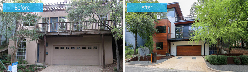
Apparently, there is a huge difference from the former house exterior to the new one. Look at the wooden features and the new colors added to it.
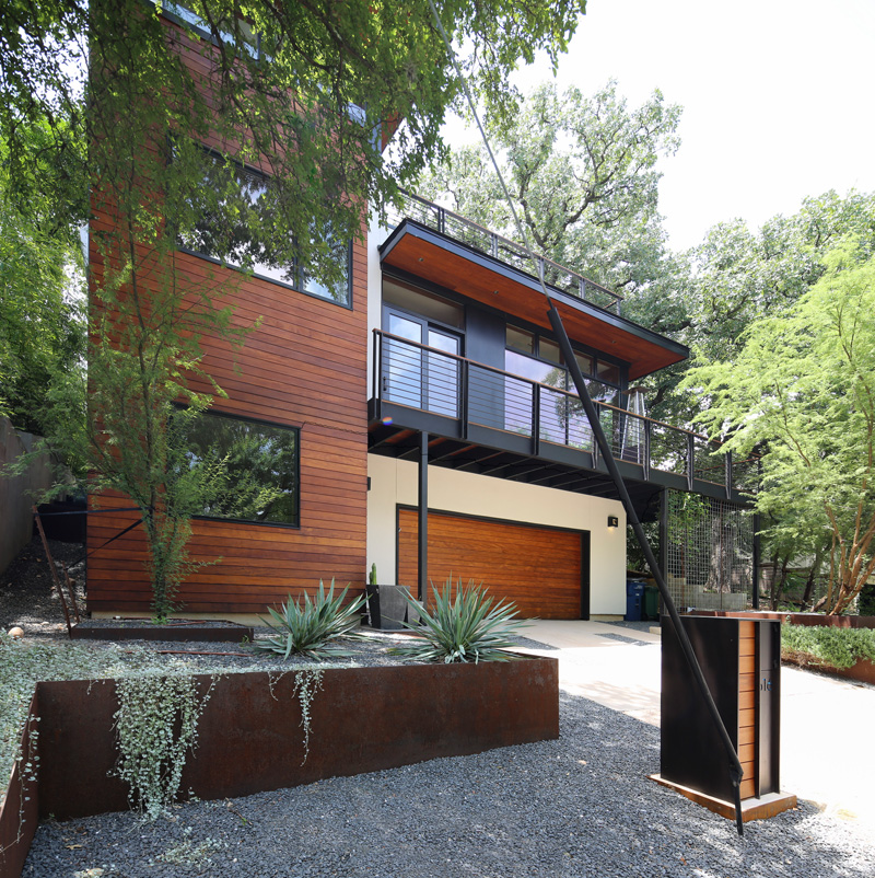
The exterior of the house used a combination of wood and steel which made it look very contemporary. It may have the same design with the old house but the materials were updated and it looked totally stunning!
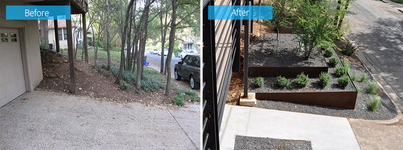
Even the landscaping of the front yard was improved to give a better curb appeal to the home. Instead of just a plain sloping land, two level terraces were added with plants on it.
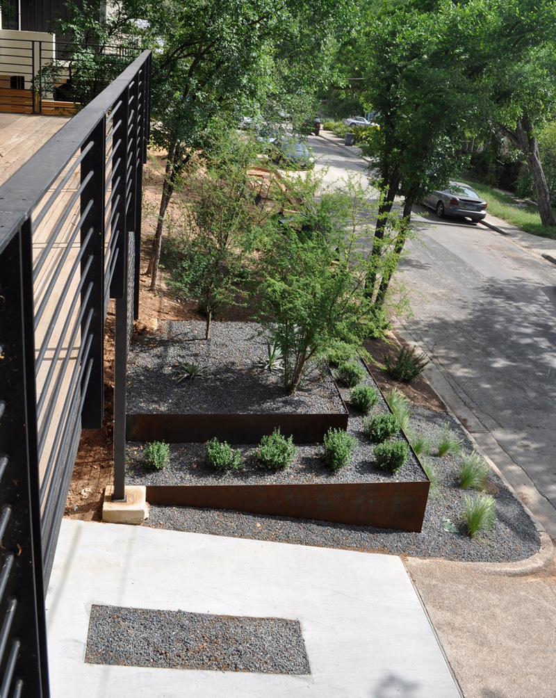
Using steel planters for the landscaping added a contemporary touch to the curb appeal of the house. It also complements with the materials used for the exterior and architecture of the home.
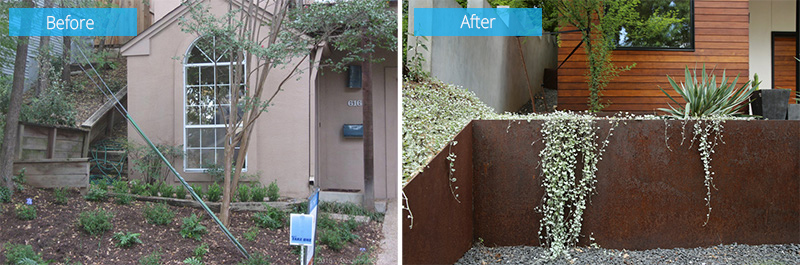
Instead of this plain looking area, a steel planter was added with plants of various types on it. Indeed, when you are more creative with the landscaping, the house looks totally more beautiful.
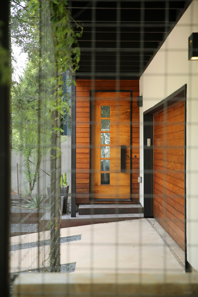
Look at that door! I love the design of this wooden door! It combined wood and steel with some high technology lock system. Love the idea that the entrance is on the side just next the garage. Beautiful textures are seen here too.
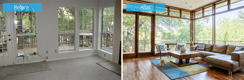
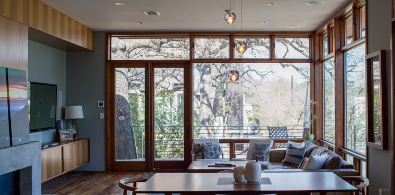
Before, the interior was in all white with large French windows and doors. This living area located in the upper level now has an even brighter space with picture windows and clerestory windows just above it. Now one can take a look at the view with any obstructions!
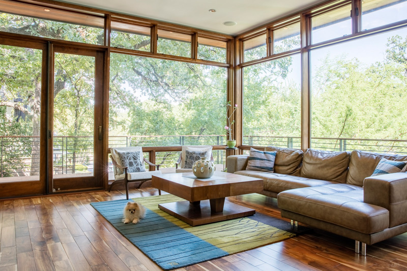
Oh that puppy is so cute! It sure loved that soft modern area rug that added pops of color to the home. The flooring was changed adding wood into it bringing more warmth and coziness to the entire home. Its choice of wooden coffee table and L-shaped leather couch fitted to the contemporary feel of the living space.
Read Also: Before and After: Impressive Usage of Reclaimed Wood in this New England Farmhouse in Maine
This living area and dining area are on the same space with a concrete fireplace on the side. Facing the living area is a floating cabinet with a television above it. Orb chandelier is suspended from the ceiling.
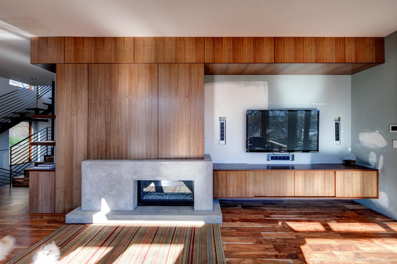
This one has a similar layout with the previous area. But as we can see, it has different flooring signifying that this is a different space. Notice the speakers installed on the wall on both sides of the television.
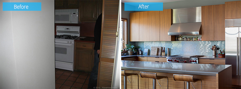
Before, the kitchen was closed-off with a partition. The wall was removed creating an open kitchen area allowing them to add a kitchen island. The space is now friendlier and more inspiring to work in. The previous one looks a bit scary.
The kitchen area turned into a lovely space to prepare food in. Just next to it is the dining area. Like other spaces, it also used wood here with a combination of steel and silver colors. The backsplash has a light blue color in glossy ceramic tiles.
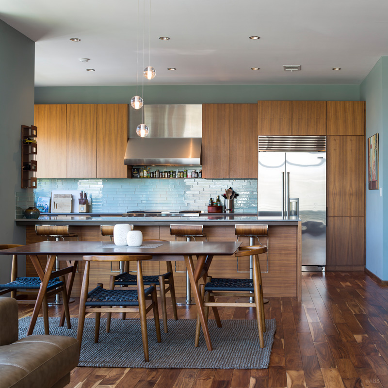
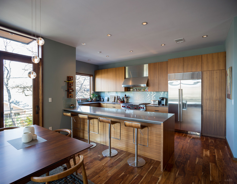
I’d say this is one beautiful kitchen and dining space. The design of the area is just so cozy and comfortable. Look at the design of the dining chairs. Isn’t it lovely with the woven seat? It matched with the color and material of the area rug.
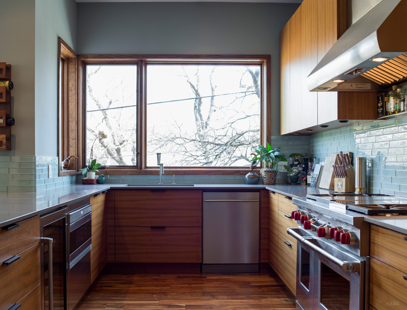
The other side of the kitchen has hanging cabinets and a hood for the range. It also has a picture window that allows entry of natural light into the area. Wood is used all throughout the space.
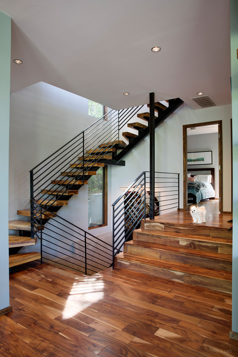
Oh that dog again! Lol. Go home with me sweetie! Anyway, for this one the staircase is featured showing us its combination of wood and steel just like what was used for the exterior of the house. Quite a complicated design for a staircase but it does work well.
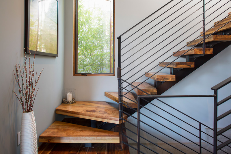
A closer look at the staircase which shows that no boring corner is seen here since there are decors here too. A white floor jar sits on the landing while a cute candle on a glass is tucked on the corner. Paintings also hang on the wall too and a window brings more light to the area.
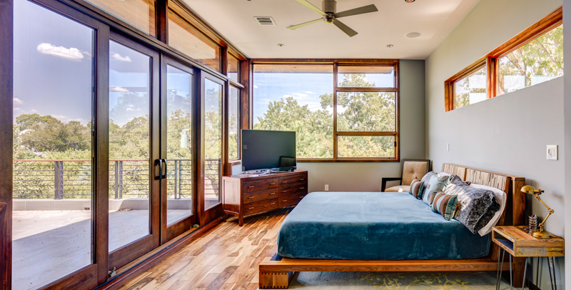
And this is the bedroom. I can sense some rustic feeling here because of all the wooden items. It leads directly to a balcony where a view of the trees can be seen. Lovely, right? The texture and print of the bed also add more beauty to this private area.
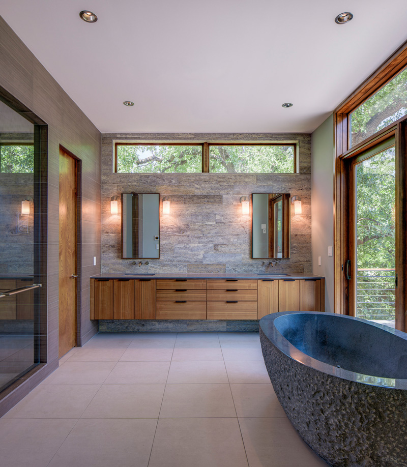
The bathroom is spacious with wooden elements inside it. It has a glass shower enclosure and a long vanity with wood. The bath tub is an interesting feature especially that it has a unique texture on it. Windows around it bring light to the bathroom.
Such a transformation indeed! Isn’t this a beautiful contemporary home? There was indeed a huge difference from the old house to the new one. Obviously, Dick Clark + Associates did an amazing job for the design of the house. We can see how much work they have done both for the interior and the exterior. This house doesn’t just give us ideas and inspiration for our future home but it also reminds us that even an ugly space or an outdated home can actually look a lot better after a renovation. It just depends on your budget as well as the kind of design you want for your home. When you decide to do a home renovation, make sure you know what you really want for your house so that you won’t need to make changes every time because that would be more costly. Also, spend time to create an inspiration board so that you can choose a good design for your renovation. So, what can you say about this house?