Most people would think that when designing a house, it is best to have everything in coherence. Others even prefer to work on the same color scheme all throughout the house while still others try to bring in the elements they use from the exterior to the interior. But in truth, you don’t have to be that strict. You could also be creative and even play with contrasting elements and features because when you put together these contradicting features, you can come up with an amazing design that looks very impressive the same as that house that is called the Hidden House.
The Hidden House in Tel Aviv, Israel is defined as a house of contradictions that evolves on the idea between “sealed and closed, to open to natural light and to the outside area.” Contrasts in colors and volumes are also seen in the house. What made it more interesting is that the house is designed on a small square plot which appears little with the program’s requirements but was successfully achieved. The house has a ground floor with maximal openness and lightness. It also features an accentuated interior-exterior connection allowing a good view of the pool and the outdoor seating areas. Privacy was achieved in the house through a mysterious facade built of concrete beams and wood trellis. The facade looked opaque but did not prevent the rooms from being filled with light. There are strip windows all along the structure and rooms. The structure has a clean geometric design wherein the cube of the first floor hovers over the ground floor. Thinner columns made of iron were used to create drama between the two volumes – upper and lower. Let us take a look at the Hidden House below.
Location: Tel Aviv, Israel
Designer: Dan and Hila Israelevitz Architects
Style: Modern
Number of Levels: Three-storey
Unique feature: A home with a strong bold cube facade in black that seems to hide everything in the house while the other side has an open concept connecting the interior to the exterior seamlessly.
Similar House: Effective Use of Raw Materials and Sense of Openness in Cube House in Melbourne
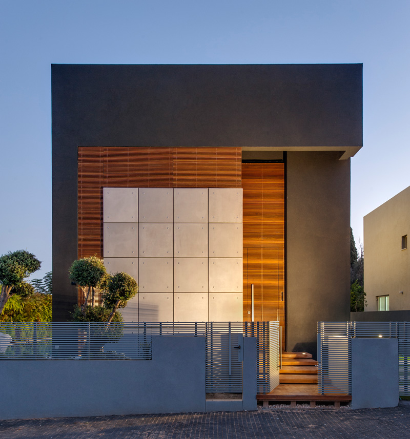
The front facade of the house looks very beautiful with only clues of cracks of light breaking through it. The combination of materials used here also add to its appeal.
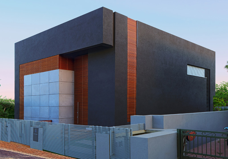
The house has a low fence that surrounds it which is a good idea in order to expose the design of the house. What you can see here too is the geometric design of the exterior.
Three floors were planned for the house which includes the entrance floor that is intended for social interactions in the house, a dining room and a living room, and a kitchen that constitutes an integral part of the home.
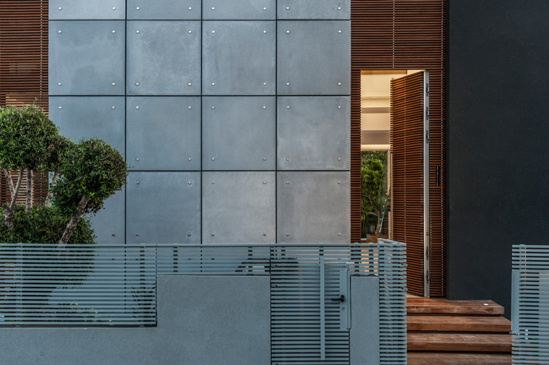
Aside from the mix of materials the house facade also has plants added to it. Even the interior has some plants too.
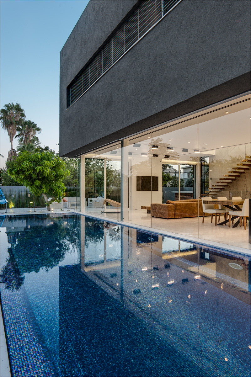
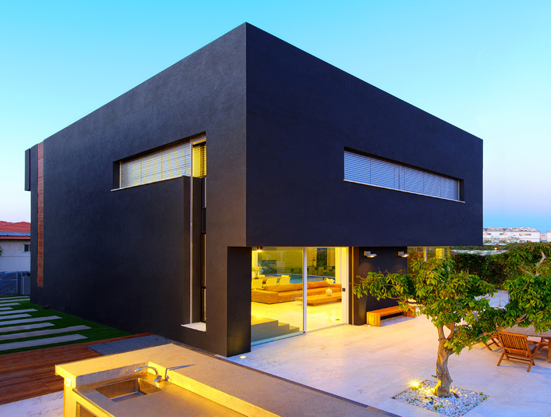
On the other side of the house is a pool and a glass wall which is a design contradiction to the concrete walls on the other side. And there are lights too that bring more drama to the area.
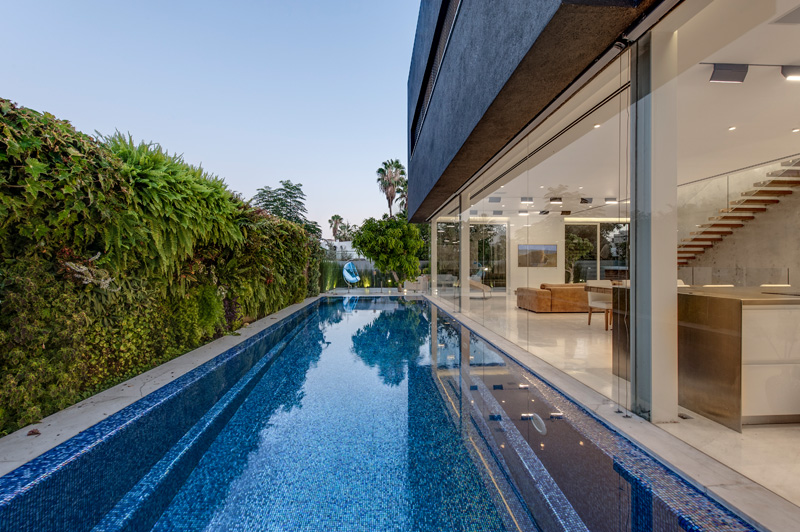
To create a separation and drama between the floors, an all glass wall without divisions were used in the ground floor that is parallel to the pool. It faces a living wall which makes it even more interesting.
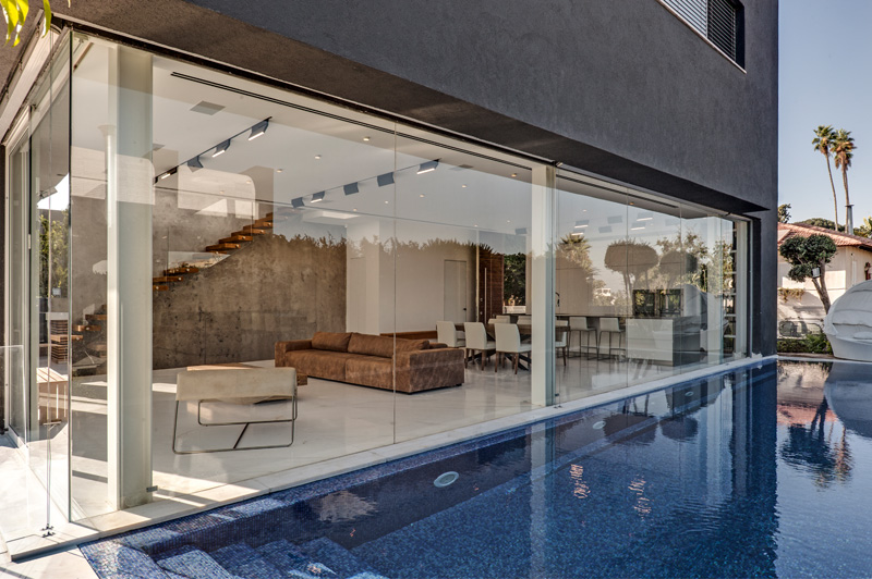
The space was planned in a way that it goes outside and crosses the structure. You can see the interior-exterior connection in the two floors that is being liked by the staircase.
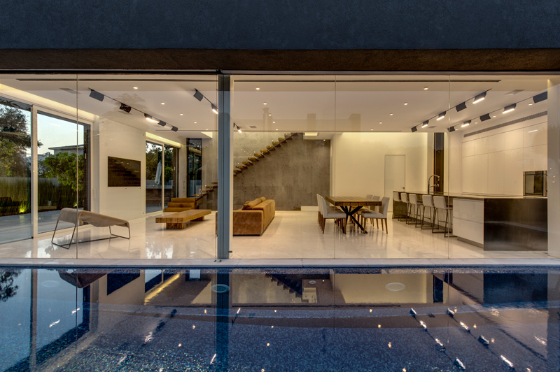
It is the goal of the designers to make it appear that the interior and exterior are connected. Hence, aside from that glass walls, the pool was planned along the living room and kitchen with a “pathway” between them. A seating area is preserved in the narrower side of the area.
Read Also: The Surprising and Interesting Design of the Cobogo House in Brazil
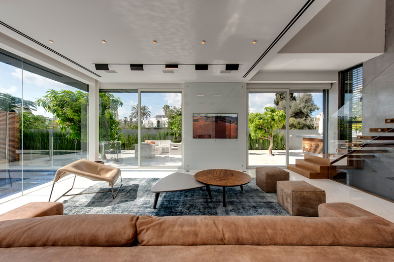
In the interior, one can feel a sense of comfort and coziness with the colors it used and the materials as well too. You can see that there are white walls and flooring here with some textured area rug and furniture.
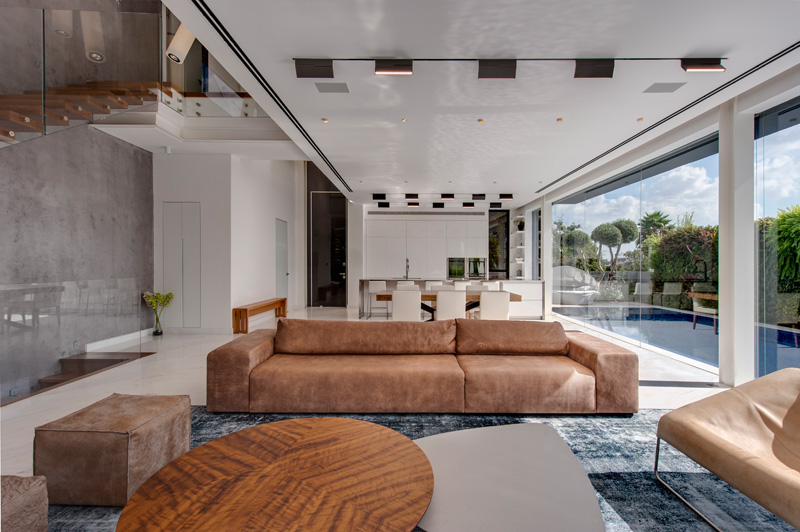
Since the house connects the indoor and outdoor area seamlessly, you will feel like you can just jump into the pool anytime you like while you are inside. A similar freshness is felt even when you are inside the house.
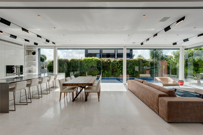
What I love about the outdoor space aside from the pool is the living green wall since it creates a stunning backdrop which can be seen even from the interior. I had always been a fan of green walls!
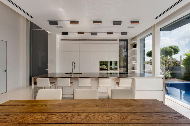
The dining area used a wooden table paired with white upholstered chairs. Meanwhile, it has a kitchen with glossy countertop and white counter height chairs as well as white kitchen island too.
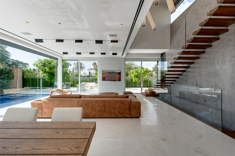
The stairs leading to the master’s bedroom and kid’s bedroom were attached to an external wall. The same design of the staircase is used to access the basement where a screening room is seen. Said screening room is comfortable and soundproof. Beside the screening room are the two living units of the older children.
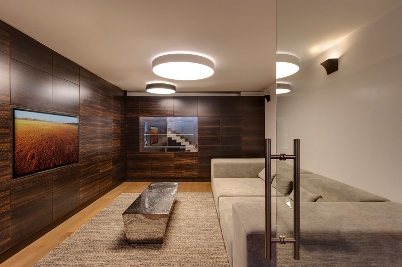
This is the screening room at the basement with a contemporary design. It looks really nice indeed especially with the lights on the ceilings and that mirrored coffee table/bench in the center.
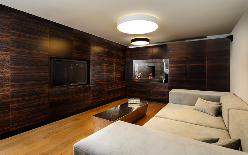
A comfortable lounge chair are added to the space with beautiful lighting. Another interesting feature here is the walls that contain storage spaces. In this area, there are bedrooms on the other side too.
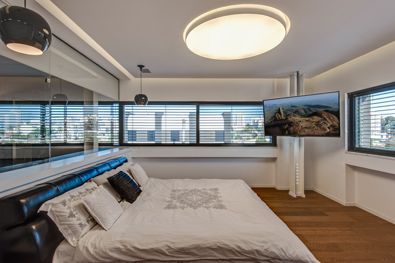
This is the masters bedroom with a hanging television and beautiful round lights. I like the color of they used in the space which is just relaxing and very modern too.
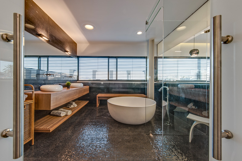
And this is the bathroom which is very beautiful indeed! Aside from the mosaic tiles on the flooring, I love its use of wood creating a spa feel in the entire space.
The house indeed has an interesting design. The name itself is already intriguing and the look is no doubt very attractive which might even make us wonder if it is indeed a residence, but yes, it is and it is one unique home. The Dan and Hila Israelevitz Architects designed the house giving it a beautiful appearance despite using a black cube where lights are seen peeping through it. Seldom would you see a house like this because most homes would have windows all around. Worry not because the other side of this house has glass openings on it allowing the entry of natural light to the home. Impressive design indeed which portrays an intelligent balance between contrast and coherence.