The design of a home varies depending on what the homeowners need. Aside from that, the location, lot area, and shape also need to be considered for a home’s design.
Most of the time, homes are designed as one structure. Although other homeowners also prefer to have two different houses separated from each other but in the same lot area.
Did you know that you can have a home that is split into two?
Yes, it sounds a little weird, right?
But Moloney Architects were able to design a home in this manner and they called it Two Halves. The house is located in Invermay, Australia and like what its name suggests, it is really comprised of two parts!
Sounds intriguing?
Well, let us take a look at the house below.
Location: Invermay, Australia
Designer: Moloney Architects
Style: Contemporary
Number of Levels: One-storey
Unique feature: The house is split into two areas: one for social areas and the other for the sleeping area.
Similar House: Two Houses in One: The Wall House in Singapore
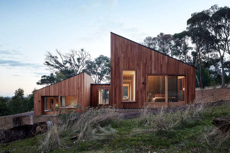
The Two Halves House is located on Silverwattle Drive. It is divided into two pavilions of exactly the same size.
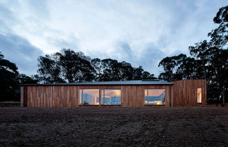
Its upper-level pavilion contains sleeping areas while the lower level houses the kitchen, dining, living spaces, and garage.
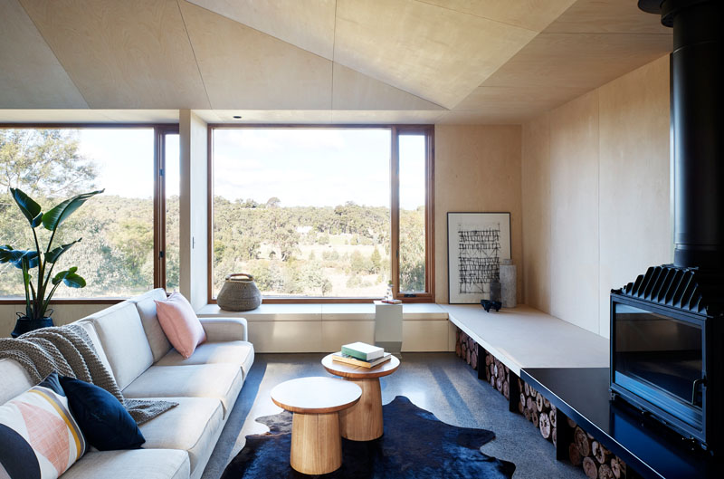
Seen here is the living room of the house which features a light gray sofa with throw pillows in pink and blue. The space also has an area rug that defines the center part where two wooden tables are placed. Notice also that the fireplace is placed on top of a shelf. Below that is a storage for firewood. There is also a purpose-built, low-set bench seat that runs around the room. This provides a space for guests for casual seating.
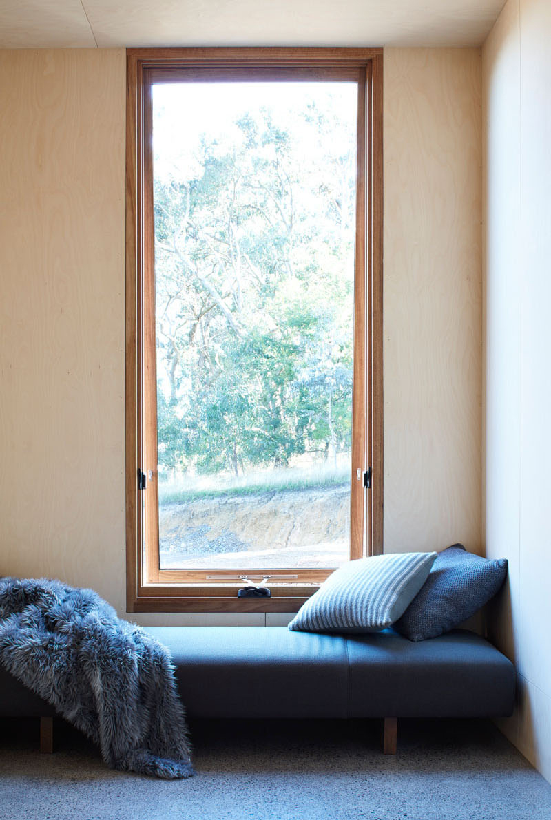
The living room has a tall glass window that brings natural light into the space. One can see the beauty of the outdoor surrounding through the window.
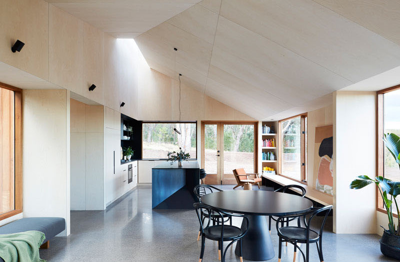
In the interior, it used light-toned birch ply for the walls and ceilings. Custom-designed steel and Paperock island bench reflect the angles of the split form. The interior also features a raked ceiling and skylight that encourages anyone who sees it to look up.
Read Also: Five Little Houses Comprise a Single Home in Denmark
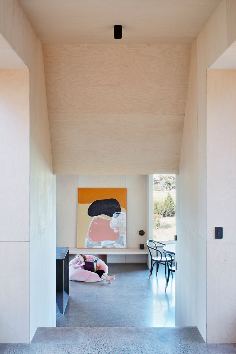
Seen here is the entryway which is a few steps lower than the front door. You can get a glimpse of the low bench that runs through the space as well as the tall windows that make the house bright.
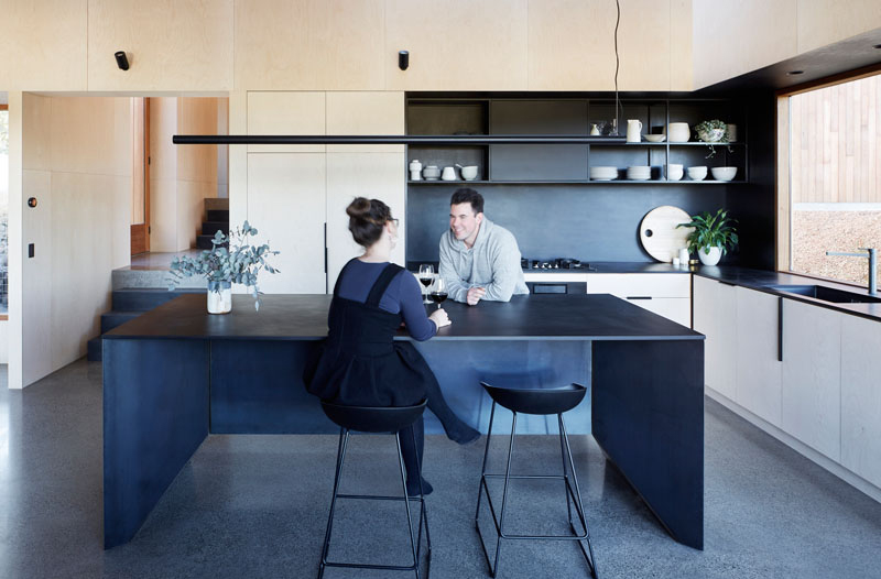
The kitchen has plenty of space since it is designed as a communal zone. It features a large black island with seating that matches with the black countertop, backsplash and shelving.
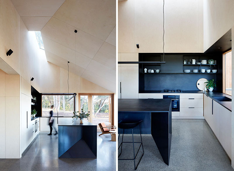
The kitchen uses the same materials as the other areas of the house. There is a good contrast between the kitchen island and the cabinets. It is also bright because of the glass doors and windows in it.
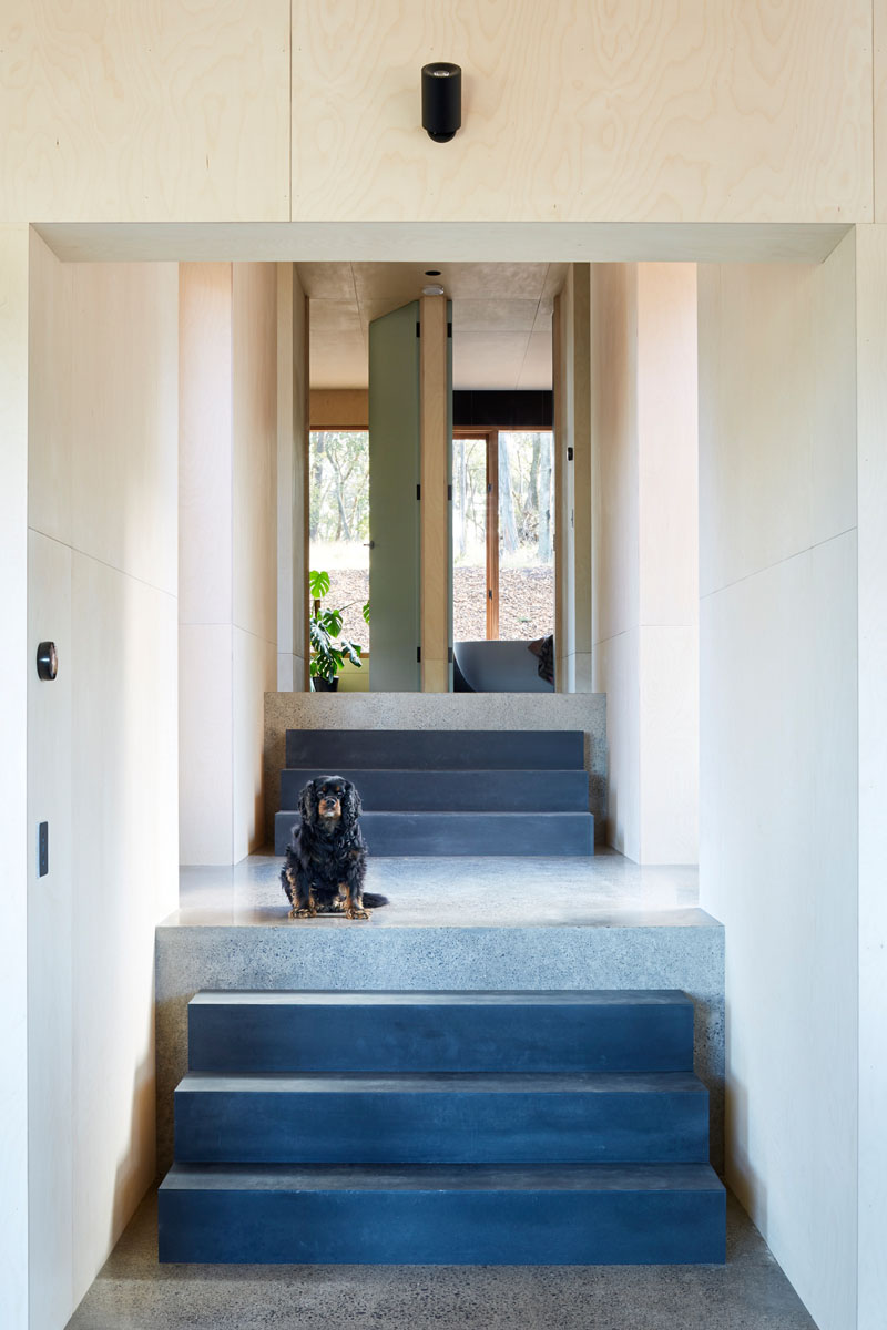
Next to the kitchen is a set of stairs that lead to the second half of the home. When one gets to the other half, it has two doors wherein one opens to the bathroom while the other one is for the bedroom.
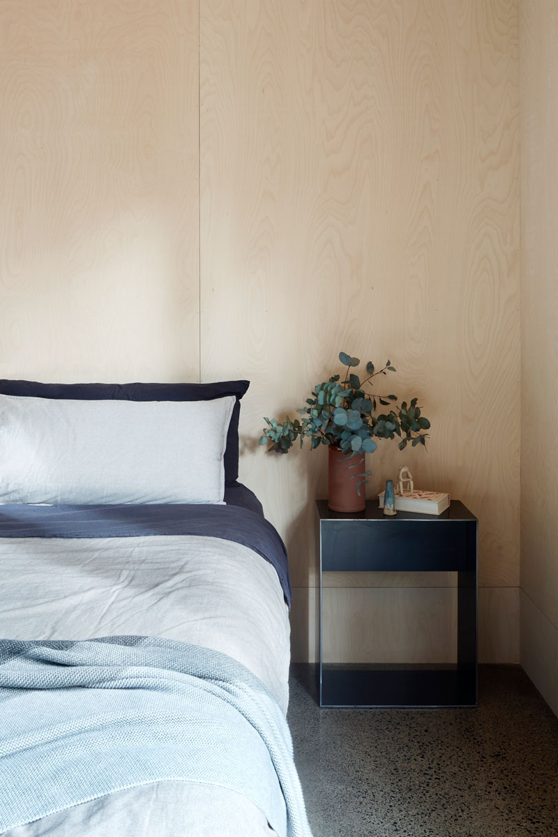
Seen here is the bedroom of the house. Although it remained neutral in terms of color, a pop of blue is added to it.
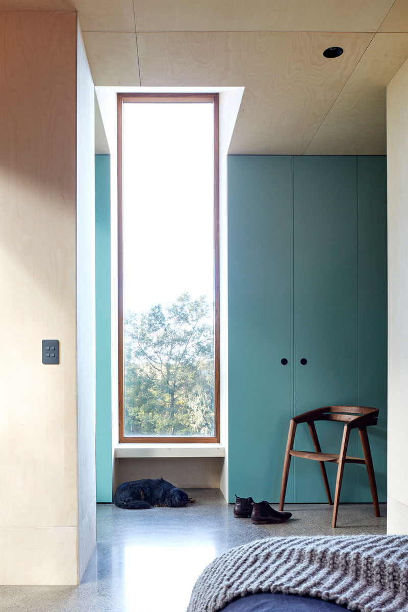
Also in the bedroom, this one shows a floor-to-ceiling cabinet where the owners can keep their personal belongings like clothes. It has a lighter shade of blue to add more life to the bedroom. Like the living room, the bedroom also has a tall window that brings natural light into the space.
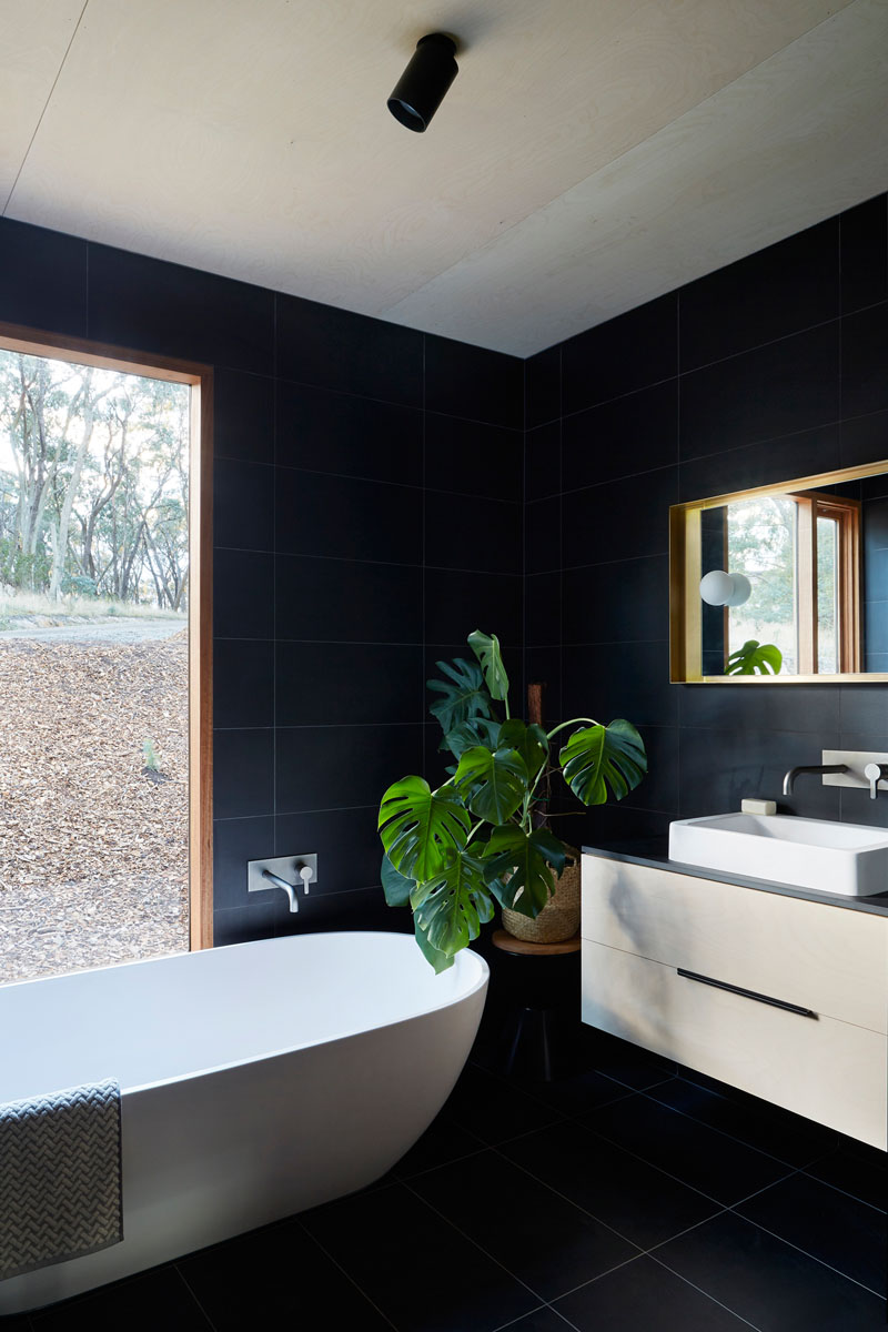
The bathroom of the house used black ceramic tiles for the flooring and walls. The designer opted to use white floating cabinet and bathtub to balance the look. Like the previous space, this one also has a tall glass window.
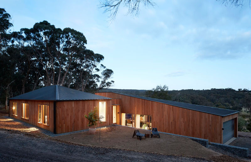
The two forms of the house are offset and are separated far enough so that they don’t overshadow each other. When you look at it, it appears like two different houses in the same area.
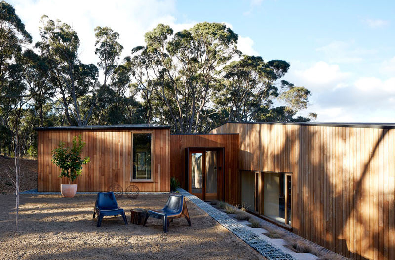
The material palette of the house is minimal and raw from the outside. However, it is warm and refined on the inside. The exterior used naturally fire-resistant Blackbutt for its cladding and windows.
Isn’t this a lovely home? This is a project from Moloney Architects who made sure that everything that their client wants will be integrated into the house. When you look at the house, it looks like two different homes especially that they come in exactly the same size. But as you look closer, it has a block that connects it. This serves as the pathway to the other area. And what makes it amazing is that the other pavilion will not overshadow the other since they are offset and separated far enough. The interior of the house has a natural feel because of the use of wood and other natural materials. While inside, one can get a good view of the outdoor space from its tall windows.