All of us want to improve the spaces in our house whether it is a structure that was built from scratch or merely a rented space. Of course, we want to live comfortably whatever our space it from a spacious house to a condominium. We may arrive at a home that is already painted but you don’t seem to like the way it looks yet. It may be bare at first but when you put the furniture and decors, you are still not happy about how it turned out. Well, worry not because you can always do something to make it look a lot better.
So, today, we will give you some helpful tips that will surely come handy once you decided to upgrade the look of your space. You will be surprised that what designers use as guides can actually be used by you too since these aren’t that hard after all and you can also get similar results like what professional designers can do.
No Secret Rule, Follow Your Intuition
You might even end up wondering how designers do it that they seem to have a magic wand when they design a home because everything would look lovely no matter what kind of space it is. You might seek for ways on how to design your space or you might even wonder if there is a secret rule book to design a home. In truth, there is none. There might be guides to achieve a better look but there is no rule book. In terms of creativity, everyone has the freedom to explore and imagine. It is actually about following your own intuition.
But of course, there are some principles that most designers use as a guide to make sure the results are amazing all the time. These principles are already tried and tested in various spaces and were proven to work out well. And these don’t need to be mastered because anyone can actually apply it in designing, decorating and improving their own spaces. When you combine these principles with your creativity and intuition, you will get a room that is beautiful, comfortable and cozy.
1. Make a focal point.
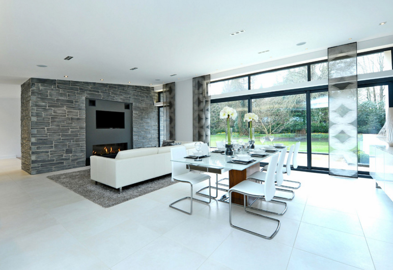
Choose something that you will highlight in your room. Then look for those that will support your focal point that will complement with the look. A focal point differs depending on the space. If it is in the kitchen, it could be a hood or a kitchen island. If it is in the living room, it could be a fire place. If it is in the bedroom, it could be a headboard. Decide on what is your room’s focal point which will add visual appeal to your area because if you have a highlight, you can do away with visual noise.
2. Choose the paint color last.
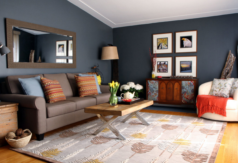
Claire Jefford at Creating Contrast Designs
Paint color is something that is of great concern to homeowners. They want to get into a home with a fresh paint. I have experience that those who want to rent a space would request it to be repainted because they want the paint to be bright and new. This manifest how important paint is for a home. But you don’t have to worry about paint even before you move in because if there is a certain color on your mind, it might not look good the way you want it in your home. There are many factors that need to be considered about paint which includes the light sources. The color must also complement well with the decors, fabrics and furniture you have in your home too. Paint colors are also available in different tints, tones and shades. According to designers, it is best to choose a paint color when you already have your stuffs for the home.
3. Bring in layers of lighting.
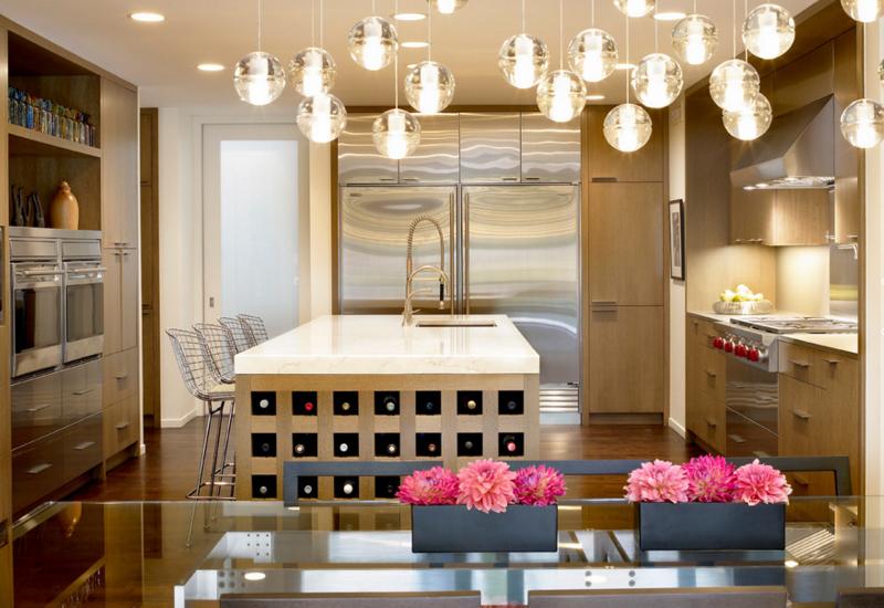
Most homes would merely use one central lighting fixture to illuminate their space. But that shouldn’t be the case. Add some lights at cabinet interiors, to highlight some artwork, to line the ceiling, and others. This way, it will create a dramatic effect to your home. Lighting as a very big impact on the way your home looks. When you use a single light in a room, everything is lit uniformly and nothing stands out. Instead of doing that, add some general ambient lights and then other lower lightings like a wall sconce, table lamp, floor lamp and others.
4. Do not overcrowd a room.
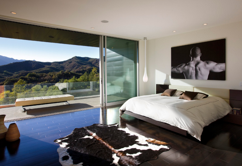
When your space is small, make sure to make use of the space really well by giving your furniture some breathing space. It will be easy to maneuver and you can also work on it even if you have a tight budget. Aside from that, you do not need to buy much furniture. Spend money to buy pieces that are high in quality and that wouldn’t crown your room.
5. Arrange furniture on a rug properly.
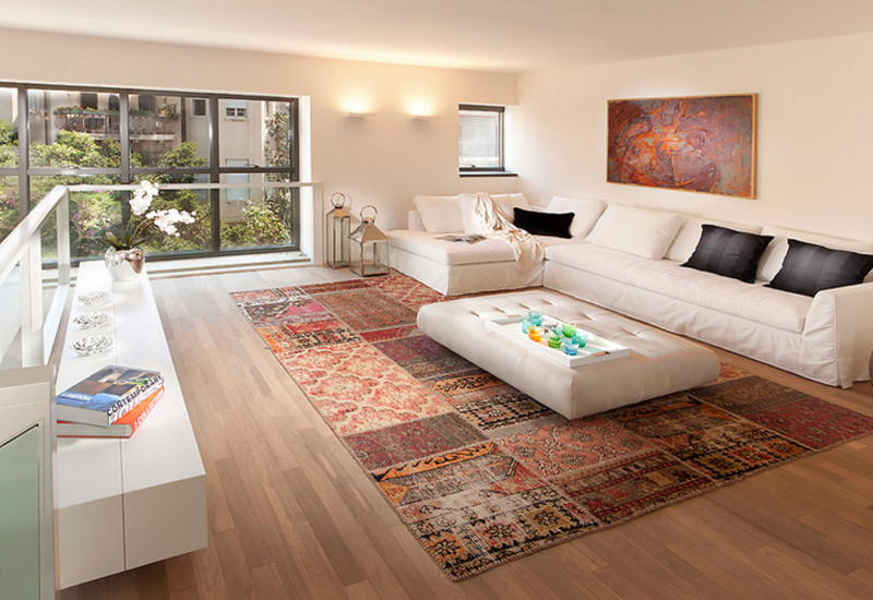
If you think there is only one way to use a rug, you are wrong. You can be creative in arranging your furniture on top of it. Here are three ways to arrange a rug:
- All on: If you have a rug that is large enough, gather your furniture and place the legs on top of it leaving at least 12 to 18 inches floor surface around the borders of the rug. This will make your space appear more luxurious.
- All off: If you have a small rug (but not too small), you can let the front legs of your furniture touch the rug. This also works well if you are layering a patterned rug over a textured rug. But make sure that the rug isn’t very small that it would look insignificant.
- Front on: Like the other one, you put just the front feet of each seating pieces on the rug in order to link all the arrangement together. This way, it creates a feeling of openness while defining the space.
6. Hang artwork properly.
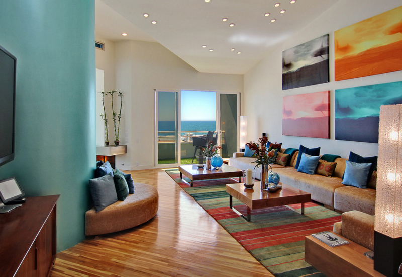
When you hang an artwork on the wall, you don’t do it in any way you want. It should always relate to human scale. In galleries, they hang framed artworks in a way that the midline (center) of each piece is 57 inches to 60 inches from the floor which is the average human eye level. If you are not sure of how to put the frames, you can take a photo of your space and try to arrange frames using a photo app or you can tape some paper on the wall that corresponds with the size and shape of your artwork so you can see how it will look like.
7. Consider the scale and size.
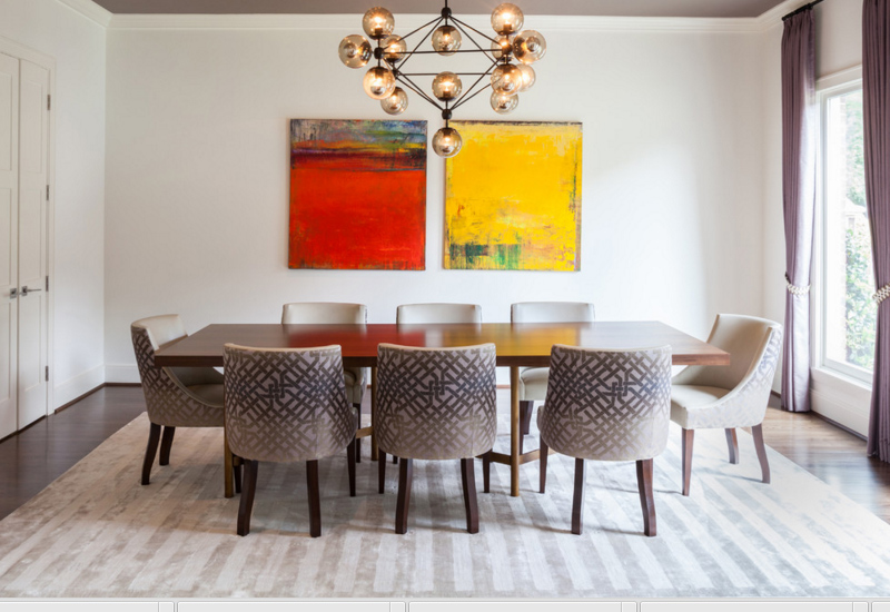
You have to be careful in adding things that are too big or too small because it could break your visual appeal. Items that are too small may look noisy in your home while those that are too big may crowd your home. Do not base on the way it looks in the store. You have to picture it on how it looks in your home.
8. Know when to stop.
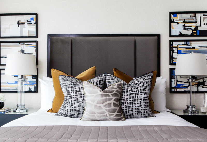
It doesn’t mean that just because you have a collection or you have something with a sentimental value on hand, that you would insist on adding it to the space even if it doesn’t fit. Always make sure that the things you add in your home look good and look right because if not, it might just ruin the look of the space. That is why, you have to learn when to stop adding stuff. You can also try to start cleaning and removing stuffs that you no longer need.
9. Make a statement.
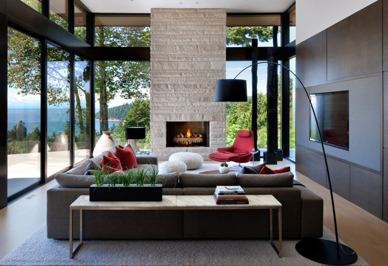
It is the personality of your space that makes it unique and attractive. If your space is bold and has its own statement, it doesn’t just appear unique but the unexpected elements in it will bring drama to the area. Add some items that are unexpected to be seen in the room to bring more wow appeal in it.
10. Put comfort and function first.
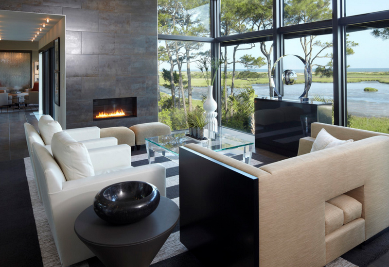
The Anderson Studio of Architecture & Design
Remember that what matters most isn’t the look of your space but if it functions well and if it is comfortable to use. Aesthetics is worthless if it can’t function well and if it cannot serve its purpose. When you add an item in the space, make sure that it will not hinder traffic and when you bring in furniture, see to it that you need it.
11. Do be sticking to principles too much.
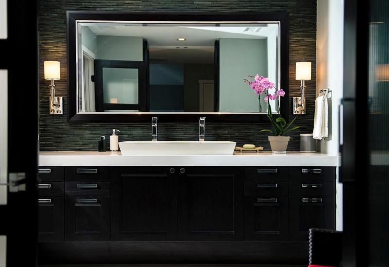
Like what I said, there are design principles that you can apply in decorating your home but make sure that you put creativity first as well as function. Guidelines are mere starting points that can help you begin with your decoration to have a practical space. After that, you can start being creative.
Designing a room isn’t that hard and you don’t have to go paranoid with following the guidelines. Use your own eyes to determine if it looks good and it works well. No one will tell you something is wrong once they found it the purpose of why you did that. Remember, there are many home items that were merely designed by creative people which were a result of their “needs” and not just they want it to look good. When we talk about improving a space, aesthetics and function should be best friends. Design and decorate a room that will make you smile every time you see it.