Since many designers these days are becoming more creative and would tend to experiment with the materials, colors and designs that they use for a home, there is indeed a huge possibility that even old homes can turn out lovely. The innovation of present day designers is impressive and it even improving through time which seems to make things possible. Yes, even a dilapidated home can look really stunning after a renovation and transformation. I know you have seen many homes that area a result of these renovations and they are all impressive even if each one has a unique approach into a home depending on it size, style, materials, and needs of the homeowners. Today, we are going to show to you another home which is the result of a lovely renovation.
A 1930s home was transformed into a streamlined modern residence that was given a contemporary renovation and addition. The home located in Hamilton, Ontario is designed by DPAI Architecture together with Philip Toms of Toms + McNally Design. With their collaboration, the heritage house looked very beautiful and for sure, those who have seen the old house will not be able to recognize the new home! This original home is said to be a good example of 1930s Streamline Moderne architecture. It was given a full restoration while a second storey was added into it. The home has the public areas at the lower level while the private spaces are at the second level including a bathroom that has a walk-in shower with rainfall showerhead, a standalone bathtub, and a vanity with double sinks. Let us take a look at the house below.
Location: Hamilton, Ontario
Designer: DPAI Architecture
Style: Modern
Number of Levels: Two-storey
Unique feature: A 1930s heritage home was transformed which looks really beautiful and cozy with some pops of colors in it.
Similar House: Peculiar Qualities of the Silver Strand 1930 Modern House in California
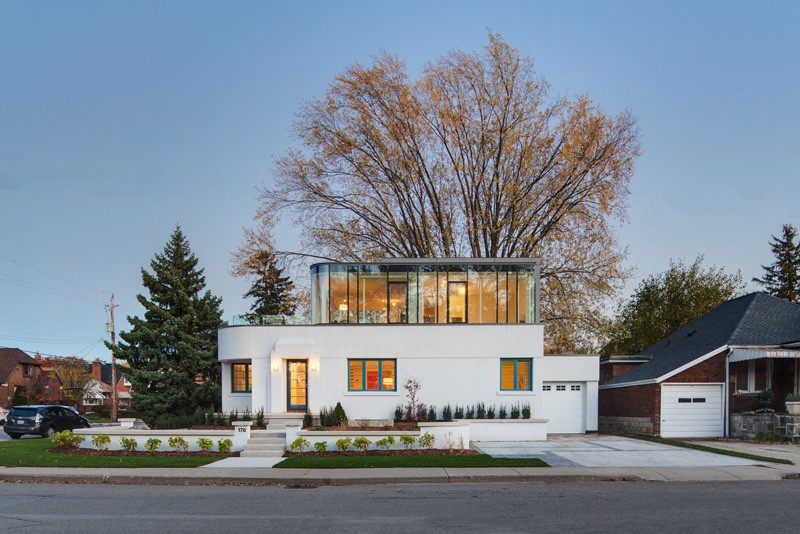
The modern home has an added second storey wrapped in floor-to-ceiling glass. Its architecture has a combination of lines and curves as well as some classic details too. It also has concrete flooring at the front of the house with plants around it. The trees in the area acts as a lovely backdrop to the house.
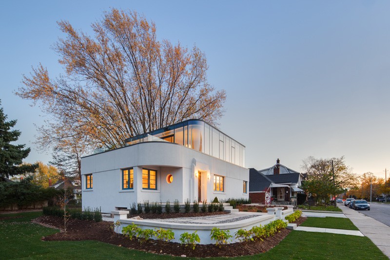
At first glance, I actually think that the house has a nautical theme because it appears like a ship due to its shape. The added glass upper level made it look more like a ship as well as that round window. I like the mix of steel, glass and concrete in the house.
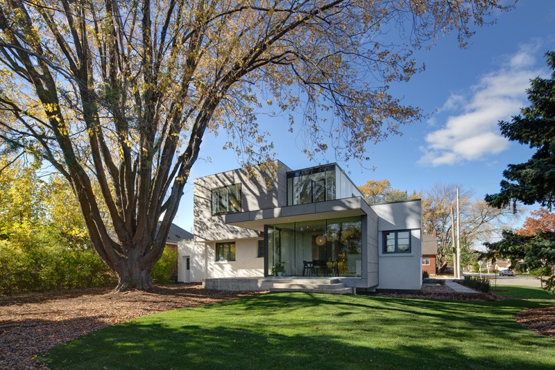
While you saw curves in the facade, the back area looks like this one with some straight lines. This rear view of the home is the result after the renovation. That big tree gives shade to the area which makes possible to run around and play around on the green lawn.
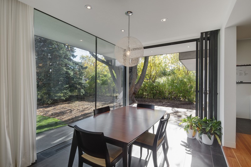
The backyard is accessible through a wall of glass doors next to the dining room. The glass windows can be covered with the tall drapes to protect the area from sunlight and to give it privacy when needed.
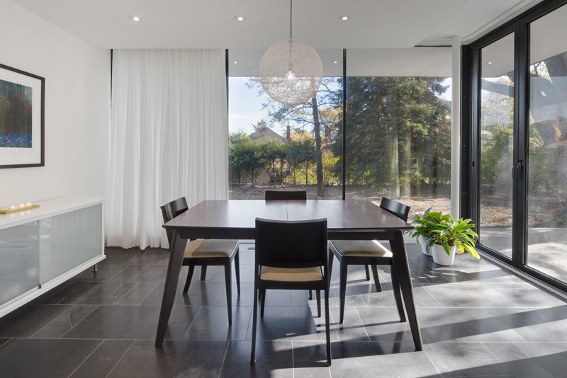
A wooden dining set is added in the dining room with dark wooden finishing. Above it is a pendant light that could be a nice idea for a DIY. It also has a white console table with sliding doors.
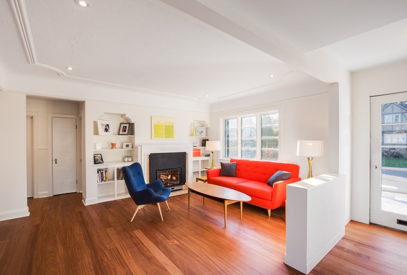
Touches of the original home have been kept, like the built-in bookshelves which apparently looks classic. But it does look lovely in here especially with the colors from the chair and the sofa.
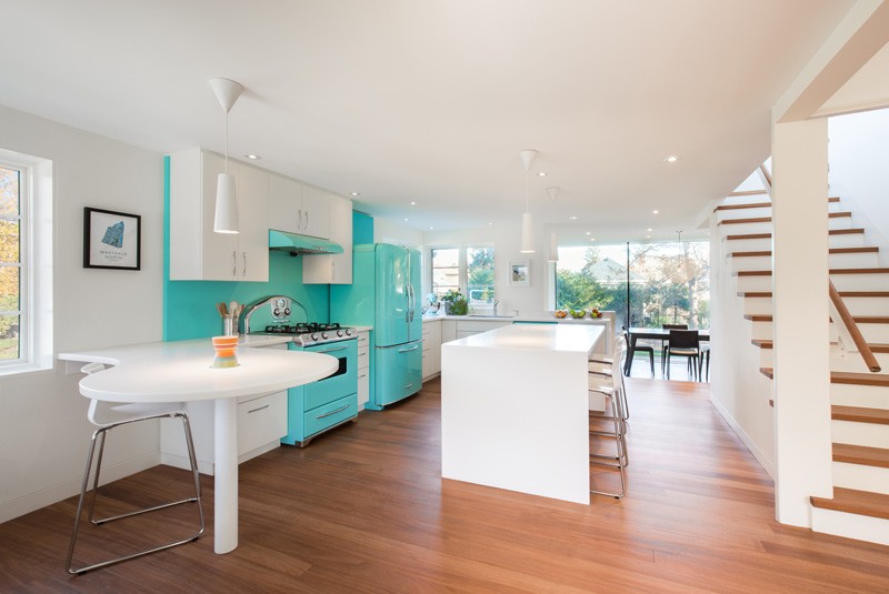
The bright retro turquoise of the kitchen really pops against the white cabinets and walls.
Read Also: Light and Airy Beach Glam Bungalow in Santa Barbara, California
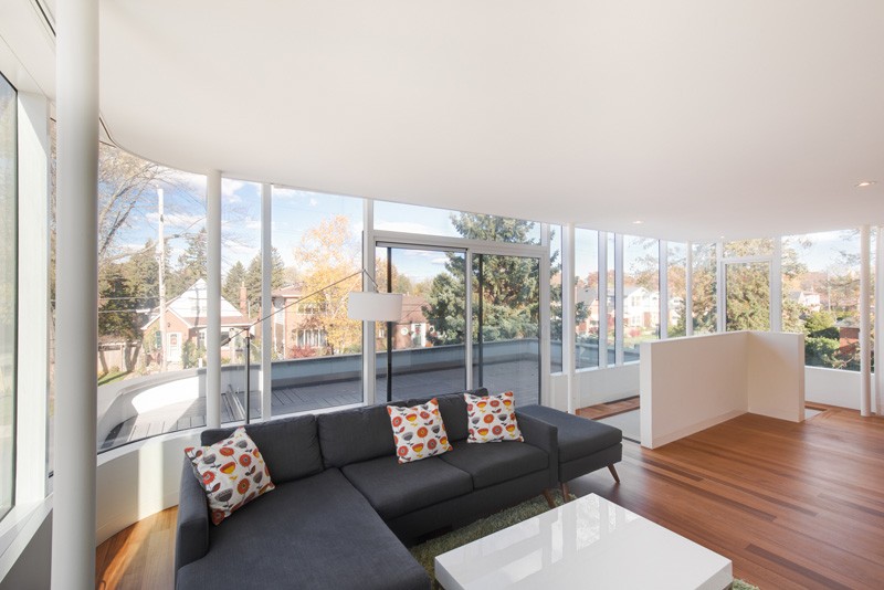
At the top of the stairs is a living space with balcony access, that takes advantage of the views with the wrap-around windows.
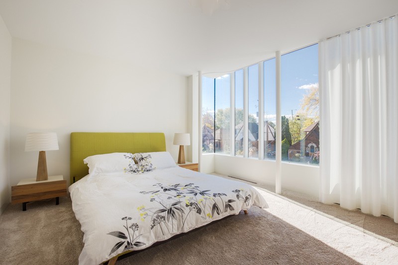
This is the bedroom of the house with glass around it. It has side tables with table lamps on it that has an identical design. I also like the color of the headboard as well as the print on the duvet set.
I like the mix of the sleek lines and curves in the architecture of the house. Also, I like the interior of the home which is very relaxing and neat in white with some pops of colors. You can see that there are some classic details inside because this is a mere renovation but the result of the design is very stunning! The renovation of this house is done by DPAI Architecture who did an amazing job in its design while retaining some features of the original home.