It doesn’t necessarily mean that if you use a modern design, you can no longer combine it with other styles. As a matter of fact, there are instances that when a designer use a style mixing up two styles, it looks even better and turns out even more unique. We have seen that in some interiors that we have featured in Home Design Lover. But this time, we will see a home that combined modern and traditional elements both in the interior and the exterior. This home is called the Balancing House.
The name of the house obviously doesn’t have anything to do with the style but it might refer to how both styles were balanced for the look of the house or how a part of it is seemingly balanced and cantilevered over the pool. The house is designed by Luigi Rosselli Architects together with Alexandra Donohoe of Decus Interiors, who successfully combined two styles to come up with a look that turned out very impressive. The master bedroom at the upper level of this home in Sydney, Australia hovers over the front door and faces the sunrise and a distant ocean view. One can see a steep pitched roof that covers the lower red wing. The lower part of the house is reddish in color while the upper part with white shuttered first floor that overhangs the living room terrace is white in color. The white upper floor is pertinent to timber construction. In the interior, it has interesting features as well which we can see in the images below.
Location: Sydney, Australia
Designer: Luigi Rosselli Architects and Alexandra Donohoe of Decus Interiors
Style: Traditional and Contemporary
Number of Levels: Two-storey
Unique feature: A house with a mix of modern and traditional features both in the interior and exterior.
Similar House: The Traditional Architecture of Bahia House in Salvador, Brazil
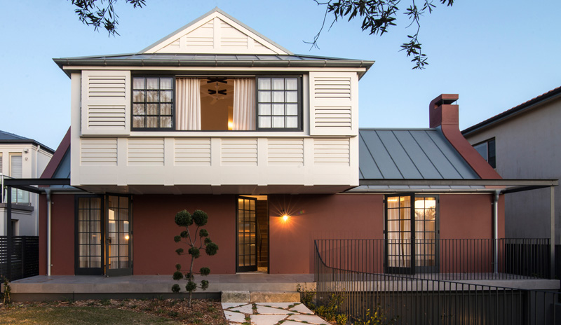
The exterior of the house looks unique as it combines modern and traditional style in it. The paint color “Ox Red” is applied to the masonry base of the exterior which is a memory of the hearth color used in clay bricks. But I honestly like the look!
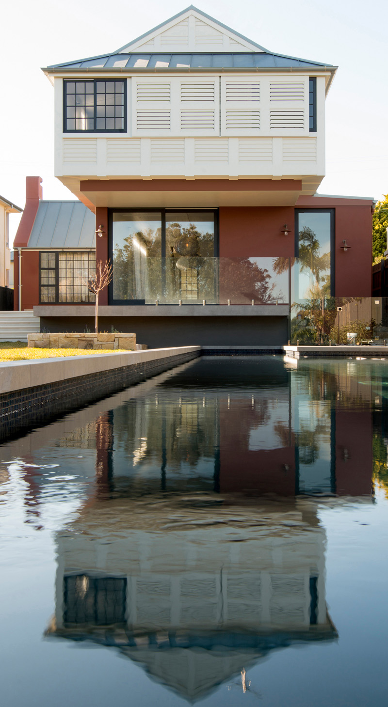
In the first floor bedroom wing of the house, one can see a laser cut plywood shutters. This part of the house appears to hang over the pool. Notice that the lower level makes use of glass windows with black frames.
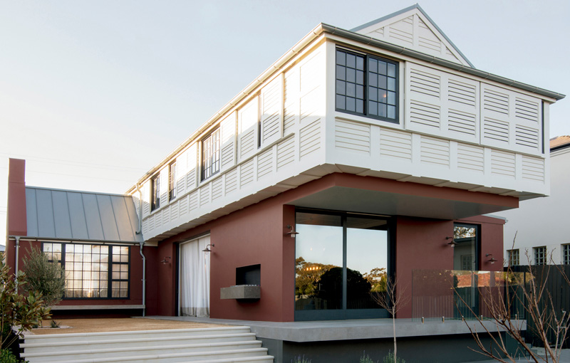
The long side of the house has a built in barbecue that has been semi-recessed into the wall. Notice that the house is elevated from the ground with a few steps.
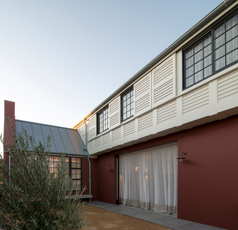
There are full height sliding doors concealed in the wall cavities which allow the courtyard to become part of the internal family room. The light curtains are connecting the two spaces.
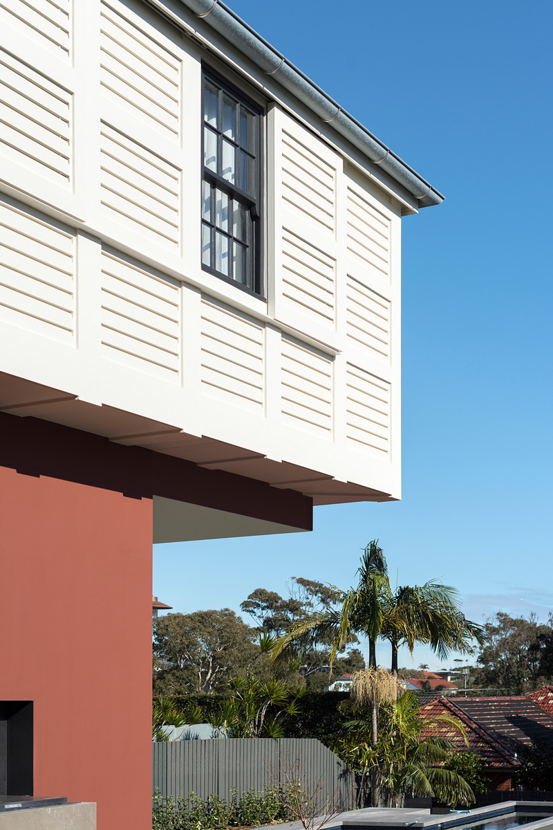
What you can see here is the upper level as well as a small glimpse of the pool area. You can also see that there are trees and other plants in the area as well.
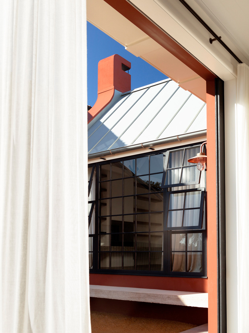
In the picture, you can see an off-form concrete bench that terminates the long courtyard under the library window. A canvas awning is used to cover the seat. There will be a table and some chairs that will invite the family and their guests to relax in the shade.
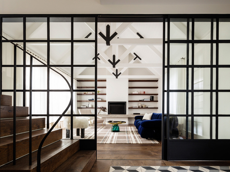
The interior make use of contrasting colors. It has different geometric patterns and lines seen inside the house.
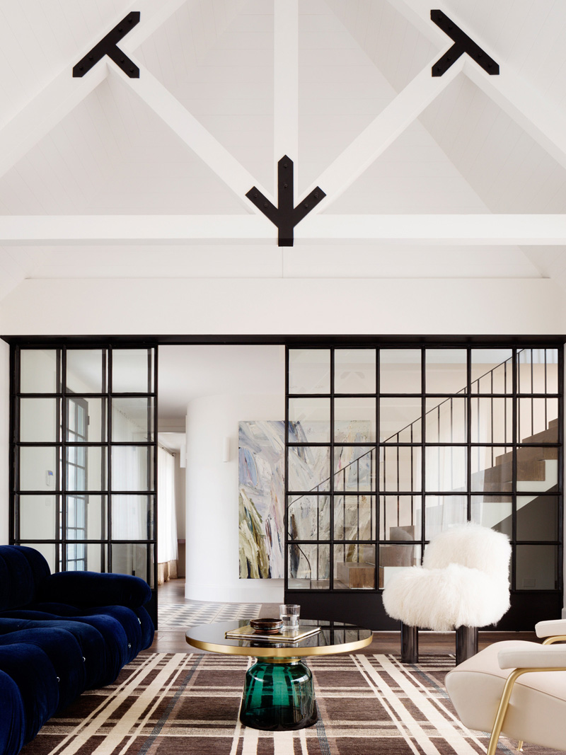
Broadline glass has been used throughout the home that has a grid design. Glazed front doors are used for the home that provides more play of light and shape than a matte sandblasted glass. In the living room, a plaid area rug is used.
Read Also: Balanced Features of the Tower House in Victoria, Australia
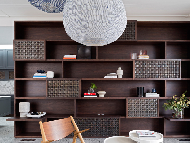
One feature that is highlighted in the house is a post-industrial bookshelf. This isn’t just an additional decor to the house but it also provides plenty of storage for the home owner’s items.
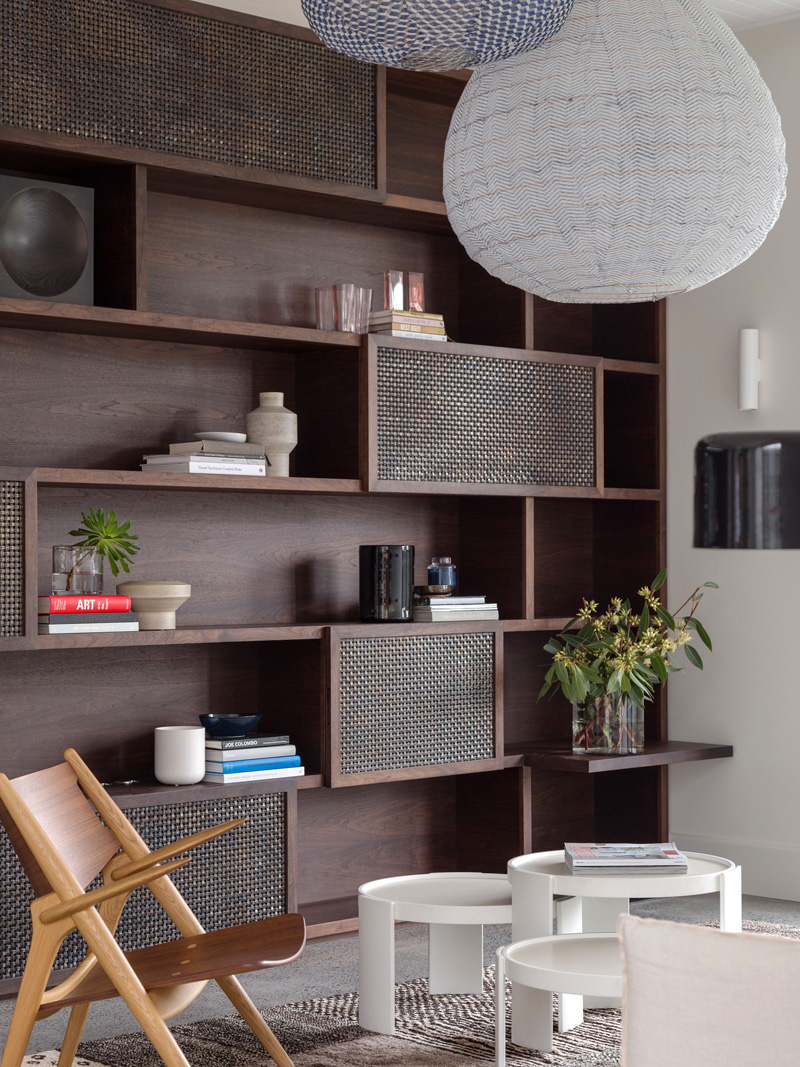
The storage unit is made from walnut and is a warm contrast to the polished concrete floor and white walls. This is part of the large family room that adjoins the kitchen and provides storage and comfort to the area for a busy family life.
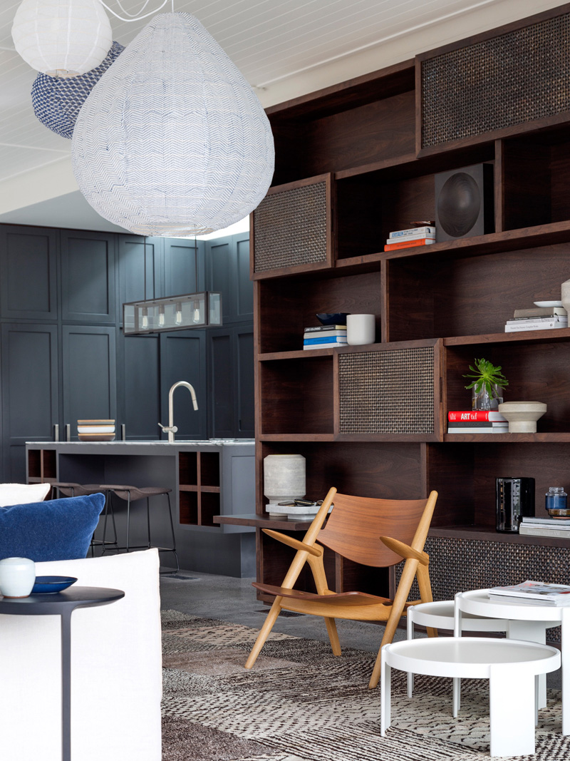
The walnut stained shelving is combined with woven aged brass mesh that gives it an industrial look. Notice also the design of the lightings which also has gorgeous designs.
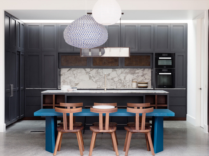
The kitchen has gray colors in it with a polished concrete floor, paneled joinery and a marble bench top. What breaks the gray colors here are the blue bench and the pendant light.
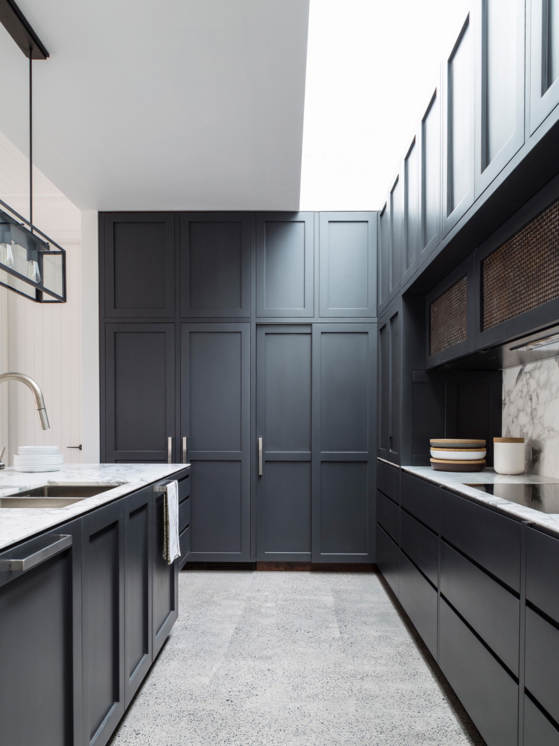
Kitchen cabinets have paneled doors where two fridges and a pantry are hidden behind it. Industrial lights are added above the kitchen sink. Below the sink are more storage areas.
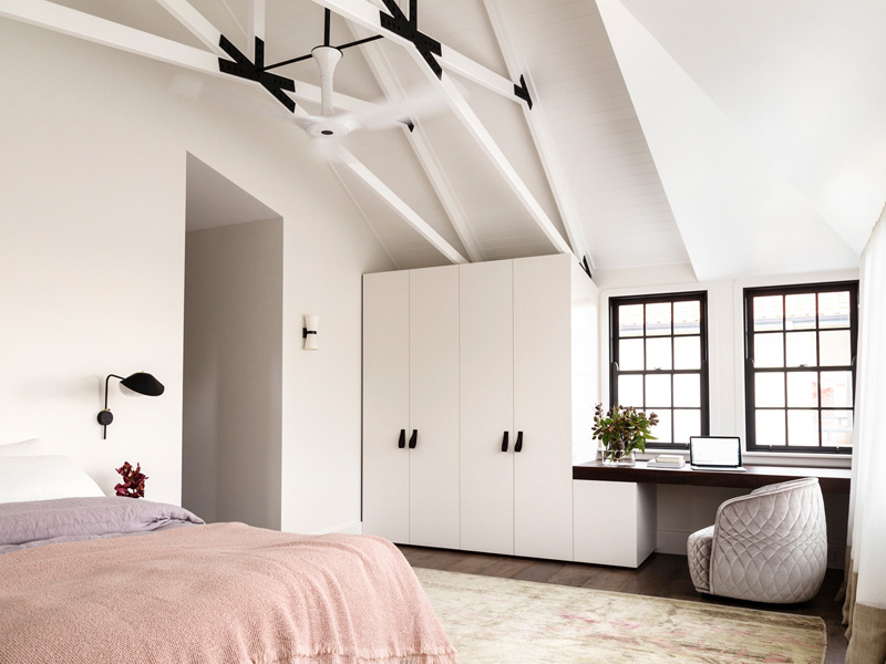
The bedrooms are also white in color and are kept cool by a combination of the external shutters, cross ventilation and a large air gap in the roof space. The covers used here have soft colors. I like that chair with a floating desk near the window.
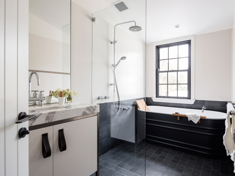
The bathroom is designed with the tiles. Only the bath tub and window frame are kept dark while everything else kept light.
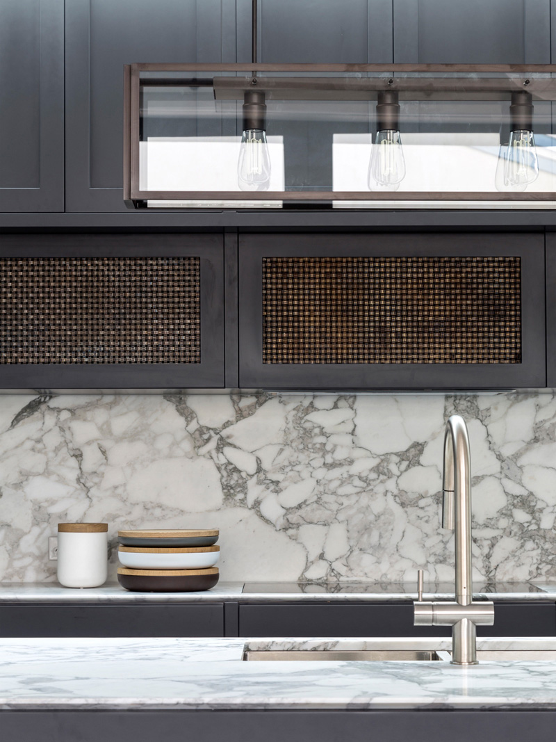
Back in the kitchen, there is a marble backsplash as well as dark wooden cabinets above the sink and countertops.
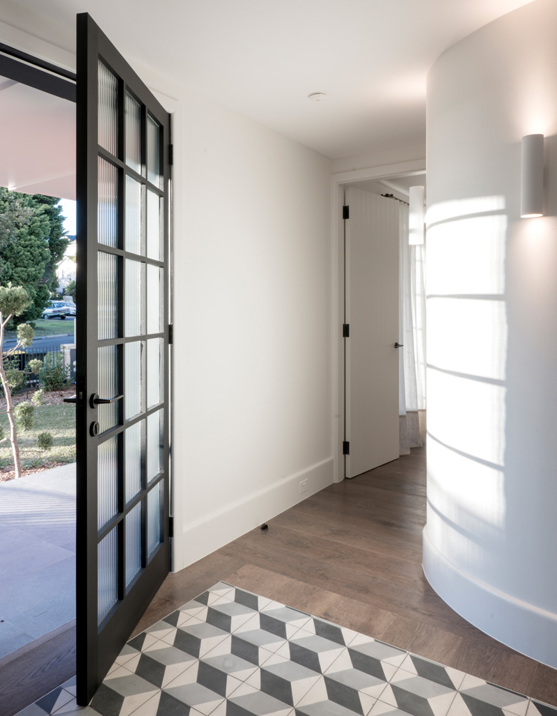
Natural light streams through the broadline glass. What you can see here is a curve wall that reminds the designers of Corbusier’s motto: “Architecture is the mastery of correct and magnificent play of masses, brought together in light.”
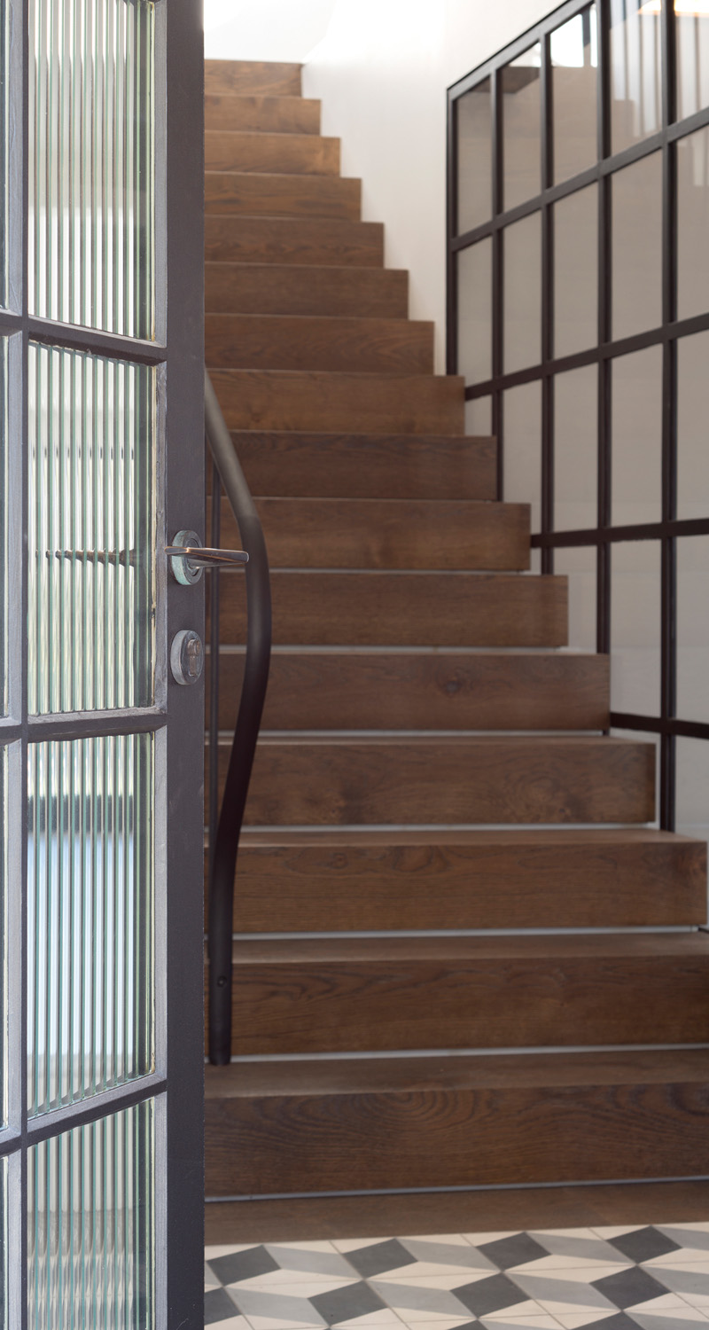
The staircase has dark oak treads and a classic steel balustrade that provide a contrast against the white walls of the house.
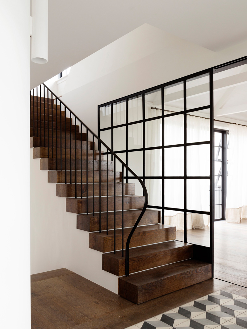
According to the designers, “the encaustic tiles in the foreground form a square, over-sized entry mat for the front door. The cubes pattern is an ageless design that one saw in the 19th Century encaustic as well as in more recent porcelain designs.”
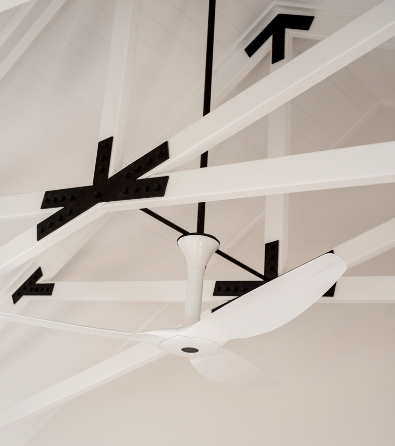
The Balancing House is air-conditioning free and only use fans. In the bedroom ceiling, it has a large ceiling fan that assists air movement throughout the bedroom.
There is really something about the Balancing House that makes it appear very beautiful from the exterior to the interior. The house is a result of a collaboration between Luigi Rosselli Architect and Alexandra Donohoe of Decus Interiors. If you observed the interior of the house, there are many interesting features because even the design of the furniture is gorgeous and unique. You can also see different patterns in the interior as well. So, what can you say about this house?