Before and After Photos of a Happy Hip Family Kitchen Renovation in St. Louis
From a traditional kitchen to a modern kitchen inspired by the home owner's favorite TV show.
In some cases, a home’s design is influenced not just by its history or some modern trends but even by some TV shows. I can recall that there was one home renovation we featured wherein they retained the staircase because it reminded the owner of her favorite TV show back when she was still a child. Well, no doubt, our tastes and design preferences can surely be influenced by what we can love including favorite movies and TV shows. This is also what the owner of this lovely kitchen did. They were inspired by a TV show and decided to bring that touch to their own kitchen which turned out very successful.
The TV series Mad Men had a great influence to a revitalizing mid-century modern design of a kitchen that is located in a home in Columbia, Illinois. The home is owned by Tom and Kathy Barrett. Tom, is retired from the Air Force five years ago after serving 22 years, and now works at Scott Air Force base doing budget analysis while Kathy is a stay-at-home mom who takes care of their two 9-year-old girls. The home was enjoyed by the couple for so many years with its traditional furnishings. They have also accumulated antiques and Oriental rugs from places like Japan. One day, they were watching their favorite TV show of Man Men where they found a beautiful interior. While watching an episode of Mad Men, they wanted to get rid of the traditional design and get a new modern one. “We saw Don Draper’s office and we both just realized – That’s it. That’s our style,” Tom says. And that is what they used as an inspiration for their kitchen design. The kitchen is about 12 by 20 feet (240 square feet); 4 by 6 meters (22 square meters). The renovation spent about $70,000 that included the design fees, appliances, materials, labor and the conversion of a sliding-glass door to French doors. Let us check the new kitchen below that they call Happy Hip Family Kitchen.
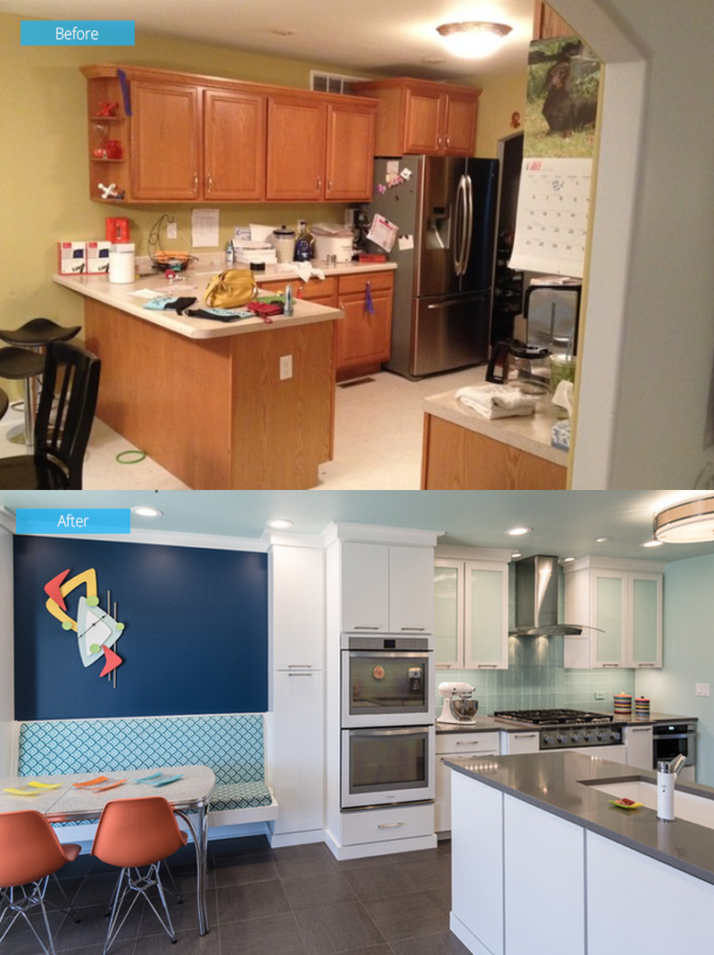 Before, the kitchen used standard off-the-shelf oak cabinets, laminate countertops and sheeted vinyl floors which didn’t fit the family’s ideal style. The lighting was also poor and they didn’t like the layout as well. Kathy would like to work comfortably and conveniently in the kitchen. She wanted to stand at the kitchen sink and look out to the backyard while their two 9-year-old daughters play outside. In the new kitchen design, the original peninsula was flipped to the other wall and then arranged everything to establish a good working triangle for the kitchen. Hence, the range, ovens and microwave were put on the long wall.
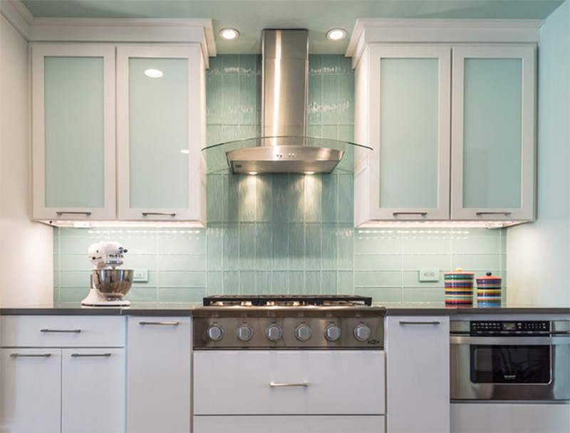 The family wants to avoid stainless steel appliances because they would constantly wipe off fingerprints on it. “Kids use everything but the handles to open appliances,” Tom says. They bought a new refrigerator, ovens and a dishwasher from Whirlpool’s Ice White collection. A custom cabinetry built by Amish workers was added to the kitchen. These were painted in a custom Benjamin Moore color to match the white appliances. Originally, a wall would be removed to open the kitchen to the living room. But they couldn’t think of a good furniture arrangement to make things work. Hence, a banquette area was added on the left so that the family can gather there.
On the ceiling, walls, cabinet faces and backsplash, a faint seafoam color was used. Glass tiles in a stacked pattern were added to the backsplash making it look very contemporary. To mix things up, the pattern was switched to vertical over the range and the same tiles were used in a wavy texture. Outlets by Lutron were also used since it matched the color of the tiles. The tile grout was custom made to match the Benjamin Moore color. After applying porous unsealed white grout, an artist painted it with stain proof sealer on top. “The grout was cheap in material cost but expensive in labor,” the designer said. “But totally worth it in the end.”
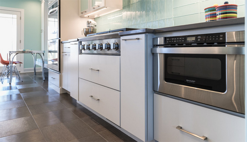 The designer added a microwave drawer in lieu of putting a bulky appliance on the countertop or above a range. The focal point of the kitchen is the bumped-out cook top area. It is also installed in a way that it will give Tom a little more headroom in relation to the range hood so that the “hood isn’t right at his forehead.”
 LED strip lighting was used under the cabinets to highlight the backsplash. Lighting fixtures that are 3,000 Kelvin were used because they are not to warm and not too cold. For the upper cabinets, it used opaque panels from Lustrolite which are scratch-resistant, acrylic-like material.
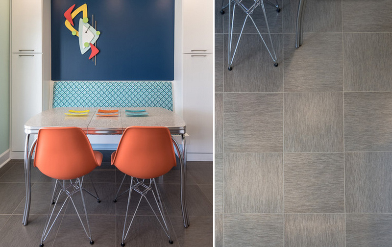
For the breakfast area, a Chromecraft table from the 1950s was used giving it a retro look. To bring in more prominence to a midcentury-style clock that Tom made, a navy wall accent was added. There is also an additional pantry space on either side of the banquette. The cushion is covered in outdoor fabric that was done by Kathy. One highlight in this area is the flooring using luxury vinyl tile. “It gives you a ceramic tile look without being cold on the feet,” King says.
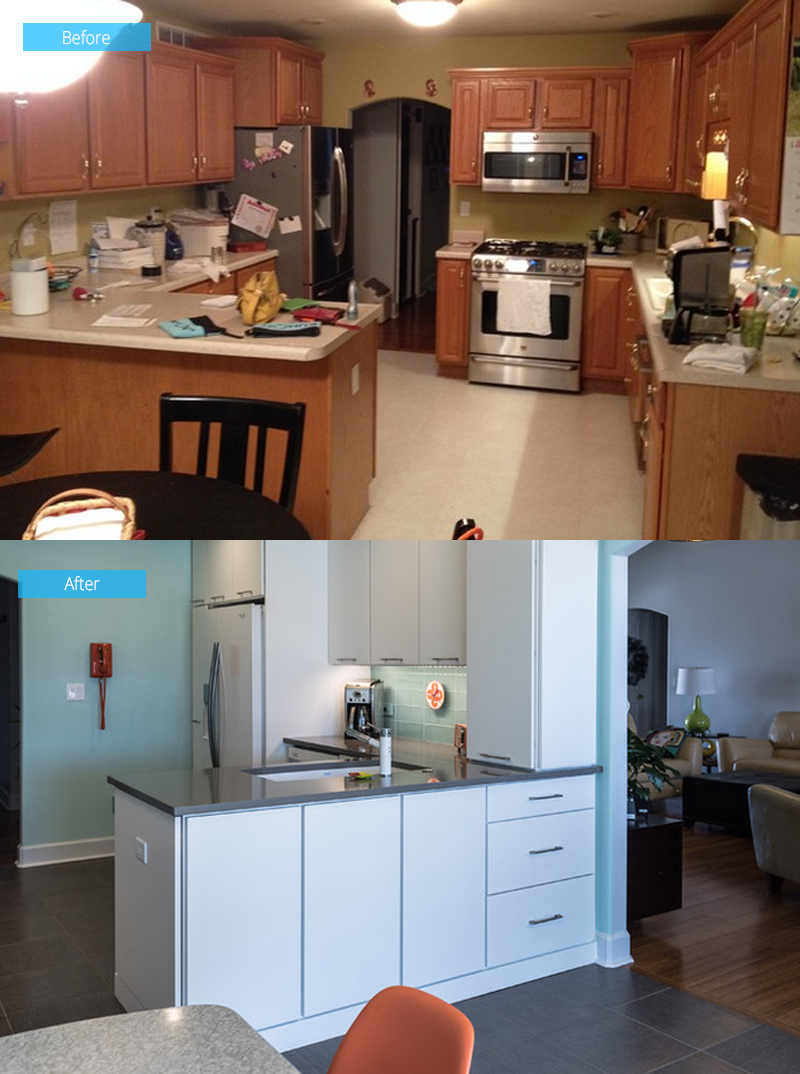 In the original kitchen, the stove, sink and dishwasher prevented ample counter space on the right side. In the new design, the range was placed on the opposite wall allowing space for the refrigerator, more countertop space and the peninsula sink. Since the placement of the sink created dead space in the lower corner cabinets, drawers were added on the other side near the archway. The drawers store the daughters’ crayons and other art supplies.
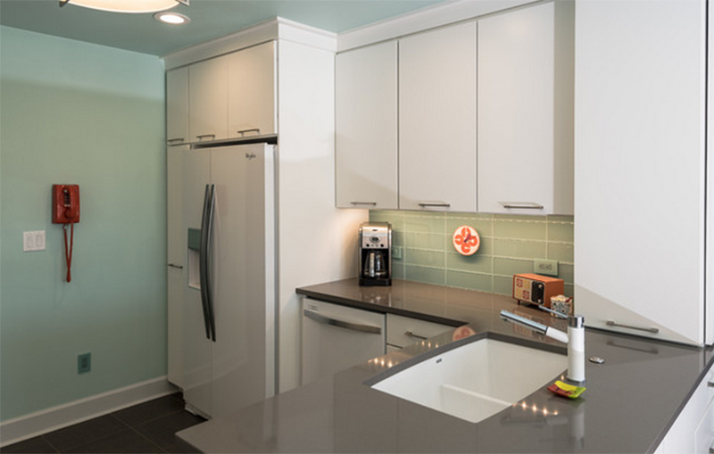 Glass is stored on the counter-to-ceiling cabinet above the drawers that avoid clutter in the kitchen. The design also made sure that the location of the sink isn’t awkward with the dishwasher’s location. The 8-foot ceiling is painted with the same colors as the walls give the appearance of more space.
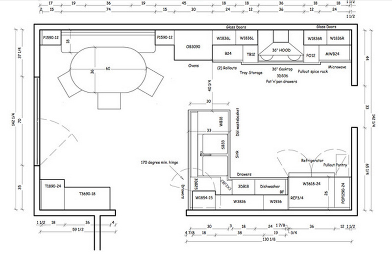 This is the layout of the kitchen. This will give you an idea of how to apply this design to your own space.
Such an inspiring renovation indeed! This is a design done byNext Project Studio who definitely made sure that the owners will get the kind of kitchen they want not just on terms of style but also of function. Who says your home design couldn’t be influenced by your fave TV shows? Well, it could be like this lovely happy kitchen space!


