Many homes have lovely designs even if they are merely a result of a transformation or a remodel. Yes, you don’t have to start from scratch if you already have an existing home. You can also have it remodeled or renovated so that it will get the kind of look that you need. You could have some addition or extension to your home or you can merely improve the look of your existing residence giving it a fresh appeal. We have featured many homes like this. As a matter of fact, others go with before and after photos. But today, we will feature a house which is the result of a home remodel.
A run-down mid-century house was remodeled by Klopf Architecture as requested by the homeowners. The house was in a state that looks dull but with the ideas from the designers and the homeowners, the mid-century modern home became a stunning residence to live in. The house is located in Lafayette, California and it turned into a gorgeous space from the exterior to the interior. Klopf Architecture worked in collaboration with Envision Landscape Studio in order to re-imagine the house and property. The design aimed to achieve a unified, flowing, sophisticated, warm, modern indoor / outdoor living space for the family of five and they were able to get that look. Scroll down and join us in a brief tour of the house through the images below.
Location: Lafayette, California
Designer: Klopf Architecture
Style: Mid-Century Modern
Number of Levels: Two-storey
Unique feature: A beautiful mid-century modern house with a cozy and relaxing interior featuring a mix of materials and earth tone color scheme.
Similar House: Before and After: Impressive Usage of Reclaimed Wood in this New England Farmhouse in Maine
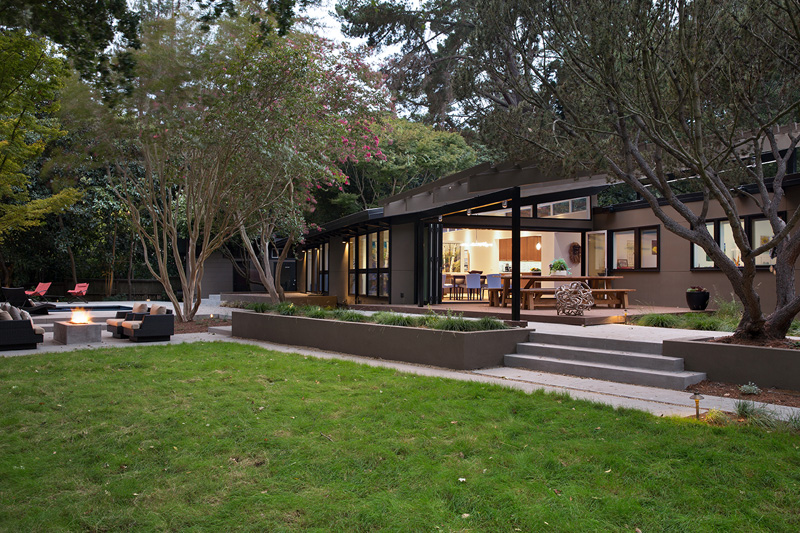
The house looks simple ye beautiful. Seen here is the exterior of the house with gray colors and black frames for the windows and doors. It also has an outdoor seating area that surrounds a fire pit. Steps are used to access the house and it’s interior. There is also a lovely landscape too with trees, bushes and concrete planters.
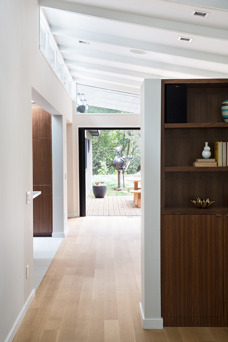
The home features a sloped roof with a row of windows to allow the natural light to flood the room.
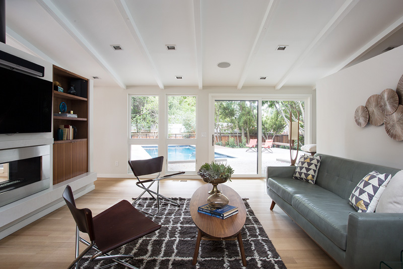
Windows and doors in the living area provide a view of the backyard and pool.
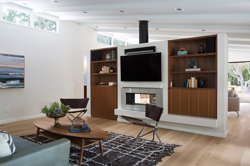
This time, shelving flanks the fireplace, with a flat screen TV hung above.
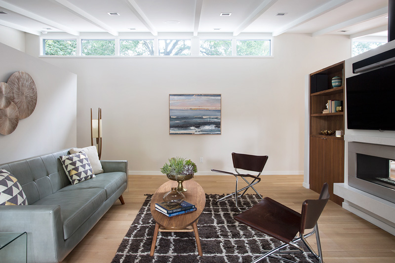
On the other side of the fireplace, an additional sitting area is hidden from view.
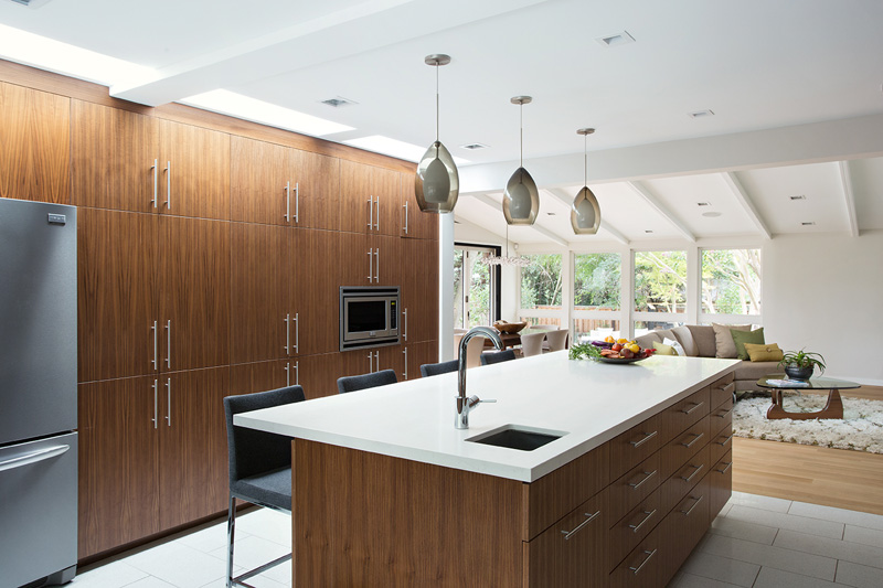
A large central island with seating provides an additional eating space.
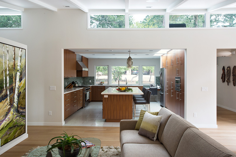
The old kitchen was replaced with a spacious cook’s kitchen, complete with a row of skylights bringing light into the space.
Read Also: A Teardown 1950s House in Massachusetts Turned into a Cozy Modern Home
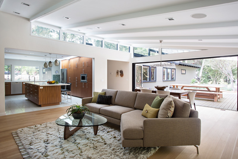
Here you can see just how open the space has become.
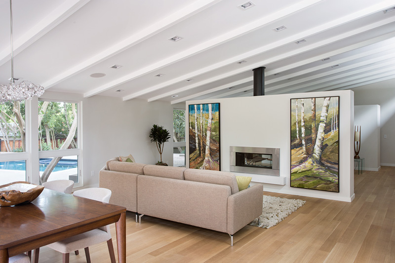
The home was staged by The Design Shop, except for the two large pieces of artwork that flank the fireplace, they are the home owner’s art.
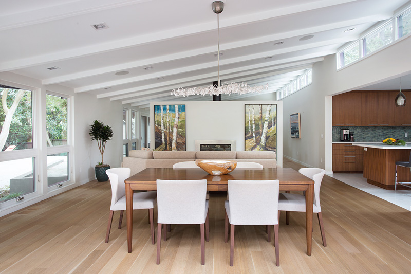
By opening up the wall, this allows people to flow from kitchen to the living / dining room and the deck seamlessly, making the main entertainment space feel at once unified and complete, and at the same time open and limitless.
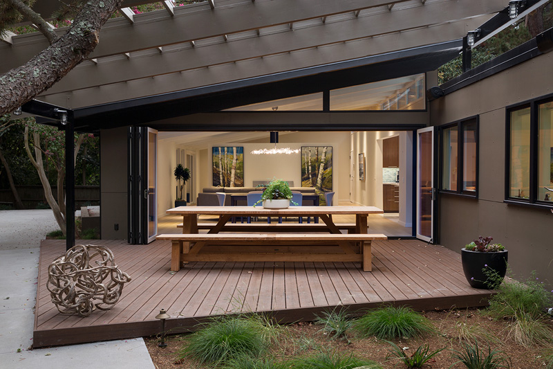
The architects opened up the wall with a La Cantina folding door system, connecting the interior living space to a new wood deck that acts as a continuation of the wood floor.
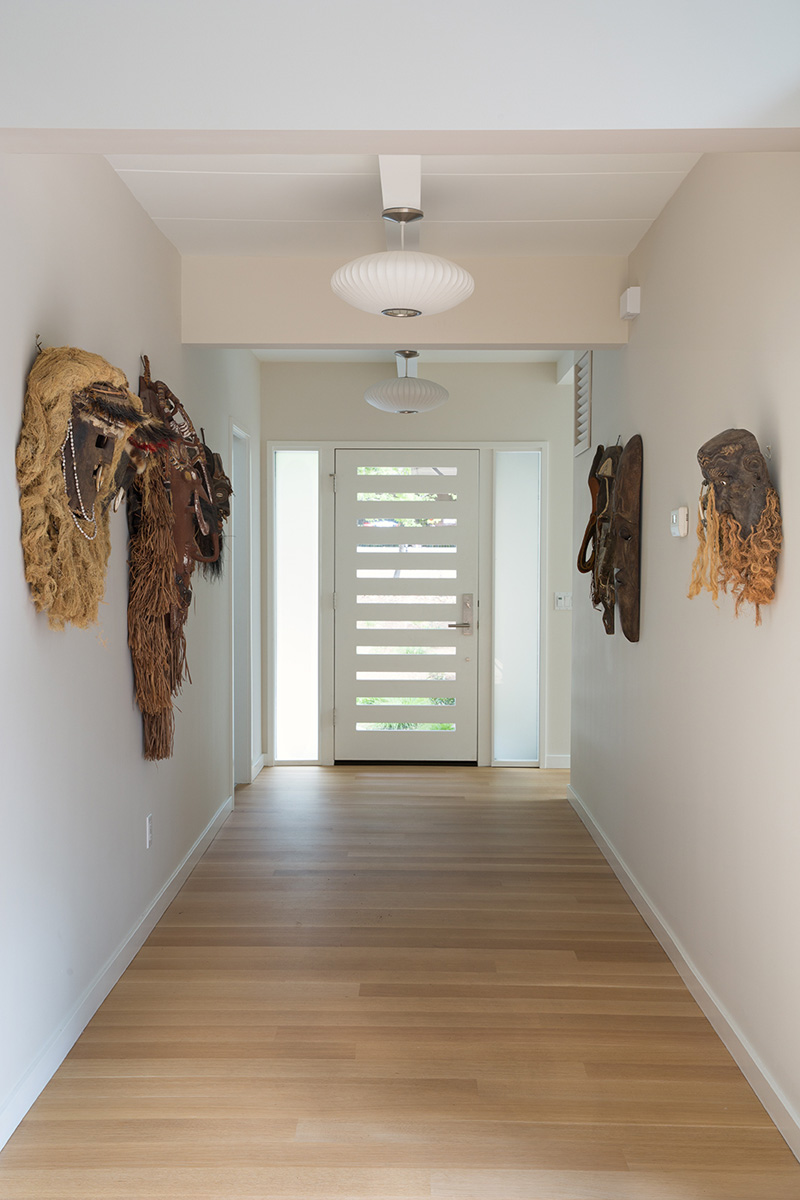
Welcoming you to the home, is an entrance hallway lined with tribal masks.
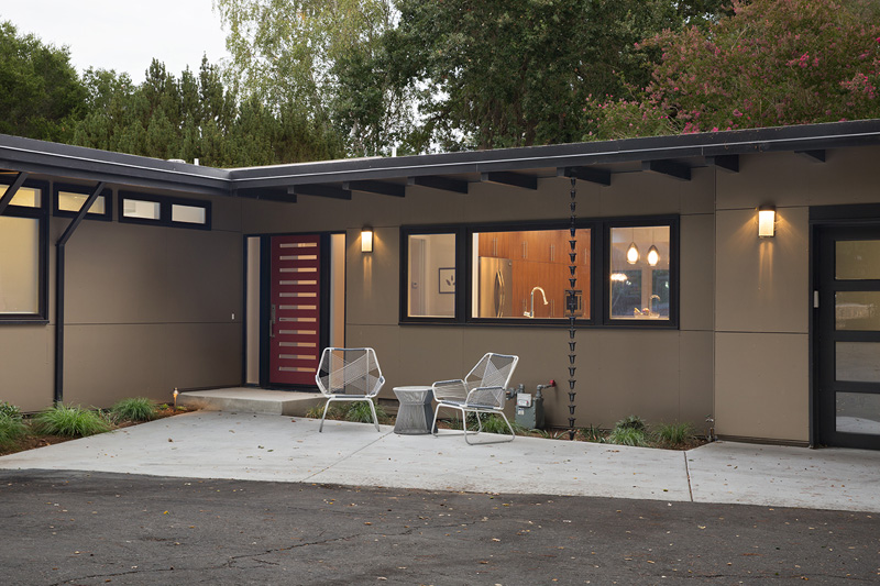
The color of the exterior could be credited to the beauty of nature. You can see that it has glass windows here as well a contemporary door. Aside from the seating area we saw in the first photo, there is another one here just right outside the kitchen.
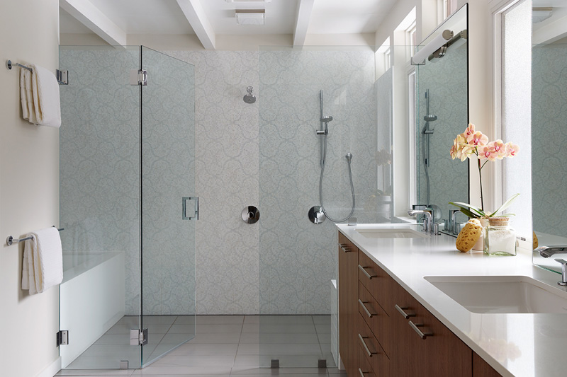
A large wet room housing the shower and bath, is partitioned off by a glass from the rest of the bathroom.
This is a nice home remodel. The new home looks particularly stunning and cozy especially that it has an open layout and everything can be seen from one area to another. The wooden elements in the interior are also nice and notable which brings warmth to the feel of the area. From the living space, one can easily connect to the outdoor area. I also like that it used white for the ceiling that made it appear spacious despite the low ceiling. This house remodel is done by Klopf Architecture and this isn’t the first time that we have featured a home from them. I know you have seen other homes that they have designed too which are as impressive as this one.