Whenever you see mirrors that are broken, all you could think of is to dispose them because apart from not being able to show a complete image of yourself anymore, it would also be risky and might cause danger because of its sharpness. But some creative people have found a good way to use mirrors. Some would add them on jars or other items. But did you know that it can also be used for the flooring too? I know this sound very new to you.
We are going to see a unique usage of glass and broken mirrors in this project called the Lab LZ by GT by Giselle Taranto Architecture which she completed for the Casa Cor Rio competition of 2015. The interior has a stylish eclectic appeal wherein various elements are combined together to create an aura that is very beautiful. This is done in collaboration with LZ Studio. I guess it is where the name came from. The intention of this lab “is to get people out of their comfort zone and spur them to think and participate in our ‘experiences’.” The space could show that there are layers of various thoughts by freezing the retaining walls and ceilings. The design also aims to “bring up discussions about solutions and thoughts in different areas that directly or indirectly influence and / or will influence the way we inhabit and live, and what future we should expect or in fact is already reality.” Well, I am sure that once you see the interior, you will be able to see different aspects of interior designing.
Designer: Giselle Taranto Architecture and LZ Studio
Style: Modern
Type of Space: Apartment
Unique feature: The space features various artistic elements but what makes it very unique is the glass flooring wherein there are broken mirrors inside it. When the lights are on, it is being reflected around the space creating a unique aura.
Similar House: A Splash of Colors Fills the Tuhachevsky Street Apartment in Russia
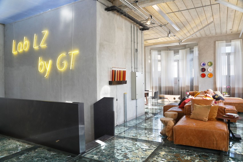
As you can see, the name of the space can be seen on the walls near the staircase. At first glance, you can see the unfinished walls and other industrial elements.
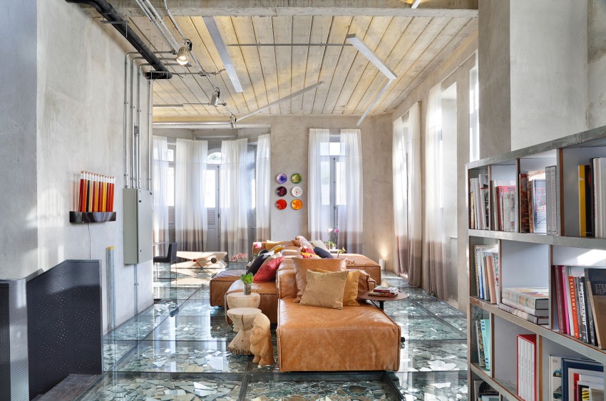
Leather furniture is used for the living area with a beautiful warm color. There are also wooden items in here.
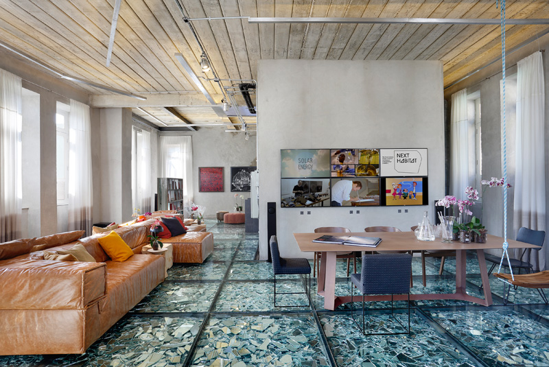
As you move forward, you will be brought to the dining area that is just near the living space. Notice that there are many artistic elements in here.
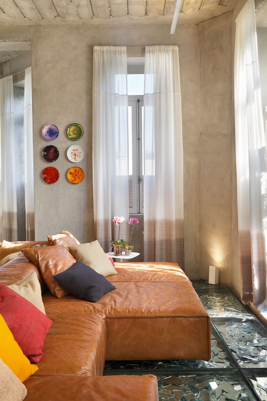
A closer look at the upholstered leather sofa that stretch in the long and narrow living room. Various fabrics in different colors are added on the sofa as well. A side table in white has pretty orchids on it.
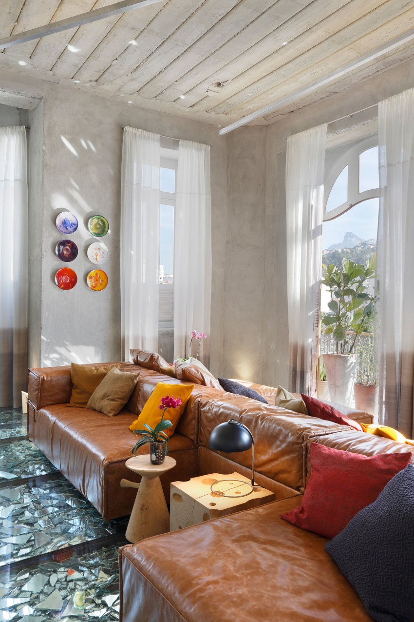
That cheese-like side table looks very interesting! I want one! Aside from the furniture, you can also notice that it used white sheer curtains for the windows.
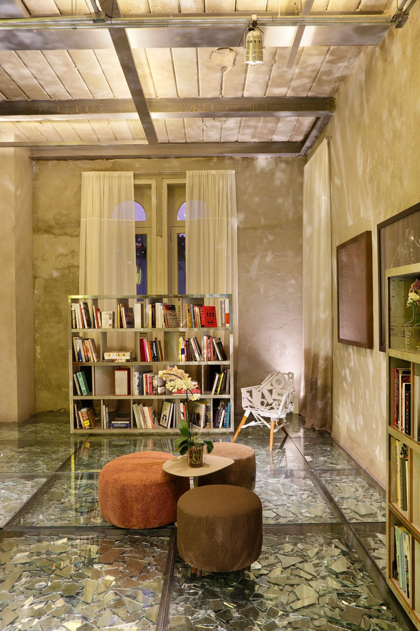
On the other side of the space is another smaller seating area with a free-standing cabinet that bears books. A sculptural element here is that Eames-like chair in white. I am not sure if you can sit on it.
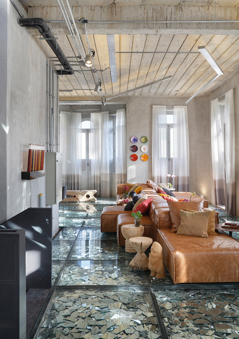
I know your eyes are drawn to the different colors of the throw pillows and that plate decors on the walls, but what I am looking at is that huge clothespin on the floor!
Read Also: Symbolic Tree Concept in the 38/F-39/F Mandarin Oriental Apartments in Macau
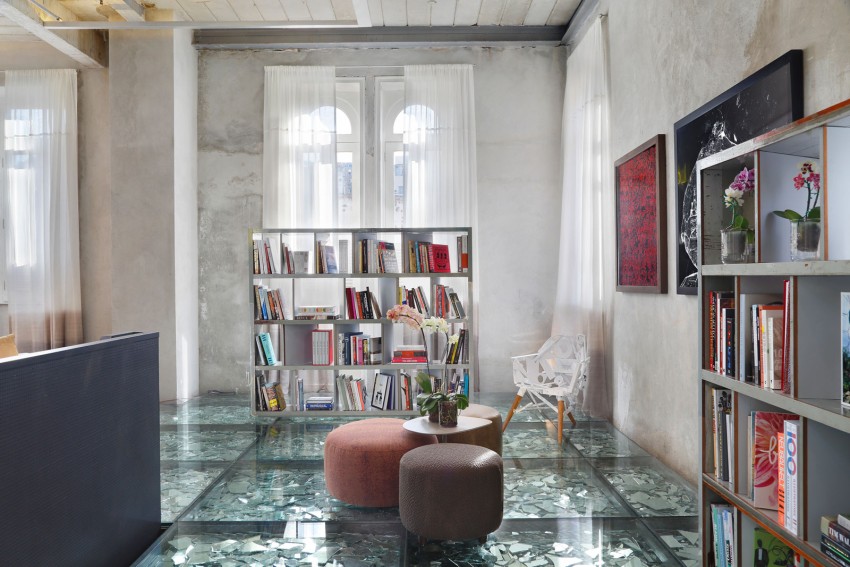
The space has many windows around it allowing natural light into the area. Notice also that painting on the wall.
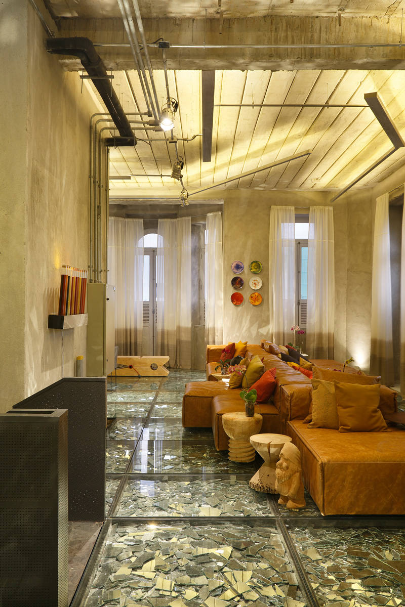
When the lights are on, the mirrors reflect it into the area just like what we can see here. You can compare this to the other image of the same space above.
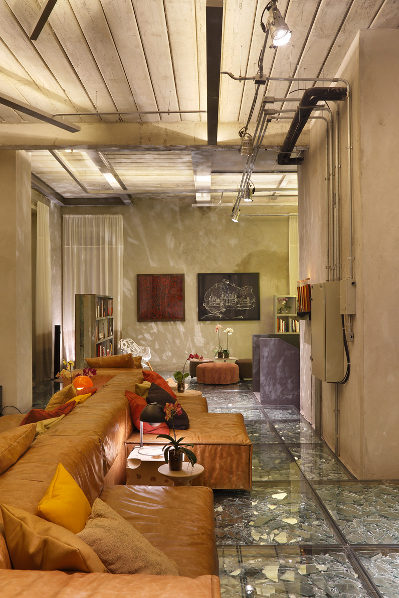
If you look at the walls, you can see the effect of the mirrors on the floor. I know the flooring does look very delicate. If I am wearing high heels, I’m not sure if I walk here.
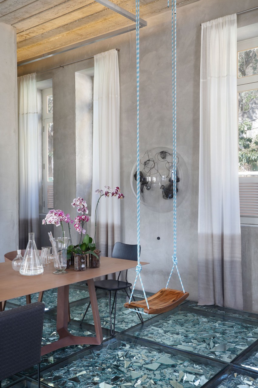
A swing is added on the dining area which brings a fun childish element into the space. Note its use of blue and white rope and the design of the wooden seat for the swing as well. Who would expect that they could see a swing in the dining area?
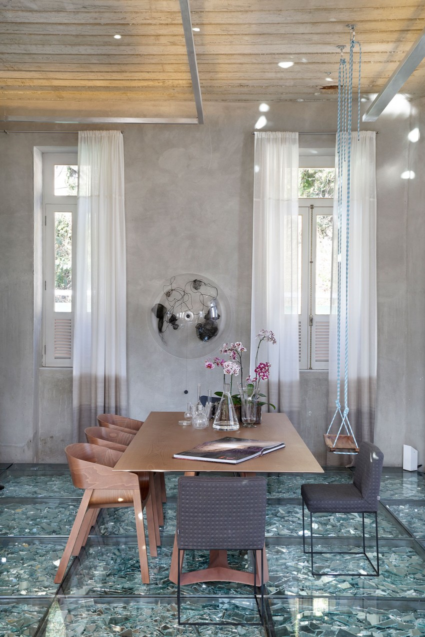
Two types of chairs are combined for the dining area’s seating. But the colors complement with each other. I also like the pieces on top of the dining table too.
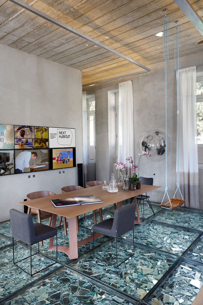
A creative gallery of photos can be seen on the dining area which brings life to the wall. On the other side is a wall sculpture of a glass orb with some interesting things inside it. Adding these items to the space bring a great deal of arts and creativity into it.
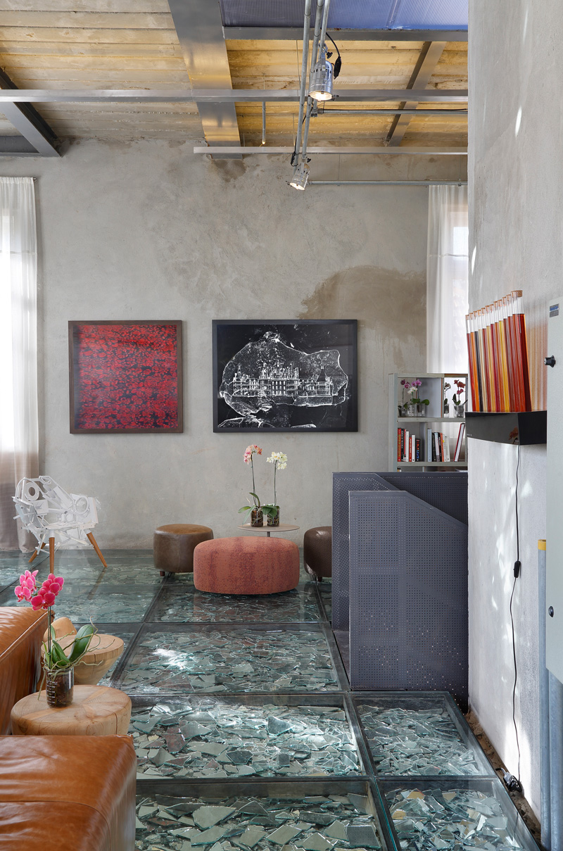
The staircase of this space is a metal screen which matches to the subtle industrial feel of the area. I’m sure that once the guests gets to the landing, they will be very surprised to see the glass floors and the broken mirrors inside it!
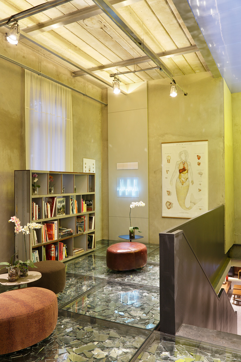
What is interesting for this part is the poster of a mermaid’s body parts as well as other wall decors. You can see here another round ottoman with a table. I have noticed that they like orchids.
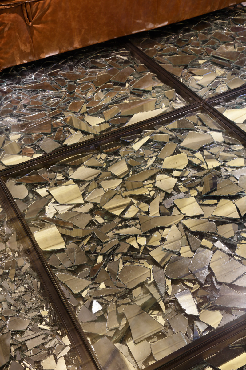
And this are the broken glass mirrors that are seen inside the glass panels with steel frames. Very interesting, right? I wonder where they got all these broken mirrors! If they bought all this and broke them, then it would be very expensive.
Giselle Taranto Architecture showed us that a space can definitely look unique in various ways and that anything can be possible. Even broken glass can actually look beautiful when creatively used and it would also serve for a certain function as well. Aside from seeing scrap as beautiful, the experiment in design also shows us that we could actually go beyond the norms and what our society looks into the usage of certain things. It also shows us that there is no limit terms of design and that even our interiors can look fashionable and in style in any way we want to.