Even if modern homes are a trend these days, we will of course expect that they would come in different designs. As a matter of fact, even if we can spot similarities on each of the homes, we will still expect that there is a unique feature on every house design both in the exterior and interior. That is why, every home we showcase here on Home Design Lover are unique and has their own distinct characteristics which sets them apart from other homes. So, what we will feature today is a modern concrete home that has a screened facade.
The house is designed by Paul Raff Studio and called it Counterpoint House. It is a lofty, light filled home that is built for a family of four in Toronto, Canada. The house has a modern design with a bright interior and geometric exterior design. The exterior looks simple but impressed as it feature a screened facade. In the interior, it used white for most areas especially the walls and has some wooden elements in some parts too. The color palette is very cozy and relaxing that makes the home beautiful and inviting for guests. Aside from that, it also has a garden that can be seen and accessed from different areas of the Counterpoint House. Let us take a look at some images of the house below.
Location: Toronto, Canada
Designer: Paul Raff Studio
Style: Modern
Number of Levels: Two-storey with Basement
Unique feature: A modern home with screened porch and a basement. It has a white interior with some wooden elements in it.
Similar House: Impressive Design of the Concrete House in Melbourne
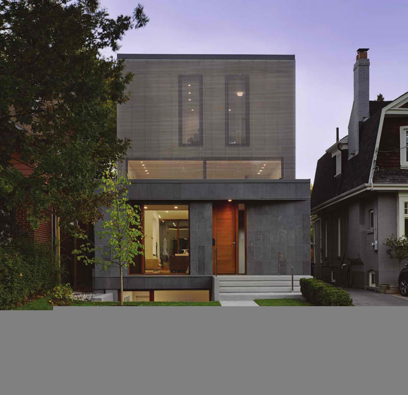
The exterior of the house is simple with gray stone exterior, a screened facade and wooden frames for the doors and windows. You can also see here that it has a basement. To access the home’s entrance as well as the basement and the garden, one can use concrete steps with stainless steel railings.
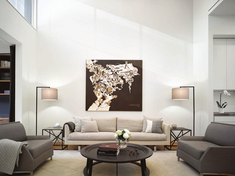
The house interior has a very neat look because it used white all over the walls and ceilings. You can see some colors from its high-quality and comfortable furniture as well as from its decors too. Lighting fixtures are other elements that bring beauty to the area.
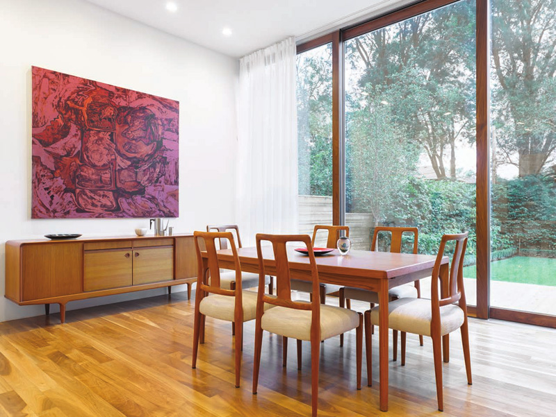
The dining room has a wooden dining set. The chairs have comfy upholstered seats and wooden backrest. It features a floor-to-ceiling window that show off the backyard view. To add appeal to the space, an abstract wall art is brought to the walls just above the wooden console.
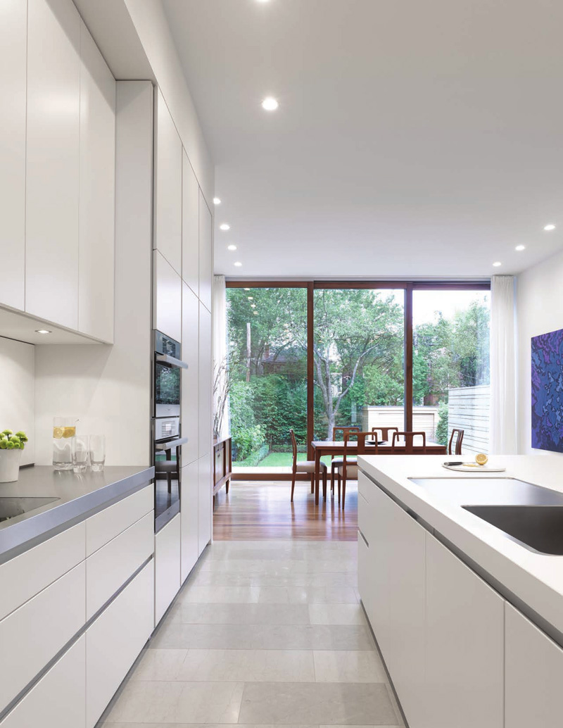
From the dining area, one can get into the kitchen that is filled with white cabinets. The white colors in the kitchen reflect the light, and ensure a very bright space. More brightness is added because of the natural light that comes from the glass windows.
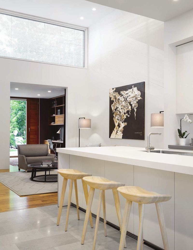
There is also a window high up on the wall that allows lots of natural light to flood the living room and kitchen. You can see that there is also an artwork on the wall here that gives an artistic flair to the space. I love the wooden stools located on the kitchen island!
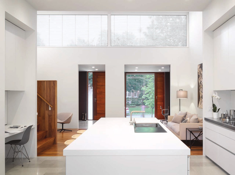
In the kitchen area, there is a small working space with white colors as well. You can see that there are wooden elements in the staircase as well as the living area. Large windows bring more light to the interior.
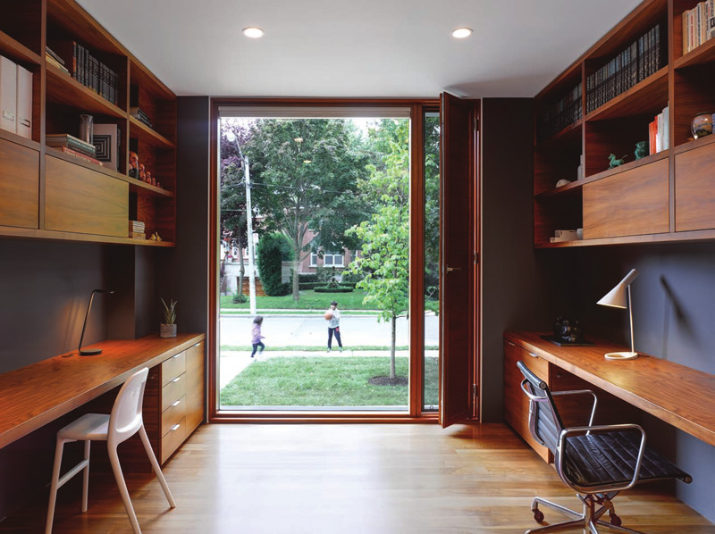
The house also has an office that is specifically designed for two. It would indeed be nice to have a shared working area like this one. This part of the house has an uninterrupted view of the front yard through the floor-to-ceiling window. And of course, you can see that it used wood for the cabinets both above and below the desk.
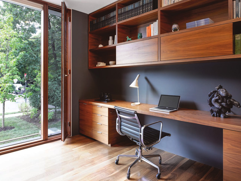
Custom cabinetry has been designed to perfectly fit the space. Notice that it has an ergonomic office chair which is recommended even for home working areas to ensure comfort even for long hours of work. Beautiful cabinets, right? And the backyard can be accessed from here too.
Read Also: Easy-Cut Volumetric and Naturalistic New Concrete House
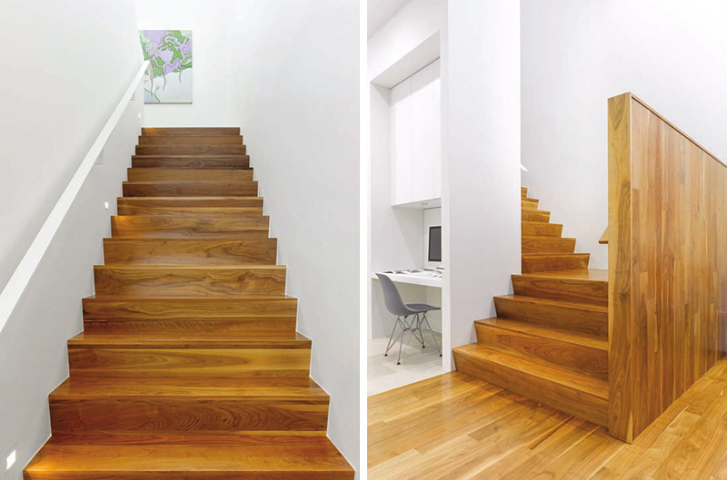
What takes you to the second floor is wooden staircase that provides a nice natural contrast to the white walls. This is what you can see from the kitchen and the small working area inserted in there. Aside from the wooden staircase, there is also a wide panel of wall that is made of wood and serves as a another eye candy in the white interior.
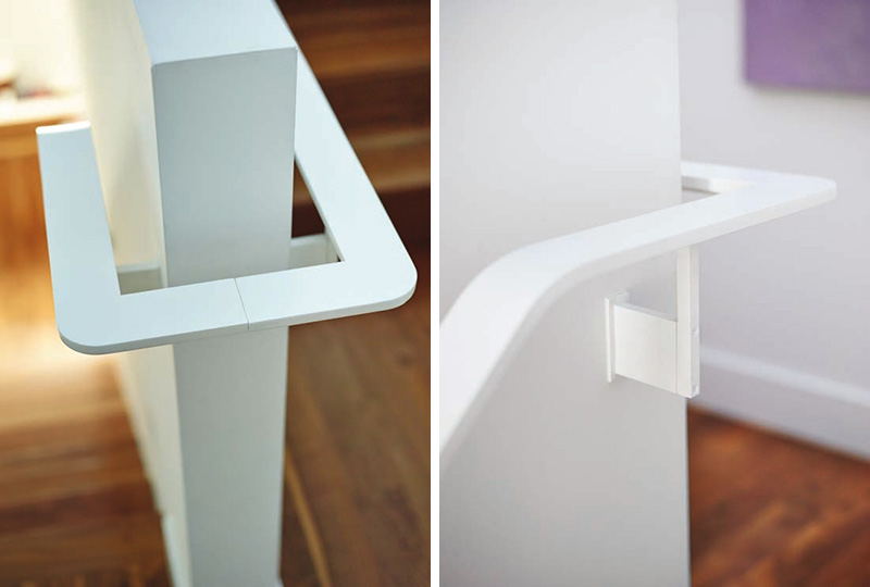
Here’s a close-up look at the stair handrail in white. Imagine that it seems to disappear because of the white walls but of course, it is there and can be a good aid in climbing the stairs.
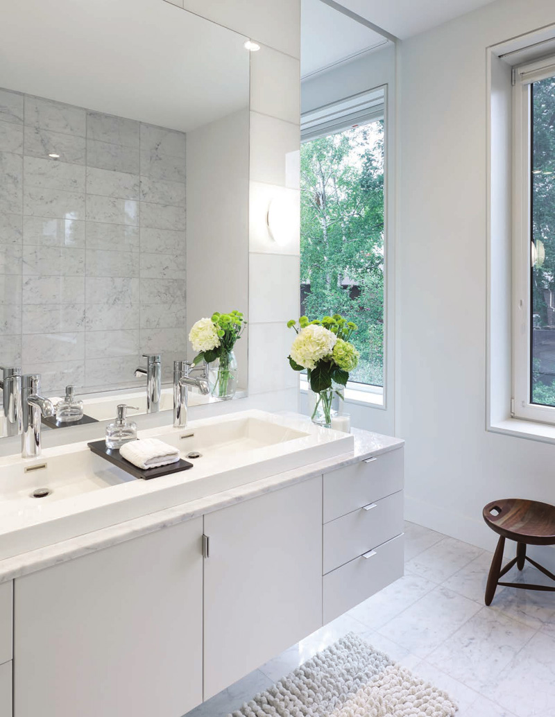
A neat modern bathroom features a floating vanity with a large double sink. You can see how those flowers added freshness to the space. Also, notice the marble like design of the bathroom walls that can be seen from the mirror. Another thing I noticed here are the modern bathroom fixtures.
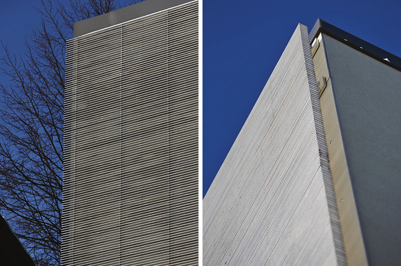
The detail of the facade is seen in this image. A closer look of it gives you a glimpse of the screen that helps limit the amount of sun that hits the windows.
With the design of the house above, it would make us realize that it doesn’t need to be full of colors and decors in order to look beautiful. There is indeed beauty in simplicity. What is more important is the function than aesthetics. What is beauty if you cannot use it, right? This design of Counterpoint House is well done and resulted into a cozy home. Credits go to the Paul Raff Studio who apparently did a great job for this home. I am certain that the homeowners were happy to see have a house like this because it doesn’t just fit their needs but it even surpassed their expectation. How about you, do you want a home that is simple but functional like this one? What particular features do you want to add in here?