We have been talking about condo living for a while now and I think that this list could be a great finale for the lists that we have about condo spaces. The toilet and baths in this list are all standard spaces but for modern living, you’d wish that you have a larger space.
Take note. Although the bathrooms we will feature are small, these toilet and baths are fully functional and beautifully done!
So, yes, today, we will be showing you a couple of photos of small and sleek bathroom condos that will surely inspire you to go for minimalism especially in the bathrooms. All these spaces will definitely be something for you to check back when the times that you decide to redecorate or on the verge of planning how your toilet and bathrooms would look like. Let us go ahead and check out the photos below.
1. West Hollywood
http://www.l2interiors.com/portfolio_page/west-hollywood/
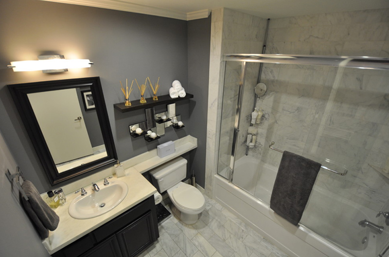
Since condos usually have limited spaces, their bathroom spaces are a little bit sacrificed. Seeing this bathroom, you know that this condo is bigger than usual because it was even able to accommodate a tub. The minimalist look is neat and is a classic.
2. Bellevue Avenue
https://www.raveninside.com/projects/1445802/bellevue-avenue-west-vancouver-residence
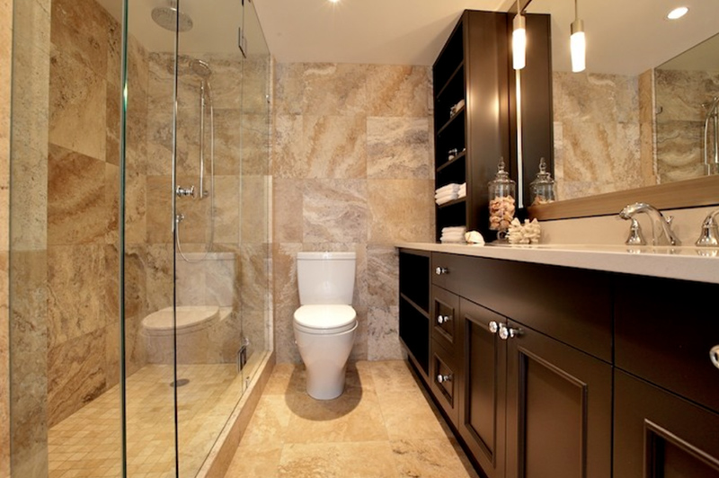
This Bellevue condo has a long bathroom space and I think it looks fab! The neutral color choice is perfect for any season and any user. I think what I love most about this bathroom is the chocolate cabinets and drawers.
3. Beacon Street Condo
![]()
https://www.betsybassettinteriors.com/beacon-street–brookline-ma
I love how this condo in Beacon Street has a large bathroom space that included a tub that doubles as a shower area as well. I adore the mosaic tiles below the large mirror as well. A great way to add color to this neutral-colored space.
4. Pelican Bay Condo
http://www.palmbrothersremodeling.com/portfolio-2/bathroom-remodels-2
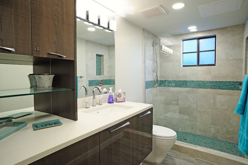
Beiges and browns were used in here and adding a hint of blue on the floor and on the wall added a hint of drama to the shower area. Enough cabinets have been installed to this bathroom.
5. Compact San Francisco Condo
https://www.gkandb.com/gkb-portfolio/3rd-st
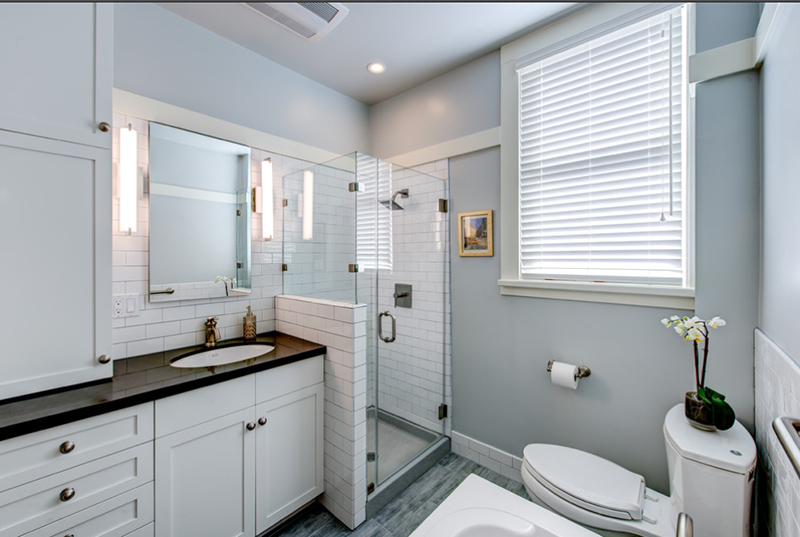
A smaller shower area is seen in this bathroom and notice the cute color of the walls – I think it looks friendly and rather charming. Sleek bathroom designs like this one is common for most condos since designers make sure that the spaces look really nice even when it is rather small.
6. Industrial Condo
http://www.raeduncanid.com/copy-of-lakeview-eat-in-kitchen
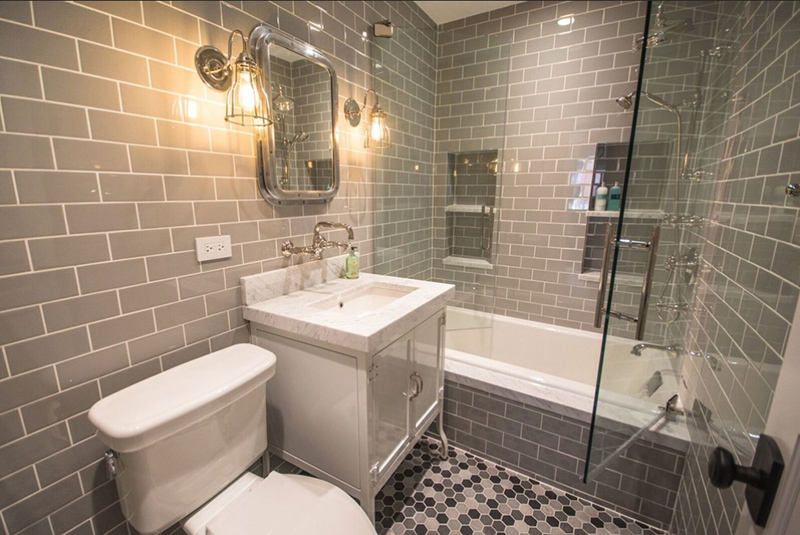
I have a few photos of how small their spaces are because of how expensive rent is – but seeing this bathroom, you know it’s small but definitely not cheap! The tiled space is appealing and interesting – its industrial look will surely capture the eyes of many.
7. Waterfront Condo
https://www.sheilarichinteriors.com/portfolio/colorful-contemporary-condo
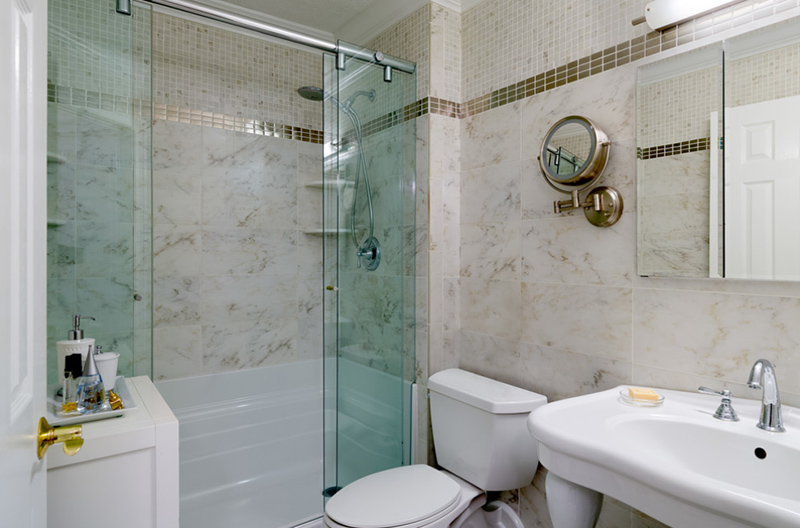
The fixtures in this bathroom are simple yet complement with the color of the tiles used in the walls. Since this is a small bathroom, no tub was added to it. I love the movable circular mirror added just beside the larger mirror.
8. Main Street Condo
https://www.nistylepc.com/blank-cow8
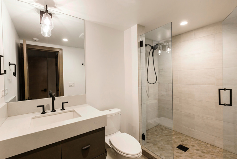
I am personally not a fan of doors directly across a mirror but since this is a smaller space than some toilet and bath, I understand the location of the door. A glass wall and door separates the bath with the sink and the toilet bowl. Notice the lighting used above the sink – industrial in design, and I think it matches the color and looks of the cabinets below the sink.
9. Front Street Condo
http://www.esteedesign.com/projects/various-projects
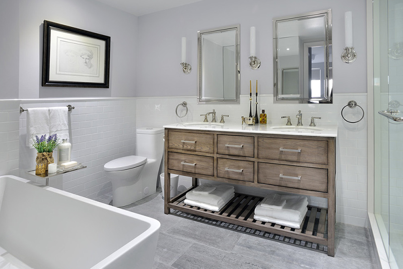
This toilet and bath look like it came out of a magazine and I totally love it. The color of the walls matched with the tiles looks adorable. The double vanity’s cabinet work is stunning and I would not mind having one for myself in my place; the mirrors and the candles beside it is just a perfect match made in heaven.
10. Chaz Yorkville Condo
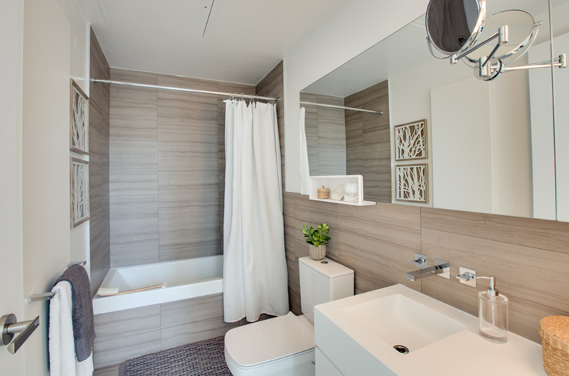
The look and feel of this toilet and bath resemble that of something I saw in a hotel I once visited. They indeed maximized the space and used a large rectangular mirror to create an illusion of a larger toilet and bath. Contemporary choices were made for the fixtures and decorations.
11. Mt. Pleasant Condo
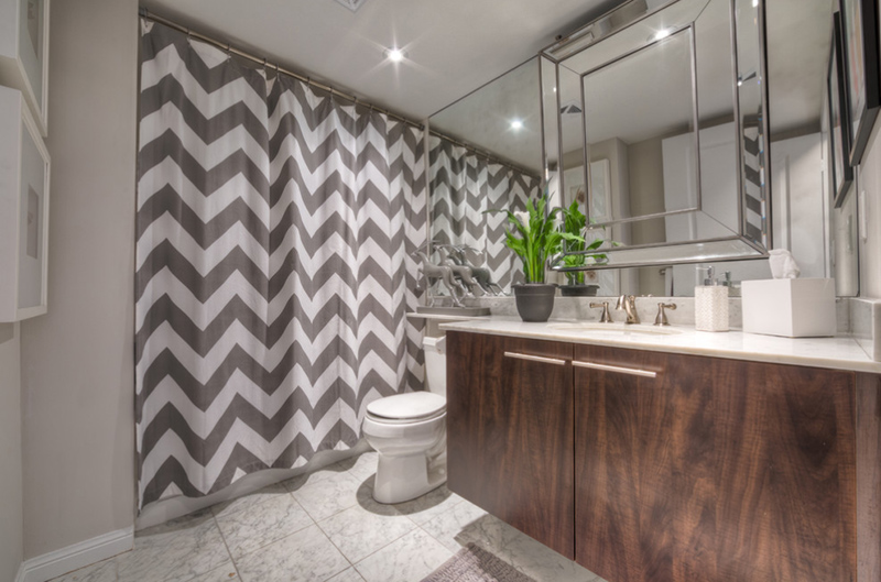
See what happens when you use a large mirror? It makes spaces seem larger than they really are and I think it’s a smarter way of enlarging spaces. The color of the cabinets contrasts with the wall color and the floor tiles. The geometric pattern of the shower curtain is simple but very catchy.
12. Urban Chic Condominium
http://greatvancouvergeneralcontractor.com/portfolio/renovation/reno
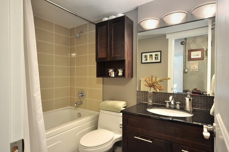
This bathroom has this traditional look and feel to it that it just looks homey. It’s like you have nothing to ask for in a bathroom! All the essentials are there and the designer added enough ammo for it to really look pretty, neat and definitely functional.
13. Montreal Condo
http://uniquehomesolutions.ca/projects
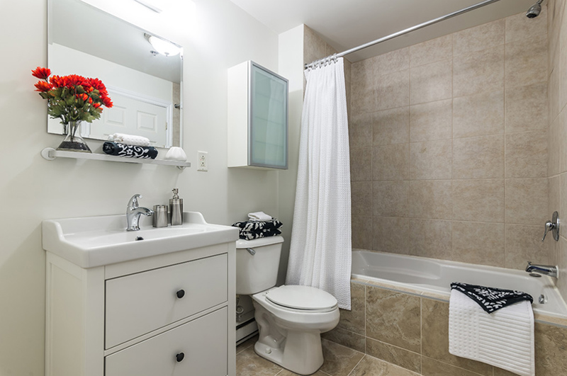
Notice that they used the same tiles for the wall by the tub to the flooring. I feel like the white wall where the furniture and fixtures are attached to seems dry or lacking something but all in all, this toilet and bath sure is functional and neat.
14. Crabapple Dr. Retreat
http://falkenreynolds.com/portfolio
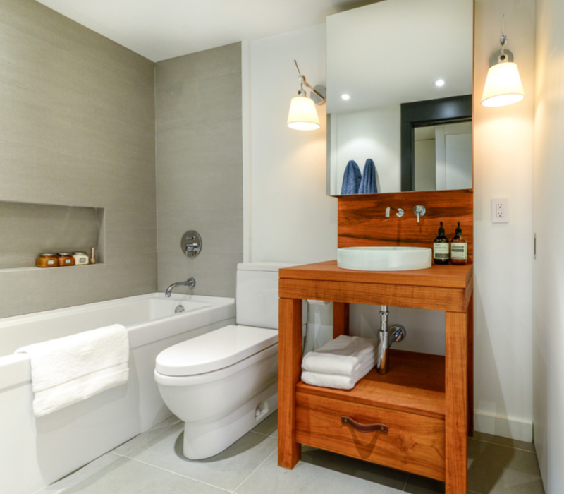
The color combination of this toilet and bath is a classic – white and grey with wooden accents to create a more elaborate contemporary look and feel to it. The choice of the lighting fixture is really beautiful too, I love it.
15. Boca Condo
https://www.patronamarble.com/bath
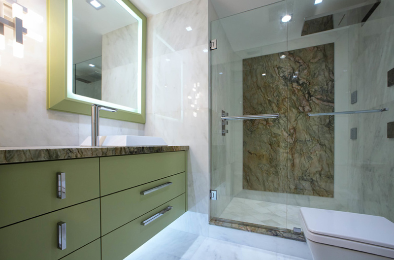
How do you feel about straight edges? This bathroom sure has enough edges if you actually love them. Squares and rectangles are seen in most portions of this bathroom and I think it looks modern and classy.
16. Pierce Street Condo
http://tocdesign.houzz.com/projects
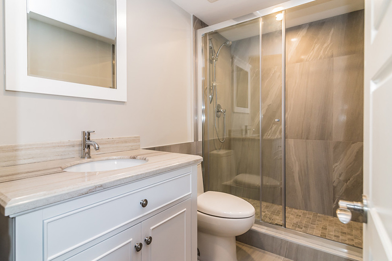
The tiles used in this bathroom sure is interesting. The nude colors make the white fixtures stand out along with the tiles making the space stunning. This bathroom sure is minimalist but that’s okay because it’s still functional.
17. Mississauga Condo
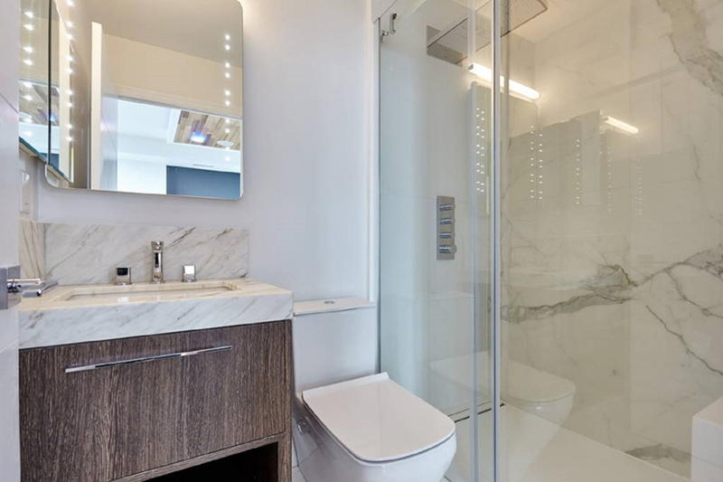
Look at how sleek the toilet bowl is; it is beside a contemporary mirror and a slamming counter for your bathroom needs. The light colored walls and granite choices make this space real sleek and pretty.
18. Midtown Condo
http://istagenorganize.com/gallery
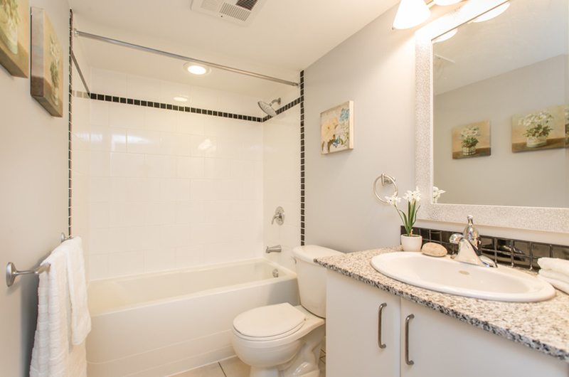
This toilet and bath seem a bit larger than most of the spaces in this list but it sure looks neat and pretty like a bathroom you’d find in your granny’s house just a little bit modern.
19. Beach Front Condo
http://www.sandwkitchens.com/portfolio
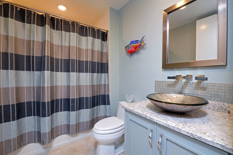
Another bathroom in this list that has a cloth divider to hide the bathroom area of the space. The toilet area with the sink, toilet bowl, and the mirror is simple but showcases its purpose.
20. Miami Home Staging
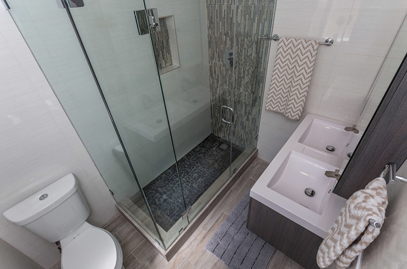
The angle of this photo sure is showing off the size of the entire toilet and bath. You see everything that’s inside the space and at the same time have an idea as to where you can add more color or decor. This toilet and bath is minimalist but at the same time real classy.
If you ever wanted to experiment with the look and feel of your small bathroom, this list will surely be of great help. The designs are direct to the point – the designers added what is necessary and made sure that everything you need is there without the need of overdoing things but still maintaining a beautiful feel to each space. For more condo bathroom inspiration, check out the 20 Gorgeous Tiled Modern Bathrooms in Condominiums.