More and more designers and home owners that opt to get floating or wall mounted counters or shelves. Aside from people actually considering it than the ones that are movable or bulky, floating shelves and counters seem to create more space while being fashionable and new. Most people who started using floating shelves or counters had a better experience with them than with the ones which were movable or connected to the tiles and the cabinet works.
Seeing more designs like this, I thought that we should go ahead and create a list that showcases the beauty of wall mounted counters or shelves that is why this list came to be. Below, you would be seeing 20 Wall Mounted Counter in the Bathroom which are not only more modern than the traditional designs there is, but they are real pretty too – take a look and judge for yourselves!
1. BC Ensuite
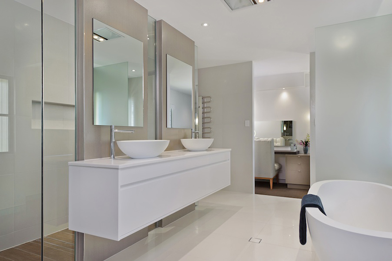
SMB Interior Design
This beautiful bathroom sure looks like something that came out of a magazine or a hotel room. The exquisite choices of fixture in here make this bathroom prettier than when you actually have older version of fixtures; but then again, this is a new bathroom to begin with.
2. Beach House
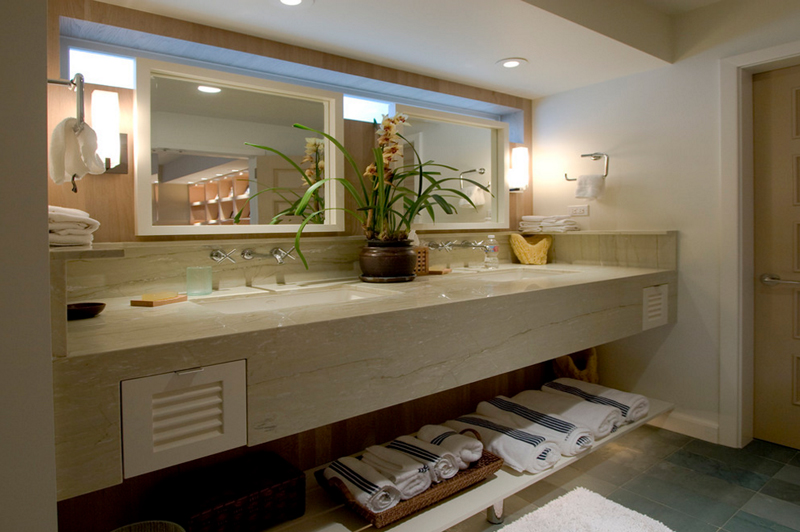
This beach house bathroom sure looks like something you’d see in a hotel bathroom. The choice of material for the sink is something common to hotel and I think it looks fantastic! A double vanity makes this bathroom gain more points for being a wonderful bathroom!
3. Carefree Contemporary
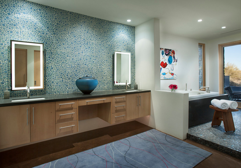
If you love blue, I think the backsplash of this bathroom would be something that you’d actually like. I mean, I like it enough that I am even remember considering it for my own bathroom at home. The mosaic feel to this is just incredibly beautiful!
4. Classic Contemporary Residence
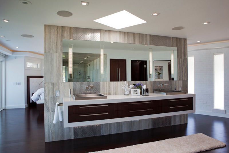
Shane D. Inman | The Inman Company
The wall that we see in here is basically the division from the bedroom and the bathroom; pretty cool actually and at the same time, really modern, I love it! The division created here looks incredible and adorned with a wall mounted counter and it looks wonderful!
5. Green Oak Writer’s Studio
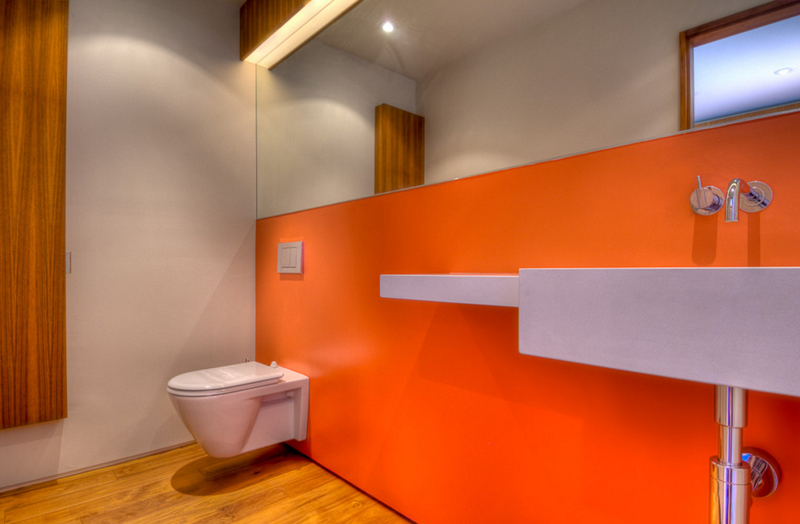
I am not so crazy about the color of the wall in this bathroom because it seems to bright, people could actually go blind! Especially that this bathroom was intended to be used by a writer; but then again, if this was a special request by the client, I think they still enjoy it – so, I think this one’s great!
6. Hillside Modern
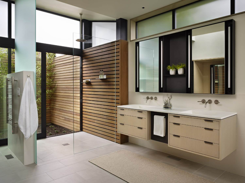
The color of the cabinet/drawers used for the base of the counter looks outright vintage; good thing that they actually used this because it contrasts with the color of the wall that somehow connects the bathroom to the outside of the house. Pretty cool!
7. Infinity Oasis
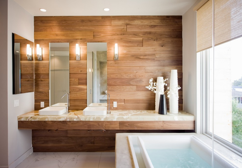
If I am not mistaken, this is the only bathroom in this list that actually have wooden planks as the backsplash and basically an entire accent wall. I think that it looks incredible and really wonderful too! The material used for the counter is real sweet too, do you agree?
8. Maresfield Gardens
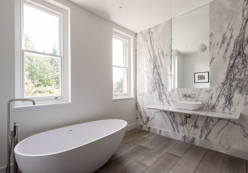
The color of the flooring of this bathroom somehow seems like a painting which makes it interesting. The material used on the wall is pretty cool too. If you notice, this bathroom has a long counter but only has a single basin on it, could it be a provision for another one or merely for all the things the user needs in the bathroom?
9. Minum Cove
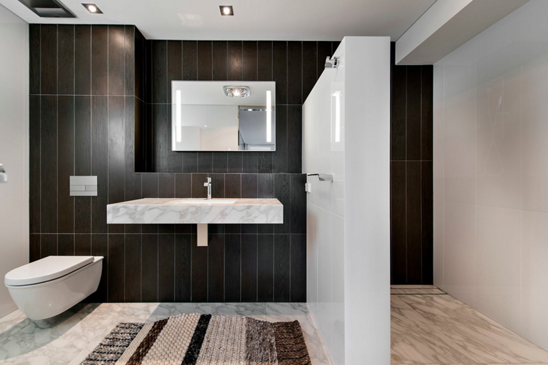
European Ceramics
If you like color combinations like this one, I think you’ll know that you’d want in your own spaces – contrasting colors always creates a balanced look to a spaces which adds to its beauty rather than destroying it with too much monochromatic approach.
10. Modern Showbiz
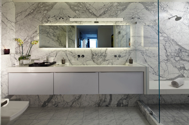
Studio Becker- Bespoke Cabinetry & Millwork
Well, this bathroom sure looks like a counter in the kitchen because of all the granite used in it. I mean, I think it looks incredible and very beautiful, but I think too much of the granite made it look like something else other than a bathroom.
11. Naxxar Townhouse
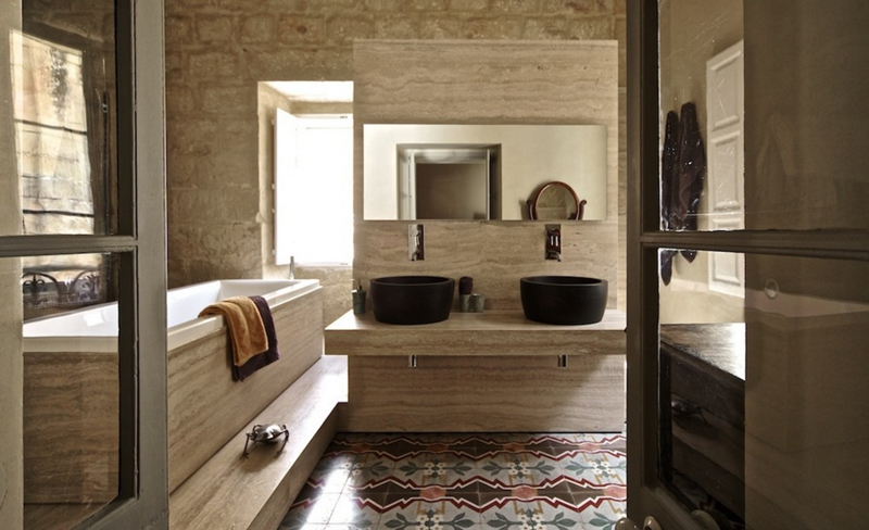
Camilleriparismode
I am in awe with how stunning the colors are in this bathroom. The simplicity is seen on the light brown with a hint of grey tiles all around the place and the colorful and printed tiles on the floor contrast to that – which made it look incredible! Even the black basins on the counter are added sophistication and beauty!
12. Nixon
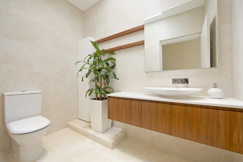
SMB Interior Design
The wooden base of the counter sure creates a different look and aura for this bathroom which I think is real nice. It somehow gives it an Earthy feel; adding a tall plant did create that feel too which most likely would be loved by the people seeing this picture and most especially the home owners.
13. Ozone
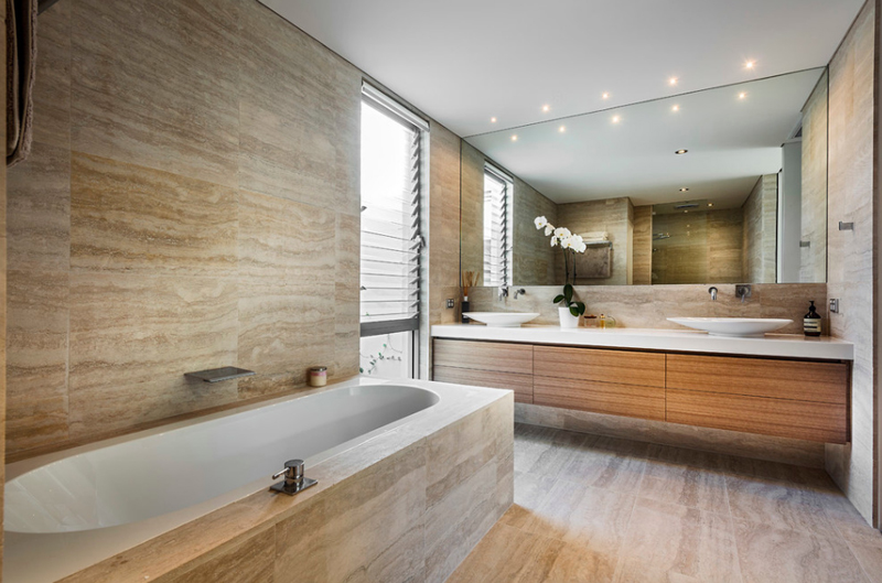
The color of the tiles sure complement with the color of the wooden cabinets or drawers below the counter. The large mirror that spans on each end of the bathroom looks superb and definitely perfect!
14. Port Macquarie
SMB Interior Design
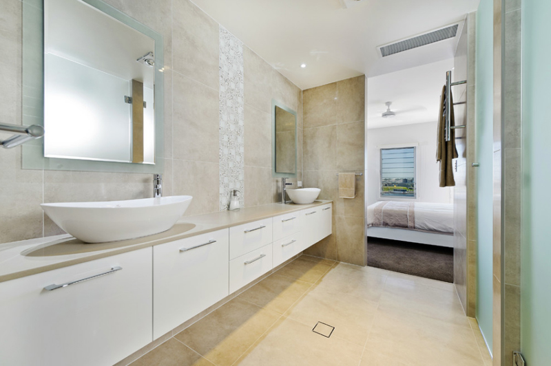
This long bathroom boasts a beautiful double vanity that just right around the corner of the bedroom. It’s probable that this bathroom is that of the Master’s bedroom and it sure looks incredible for me, how about you? The simple basins and the mirrors are great choices too!
15. Saville Isaac
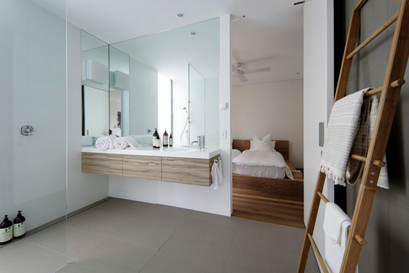
I love how they used the wooden stair to hang their towels in – it’s multipurpose while still being match with the theme of the rooms. If you notice the bedroom has wooden flooring too which actually match the color of the stairs and complements with the counter.
16. Soft Contemporary Home
RS Design Studio
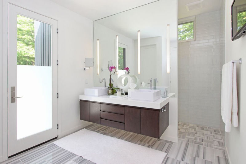
The dark brown color of the cabinets and drawers below the counter looks lovely. It matches with the grey striped flooring and of course complements well with the white overall design and look of this bathroom. I am surprised that there is a door on the other side of the room, but then again, it makes it all interesting and fun!
17. Vail Valley Mountain
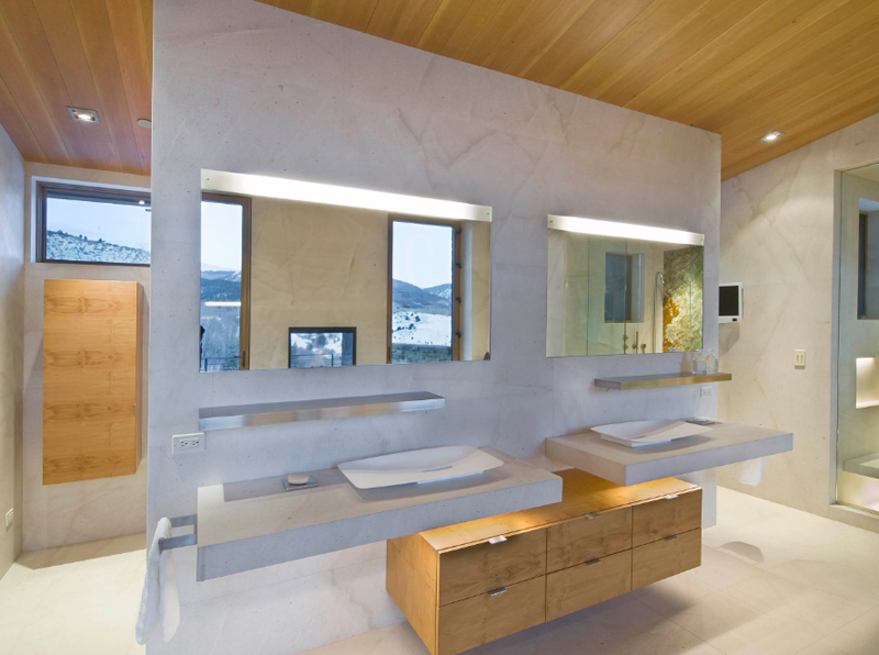
This double vanity sure looks incredible! The grey counters and wall look awesome which actually match well with the wooden cabinet just below it. I find it unnecessary to place a lavatory or counter in the center of the bathroom, but I think the designer thought otherwise but still made it look stunning!
18. Watermill Toud
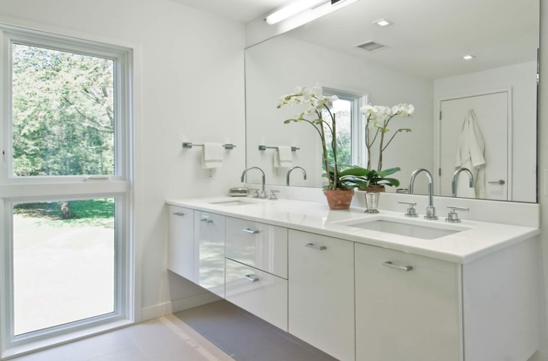
This bathroom showcases a double vanity in an entirely white space! Pretty awesome, I should say and I know that you’d agree that it’s actually the case. Luxury is usually associated with linens and furniture or fixtures in white – what do you think?
19. West Hills Remodel
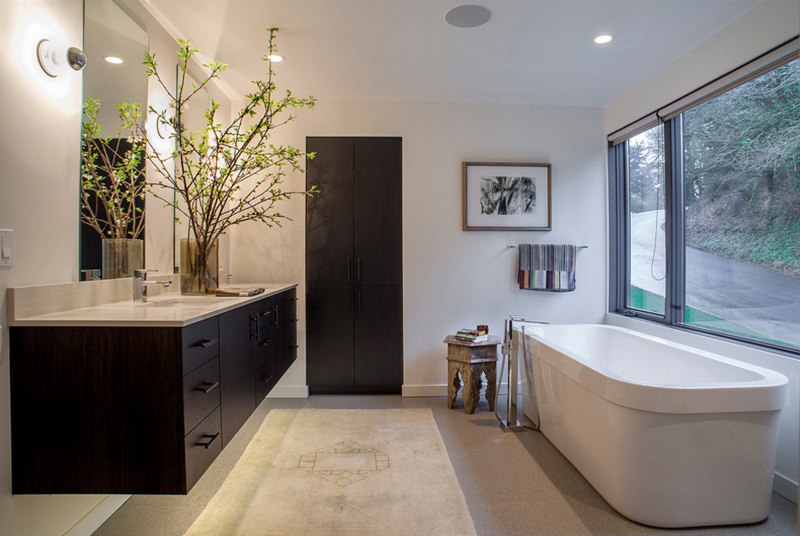
The black wall mounted counter seen in this West Hills home sure looks classy and sophisticated. We can see that it’s just this counter and the door which are black – pretty nice choice to match the white beautiful tub!
20. Wildcat Residence
Oscar E. Flores Design Studio, LLC
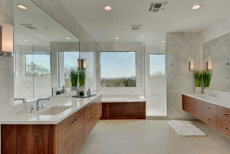
In this bathroom, we see that there are two separate counters – I would like to assume that they wanted to create enough space for the users of this bathroom, that’s why, instead of creating double vanity beside each other, they created it away from one another.
If I ask you now, after seeing this list, would you actually say that this innovation is better than the traditional ones? Or even not better, but would you say that you’d actually consider this? Inspiration just comes to us when our brains are indulged with beautiful things like this list; if you have more time and is interested in checking out more wall mounted furniture, check out the 20 Interesting Wall Mount Tables and go ahead and share them with your friends!