Most people would opt for a redesign for many different reasons. Some would like it to go with the trend of the modern structures around it while others want their homes to stand out. Some would also see that the house is no longer structurally stable or it doesn’t fit their lifestyle and usage. Today, we are going to see another renovation project for a townhouse wherein the lower level is intended for rental while the upper level were occupied as a home.
The South Slope Townhouse is a renovation project in South Park Slope, Brooklyn, New York. The project maximizes the potential of a non-descript building shell, and limited budget. The goal is to create a modern, light filled home that “acknowledges the building’s past, while envisioning the neighborhood’s future”. This three story building utilizes the top two floors as the owner’s duplex while the ground level is a rental. The existing fire escape was removed from the facade of the house. The location of the home is an eclectic block consisting of early 1900s multi-family buildings of similar or smaller size. There are also many recently constructed larger condominium buildings around the area. Because there isn’t uniformity on the block, this house took the opportunity to create a bold facade while retaining some traces of the original facade like the window placement and its exterior geometry. Aside from its bold exterior, the home’s interior spaces are also stunning and equally emphasize traces of the original structure. Let us take a look at the home below.
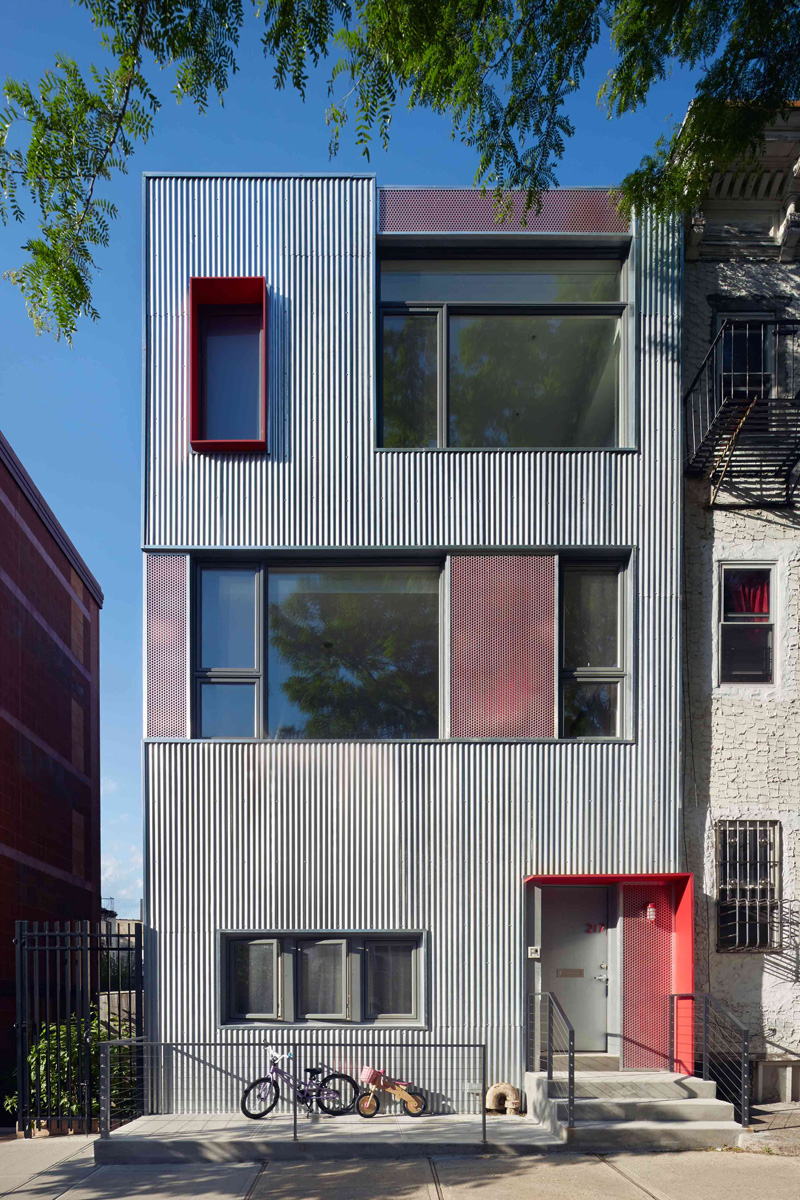
The facade of the home has an industrial style since it used corrugated galvanized steel for its exterior cladding. This material blends in to the gritty, eclectic architecture adjacent to the site, as well as for its affordability. You can just imagine seeing a unique home like this in the middle of a busy street. It would definitely be intriguing!
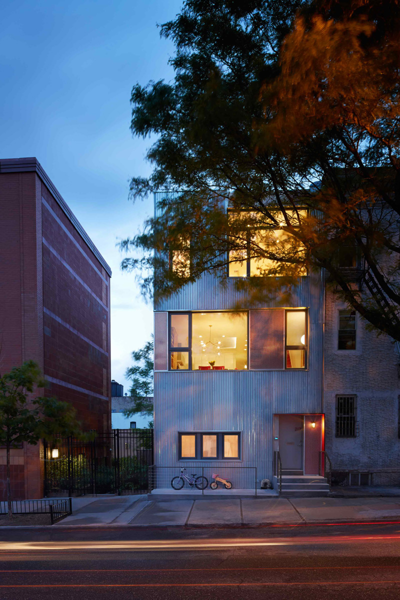
Framed accent panels of perforated aluminum are installed in front of the red painted panels that provide complexity and balance to the facade. Note how unique it looks from the other buildings around it. But because every building in the area has a different design, this structure just fits in.
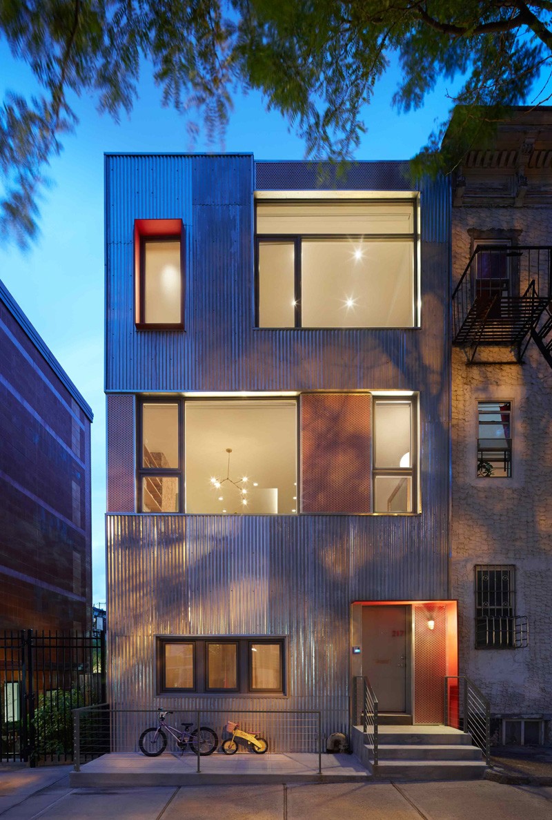
Love the texture of the exterior of this townhouse! It is a surefire head turner especially when its lights are on during the night like what you can see in this photo. Because of the galvanized steel exterior, light is being reflected on it which adds drama to the home’s architecture.
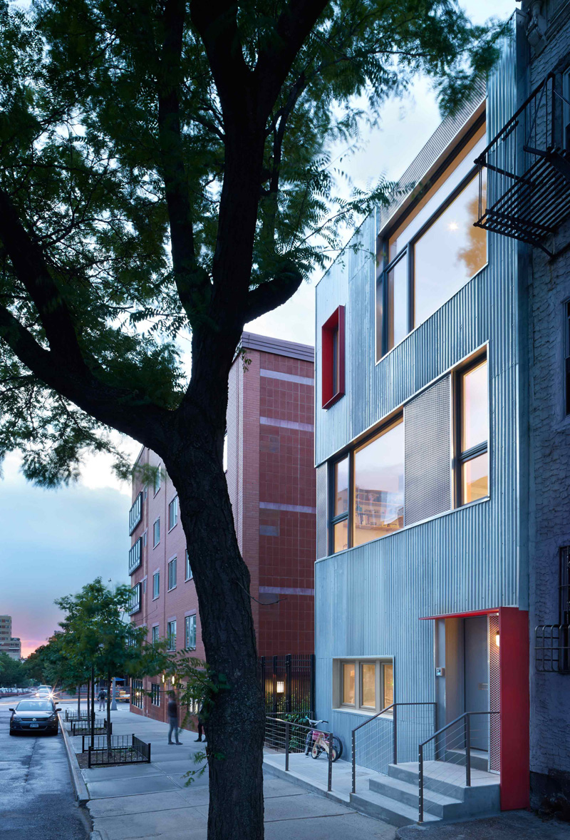
The facade of the house has red accents that were used to frame the entry canopy as well as the frosted glass window in the Master Bathroom shower (which we cannot see here). I also like that it has a small area where bicycles can be parked.
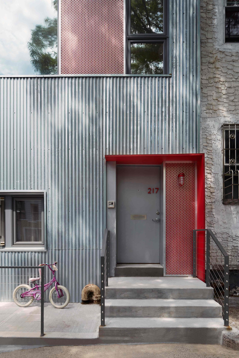
A closer look at the home’s facade with the materials it used for the exterior. You can notice that there is also a different design of metal screen that was added to it. We can see it on the entrance doors and windows.
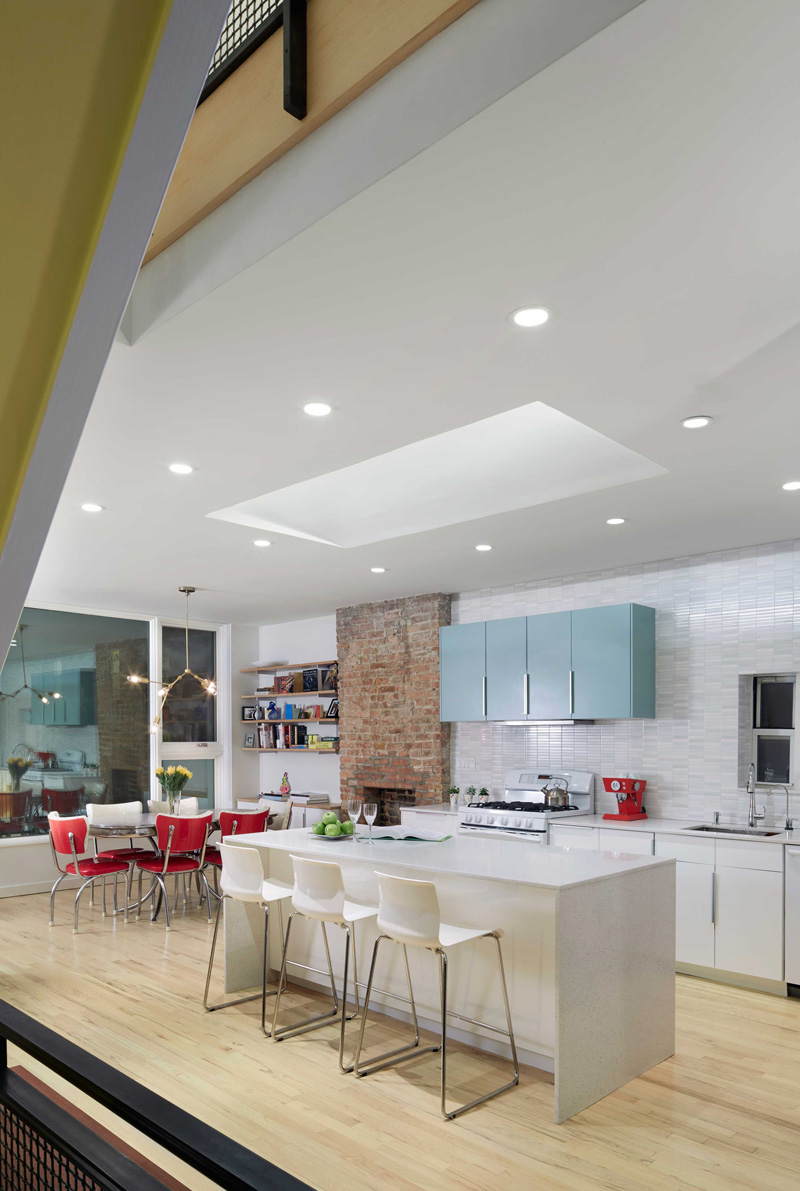
The interior used white for its walls and laminated wood for the flooring. There is an existing brick chimney breast that became the organizing element of the primary living space on the lower level of the owner’s duplex and the Master Bathroom on the top floor. Seen here is the kitchen and dining area where you can sense some combination of old and new elements.
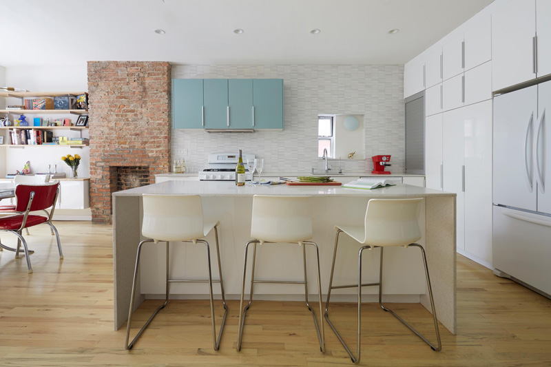
This space acts as the primary gathering space for the young family of four. It is intended for cooking, eating, practicing music, the chaos of the morning routine, and others. We could say that this is the busiest part of the house the entire day.
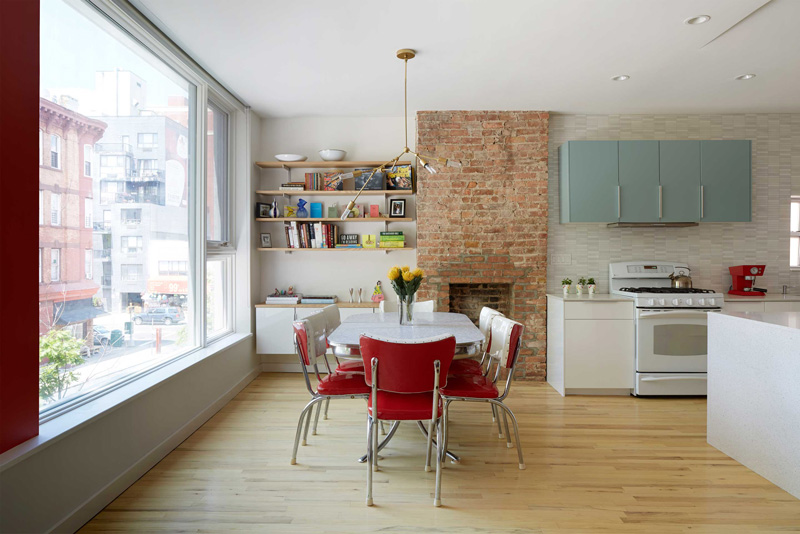
The dining area has red and white dining chairs that add some subtle retro feel to the space. The brick fireplace as well as the floating wall shelves with eclectic displays brings in some interesting appeal to the dining area.
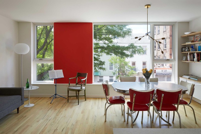
Accents of red are not just seen in the exterior but also in the interior as well. Note that red panel on the wide window and of course, the red chairs. From this area, one can take a glimpse of the outdoor beauty in the neighborhood.
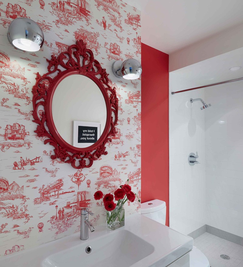
What I love about this powder room isn’t just its red colors and accents but the choice of an intricate decorative mirror frame as well as the wallpaper print. I honestly forgot how we call that kind of wallpaper but whatever that is, it does look beautiful!
Aside from the busy area of the house around the kitchen, there is also a quite area on the other side. The two areas are separated by a closet and bathroom. On the second floor of the house are two bedrooms at the rear with a shared bathroom, and the Master Suite at the front. A custom steel and glass pocket door creates an opening between the Master Bedroom and Master Bathroom. When the door is completely open, it blurs the difference of the two spaces.
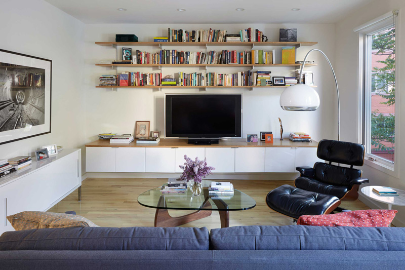
On the rear portion of the floor, you can find this separate, but singular space. It is dedicated to quieter, private activity which includes a work space and area for watching TV. You can notice that it used calm colors for this area to achieve its goal of serenity and privacy. Note the floating wall shelves again that is similar to the ones we saw at the dining area.
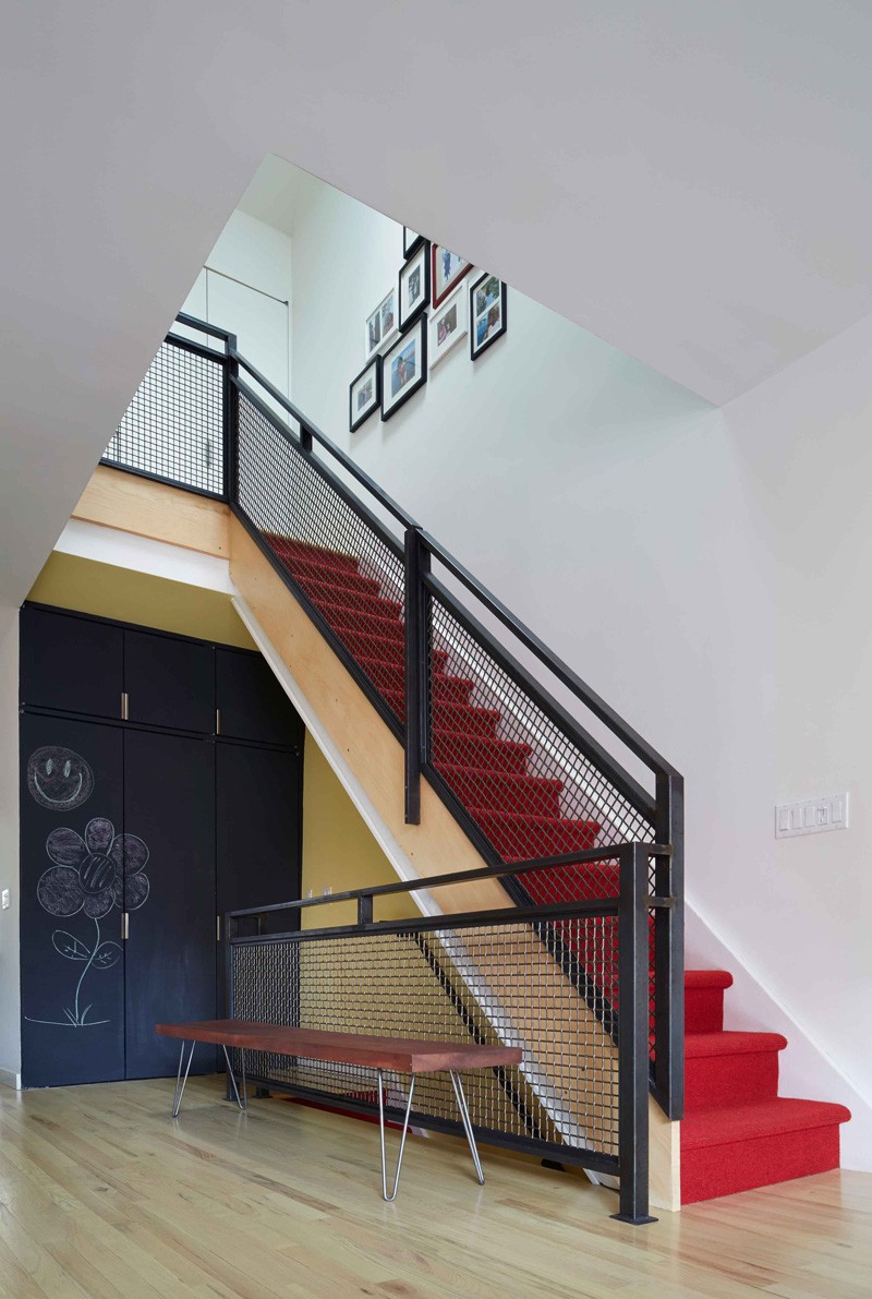
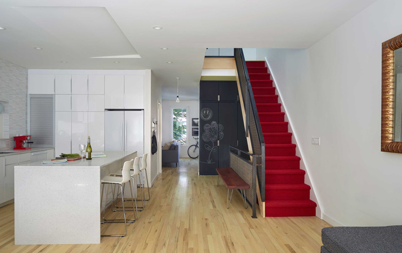
The staircase connects the different levels of the house with red carpet on the steps and metal railings. From the ground floor, it leads to the center of the main living floor of an owner’s duplex. Upon entry on the second level, one will see an open family space at the front with a kitchen, dining and small seating area.
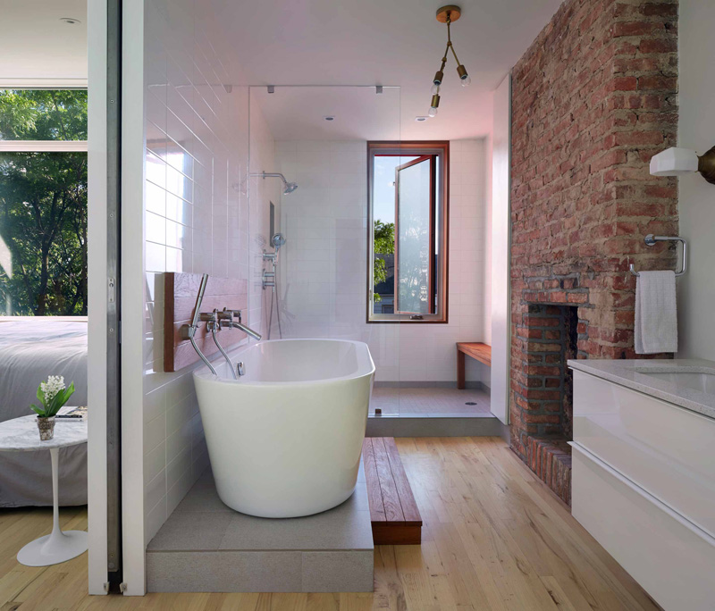
This is the master bathroom that we have been talking about. It is contained in a separate, private compartment which allows other functions of the bathroom to become more a part of the bedroom itself. Note here the use of wood for some parts of the bathroom which gives it a more interesting look.
So, what can you say? Well, this home had a limited budget but look at what Etelamaki Architecture did to it! If there was more budget, then this might look like a palace! Lol! But kidding aside, the designer really did an amazing job to this renovation. It was also able to successfully put together the history of the building as well as what the home owner wants despite the limited budget. I love how the interior turned out. I just wish I could take a glimpse of the bedroom because the photo wasn’t provided. But with the looks of the other areas of the house, it would surely be gorgeous too!