Duplex homes are two separate residences that are built beside each other with a design that makes them look like one. Or in some instances, each side has the same design. But others, who have acquired possession of one house in the duplex, would make amendments to its exterior design so it will look different and its look will suit to the owner’s design preference. This is what we are going to see today- a remodel of a home which was given a beautiful contemporary update.
Klopf Architecture worked with the home owners with the vision to create a brighter home with clean lines and visual surprises. The owners also aim to enhance the Eichler vernacular of the home and blur the boundaries between inside and outside while supporting “modern living.” The 1962 Eichler home was renovated into a contemporary residence while retaining its Eichler style to keep some historical elements in it. This three-storey courtyard home was updated with the collaboration of Klopf Architecture with San Francisco’s Diamond Heights to help them balance the both contemporary and Eichler designs that is used for the house. The result is a clean and minimalist aesthetic and a clutter-free interior with carefully placed art and whimsical collectibles. It has white walls, warm mahogany and rich grays throughout the area and it is also bathed in light making it appear elegant and welcoming.
Location: San Francisco
Designer: Klopf Architecture
Style: Contemporary
Number of Levels: Three storey
Unique feature: A house was remodeled into a contemporary residence and the result is totally stunning from its exterior to the interior.
Similar House: The Comforting Zones in the Plywood House II in Sydney, Australia
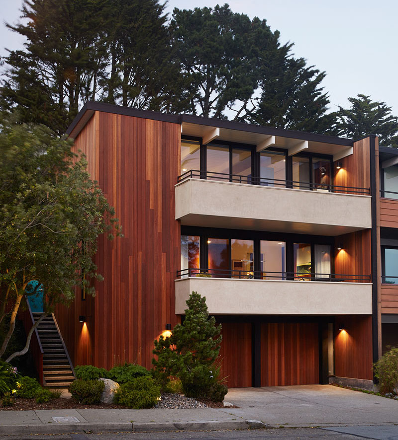
The Eichler home is an updated 1962 residence in San Francisco which is a result of an extensive remodel that is designed by Klopf Architecture. The house looks simple but very beautiful especially if you will see what it has in store inside it.
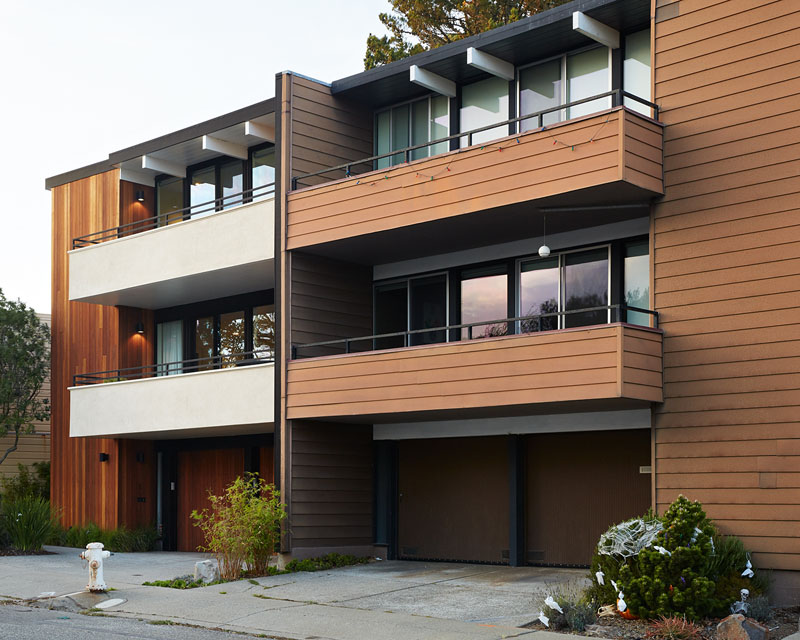
The design of the home is actually the same as that of the neighbors but since they updated their house, it looked different and more beautiful. You can compare how the house looks like from the neighbor’s home in this photo.
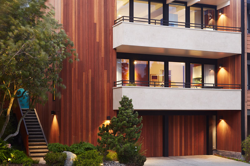
Taking a cue from the original design, the designers eliminated the wood siding on the balconies and restored them by using smooth white plaster. The exterior siding on the rest of the house was also replaced with vertical Kayu Batu wood.
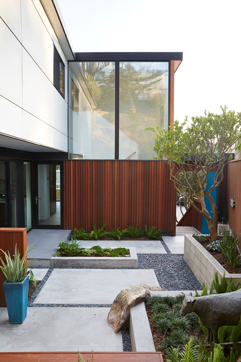
The house has a newly landscaped courtyard designed by Outer Space Landscape Architects. This area helps to create an open and spacious feeling. I like how this courtyard is designed with various plants grouped together, concrete pathways and gravel around the ground.
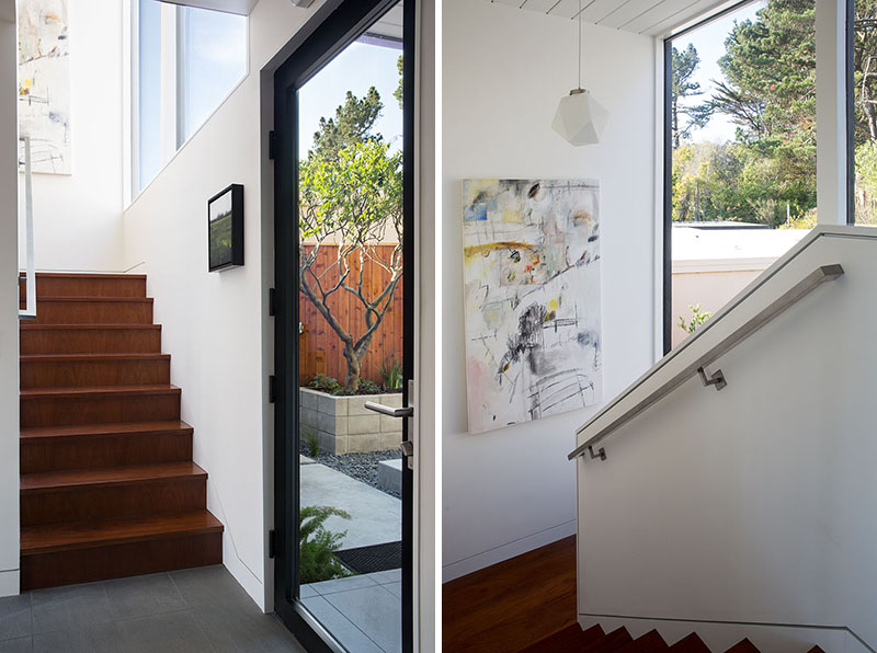
A wooden stairs lead up to the various levels of the home as seen in this image. It has large windows that allow plenty of natural light to fill the space. You can also see artworks on the wall near the staircase adding a creative vine to the home.
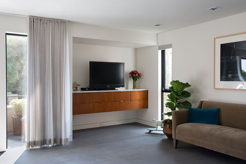
The living room is focused on the view of the house outdoors. It has a simple design with a floating cabinet that also carries the television set. From the area, one can go directly to the balcony.
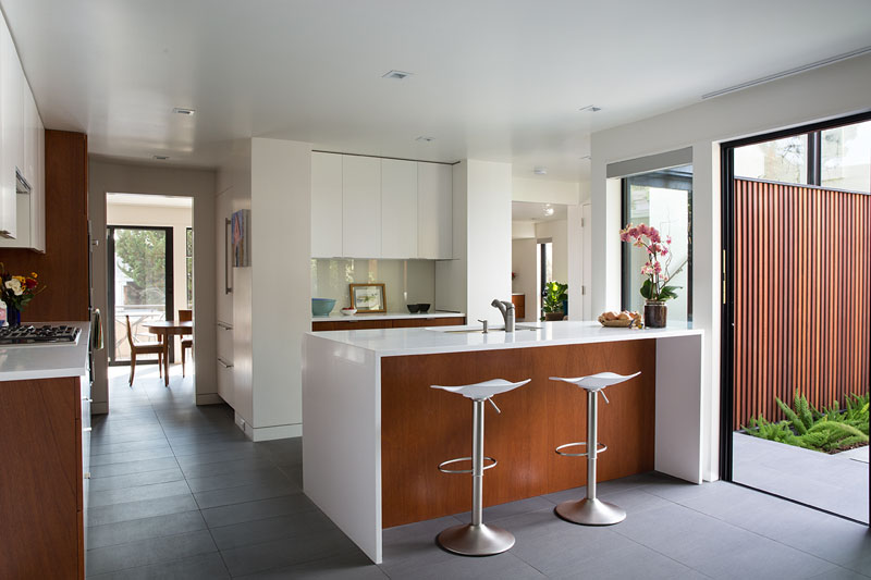
The architects worked with Benchmarc Woodworking to meticulously design and build custom cabinetry throughout the home’s interior. Seen here is a central island with a white countertop which provides plenty of space for entertaining. It also has counterweight stools on the island. From the kitchen, one can directly access the courtyard.
Read Also: Atrium House: A Home With a Palette of Wood, Steel and Stone
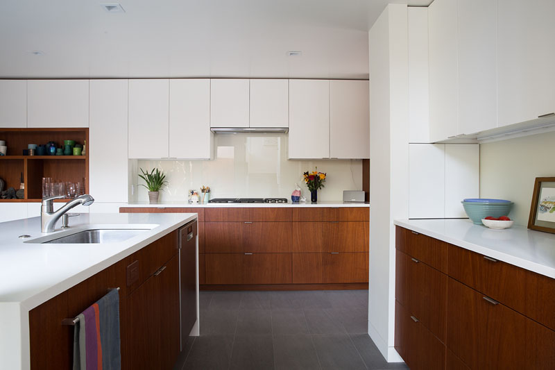
A wall of mahogany and white cabinetry extends from the kitchen through to the family room which unites the space. Apparently, this is a very neat kitchen complete with everything that one needs for cooking and preparing meals.
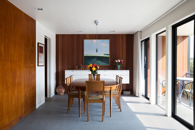
The dining and family room both used hanging cabinetry to match the wall of cabinetry in the kitchen. But what you can see here is the dining area that has a wooden dining set. Notice that the chair has nail head trims on it and there are white and wood features on the wall.
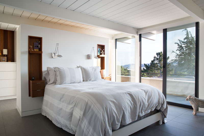
Two smaller bedrooms in the house were opened up and were turned into a spacious master suite. There’s an open closet and dressing area that is tucked away behind the bed. From the bedroom, one can access a balcony through a sliding door.
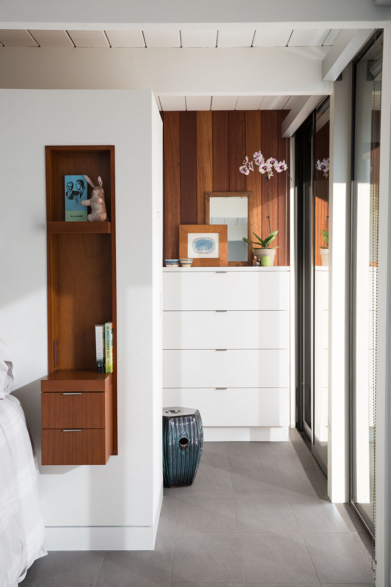
More custom cabinetry was included in the bedroom with built-in side tables. Isn’t it nice to have a side table like this one that is mounted on the wall while providing you drawers for storage?
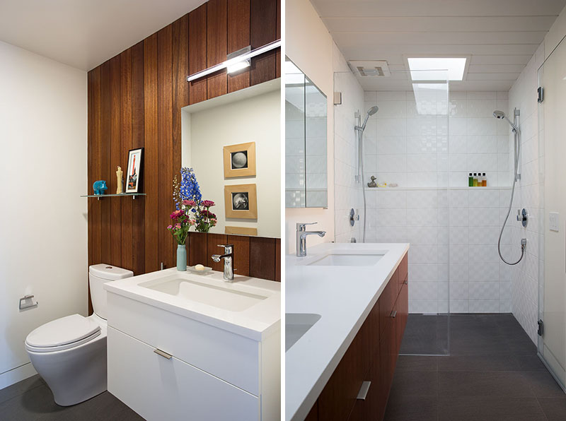
Here’s a look at the bathrooms of the house that were also remodeled. We are not sure about how it looked like before but apparently, they look really nice after the update adding wooden elements in it. On the right side, it has a wooden wall while the other side shows a vanity that used wood in it.
Beautiful, right? It sure is! I like how it changed the exterior to make it look even more up to date while retaining some Eichler features in it. You can also see that its interior was also well done combining white with wooden elements. Even its courtyard looked really very beautiful and inviting at the same time. I’d say that the Klopf Architecture did a great job in its design both from the interior and the exterior. How about you, what can you say about this home?