Of course, our homes are built not just to protect ourselves from the changing weather but also to have a certain place where you can bond and interact with the family. Some homes are very spacious that sometimes, they won’t even meet in the hallway especially if there are so many possible ways to access the house. But this house that we will feature today encourages family interaction and has an interesting contemporary design that you will surely find beautiful.
Casa 31_4 Room House has a complex design in its exterior which is a result of the collaboration between Iredale Pedersen Hook Architects and Caroline Di Costa. According to the description provided by the architects, “all spaces contain elements of the past, often manifested as objects of intrigue: the sloping floor, the barge scrolls on the front fence, the roof tiles, the chimney as water collector and the up-cycling of former building elements such as decks, gates, architraves and furniture. The front deck engaging with the street reintroduces the role and value of the front garden as meeting place, a lost tradition in a modern society where privacy and security are key factors to consider when building a home.” While its exterior looks totally modern because of its sleek white look, its interior used wood for its living areas and it has a unique ceiling design in different areas of the house. Come take a look at the house below.
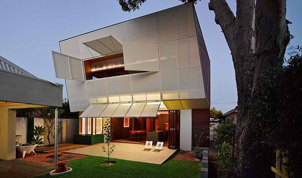
The house has a beautiful architecture. It seems to be wrapped with white screen for the upper level.
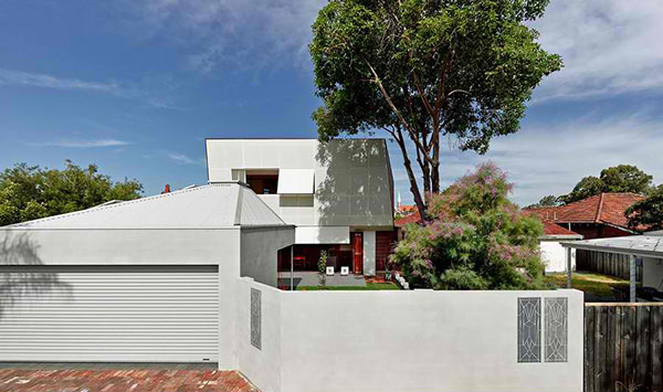
A detached garage is featured in this house which has a unique angle for its roof. It is also fenced to keep the privacy of the home.
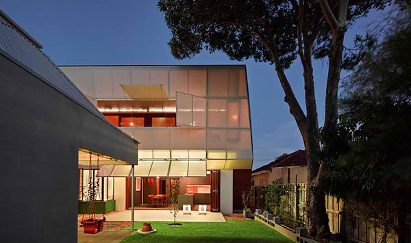
When lighted, it looks more beautiful especially that light pricks into its white covering. We did not get information about that white thingy but it sure looks gorgeous!
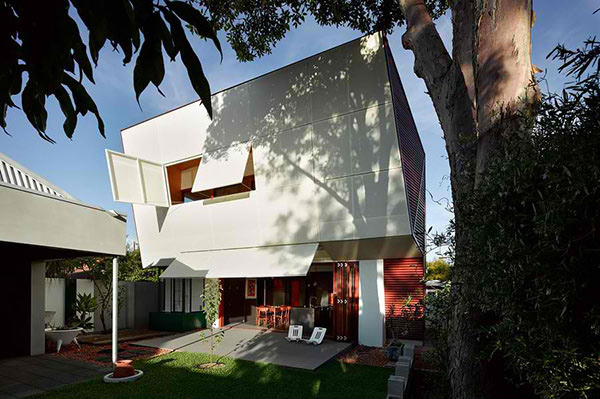
This contemporary residence bursts with personality which is very hard to duplicate if other homes try to imitate the design of this house.
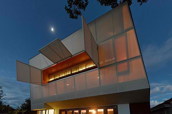
This is how the upper area looks like during the night when the lights are on.
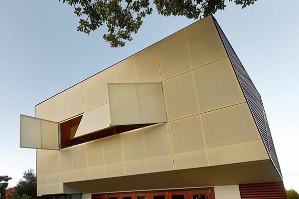
And this is how it looks like during the day.
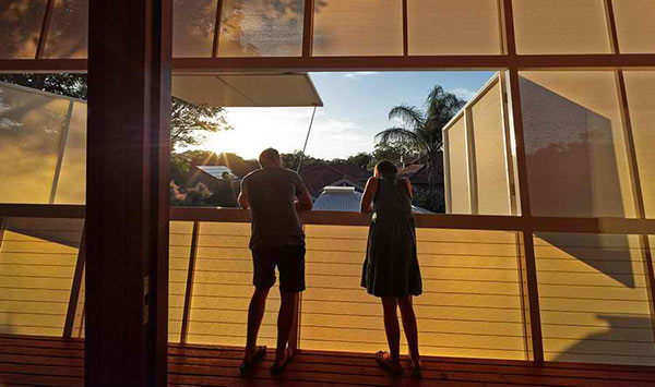
And this is the interior part. It really looks like a white fabric installed on a frame! But of course it isn’t a fabric.
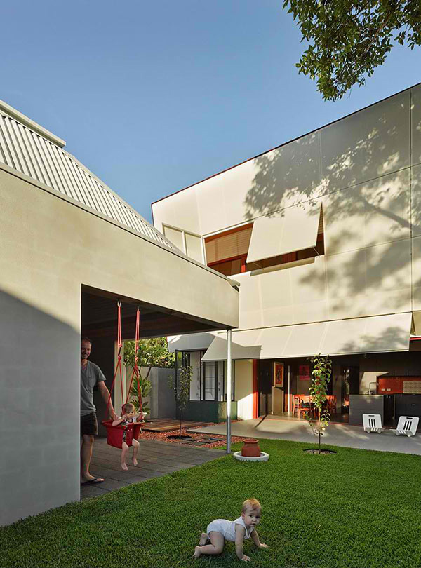
The house constantly inspires family interaction just like how the kids and their dad are spending time together in their yard.
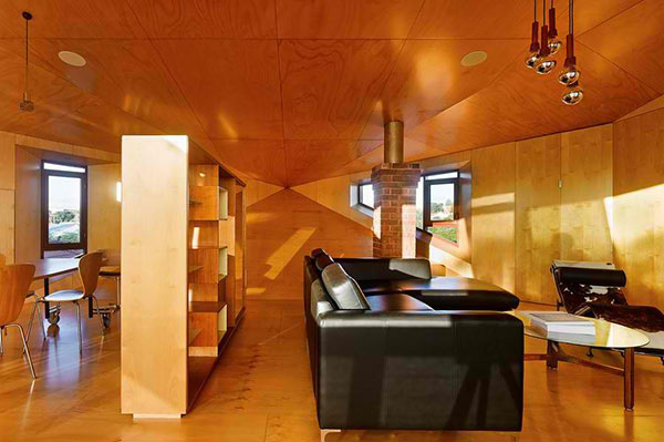
Notice the unique design of the ceiling which is like a single point perspective.
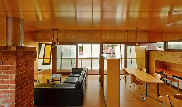
Wood is the primary materials used in the interior. Seen here is the living room and dining room.
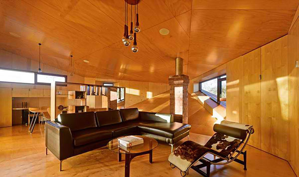
Look at the shape of the window. It follows the direction of the line as it ends on a point in one wall.
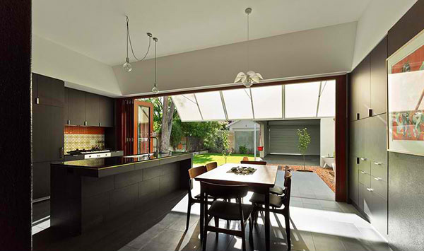
On the lower level of the house are a dining area and a kitchen. While the upper floor used wood, this one used concrete and utilized gray and white colors.
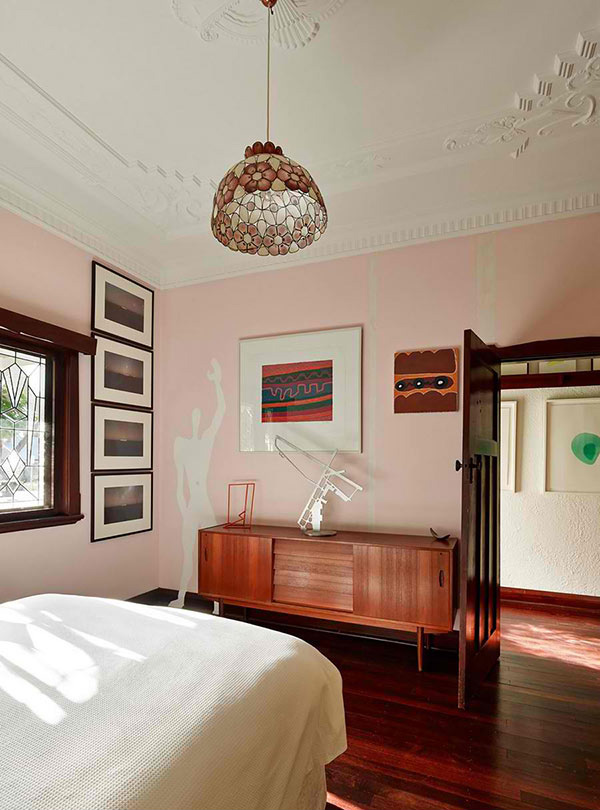
The decorations of the bedroom are simple yet artistic. Look at the four framed picture on one side that features different positions of the sun.
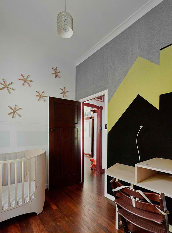
The nursery has a modern style playing with lines and colors.
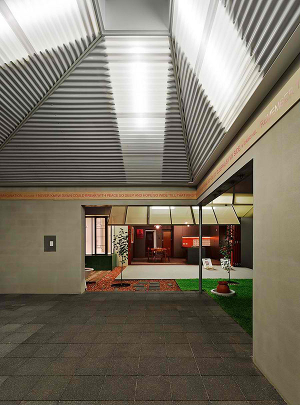
The ceiling of the garage is styled like this. The roof beam is also lined with some words as decor too.
Designers Iredale Pedersen Hook Architects and Caroline Di Costa did a great job for this project. As a matter of fact, the owner is happy about it. The design of the house enables their children and the couple to grow and evolve in a sequence of spaces that encourage engagement with each other and the dwelling. It offers new ways of understanding and exploring family relationships and an understanding of space. The owner further said that: “Our house is simultaneous a memorial, playground, place of celebration, stage set, place of community interaction and most importantly, a home.”