Simplicity is beauty. This is indeed true even for home design because there are homes that have simple designs but still turn out very captivating for both the interior and architecture. A design and style doesn’t need to be complicated with too many details in order to look beautiful because even when it’s minimal, it can still stand out. This is what we can see in our featured house for today. We have actually seen homes similar to this one already. But this has a different design which is simple and modern and sets it apart from many other homes around the world.
The house is designed by Studio Build dubbed as the 1653 Residence. It is made for a family in the Upper Westside of Kansas City, Missouri with 2,600 square feet. This simple modern home has 3 bedrooms & 2.5 baths with a compact but open floor plan. Unlike other homes, it has one volume and appears like it is connected with the roof. At first glance, it does look like a cardboard house because we can easily achieve this appearance using boxes. But this is a real home and it is a dwelling for a family. It does look very interesting despite its simple design. It is something that will turn heads whenever they pass by the house. From the third floor of the house, where the living space is located, the skyline of downtown Kansas City will be seen. Inside the home, it is filled with custom built-in casework that were also designed and fabricated by Studio Build. Let us take a look at the house below.
Location: Kansas City, Missouri
Designer: Studio Build
Style: Modern
Number of Levels: Three-storey
Unique feature: The house has a simple modern design that is aesthetically beautiful and unique.
Similar House: L250: Simple Yet Extraordinary Private House With Office
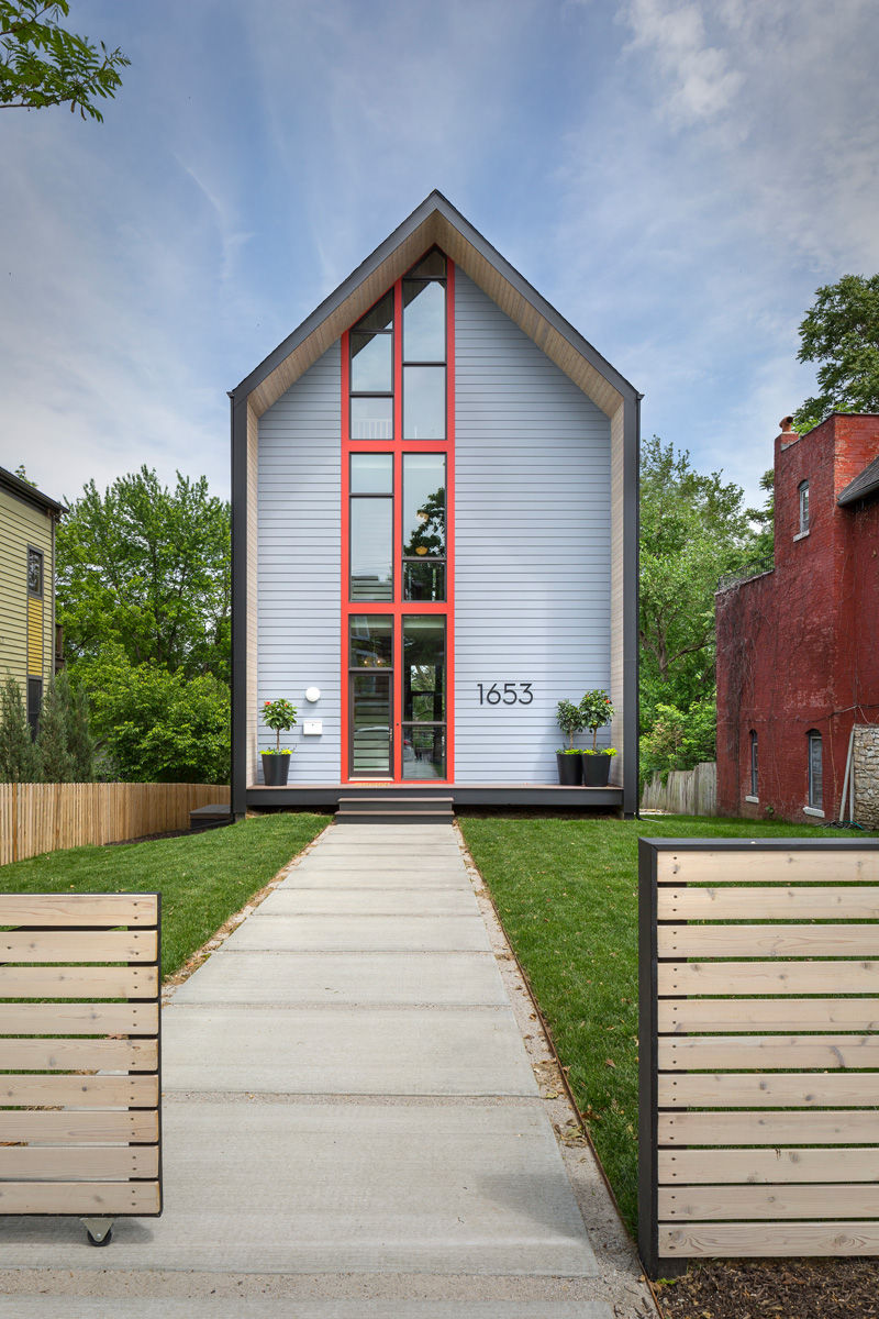
This is the facade of the house. With the looks of it, I am sure you will agree with me that it does look like a mere cardboard that was made into a home. I like the design of the windows though where we can see the different levels of the house.
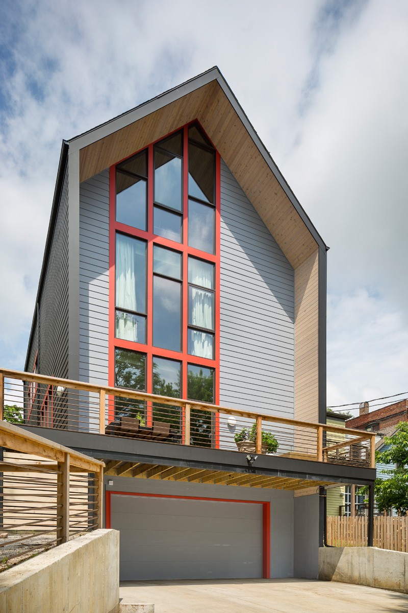
On the rear part, the garage and a terrace is located but the same design is seen like what was used in the facade. It sure is simple indeed with wooden sidings. The red lining around the frames of the windows is a good idea to bring color to the exterior of the house.
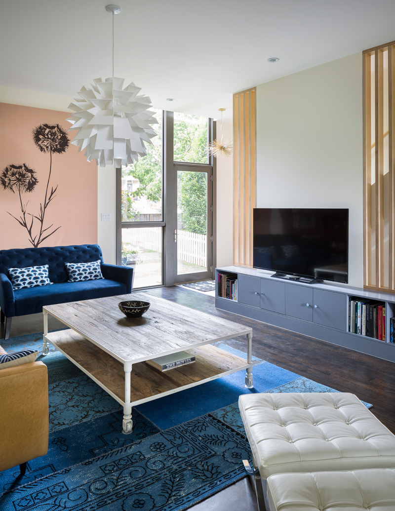
The living room has a simple design too with blue sofa and area rug. There is a black flower wall decal too that adds some beauty to the area. And there is a storage space which also carries the television. I like the design of the area rug which is patch inspired.
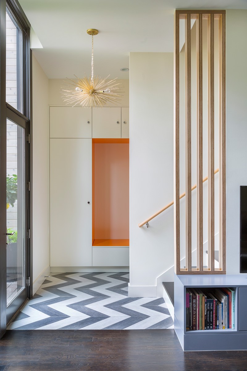
The entrance of the house immediately leads to a staircase. The flooring has a chevron design that adds appeal to the foyer.
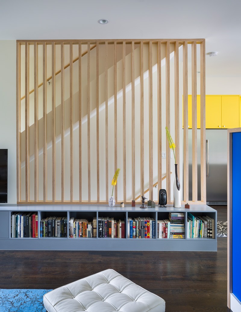
The staircase has wooden vertical design that isn’t just beautiful but also provides safety to the open staircase. A bookshelf lines the flooring just next to the staircase.
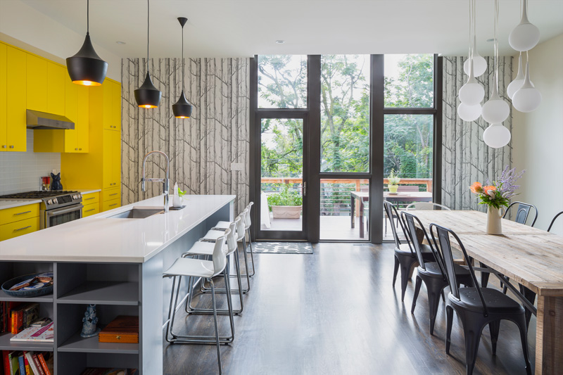
If there is one spot that will make you love this house more, it is the kitchen and dining area located at the second floor. It has a tree branch design for the wallpaper, yellow cabinets for the kitchen and some beautiful black pendant lights.
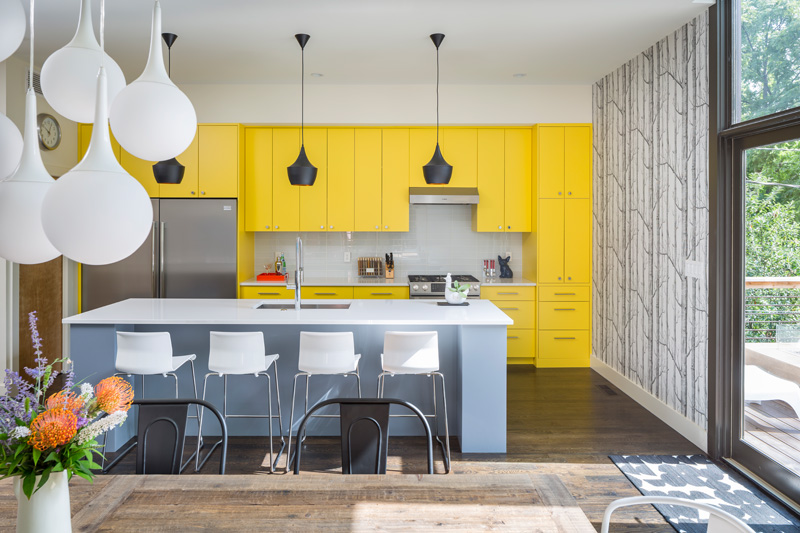
This area leads to the terrace where the family members can also dine too or merely enjoy the beauty of nature. I like the contrast of colors here as well as the yellow paint used for the cabinets. The entire space looks lively and homey.
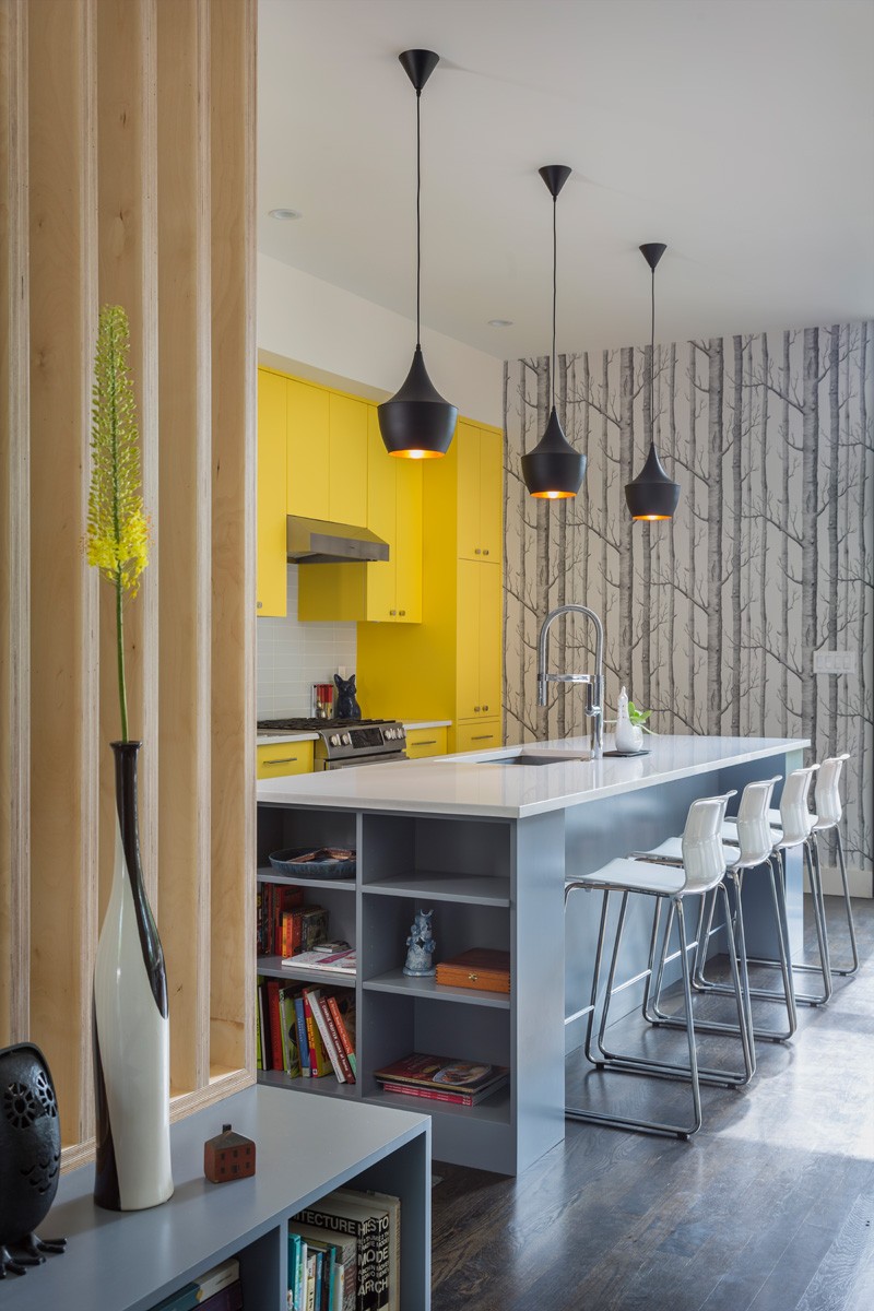
The kitchen island has a storage space on one side. We can see that books and other displays were added here. The island has a white and gray color combination where white high-counter chairs are used.
Read Also: A Simple Yet Elegant Single Family House in Cambeses
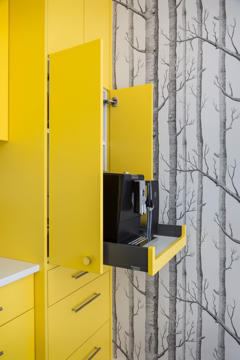
The kitchen’s cabinet stores kitchen items, equipment and appliances. This way, everything is kept in order and organized. Notice in the photo that one pull of the drawer will bring out a kitchen appliance.
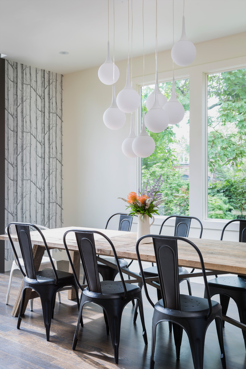
This is the dining area with gorgeous orb lightings above the wooden table. It is a nice idea to surround it with black chairs. On the table is a centerpiece with flowers.
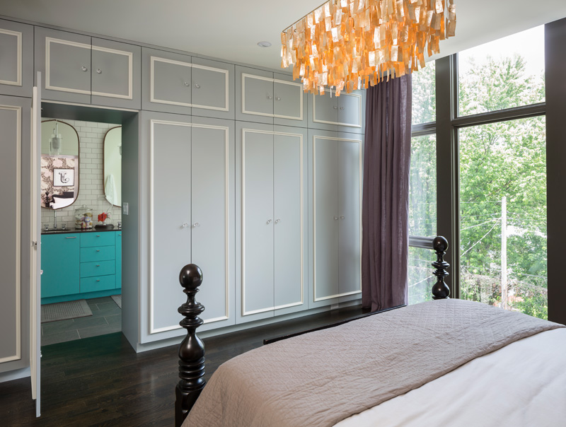
The master’s bedroom is spacious and has an ensuite. You can see that it has wardrobe cabinets on the wall which separates the bathroom from the bedroom. Notice also that a view of the outdoor space is being provided through the windows.
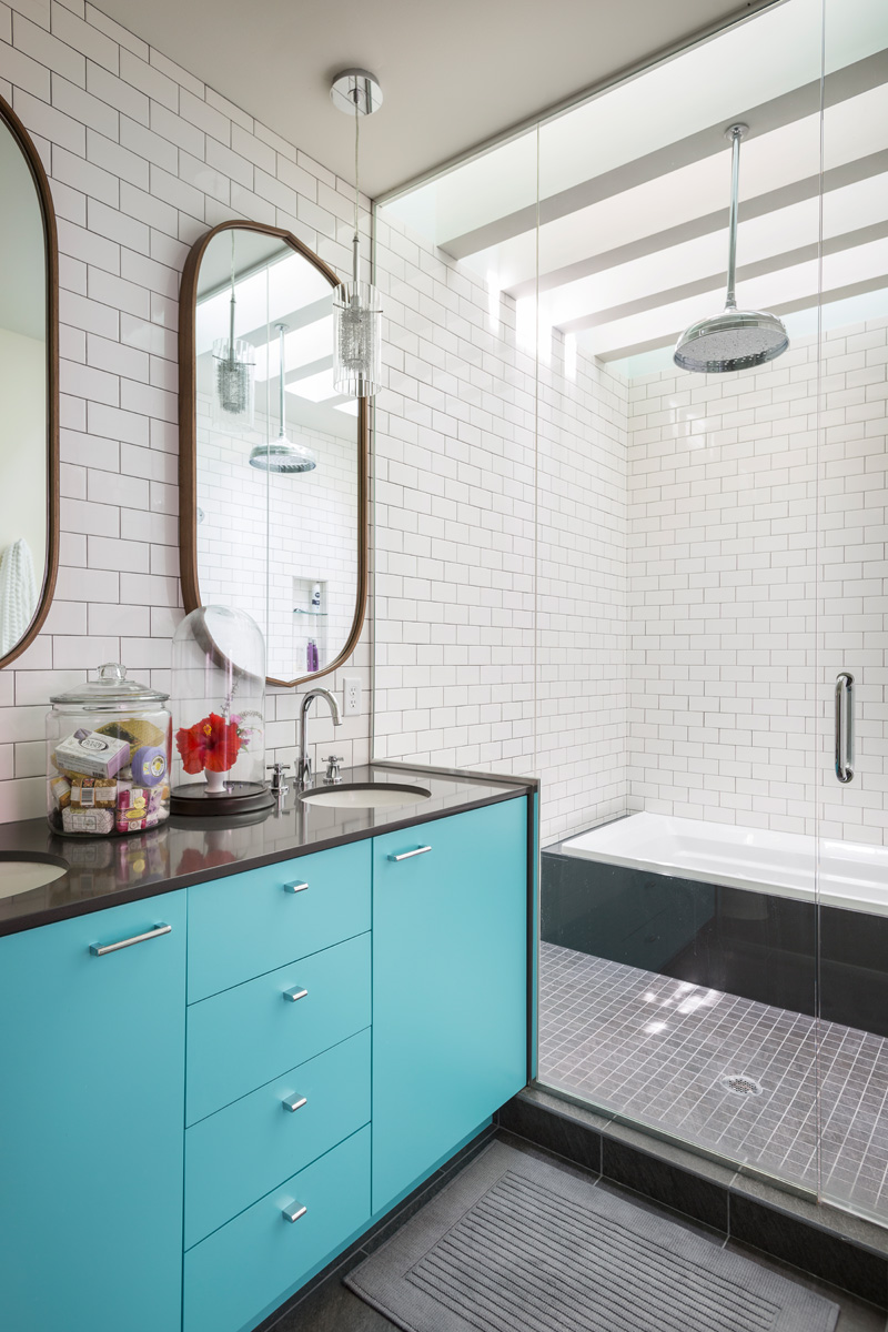
This is the bathroom ensuite with subway tiles on the walls. The vanity has a combination of green and gray colors and two oval mirrors are installed on the wall. There is also a glass enclosed bath area.
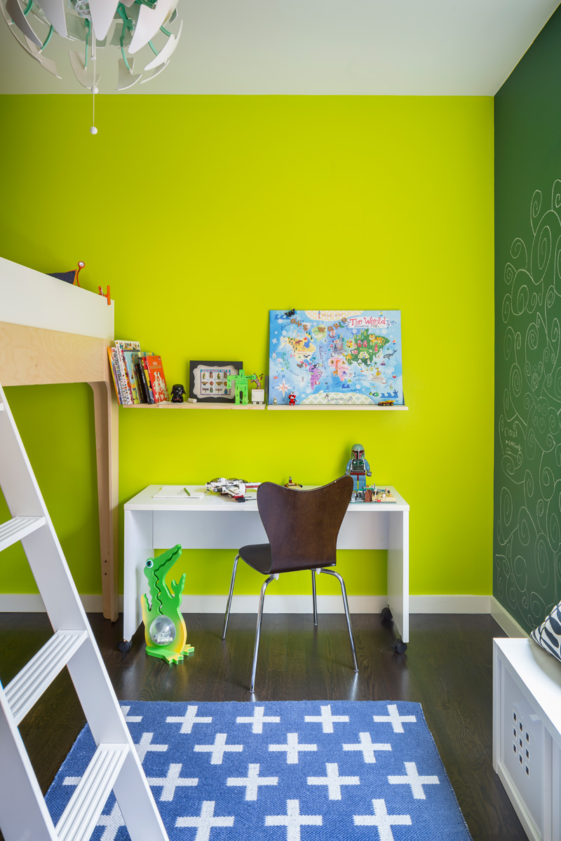
This is the kid’s bedroom with cute decors and items from the area rug to the decors on the floating shelf where books are also stored. The colors of the walls add more fun and exciting feel to the space.
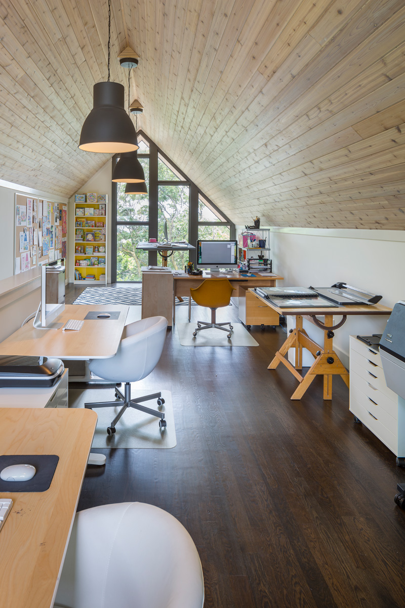
On the third floor of the house, it is where the office and working area is located. I can tell that it is also the play area and reading area of the children too. That is a good idea so that you can still watch over the kids while you work.
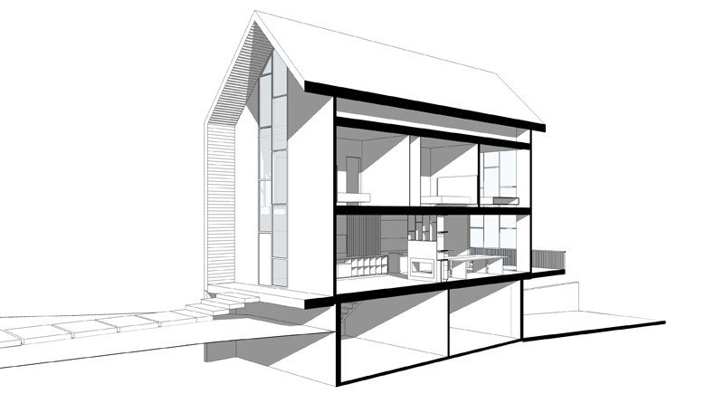
This is a 3D cross-section of the house where we can see the different areas of the house as illustrated. It sure is a simple house design but it has everything that the family needs!
Isn’t this a unique modern home? This beautiful home is designed by Studio Build. The house has a minimal architectural design while in the interior, it has a modern look with lovely pops of colors in each spaces. You can notice that there are some natural elements in the house too which made it look even more attractive and cozy. Apart from the lower levels, I like the uppermost floor where the working area is located. If this is my home, I would be spending most of my time on this area. The house manifests that you really don’t need to add too much decors in the house or make the design complicated in order for it to work. This one is functional and provided the family everything they need despite being simple. But you can see that it suits a modern lifestyle. Agree? Well, this house is looking really nice indeed! What can you say about this home?