While most of us look for homes depending on the design, location and accessibility, there are other people who consider the location first. And we say location, it refers to a particular neighborhood and street. This is actually how Houston engineers Brie and Scott Kelman looked for their home. They waited for so many years just to get their own place on that particular street. Well, I don’t know why they really like to live there but they already did got a house in that street after buying one dilapidated home.
Since the couple had been eyeing that area, they did not have second thoughts of buying a home on the said street even if they were not able to personally see it or set foot on it. While on vacation, they put in the contract because of that willingness to live in the area but they were up for a surprise.
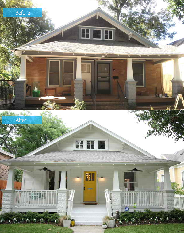
The home was built in 1920 as a three-bedroom, two-bathroom single-family residence. It was converted into a duplex then back as a single-family home but the two doors from its duplex are still retained. Wood veneer on the asphalt roofing shingles was crumbling off. The exterior was updated. One obvious change done to the home is the door retaining only one for the entry.
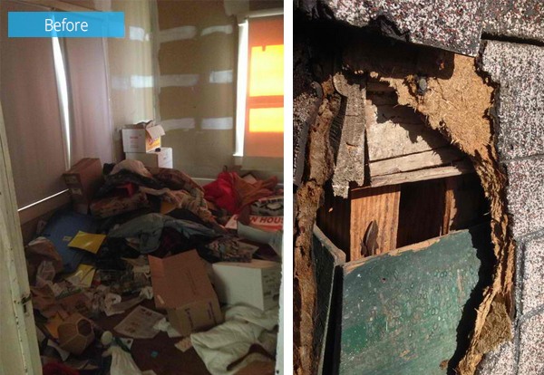
When the couple first entered the house, it had damaged floors and walls. Knee-high garbage also welcomed them. Obviously there was so much work to do.
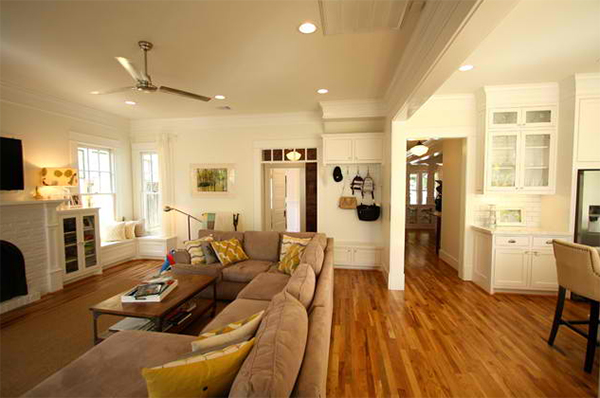
The living room and kitchen are open to each other. There is also mud room in the same area.
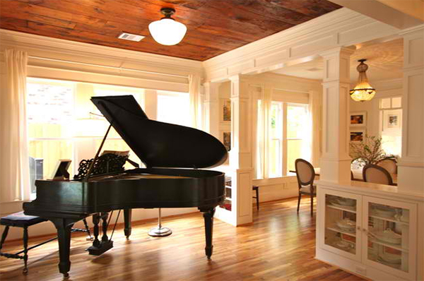
The interior of the house was completely changed. The owner wanted to highlight this piano which means so much to her since it belongs to her grandmother.
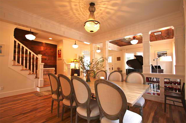
The dining area as well as other areas of the house used beautiful decorative ceiling lights for ambient lighting.
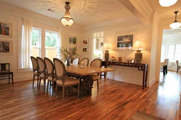
An antique industrial crank base was used for this 10 seater dining table.
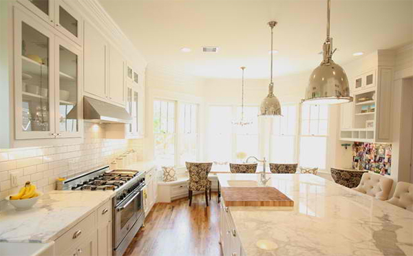
The kitchen features a bay window breakfast nook inspired by one photo the owner saw.
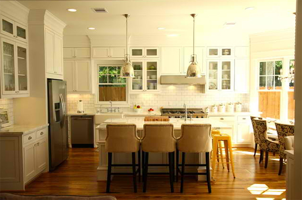
White is also used in the kitchen with a traditional design. Subway tiles are used for the backsplash for a timeless feel.
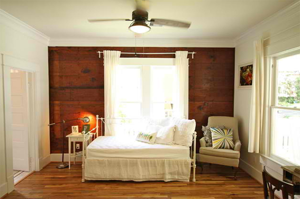
This is the guest bedroom where Brie did the curtains instead of buying expensive ones. Note the vintage feel of this area.
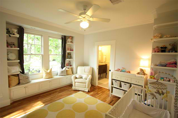
With a baby coming, the needed a nursery. They painted it light gray with some touch of yellow for some decors.
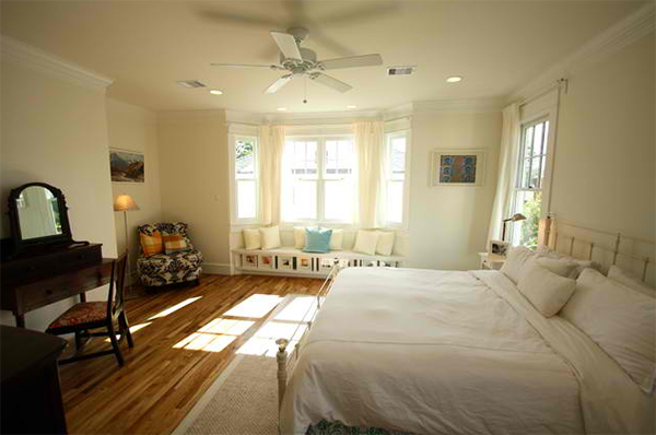
The master bedroom has its own reading nook and is also white in color.
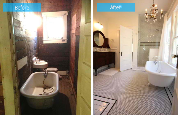
Look at the difference of the old bathroom and the new one. What a huge change indeed!
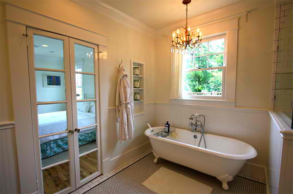
The bathroom has an enclosed shower as well as a bath tub.
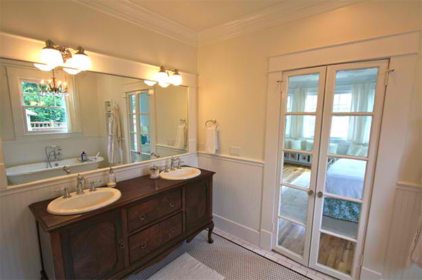
An antique dresser was converted into a vanity used in the bathroom.
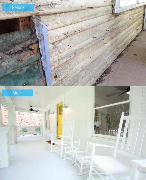
Seen here is how the exterior of the house was renovated. Now, it has an all-white color which was a good choice!
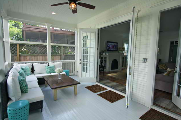
From the great room, one can get into a screened-in porch in the backyard. I love the colors in here!
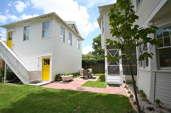
What you see here is a garage with an apartment above it. Notice the neat yard around the house too.

You can see this old claw bath tub in the previous photo. It is used as a planter but is also turned into a large ice box during outdoor parties.
No wonder why this transformation was dubbed shocker to stunner because it really showed huge difference! Who would think that this house is actually dilapidated before the renovation? Aside from the successful house remodel, what I like about this is the story behind it.