If you think it is hard to get a lovely design and updated look for your house, it’s actually not that hard because as long as you get the right people to work for you. Also, you also need to have the budget of course. For some homeowners, they are just happy with how their homes look like but for some, they want to get a new look to update the appearance for their home. Why? Because a house has a huge impact to those living in it. If one doesn’t feel cozy and comfy in his or her home anymore, they would decided to get a redesign which is of course okay as long as you they have the budget. Oftentimes, the result of a redesign is amazing. But for those who start their house from scratch, then it is better because they can just plan on how the home will look like from the exterior to the interior so that it will go with the trend.
This mid-block contemporary home in Vancouver is designed for a young family of four. It is a 3,000-square-foot house in Vancouver’s Mount Pleasant neighborhood which offers a contemporary take on single-family residential living. Since it is a mid-block home, you can easily see the difference of said home to the other houses beside it on both sides. You can see that the house is indeed more updated and it looks even more beautiful both inside and out. It uses black colors in the exterior which makes it stand out even more. It is surrounded with trees and a beautiful garden around it. Let us take a look at the house below.
Location: Vancouver
Designer: Scott Posno Design
Style: Contemporary
Number of Levels: Two-storey
Unique feature: A beautiful contemporary house with a black facade and a simple geometric design.
Similar House: Main Stay: A Contemporary House Designed for Inside and Outside Living
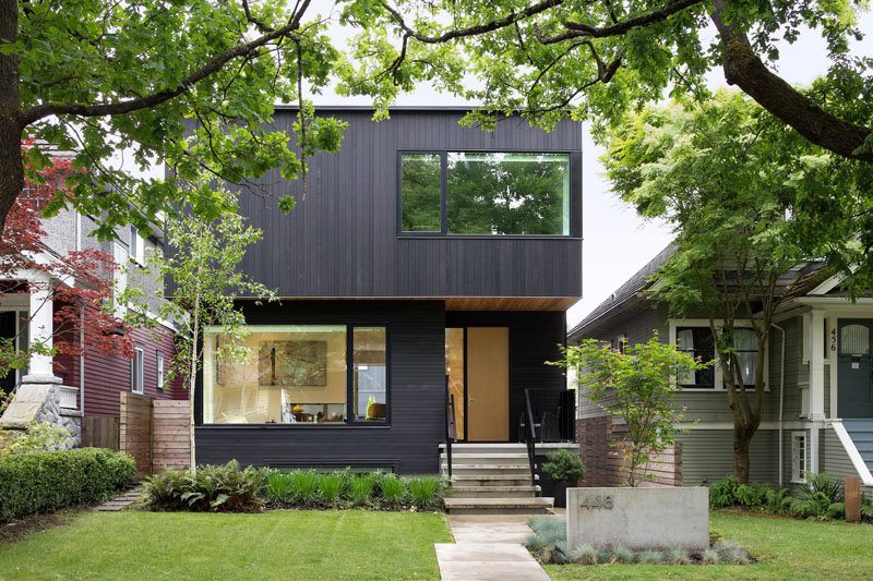
This is the facade of the house with many beautiful elements in it. At first glance, what I like in here is the black color of the house that has many glass windows around it. I also like how the house number is added in the area as well as the wooden fencing on some parts of it. Simple, right? But it sure is very nice!
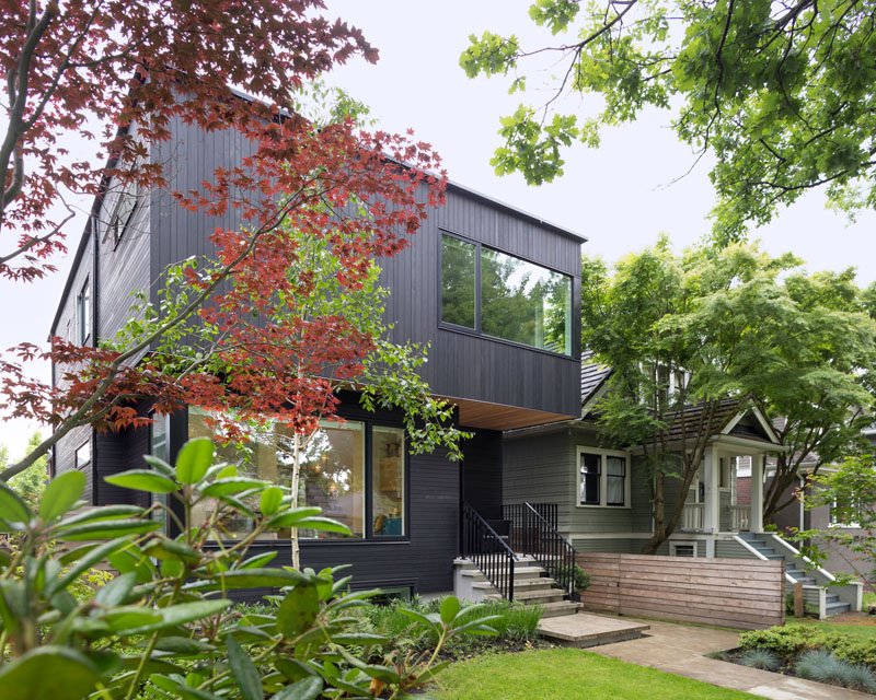
A family of four lives in this simple contemporary house. You can see that it is elevated from the ground and it appears like it has its own basement. It is cool to have a basement, right? You can also see here the house beside it which doesn’t look ugly but it does look a big old compared to the new design of this house.
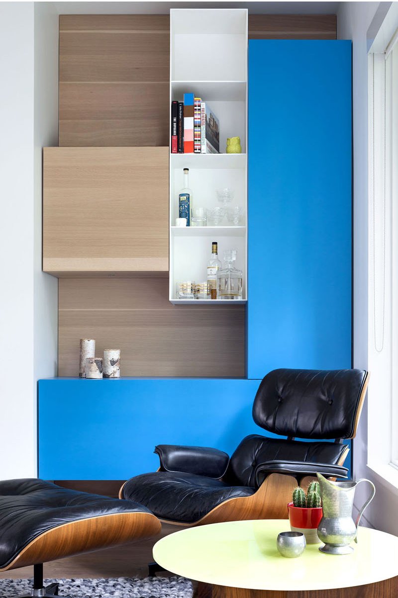
From the street, the house may appear dark because of its color but it is surprisingly bright and open on the inside. The interior is like the exact contrast of the exterior. What you can see here is a comfy looking chair with an ottoman. On the wall is a wooden shelf that has blue colors in it.
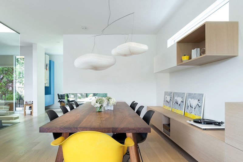
In the dining room, there are white walls combined with wood cabinetry. What are nice in here are the yellow accents that add some cheery touches to the room. Notice the yellow chairs, yellow decors and other yellow items. It is nice that the yellow chair is paired with the black chairs that sit around a long wooden dining table.
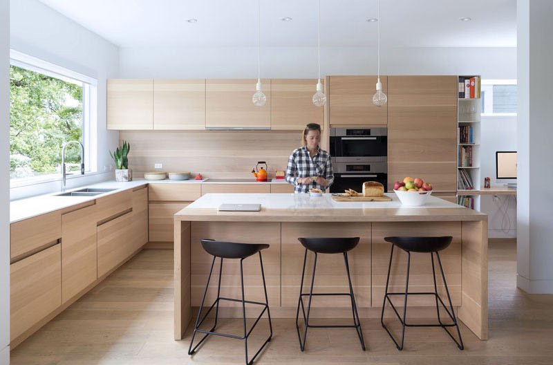
In the kitchen, there is a large window that provides plenty of natural light to the mostly wooden kitchen. It also has counter height chairs in black color that is added on the kitchen island.
Read Also: Pleated House: A Contemporary House with a Green Roof in Wisconsin
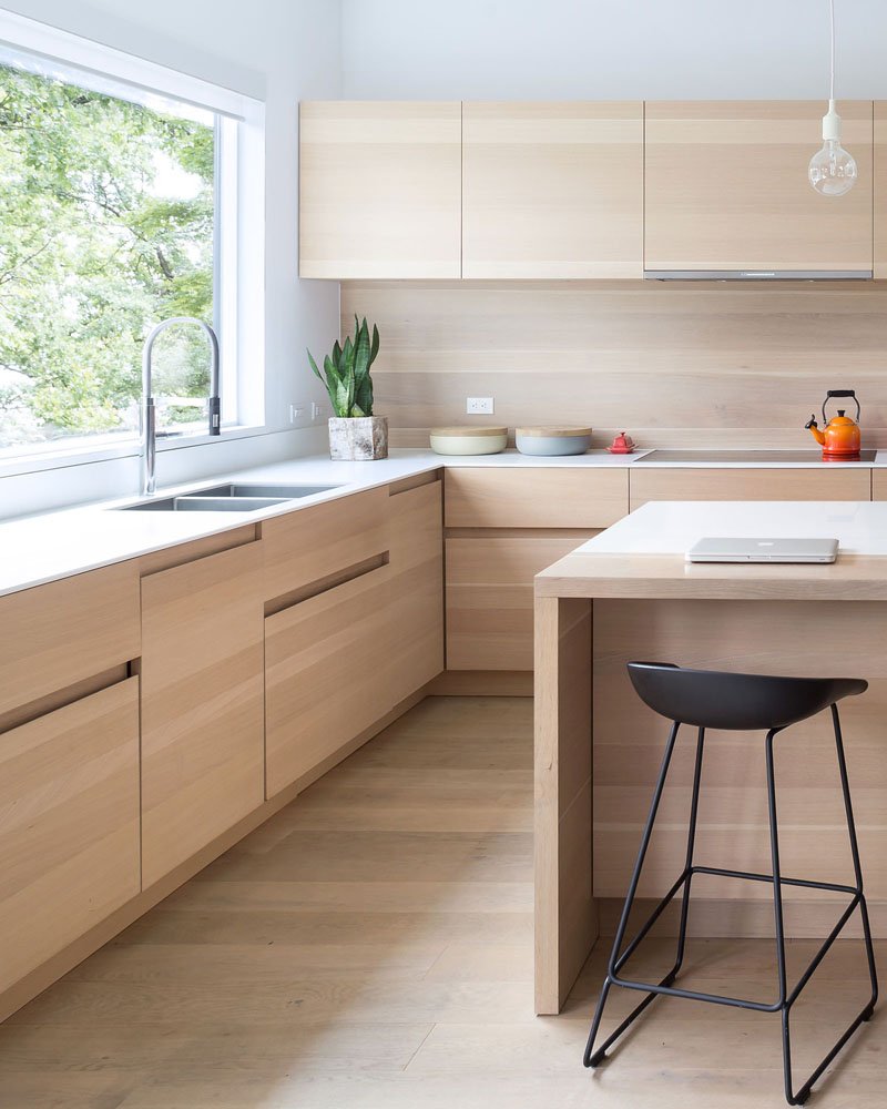
You can take a closer look at the cabinets of the kitchen here. Since the drawers and cabinets doesn’t have handles, this kind of design is a nice way to allow the users to open it.
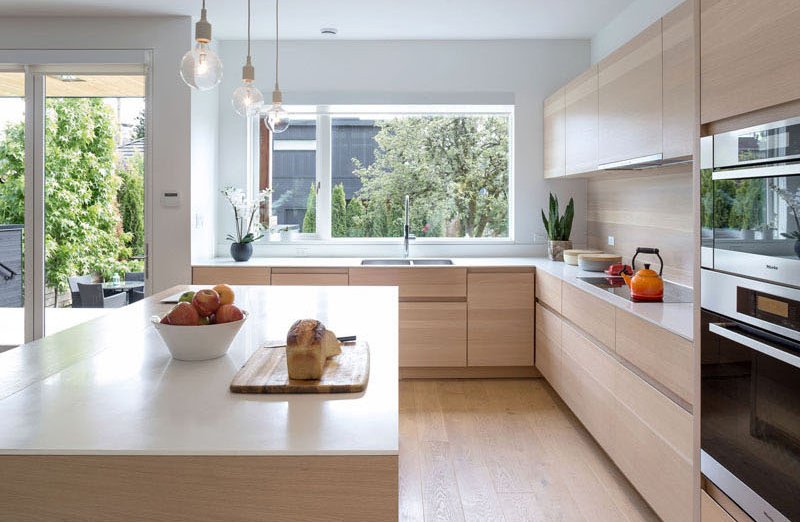
The kitchen has modern equipment and appliances in it. From the area, the outdoor space can be accessed where you can see a black outdoor dining set. This means that if you are spending time with the family and friends outside, you can easily slip into the kitchen to prepare food or get some drinks.
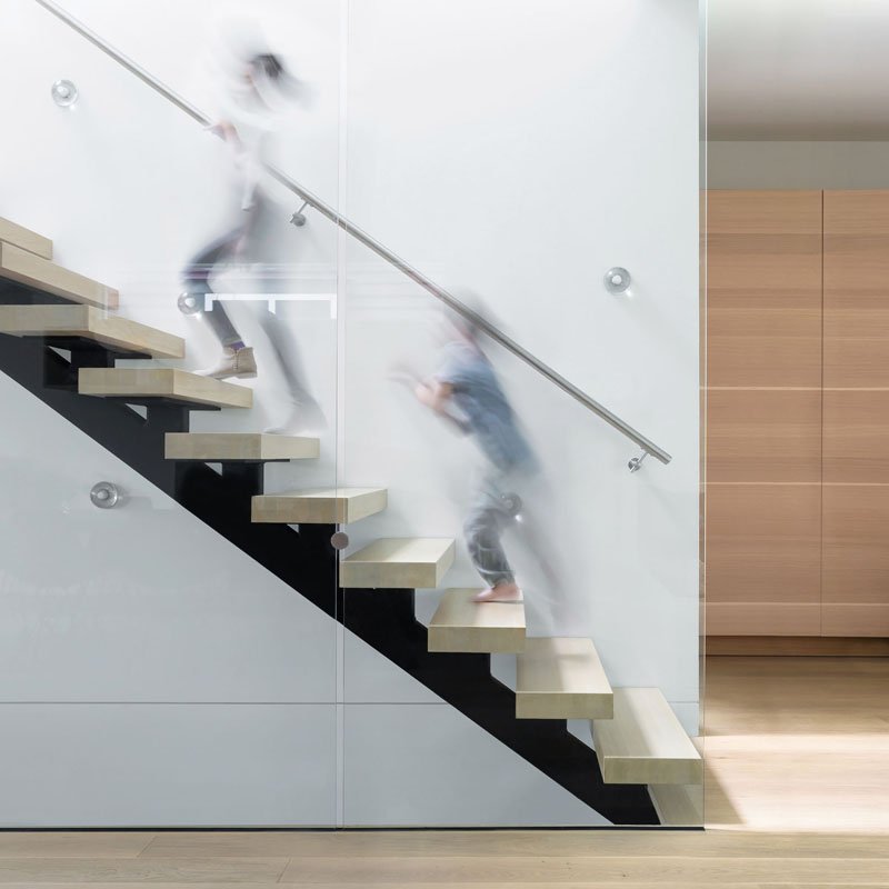
The staircase of this house is really beautiful. It makes use of a transparent glass wall and open risers. With this design, the light from the skylight above would flow through the space. Isn’t this a beautiful staircase design?
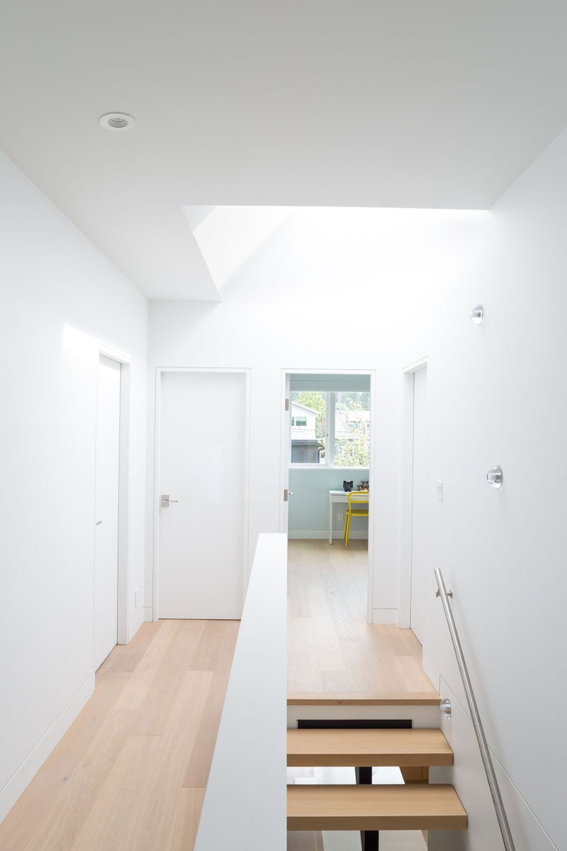
White oak flooring has been used throughout the home from the lower level to the upper level of the house. This is the hallway of the upper area where white walls and ceilings are used.
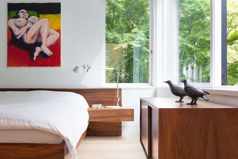
Seen here is one of the bedrooms which have windows that provide a view of the trees and street from the second floor. The bed has a wooden headboard that is simple yet very nice as it also extends to a side table where a reading lamp is placed.
I so like the simplicity in the homes design. This shows us that we don’t have to add a lot of items in the house in order for it to look beautiful. I also like the combination of white and wood in the interior as well as the pops of colors in it. It is a good idea to use colors in that manner without overdoing it. This house is a project by Scott Posno Design who created a beautiful modern contemporary home for a small family. Indeed, this is an ideal house to live in. Not so big but it has everything one needs in order to live comfortably! How about you, can you tell me what you like about this house?