Flack Studio was asked to work on a remodel of an interior just after they launched the studio. Melbourne designer David Flack and his sister who handles operations worked hand in hand to juggle 12 residential and retail projects during that time when they had this Melbourne remodel project. The suave remodel included two phases. Phase One (living area, bedrooms, and baths) newly complete just in time for the arrival of the owners’ first child. Phase Two (kitchen and family room overhaul) on the docket.
The home is owned by a young couple, who work in finance and law and “happened to have exceptional taste” as Flack said, purchased a Victorian terrace house that had been stripped of all its details sometime in the nineties. “I would never have denuded such an ornate terrace but instead of reinstating these features, I introduced contemporary materials palette—gray with flashes of black and brass. The look is simple, cohesive, and masculine: It’s subtle yet has toughness to it,” Flack said.
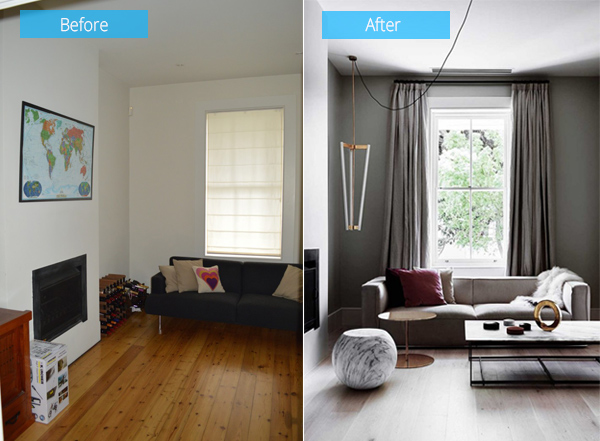
The new scheme used subtle soft taupe and white that are complemented by natural, textural materials like the gray-blond European oak floor—and punctuated with flashes of brass and black steel.
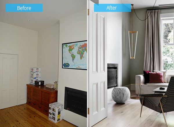
This striped re-edition of a 1934 Gio Ponti design for Rubelli is a favorite chair of the designer that is “classic and masculine with brass legs that echo the lines of the pendant light.”
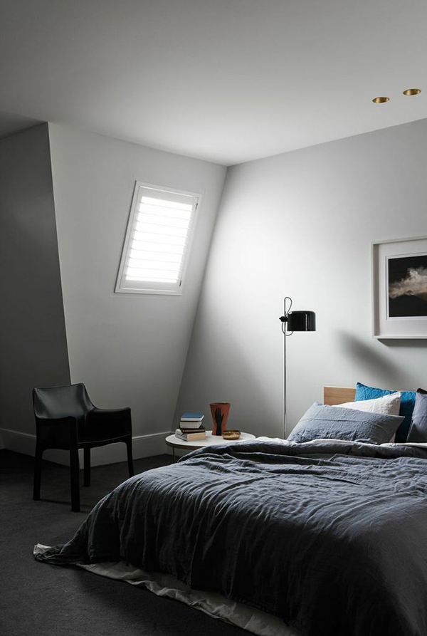
The master bedroom came has gray carpet and angular walls, and used the same taupe color as the living room and dining room.
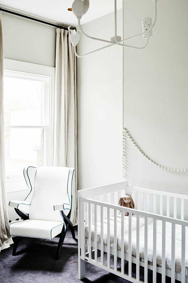
Weeks after Phase One, the owners’ child was born. The nursery was painted in Resene’s “half-strength Linen” and has a Fiorenza Armchair by Franco Albini from Poliform. The ceiling light is Anna Charlesworth’s Four Shapes Pendant.
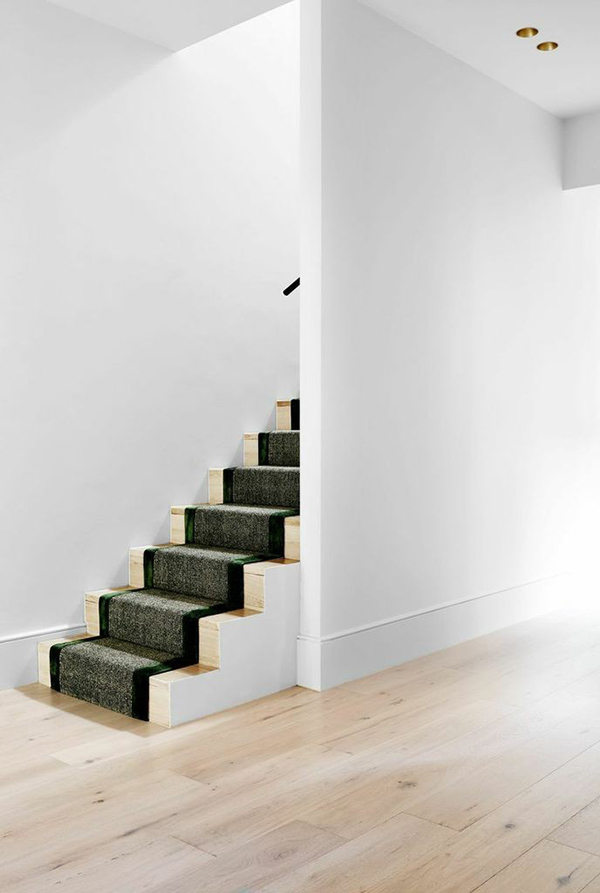
The staircase is custom stained to match the floorboards and carpeted with a bamboo-and-silk runner.
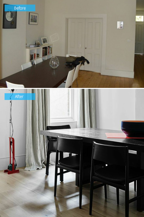
Before, the dining room had white walls and chairs. The table was not changed. Instead, the designer dressed up the dining room with linen curtains and Neve Chairs by Pierro Lissoni and Mario Bellini’s black leather Cab Chairs from Cassina as well as a standing light from Flos Toio.
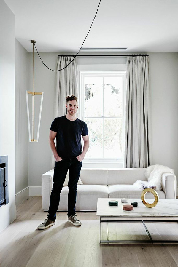
Designer David Flack is pleased with the outcome of the redesign and is ready to do more for other parts of the house.
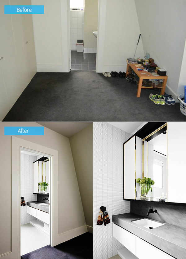
For the master bedroom and bath, the carpet was retained. For the master bedroom’s en suite bath, it only used a handful of materials throughout the house to make the rooms fit together as one.
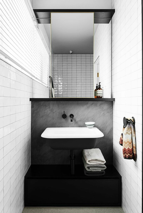
This is the guest bath, where a wall-mounted Agape Ottocento Washbasin is used against a backsplash of honed Bedonia limestone.
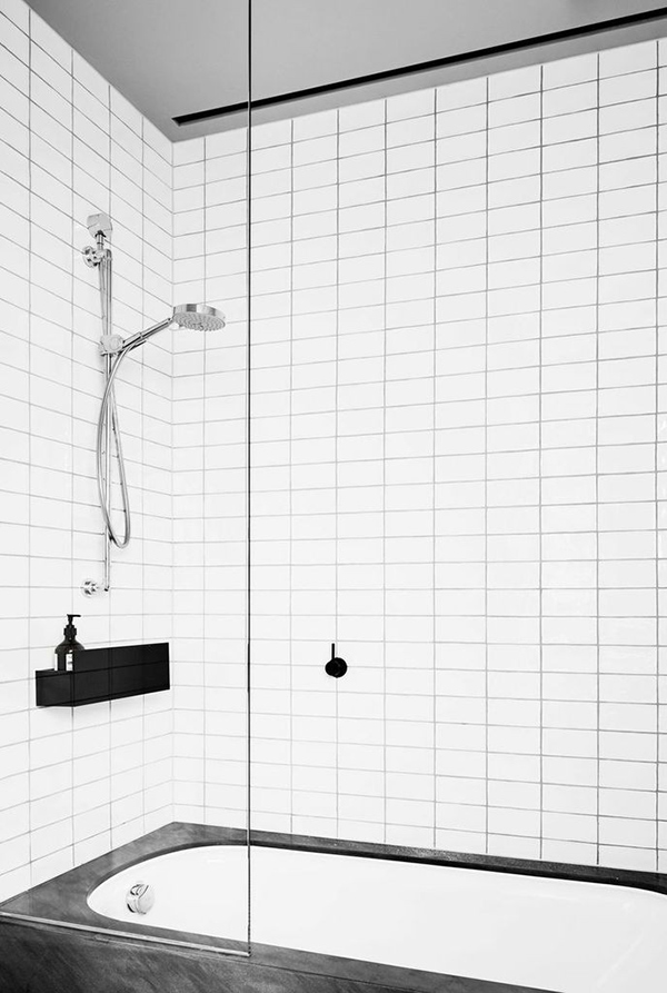
You’d love the contrast of the white subway tiles and dark gray grout. The anodized aluminum shower shelf is from Agape’s Sen Accessories line.
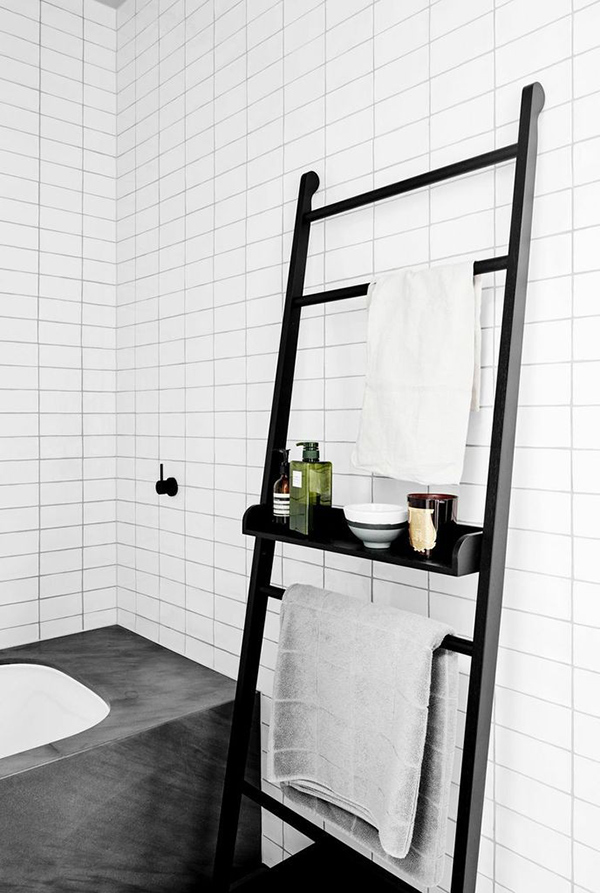
The sandstone-framed bathtub is from Kaldewei. You can also see here a towel ladder.
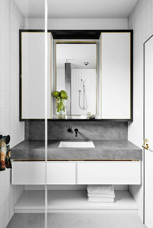
The en suite used a Duravit sink in a counter of honed Bedonia sandstone topped with a custom mirror and lights trimmed with brass.
Beautiful remodel, right? I like the neat modern and masculine appeal of this home with the idea and design from Flack Studio. You can notice that the colors it used were just subtle and have that manly tone too. It does look cozy and easy to the eyes and made the home look even more appealing despite the use of grays and whites. How about you, what can you say about the redesign?