If you’re looking for ideas for your living room decor and design, here are 24 examples of circular ottomans that serve as centre pieces or coffee tables to go along with your living room couches or chairs. Here you will see a collection of ottomans that are paired mostly with chairs and either complement or contrast the entire look of the living room. You might be looking for ottomans for decorative reasons, but nonetheless you can still choose something that can be utilized in the living room.
This list will also hopefully give you more ideas on how to decorate your own living rooms especially if you haven’t thought about the final look to it or if you are planning to buy new furniture and re-decorate your homes. From leathery looks to tufted designs, from light to dark colors, these ideas might be some you can bookmark or pin.
1. Avon Hill
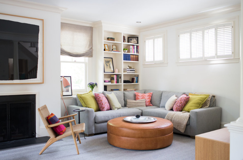
Davis Scott, LLC
I definitely fell in love with this cute living room when I saw it. I really love the color combination it has – the neutrals that are pretty much brightened up by the colors added by the throw pillows and the designs on the cubby holes behind the sectional.
2. Bohns Point Residence
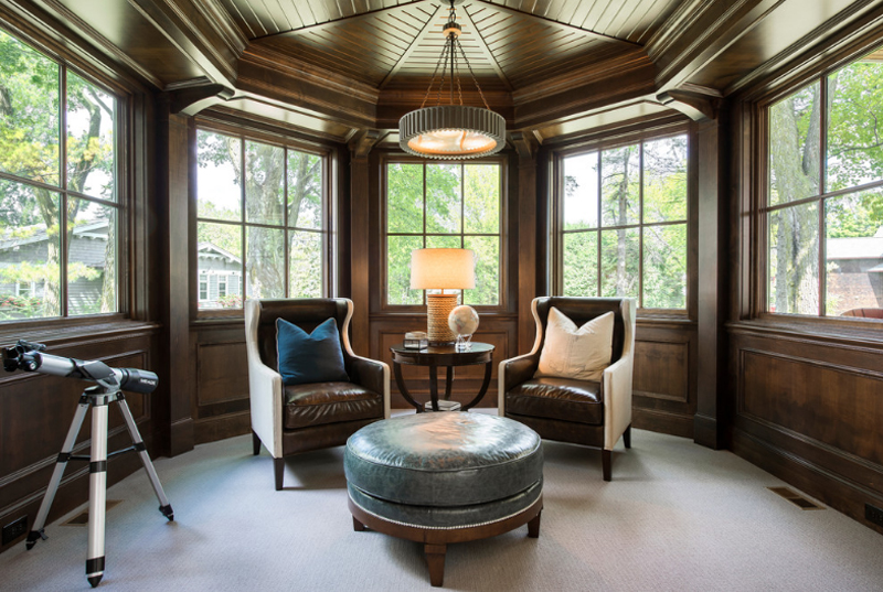
I think that this seating is really interesting and somehow fancy; with all the leather and the dark wood used for everything in here – and that small telescope on the side – I surely don’t know that to think about this space. Then again, everything about this room is just fascinating.
3. Zack Residence
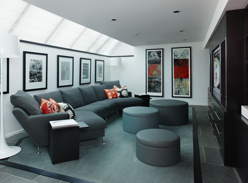
Why have one ottoman when you can actually have three! From the looks of it, the ottomans in this living room photo are also containers in which you add stuff to. Storage nowadays, in home design is something seen in almost anything in the house. You’d be surprised that you sofa is a storage space too!
4. Duplex in Carroll Gardens
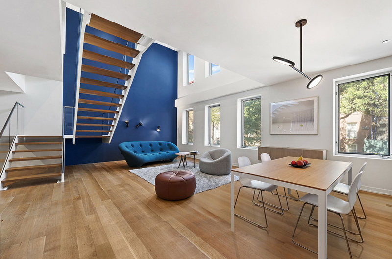
Studio a+i
In this photo, you might notice that the ottoman is not serving a coffee table purpose; I mean, it could, but the designer already added a coffee table in the middle of the living space so as to make the ottoman in here made for seating. For one thing, an ottoman as a chair allows more people to chair it than an arm chair, right?
5. Evanston Residence
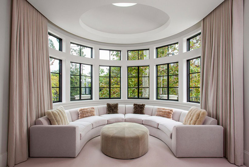
Tim Barber Ltd Architecture
If this sweet semi-circle seating area doesn’t charm you, I’m pretty sure nothing else will. Nah, kidding aside, I think that portion of the Evanston Residence is just stunning. It’s not every day that you get to see one and if you did, not this beautiful, really. The windows, the drapes, the ottoman and the fancy pillows is just so inviting.
6. Grey House
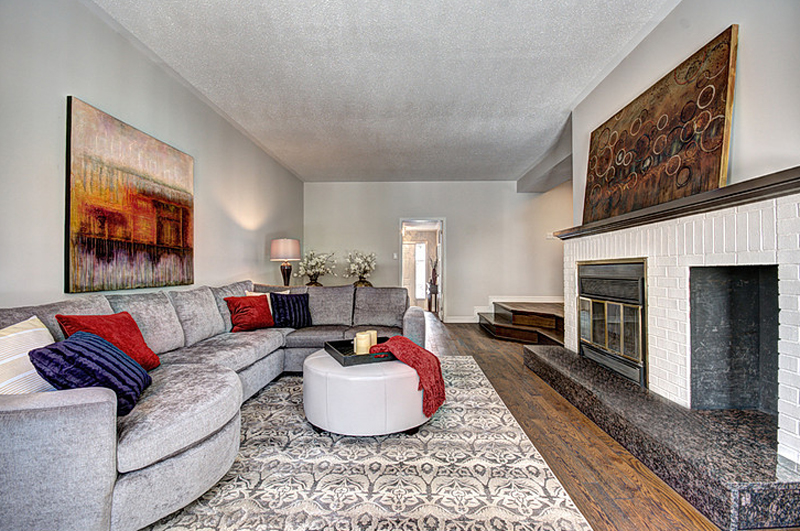
Laura Boisvert’s team sure did a great job in achieving this beautiful and minimalist living room. The colors are subtle but very powerful, especially the ones that are seen in the paintings on the wall. Everything in here is in grey and I think it’s just perfect!
7. Lahontan Home Truckee
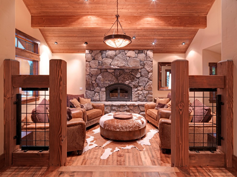
The cabin feel to this Lahontan home is marvelous! The colors of wood are just calming and earthy. It makes you want to do a staycation after an entire week of hard work. The furniture and decorations in here (although minimal), makes you wonder how many trees were cut down for this.
8. La Jolla Luxury Home
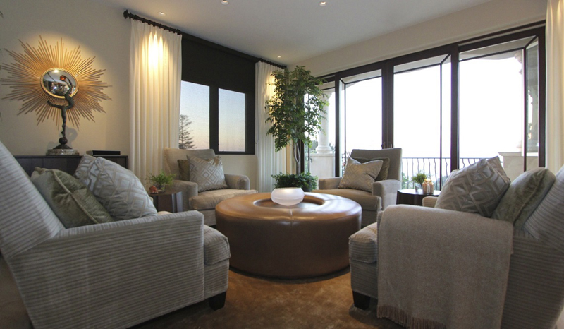
As much as the only things in here that has color are the sunburst mirror and the plant by the window – I still would like to think that the color palette for this luxury home is surely a keeper. In most contemporary homes that I’ve seen (and I’m sure, you did too), most of the colors used are the plain ones and the closest ones to neutral – which is I think neat and calming.
9. Last House on the Left
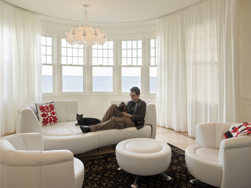
Now this is one house on the left. The white drapes, the white furniture and lighting in here are nice – but a tad creepy (not in a really negative way or anything). Although minimal, the contrast of the white furniture and that of the dark colored carpet is just what this space needed.
10. McFarlin Complete Remodel and Addition
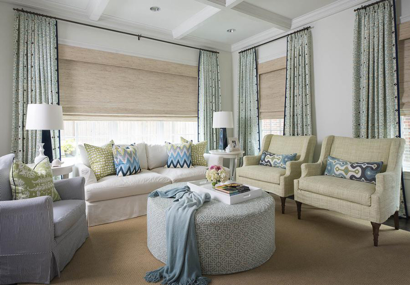
Provenance Builders
As much as this living room remodel is just beautiful – I think there’s too much going on in it. The different colored (and prints) furniture and too unique pieces of pillows and the lengthy morning drapes. I wish that there was a little bit more plain colors in here though.
11. Mid-Century Modern
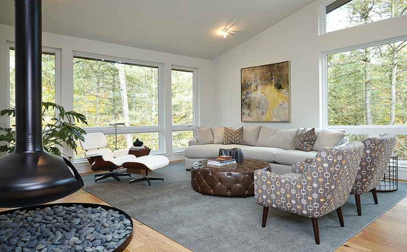
New Urban Home Builders
The material of the ottoman in this living room is particularly made from leather – I can’t say that it’s genuine or not but it sure looks stunning! I like how they mixed and matched the furniture in this space to make room for beautiful view of the outdoors.
12. Minnesota Residence
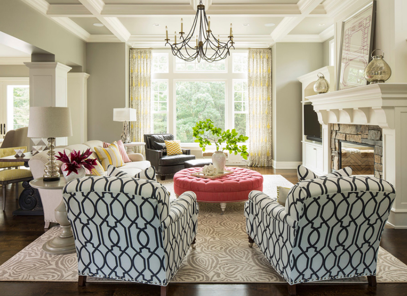
What a really charming ottoman! The color is just stunning and it surely stands out in this living room with minimal to nothing pink in it. Did I get that sentence right? Nonetheless, I know that you’ll agree that this living room looked prettier with the pink ottoman in it.
13. Modern Traditional Home
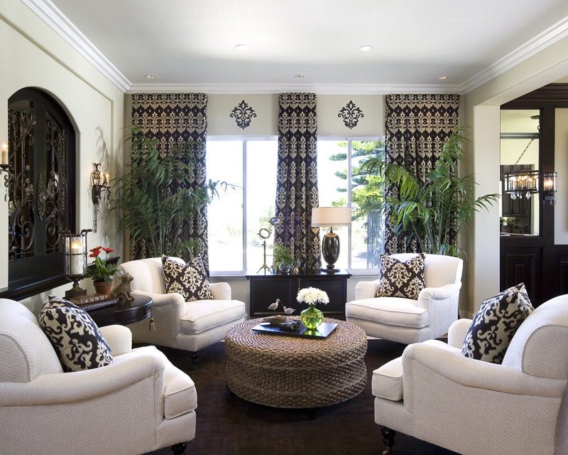
A rattan ottoman is seen in this living room from Robeson Design. The white arm chairs look luxurious and the throw pillows look fancy – they sure are a fancy pair! Notice how the prints on the drapes also capture our attention especially because the walls are plain.
14. Monterey Colonial Pizazz
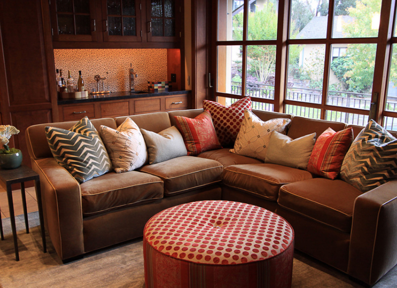
Being this space is a small living area, I think the use of the sectional helped in making sure that they maximized the seating capacity to accommodate more people (at least a bit more) and the funky pillow cases made it more fun and stylized – if that’s an acceptable word.
15. New Home Building 2
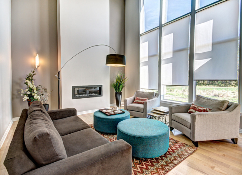
If one of the living rooms in this list had three ottomans, here is one example that has two. The color of these ottomans really made this space interesting and little more fun; because they used neutrals for the most part of this space, the turquoise ottomans and the printed pillows and carpet made it prettier.
16. North Plains Farmhouse
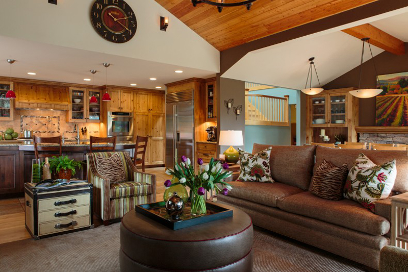
The farmhouse and rustic feel of this space is just beyond words. I really love the idea of browns and whites mixed together in furniture and interiors and even decorations. This combination may be simple, but it really makes your space stand out.
17. Palmer Point 2 Road Residence
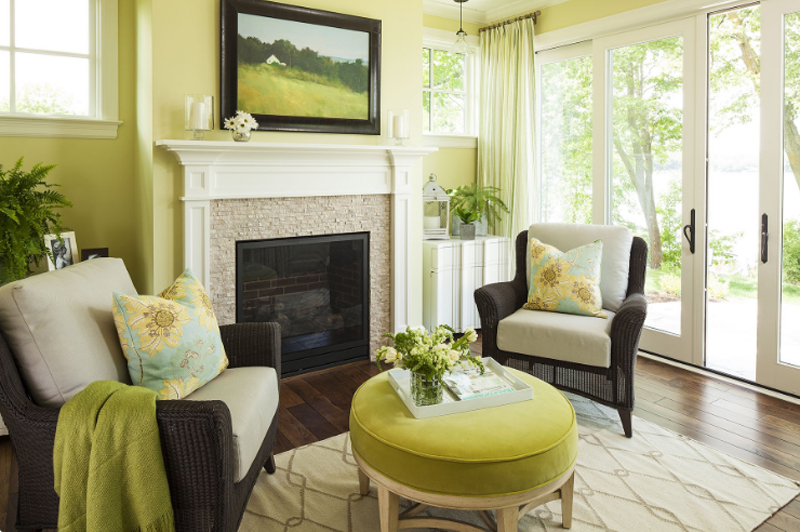
This space sure is bright – and it surely looks happy. Maybe because of the bright colored wall or accents in here, but I think the fact that this living space opens outdoors made a whole lot of difference; and if you notice with anything house related, colors really makes or breaks a space.
18. Refined Hand Hewn
Garrison Hullinger Interior Design Inc.
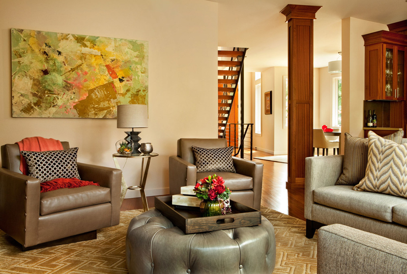
Now this living room sure is fascinating. I like how they mixed the materials of the furniture in here – some are leather, while others used a neutral fabric – what the furniture lacked in print, the painting on the wall and the carpet and pillows made sure it was present.
19. Shepherd House
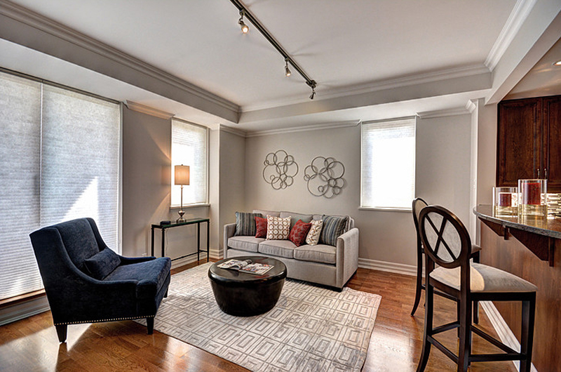
Looking at this living room photo, I somehow realized how clean and neat spaces make you feel. I mean, imagine being in this living space, or anywhere for that matter that is untidy and messy, right? I think writing would pretty much be impossible (at least for me). Different things for different people I guess.
20. Seahound Ranch
Garrison Hullinger Interior Design Inc.
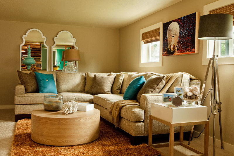
This living space is like something you can find in one of those popular Instagram photos wherein people showcase how their new furniture looks in their living rooms. The furniture actually looks simple but it’s really classy and something that would definitely go well with any particular living room setting and archetype.
21. Stylish Transitional Home
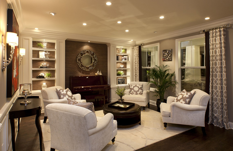
How about having a space like this one – black and white furniture in a transitional setting. The decorations in here are obviously fascinating and neat – something you’d usually see in contemporary spaces but there is this aura this space is giving off which I think makes it more special.
22. Stonehenge Terrace
Garrison Hullinger Interior Design Inc.
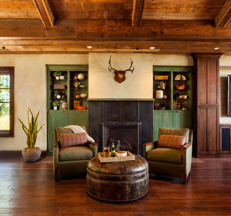
Here is one seating area that has a background – this might seem like a usual scene for a traditional home especially in places where people love to hunt animals; the colors of the arm chairs and that of the ottoman is just sweet and traditional – I love them!
23. Waterfront Residence
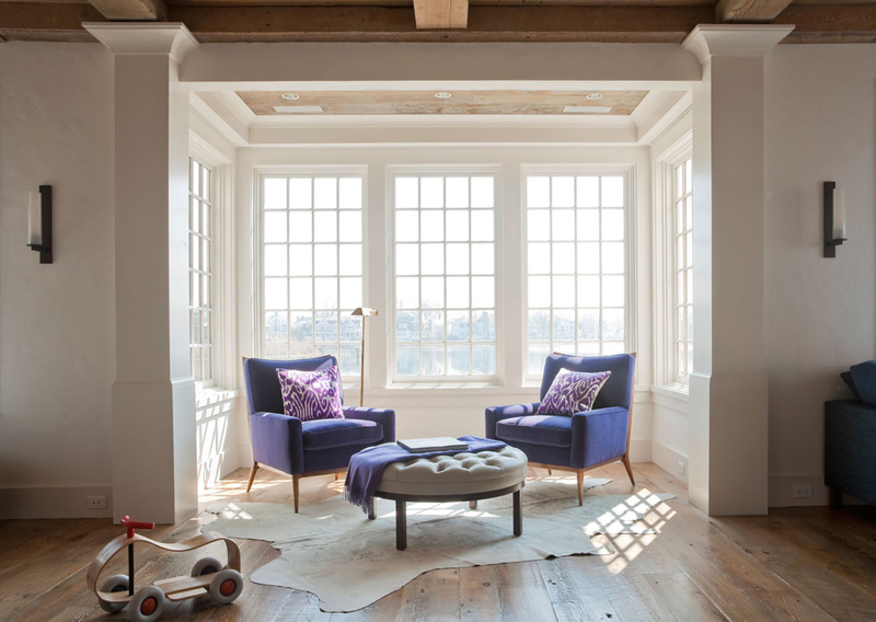
This cute seating area is something I didn’t want to miss out in sharing with you guys. I know that you might say, “oh, another tufted ottoman, but with the design of this ottoman having legs made me want to share it in here plus I think that the cute lilac chairs needed to be exposed too!
24. West Village Residence
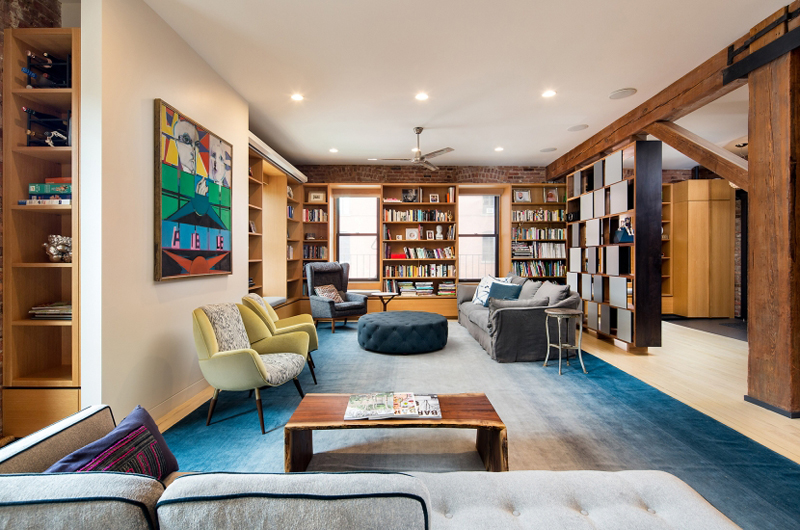
Studio a+i
The ottoman in this photo may be a bit farther away, but we can still actually see how cute the dark blue color it has and the fact that it has a tufted design to it. I like how the colors were played in this living space and I think that the way the ottoman and the carpet contrasted in color made it all the more stunning.
The ottomans shown in this collection are some of the possible ideas you might want to consider in your living room. The different materials and design are varied but just look for whichever works based on your own taste or the design you are thinking about. Do check out also the20 Printed Furniture Upholstery in Ottomans.