Apparently, a kitchen will never be complete without cabinets as it is important for storing different items. But it doesn’t mean that just because it is merely for storing, it will look dull or boring. Your cabinets have to look lovely too! Especially in the kitchen. As you have noticed, the kitchen’s cabinet has a huge impact to the look of the entire kitchen. That is why it is important that you choose a design that will enhance its appeal.
There are different styles for a cabinet. But what really varies is the door of these cabinets. One famous style is the Shaker Cabinet. This style is simple and attractive featuring recessed panel doors, light finishes and basic hardware. Shaker cabinets mirror the style done by extremely skilled craftsmen and carpenters who are called the Shakers. Most of the cabinets like this are made of hardwood with veneer panel doors. It has light wood or natural wood stains with simple knobs and handles, although sometimes it also has dark finish or other colors that will fit the look of the space. If you are still unsure of how a Shaker cabinet looks like, we have created a list for you so you will have an idea of how it appears. Here is a round-up of 25 minimalist Shaker kitchen cabinet designs.
1. Beal Kitchen
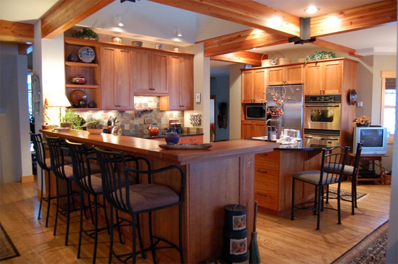
Notice that this kitchen used wood not just for the cabinets but even on the ceiling as well.
2. Shaker Kitchen Cabinets
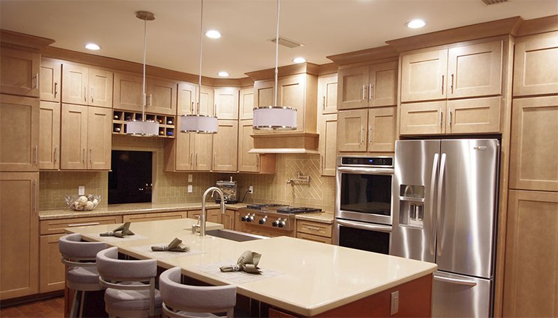
Light wooden finish is used for this kitchen. You can see that this has white pendant lights above the kitchen island.
3. White Shaker IKEA Kitchen
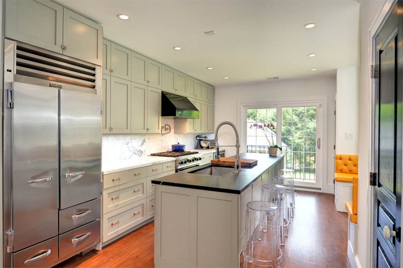
The transparent stools are used for this kitchen. Shaker cabinets also look good in a modern space.
4. Sleek Home in Oakville (1206)
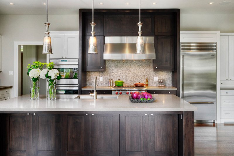
This image shows painted shaker profile doors & drawers in Benjamin Moore BM OC 17 White Dove. I like the look of this kitchen.
5. Kitchen
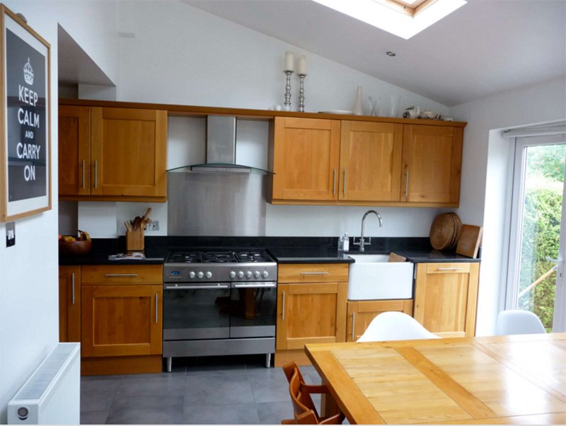
A contemporary kitchen that has a combination of wood and black colors.
6. Traditional Kitchen
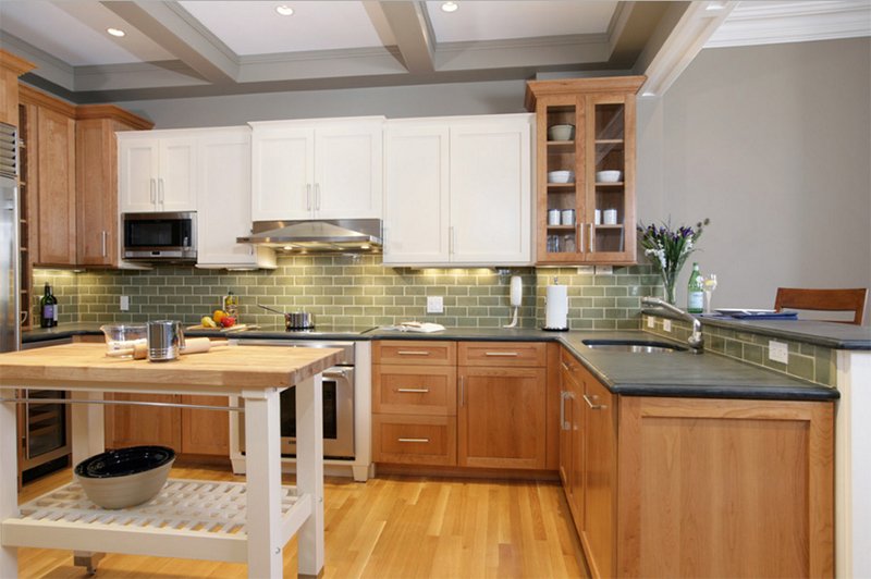
Isn’t this a beautiful kitchen area? I like the idea of combining wood and white cabinets.
7. Acadia Road Residence
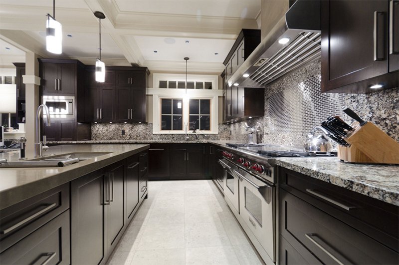
Peter Rose Architecture + Interiors Inc.
A dark kitchen that has a contrast of white and gray. What made this look luxurious are the lightings.
8. Greenwich Street
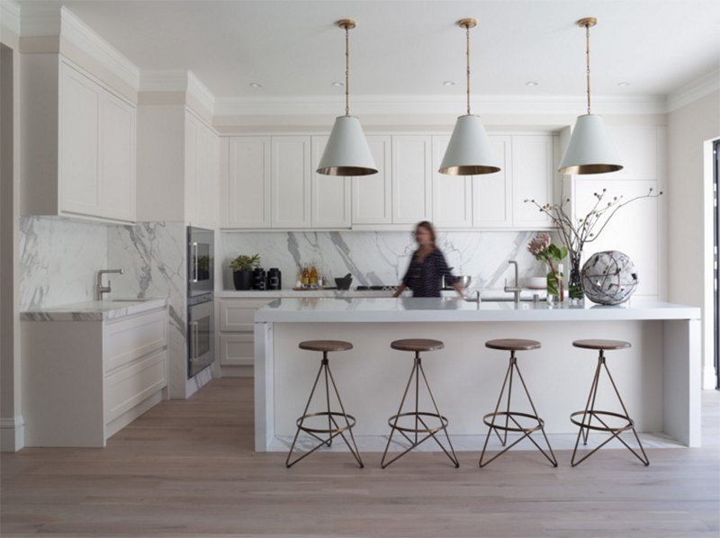
A marbled wall for the kitchen matches well with the white Shaker cabinets in it.
9. Marin Family Home
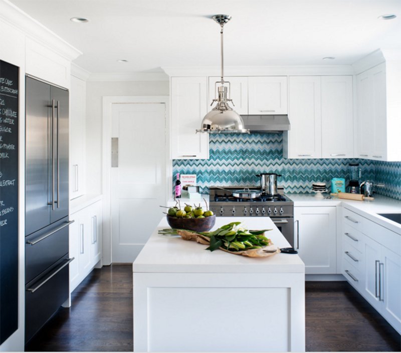
The backsplash has an interesting design with green colors that add more creative appeal to the kitchen.
10. Wellesley St E
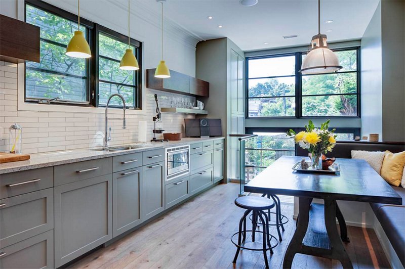
The Shaker cabinets here has Desert Twilight Paint and subway tiles that create a contemporary appeal all together.
11. Custom Cabinets
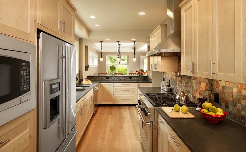
A long and narrow kitchen has light wooden finish in the cabinets. The backsplash has beautiful colors that look lovely with wood.
12. Achtenberg Residence
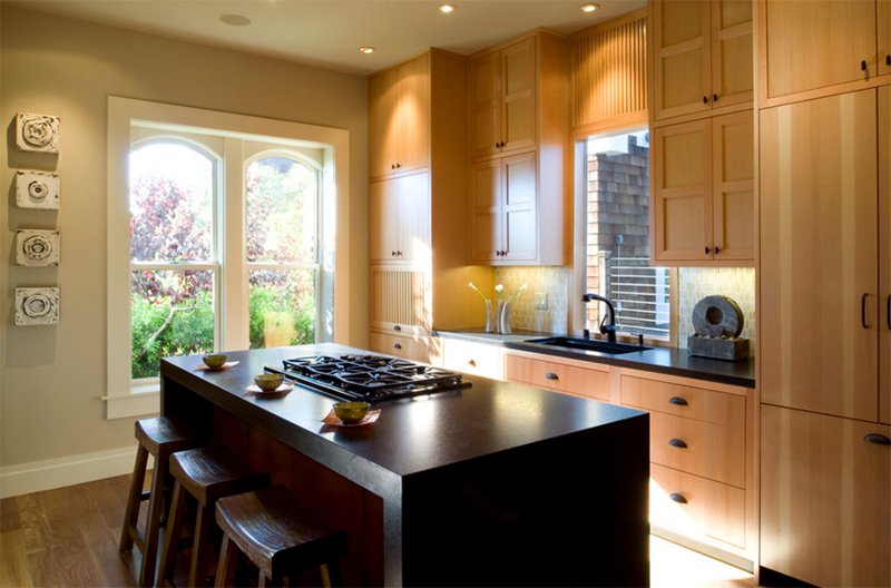
John Lum Architecture, Inc. AIA
The Shaker cabinets here have black handles that can be easily highlighted. They also match with the countertop and the kitchen island.
13. Bulter’s Pantry with German Silver Sink
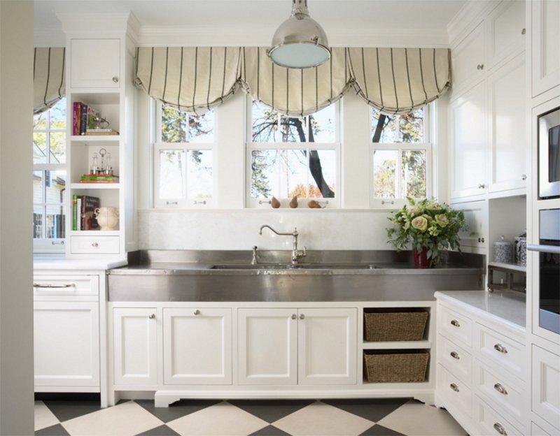
A traditional kitchen in white with checkered flooring. This may look a bit vintage because of the design of the curtains as well as the sink.
14. Northern Wisconsin Bunk House
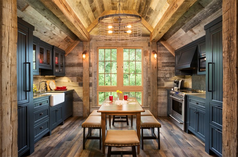
A rustic kitchen has different wooden textures used for the walls, flooring and ceiling. To break the monotony, black Shaker kitchen cabinets were added.
15. Bucknell
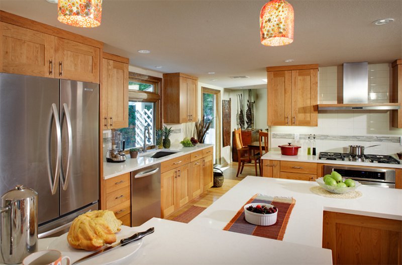
A sophisticated kitchen featuring wooden cabinets and white countertops.
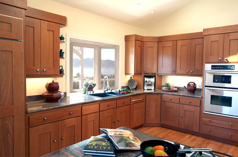
16. Tiburon home with Asian Influence
Mahoney Architects & Interiors
You can also use cabinets with darker colors too. Notice that even if it is dark, it didn’t make the area dark especially that it has cream colored walls and there is a window near the sink.
17. Bryant Residence
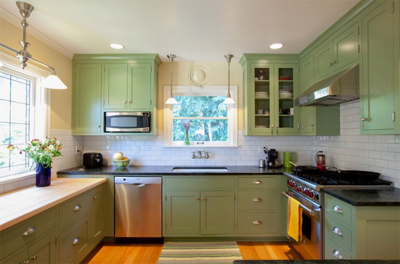
If you don’t want to use wooden finish, you can try something green like this one. This has a classic look especially that the walls has subway tiles.
18. #54 – Millennium Enterprises – Menlo Park
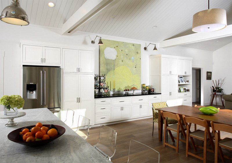
Precision Cabinets
These cabinets used Swiss Coffee paint with Glazing Doors. It features glass doors, paneled ends, base molding, and farmhouse sink.
19. Greenlake Custom Home
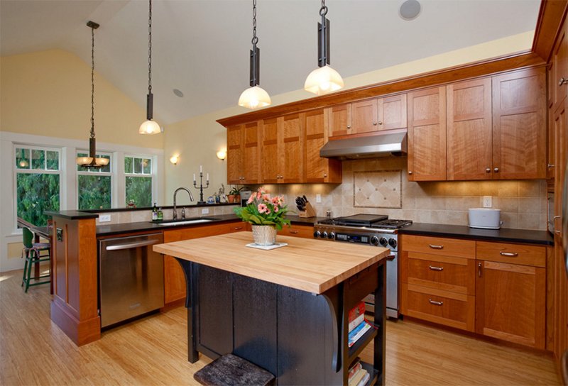
This kitchen area has a unique style for a Shaker cabinet. You can try comparing it to other cabinets especially that it used different tones for the frame.
20. Mossridge
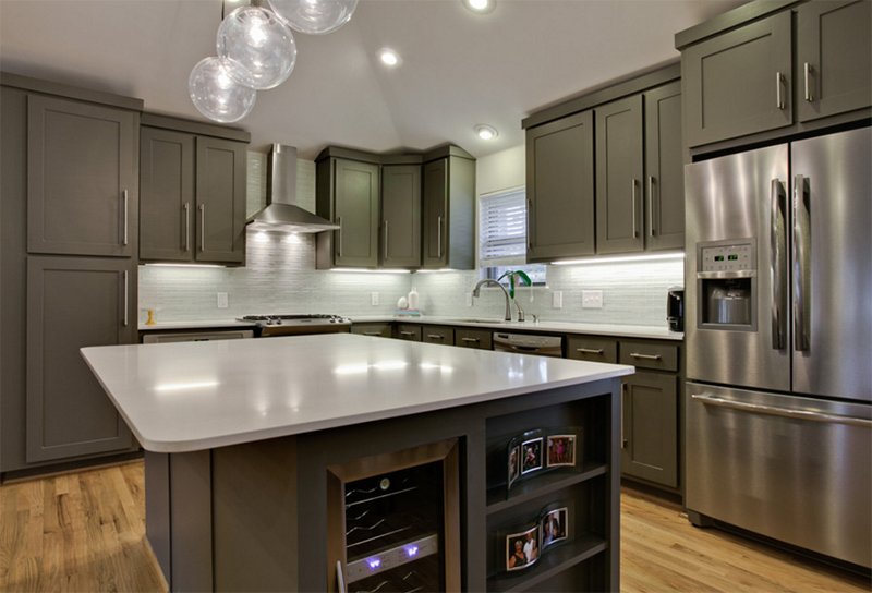
New Leaf Construction
Everything the homeowner needs for the kitchen is all here but most of them are concealed in the cabinets.
21. Raleigh Hills Kitchen
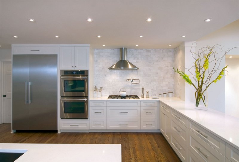
Look at how neat this kitchen looks like. It has textured walls as well as Shaker cabinets in white. I like the idea of adding a plant on the countertop for a refreshing appeal.
22. Kitchen
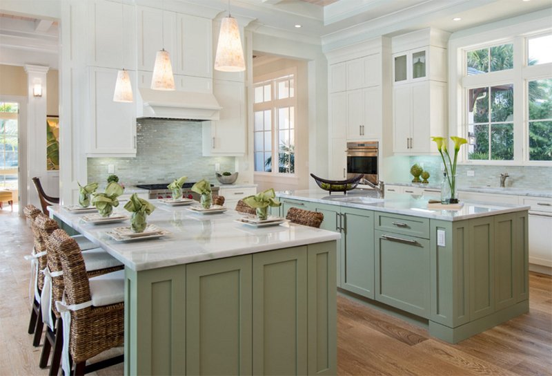
This kitchen has two colors for the cabinets. One has green while the other has white.
23. Kitchen Austin
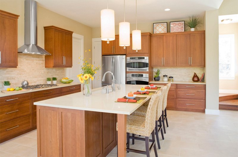
What I noticed here when I first saw it are the native chairs that add a subtle beach-y feel to the kitchen.
24. Transitional Twist Kitchen
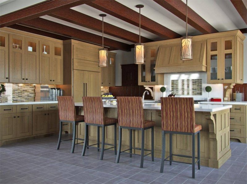
A simple Shaker style door for the cabinets that is complemented by tall but plain crown molding. The cabinets used warm earth-colored stain with subtle burnishing. It gives the cabinet a slight appearance of age.
25. Moore Kitchen
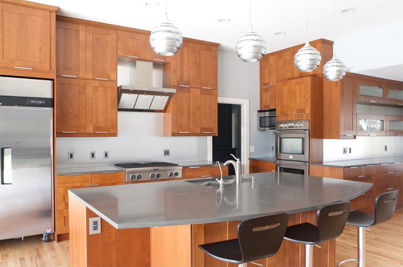
Modern Craft Construction, LLC
Beautiful wooden finishes that looks almost Asian and modern at the same time. Notice the placement of the handles for these cabinets.
I know you were not that aware that shaker cabinets actually look nice and neat. Even with its minimalist look, it still successfully gives appeal to your space because of its recessed design. One good thing about shaker cabinets is that it can look good in whatever style you have for the kitchen. You might notice that from the kitchens above. It looks nice for a modern, traditional or even Asian kitchen as well. So, if you are planning for a kitchen cabinet, you might want to consider having a shaker cabinet like the ones above.