One style that has become a great hit for interior designers and homeowners alike is the midcentury modern because of its simple yet sophisticated style that combines some elements of the past and the current modern trend. The common feature of a midcentury modern space is its open layout, its being bright and its usage of natural elements for both the furniture and the accents. This style is also known for its use of iconic furnishings as well as patterned wallpapers.
Today, we are going to show you some midcentury modern kitchen designs which vary in colors, layout and even usage of materials. You will also see geometric patterns in each space as well as beautifully designed furniture. Most of the areas also use a good amount of wood for either the ceiling or the cabinets. Let us take a look at the round up below.
1. Resident Art
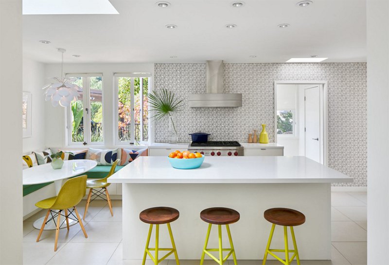
What I love in this space is the colors and the combination of patterns. Isn’t it very beautiful? It also brings a subtle retro appeal to the area while using modern furniture and equipment. Notice that it used patterns on the wall.
2. Gilbert Kivett Residence
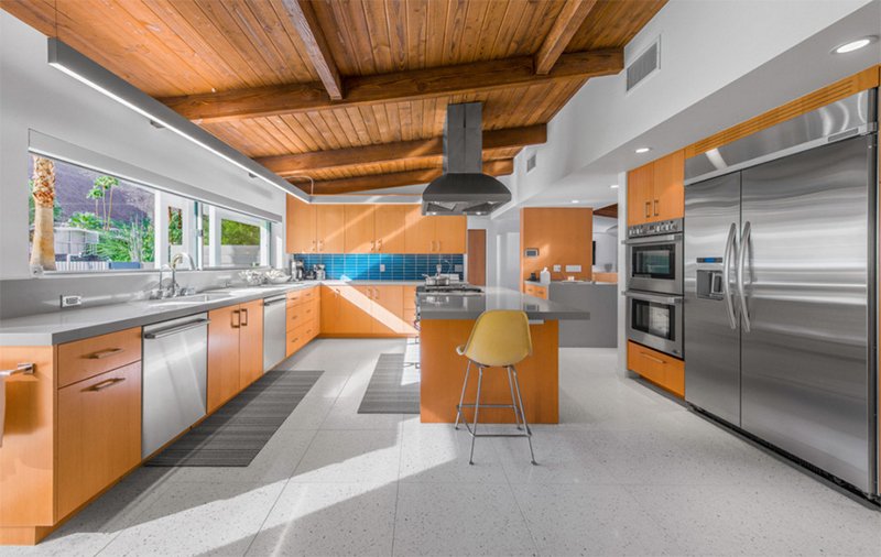
You will surely notice that blue backsplash in this spacious kitchen that used wood and stainless steel. It is also nice that everything is under a wooden ceiling.
3. Newport Beach Midcentury Modern Home
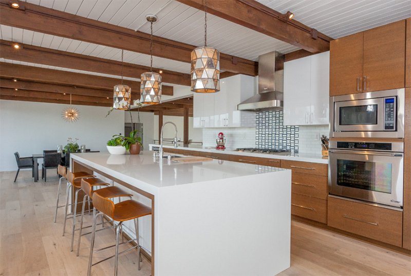
Anthology Interiors
The pendants light used here will no doubt draw your eyes to the area as well as the backsplash. For the rest of the space, wood and white was used together.
4. Allandale Mid-century Modern Kitchen Remodel
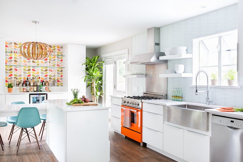
I love the whiteness of this kitchen as well as the colors from that wallpaper in the dining area. Aside from that, the orange oven has a huge impact to the appeal of the space.
5. Mid-century Modern Kitchen
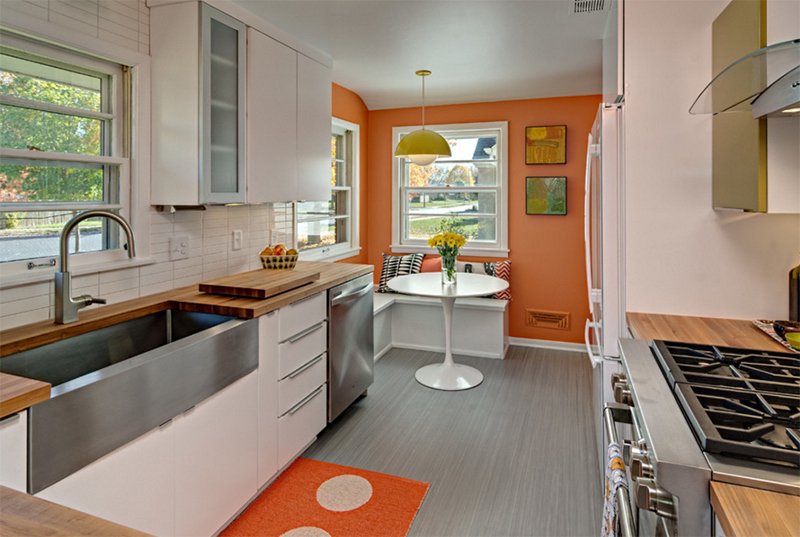
A breakfast nook was added to the corner of this kitchen with an orange wall. An area rug with the same color is used in the space too to extend the look. What I noticed here are the paintings on the wall, the patterns on the throw pillows and the yellow pendant light that is almost retro in style.
6. Cloud Residence
Ana Williamson Architect
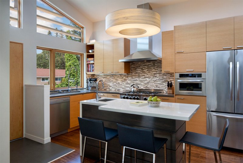
This kitchen isn’t that spacious but it looks good because of the skylights and the picture window that brings in light to the area.
7. Nautiwoods
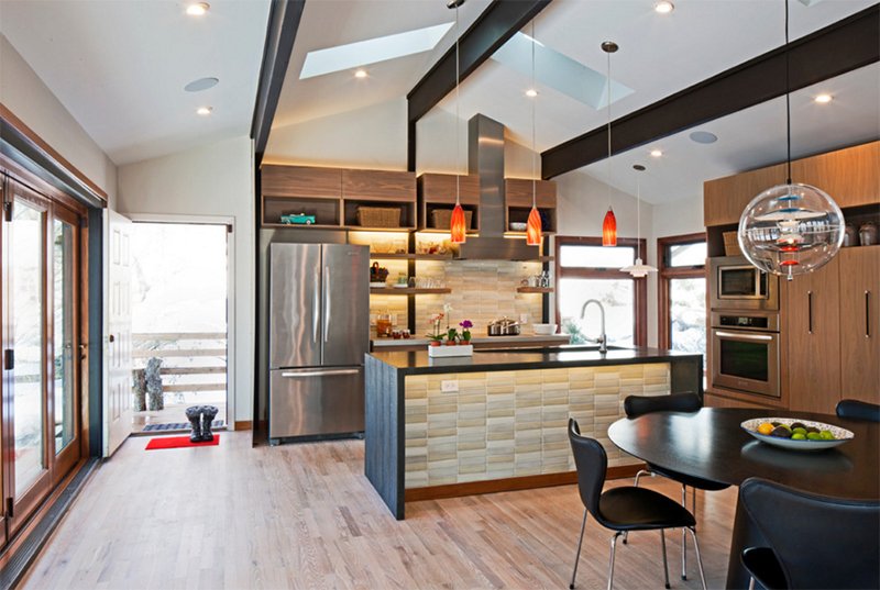
For this kitchen, ceramic tiles were used not just on the kitchen backsplash but also on the island with dark gray countertop. Those orange lights are lovely!
8. Residence M
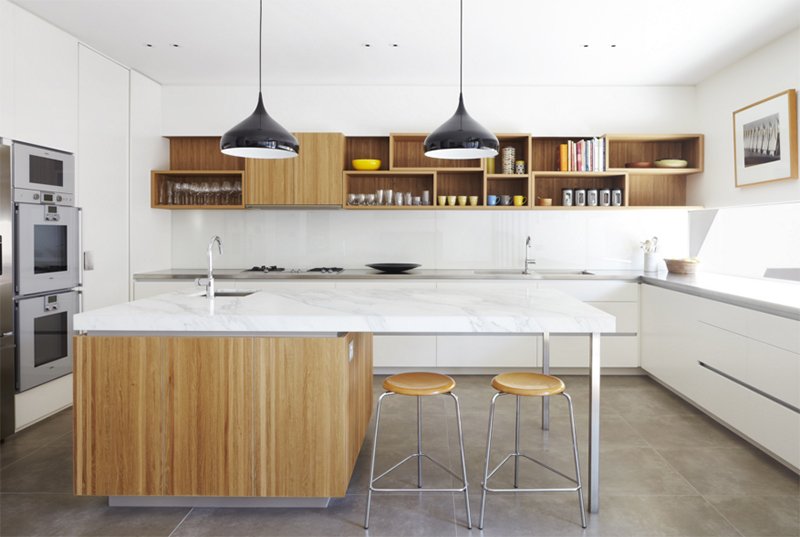
CHT Architects
This kitchen looks very relaxing to the eyes because of its color and its usage of wood from the kitchen island to the wall shelf.
9. SOUTH LAFAYETTE DR.
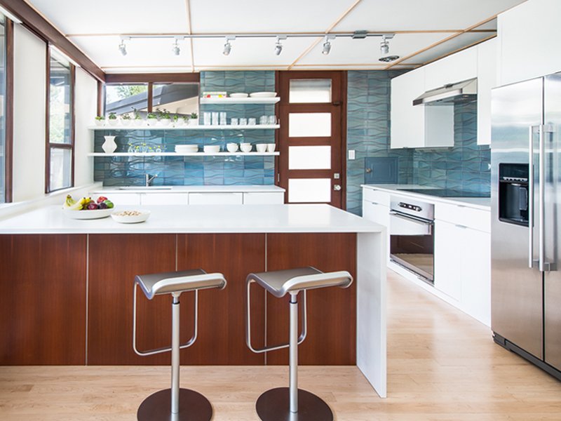
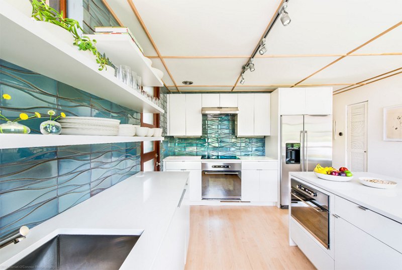
This kitchen used ceramic tiles that have the feel of the ocean as it used the colors green and blue together. It is emphasized because of the white cabinets and ceiling.
10. 1951 Mid-century Modern Home Remodel
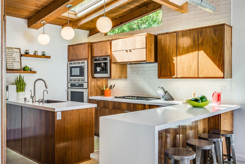
This kitchen is a result of a home remodel and yes, it does look really beautiful. I like it that it has skylights in the kitchen.
11. Sea Ranch Residence
Hudson Street Design
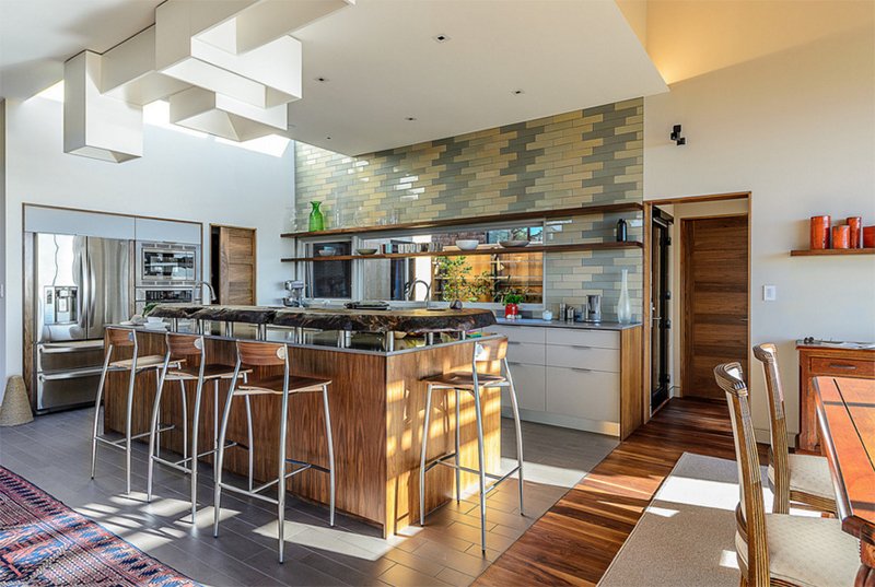
Ceramic tiles were creatively added to the wall of this kitchen and what I like most here is the natural wood in the kitchen island.
12. Mid Century Modern in Lincoln
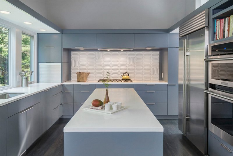
A simple gray and white kitchen with patterns on the backsplash. Everything may look simple here but it does look sophisticated.
13. Retro Revival
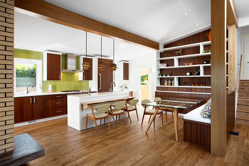
In this kitchen, the color green is used for the backsplash and it has a wall covered with shelves and drawers. Another lovely feature is that lighting.
14. Palo Alto Kitchen
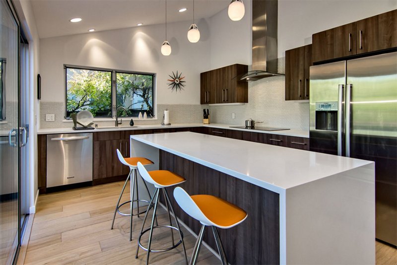
When I first saw this kitchen, what I noticed at once is the clock on the wall as well as the orange chairs. The rest looks neat in white and wooden textures.
15. Graphic Designer’s House in Southville, Bristol
DHV Architects
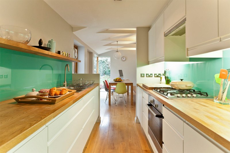
With one look at this kitchen, I could tell the favorite color of the homeowner which is used in the area. Yes, it is a small kitchen but it apparently has everything one needs for cooking and food preparation.
16. Laverne 2
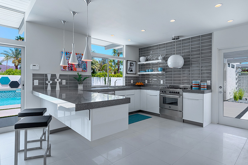
That floating and cantilevered island is very nice! It seems to bring a futuristic touch to the space especially that it used gray and white together. It is a good idea to add some wall decors in here as well as lovely yet simple lighting fixtures.
17. High Road 2
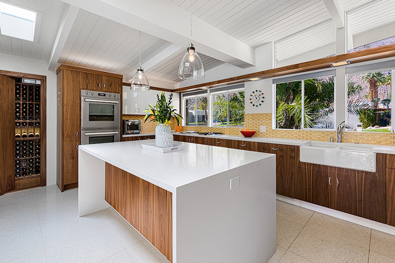
You will see patterns in the walls for this kitchen that has a wine storage and a vaulted ceiling.
18. Mid-century Modern Kitchen3
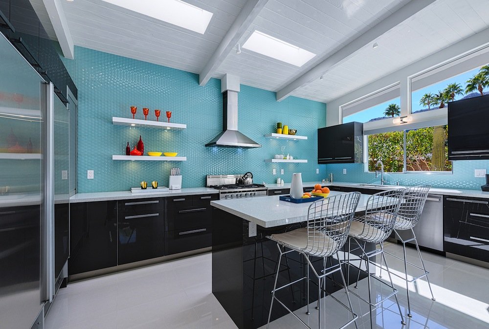
Don’t you love that green textured wall? Oh well, I like it especially that it is combined with white and gray. I also like the way the displays on the floating shelves with put together.
19. Upper Main Line Residence
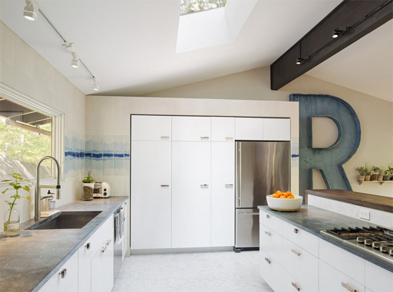
Studio Robert Jamieson
That huge R in the kitchen has caught my attention. I wonder if I can make something like that for my home. Lol. I also like the watercolor effect of the wall tiles in the kitchen area.
20. Mid-Century Modern on a Budget
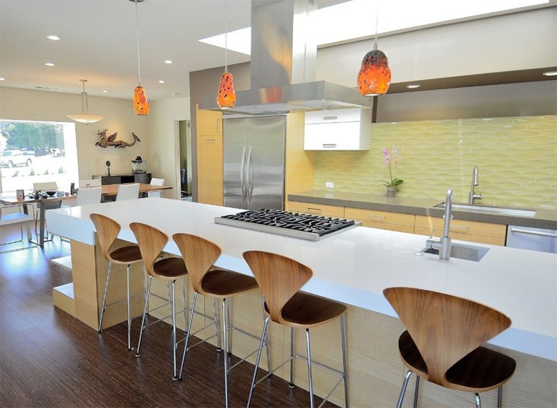
Rich Mathers Construction, Inc.
Wooden high counter chairs are used in this kitchen with orange pendant lights and light green patterned backsplash.
21. NW Hills Remodel
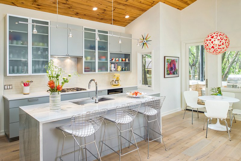
Love how everything was put together in this kitchen. The wall cabinets use a combination of doors using wood and glass. I also like the decors used here from that retro looking wall clock to the red and white orb lighting.
22. Venice Island Mid-Century Modern
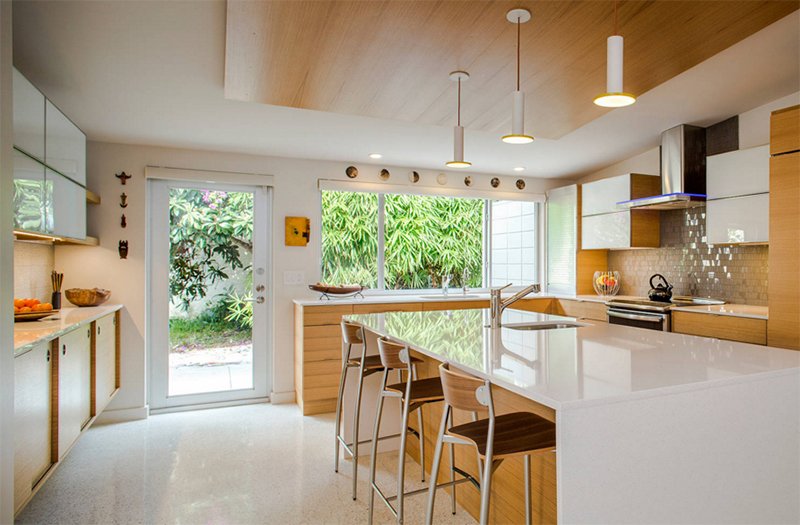
A spacious kitchen that used a combination of wood and white colors. From the area, one can take a look at the beautiful garden!
This is a lovely list, right? Well, I don’t know about you but if you will ask me, I like midcentury modern style in whatever space in the house it would be used because of how timeless it looks and how relaxing is its overall appeal. I also like the idea of putting together some retro or traditional elements with modern ones. It is like decorating the home with different eras in mind. But what appeals to me most in spaces like this, are its use of patterns and the brightness of the spaces.