Most of the kitchen designers we know are well-versed in the elements and principles of design and how to apply these aesthetic guidelines when creating a classic kitchen. For this story, we’ll define “classic” as a kitchen that is partially or completely separated from adjacent living spaces. When planning such a space, designers pinpoint one area of the kitchen and then organize the details of the space to highlight this area.
Mantel hoods or elegant metal sculptural hoods are great focal points in such spaces. Using decorative ceramic or porcelain tile backsplashes coordinating with some type of geometric pattern below or around the hood area is another great way to create a sense of visual excitement and pull the viewer’s eyes toward the highlighted cooking area. Check out the list below.
1. Andronico
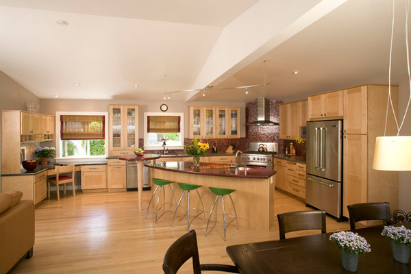
Julie Williams Design
I like the stunning corner hood of this kitchen space and the peninsula concept.
2. Chambers St.
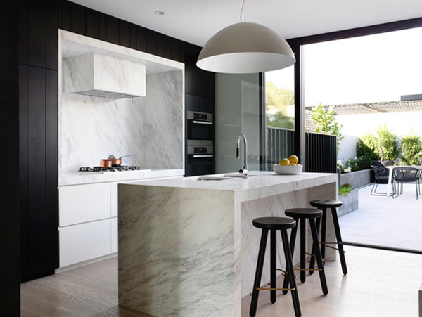
This huge dome pendant provides ample soft lighting for this prep-space-meets-seating-area. It suits this home’s minimalist, modern decor perfectly, creating a simple focal point by contrasting the countertops’ sharp edges.
3. Chicago Kitchen
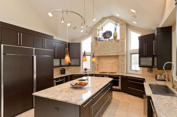
This sleek, contemporary kitchen is a piece of art. From the two story range hood with its angled window to the flat paneled cabinets with opaque glass inserts to the stainless steel accents, this kitchen is a showstopper.
4. Corralitos, CA
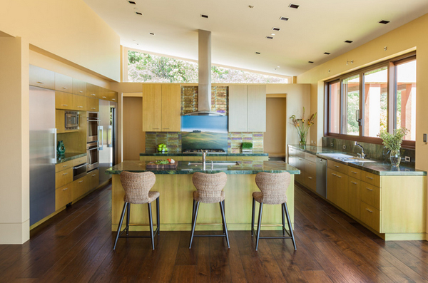
The interior will include natural finishes like clay plaster, natural stone and organic paint. The design includes solar panels, radiant heating and an overall healthy green approach.
5. Cucina Moderna
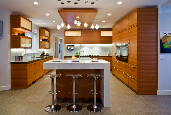
The kitchen was broken up into distinct work stations – the clean-up area with two dishwashers, a prep area that includes two fridges, two crisper drawers and prep sink, two cooking areas.
6. Gainey Village Home
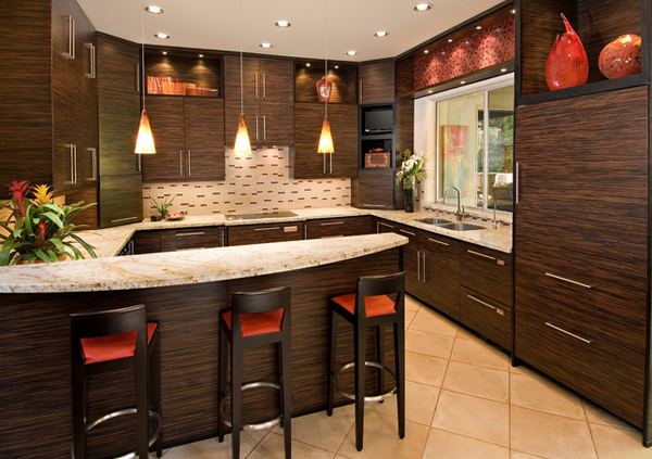
Macassar ebony wood makes this contemporary kitchen a stunner. No detail is overlooked with a Sub Zero paneled refrigerator and all Wolf appliances.
7. Heather & Bob’s Kitchen
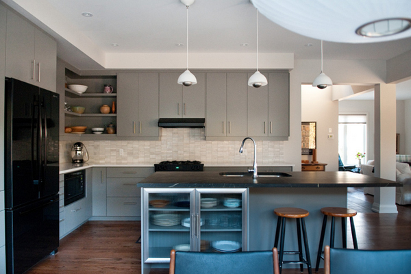
If there were no soffit or bulkhead going in, then it would depend on whether we were doing full height cabinetry or leaving an opening above. Typically in a contemporary kitchen, moldings would be at a minimum.
8. House on the Hill
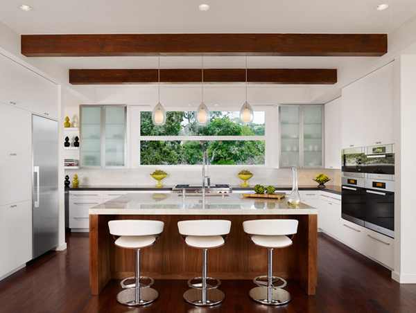
Favorite kitchen but want a black/grey island countertop with waterfall and white base for island; plus I want the floors to be lighter.
9. Louisville Kitchen
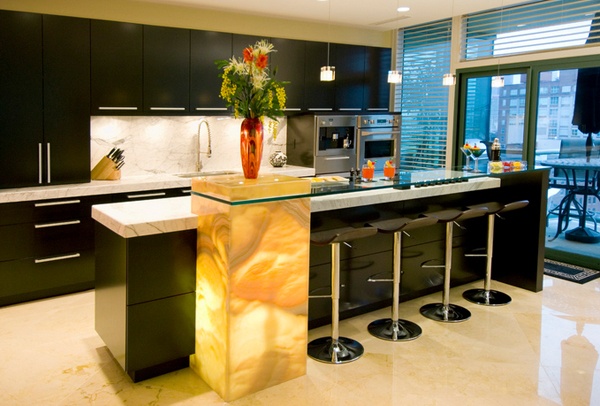
The same design concept works in smaller doses. A single backlit pedestal creates an similar statement while saving some of the expense associated with the installation in the previous photo. Interestingly enough, this designer paired the white/yellow onyx with black cabinetry as well.
10. Modern in Montvale
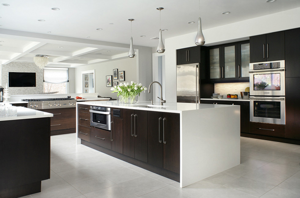
I like waterfall and contrast of light floors and dark cabinets.
11. Mt. Pleasant
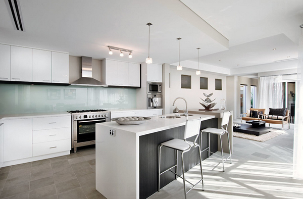
Paneled front of bench. Solid bench sides. Backsplash is too pale. Cabinetry too basic.
12. Ottawa White and Warm Kitchen
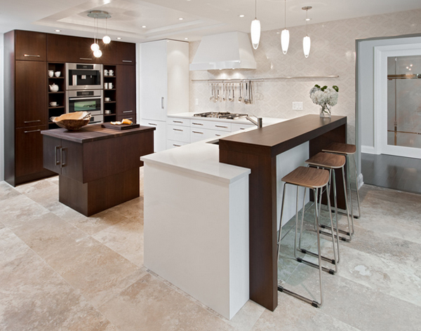
This formerly small and cramped kitchen switched roles with the extra-large eating area resulting in a dramatic transformation that takes advantage of the nice view of the backyard. The small kitchen window was changed to a new patio door to the terrace and the rest of the space was “sculpted” to suit the new layout.
13. Parsons Green House
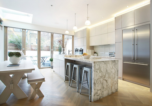
I like the fridge with the large freezer drawer underneath and also the parkey flooring.
14. Pletcher Kitchen
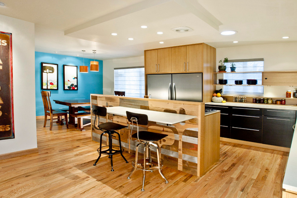
Combining of an existing laundry room and kitchen in a 1950’s ranch in the Highland’s into a Chef’s Kitchen with Eat-In Island. Reclaimed barn wood kitchen divider with etched artwork by Tandi Venter.
15. Ranch Lane
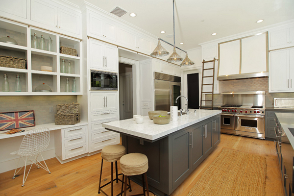
I am loving the style and color of grey cabinets of this Los Angeles kitchen!
16. Summerlin Kitchen
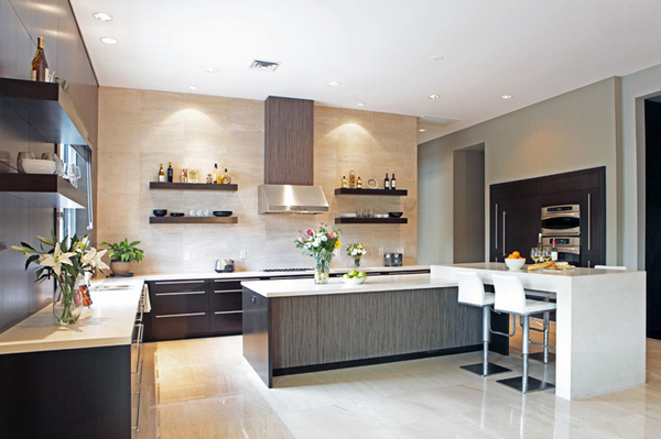
This sleek kitchen was completely missing when we took on this project as the home was a foreclosure sale and the previous owner had stripped it of everything.
17. Terra Bella Show House
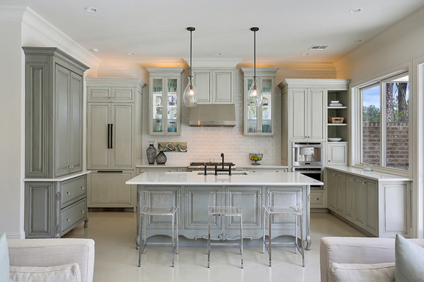
The clean and simple, long and lean, even the color of the cabinets! Thicker countertop on the island, almost too much of an overhang, and cabinets all the way to the ceiling.
18. The Burnaby
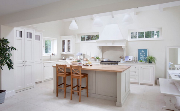
Bespoke Plain English kitchen hand made from solid timber and hand painted in Farrow and Ball Pointing. Wide planked oak worktop with contrasting Silestone. Hand made solid oak dovetail drawers and walk-in pantry.
19. Upper Saddle River Contemporary Kitchen
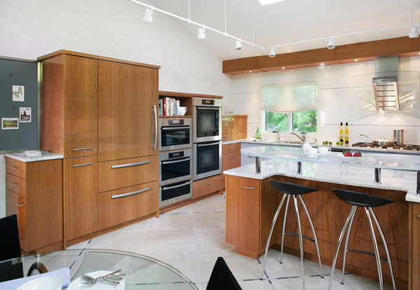
The design challenge in this kitchen was to combine sleek materials to make the space look modern – in fitting with the overall character of the home – and also to achieve a warm and inviting living space.
20. Villa Nuevo
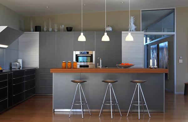
This kitchen utilizes a lot of metallic finishes. The bulk of them are matte, while the stools, hardware and a few accent pieces are polished.
Too often, designers plan a kitchen exactly the same for a traditional aesthetic or a contemporary one – they just choose different door styles. But, the difference between these two styles is not a difference in the door style; rather, it is a difference in how the space is constructed, how it is molded into a vibrant, yet simple and inviting kitchen.