There are really families that prefer to retain the look of their homes for so many years. This isn’t news to me because I have personally seen homes that have the same look over the years from the exterior to the interior. Some people just love to have the same space that they have learned to live and love for years. It maybe because they aren’t fans of change or they just don’t have that time and budget to change the look of their home. This is what happened to a family who lives in Greendale, Wisconsin.
Couple Deb and Michael Linley may have been so occupied with their job and raising their kids and set aside renovating their 1,600-square-foot home. For 27 years, they used the same ranch-style kitchen where they raised their daughter and son. Now that their children have grown up, they decided to update their home starting on the kitchen. Well, at least the Linleys also know how to move on. For nearly three decades, the kitchen floor was covered with carpet and it has mismatched cabinetry and awkward hallway to go. “We were down to one working burner on the range, and the dishwasher no longer worked,” Deb said. “I had never even purchased a brand-new stove in my life, so this kitchen was just the one thing I wanted for me. It was my heart’s desire.” Well, it is indeed right to update the kitchen especially that they need a functional range and dishwasher! Here are before and after photos of the kitchen.
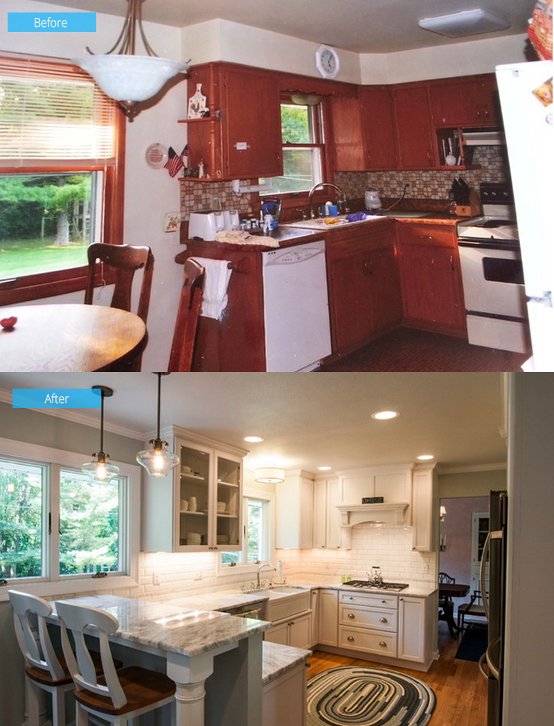
The original kitchen has a 1960s ranch-style where the finishes were outdated and mismatched. It also has a serious lack of counter space for Deb who loves to cook and bake. The new look of the kitchen is a result of Deb’s thorough research for design inspiration and ideas. A more efficient layout and updated finishes paved the way to Deb’s dream kitchen. The kitchen now has white color palette that includes the white painted transitional cabinets with full overlay doors and a pewter accent placed only on the edges for definition. The designer said that they added texture to make sure that the kitchen will not look boring and flat.
The beveled subway tile backsplash with a dove-gray grout added texture to the kitchen which is highlighted by a strip of marble mosaic tiles that also add dimension to the space. Instead of marble, the counters used Super White granite which is a more practical option. On the white walls and ceilings, there are also hints of gray that give it a soothing and elegant appeal.
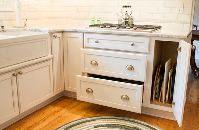
On the same location of the previous range is a five-burner cooktop. A counter was also added to the right of the cooktop creating symmetry as well as more workspace. There are three large drawers and two cabinets below the cooktop which offers lots of storage. Dish towels and plastic wrap are added on the drawers, while the middle drawer is used for pots and pans storage. Meanwhile, a deep bottom drawer was included for large pots and casserole dishes. The left cabinet has a Lazy Susan which holds the blender, mixer and food processor.
The new oak flooring was stained in red which match the existing floor. Doing that joins it with the dining spaces which make the interior look visually larger.
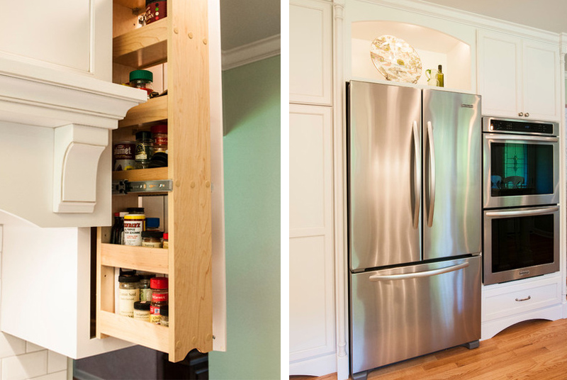
On the left, you can see a pullout spice rack in an upper cabinet which is within arm’s reach. This is a good way to stay away from clutter while storing everything you need for the kitchen. On the right photo, you can see the refrigerator with new wall ovens beside it. An arch lighted display shelf above the stainless French door refrigerator adds some place for decors. There are also pantry cabinets with pullouts to the left of the refrigerator.
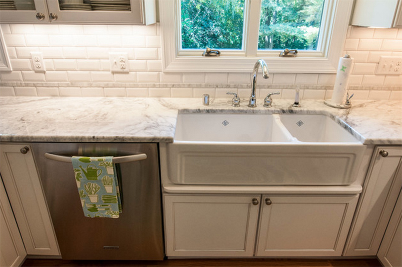
A big double-basin farmhouse sink was an expensive item in the kitchen. To pair with the sink, they used their old Moen faucet. For a finished look, molding details were added between the bottom of the sink and the top of the cabinets. The sink is heavy, that is why additional support was installed below the cabinet.
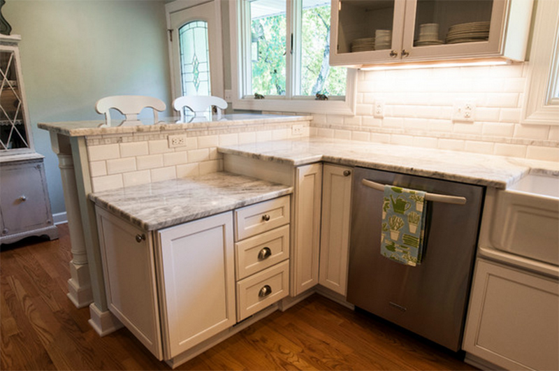
The baking center counter to the left of the dishwasher was lowered for Deb’s usage. On this area, she could roll pie crusts and work on bread dough comfortably. “I love it because you can really lean into stuff with the lower counter,” she says. There is also an end cabinet on the side of the baking center where the microwave is added. On the upper glass-front cabinets, the dishware and glasses are being highlighted.
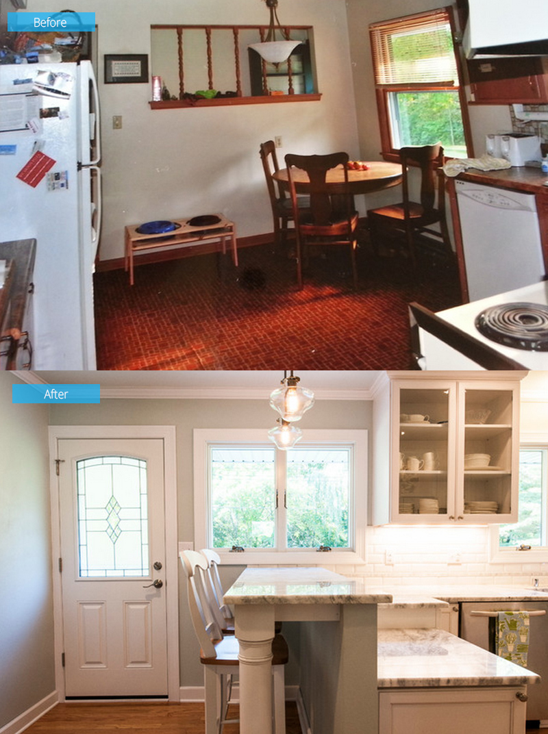
The old kitchen has an eat-in breakfast table and a non-load-bearing wall that leads to a narrow and awkward hallway to the back door. The walls were removed to improve traffic flow in the kitchen. Casement windows were used instead of the old windows in the kitchen. The new kitchen has a raised eating bar that replaced the old breakfast table. The window by the breakfast table was removed. To add more natural light to the area and give a good view of the backyard, a horizontal window was installed to the right of the location of the original window. Meanwhile, a decorative window insert with a storm door on the outside was added to the new back door which is already part of the kitchen.
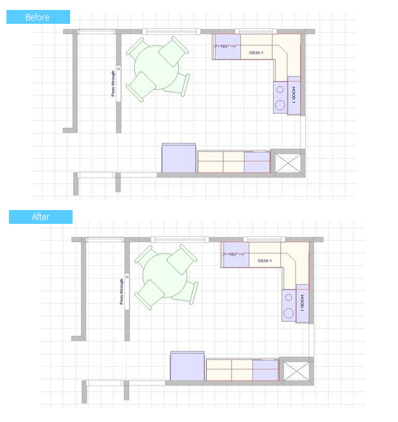
In this old floor plan, you can see that the kitchen shows the lack of counters and general workspace and that the round breakfast table and awkward hallway were taking up space. On the new floor plan, you can see that it has a better layout that is user-friendly with extended countertops as well as lots of storage options and a new eating bar.
The kitchen they used for 27 years now looked very beautiful and very different too! This is the work of Renovations Group Inc. who gave the family their dream kitchen. As for Deb who uses the kitchen most of the time, she said that it turned into a space where people can hang out while she is cooking. She also added that it becomes a very welcoming space and that “it’s really the room everything leads to and from.” Well, the difference of the previous space and the new one is pretty obvious. What can you say about this kitchen upgrade?