Apartments are common places occupied by those who live in urban areas. Most of the time, these aren’t spacious but the areas are just enough to contain rooms and spaces that one needs. Basically, it would have a living area, kitchen, dining, bedrooms and a bathroom. But if you have an open layout space, you can actually even add more to it. There are different approaches in designing an apartment. Let us check what this apartment we will feature today has in store for us.
In Nicosia, Cyprus is a Split Level Apartment with a lovely contemporary design. Like other apartments, it has a limited space but it contains everything that one needs in order to live. As a matter of fact, it has bonus areas too. The apartment has the kitchen and dining room split onto a higher level from the living area. This is the unique feature of the space. So you can understand more about the design, take a look at the images below.
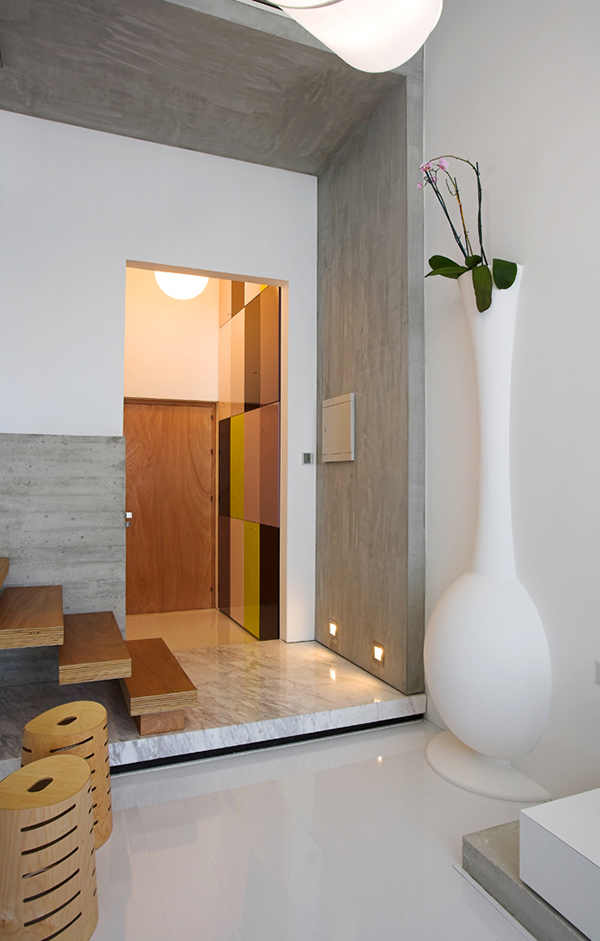
Look at that giant jar! Nope. It isn’t actually a giant jar but it is part of the wall as a planter! Very creative!
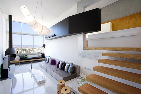
The living room looks very relaxing because of the sleek design of the furniture as well as the natural light that gets into it from the window.
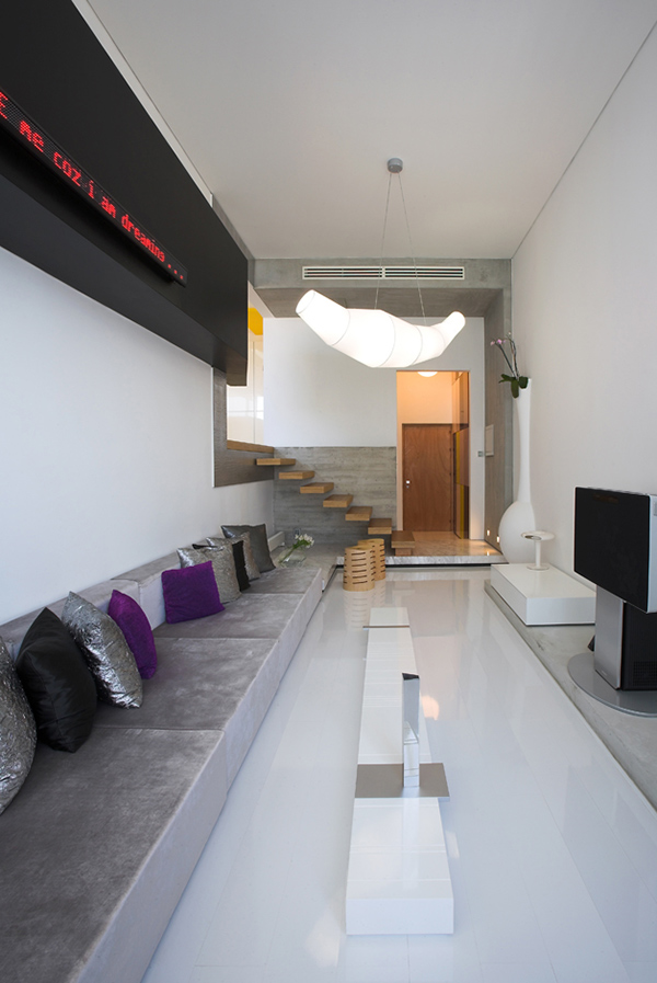
You can see that it isn’t crowded with decors that made it look more appealing.
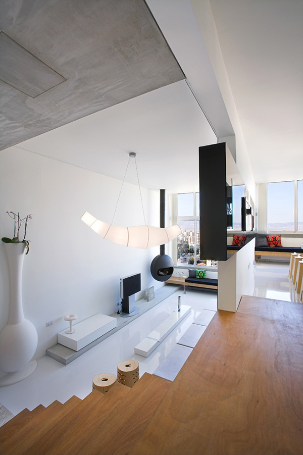
Leading to the upper area are floating treads made of wood.
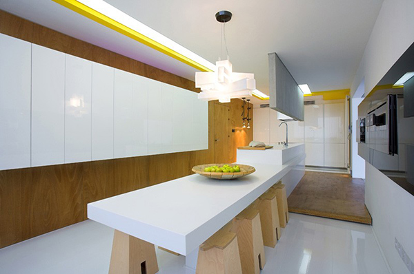
This is the dining area with a white table and wooden stools. Note the yellow lining on the ceiling.
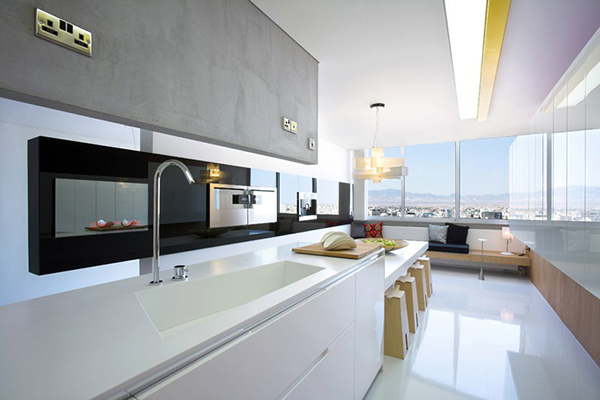
Well, the dining and kitchen area are elevated. The stairs you saw awhile ago leads to this space.
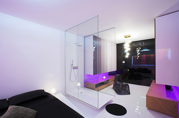
This one is the bedroom with a bathroom in it. Interesting, right?
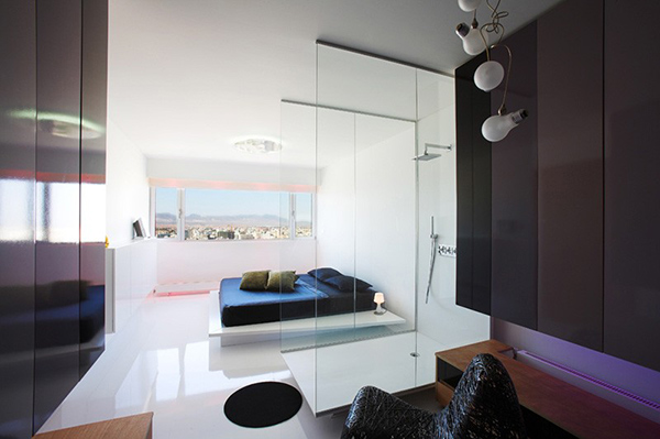
This bedroom is has a minimalist design with modern bed and furniture. I am really digging that shower area!
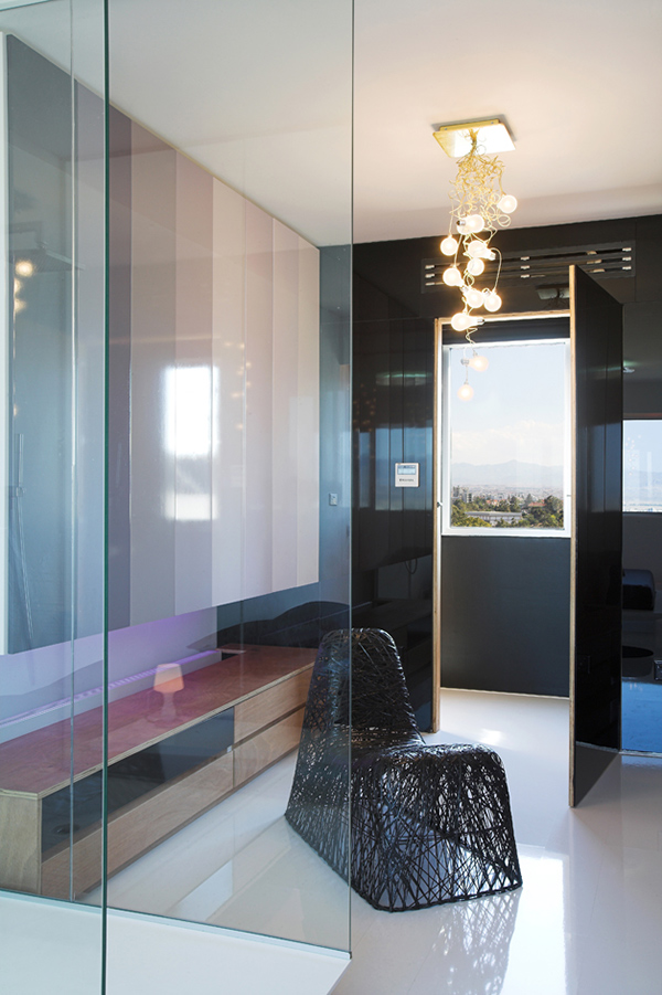
The use of glossy black for the walls together with white flooring added appeal to the bedroom.
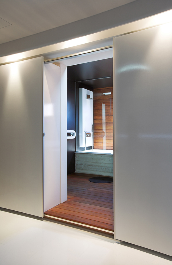
A sliding door leads to the bathroom. It looks high-tech, doesn’t it?
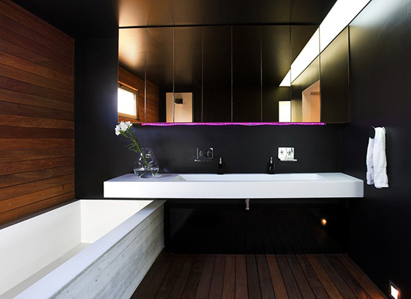
In the bathroom, you can see a bath tub as a vanity that all have edgy designs. The combination of black and wood is lovely!
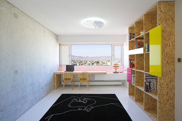
While this is a working area. I guess it can also double as an activity area or play area too.
Pretty, right? Apart from that, I would say that it is bright and airy. The spaces are well distributed too and it looked good that it isn’t crowded with stuff. I also like the pop of purples in some spaces. This interior is designed by M.O.B Interior Architects and it sure is something that we will love because of the cozy design. It is like when you are inside, you are away from any worries and stress. What are your thoughts on this apartment interior?