Some people would think that an old house can no longer be transformed into something modern and trendy because of it may appear dilapidated and that it would cost a lot. That is why, many prefer to build a new home from scratch than to renovate. But then, there are also some people who consider the sentimental value of a home to their family. So, instead of demolishing it or getting a new home, they prefer to have it renovated. And unlike what others think, it is actually possible to do that. As a matter of fact, many homes were already renovated that looks totally amazing that it’s original condition. This is what we can see in the house that we will feature today.
Duncan Foster Architects completed the transformation of a 1980’s house in London, England. From its old classic look, it was turned into a contemporary home with lots of glass and a landscaped yard. As a whole, it looks really nice and stunning and very modern indeed even if there are still traces of its past and of its original design. Yes, it is also good to preserve some details of the house because this way, the owners as well as its guests, will be able to appreciate the home even more considering how it looks like before. Here is a before and after showcase of the house:
Location: London, England
Designer: Duncan Foster Architects
Style: Modern
Number of Levels: Two-storey
Unique feature: An old house built in the 1980’s was renovated into a contemporary house which looks really beautiful neat and organized. It used glass in many areas to make it appear gorgeous.
Similar House: Before and After: Remarkable 1980’s Contemporary Duplex in Queensland, Australia
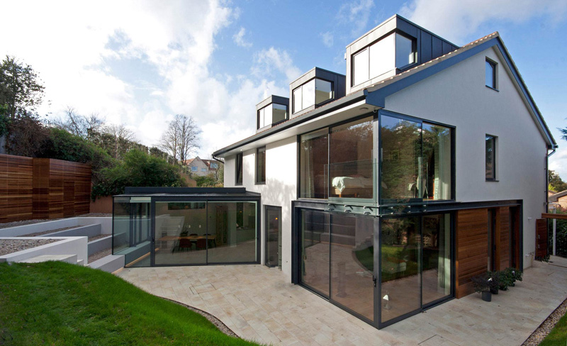
This is the updated home. It is indeed contemporary in design with a lot of glass added to it. Even the landscaping is made even better too with pavers on the flooring and steps from the entrance gate that looks like made of wood.

Seen here is the rear of the house which give us the idea of how the old home looks like. It is covered with bricks and it also used clay roof as well which added to its classic look. But all these were removed that totally changed the exterior of the house although the structure is still similar to the original building.
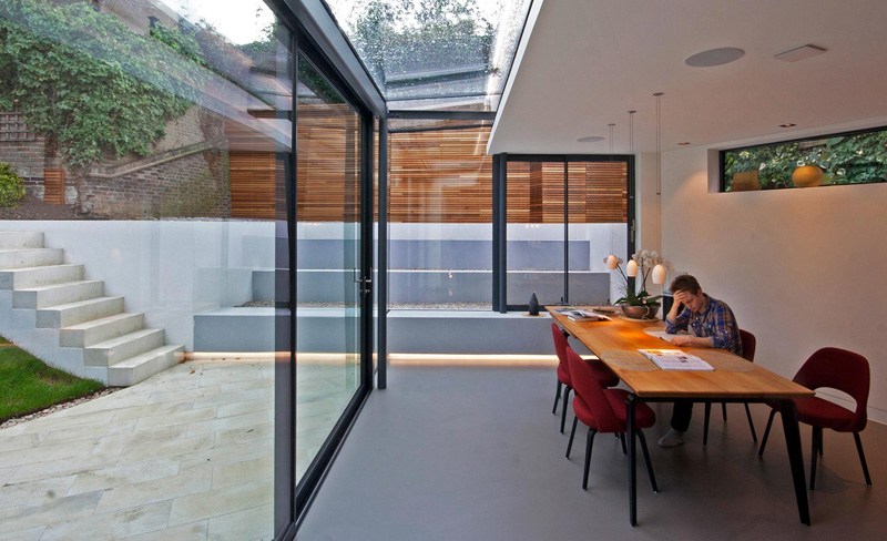
Adding plenty of glass to the home made it look really nice since the house became brighter and airy as well. The combination of concrete and glass never fails indeed! Seen here is the dining area which can also be used as a study area. It also has clerestory windows too.
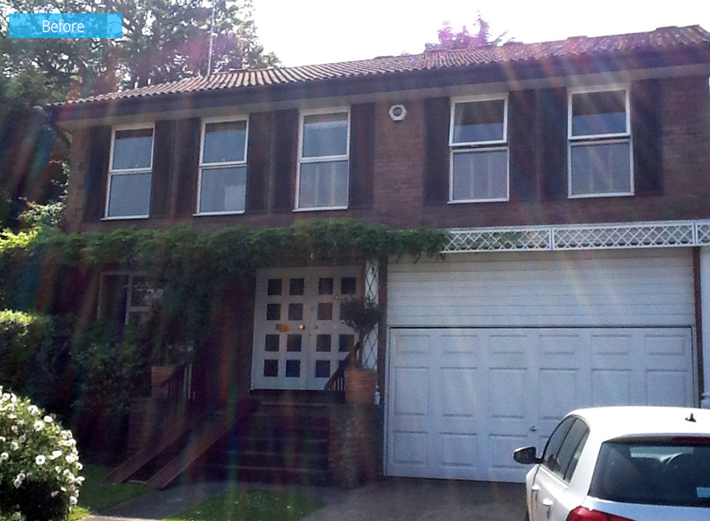
This is the front of the house with a garage and steps that lead towards the entrance door. But you can see that it is already different now and is even more presentable. Even the design of the doors and windows were changed too. I can tell that they indeed spent a lot for this project!
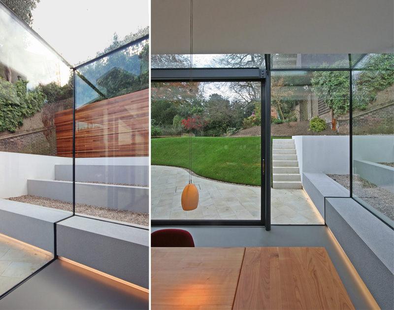
The interior of the house make use of concrete and glass combined. With the glass walls and sliding doors, one can get a lovely view of the garden and outdoor area as what we can see here. I also like it that the steps outdoors is connected to the beam in the interior with lights at the bottom. Now this is indeed a seamless design!
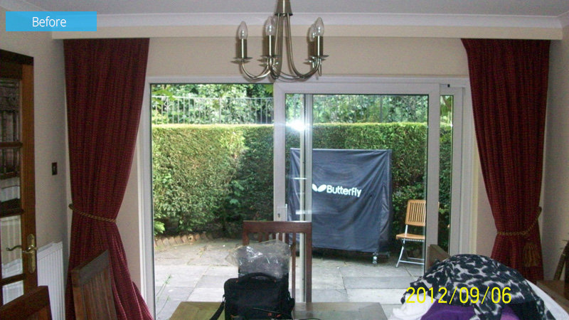
You can get a glimpse of the garden here as well as the sliding glass door. With the looks of it, the house is a bit cluttered and the idea of having that bulky curtain seems to bring much dust to the home.
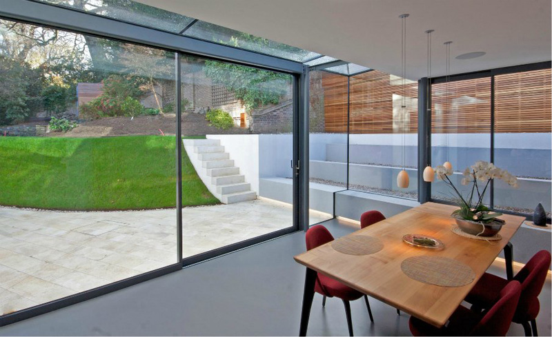
But now, it looked a lot better with this kind of design. Instead of white frames for the glass, it used dark gray. The home also received a major extensive rear landscaping which is carved out of the space for a new glass extension. Obviously, it looks better this way.
Read Also: Before and After: Brightened Modern Celio Apartment in Italy
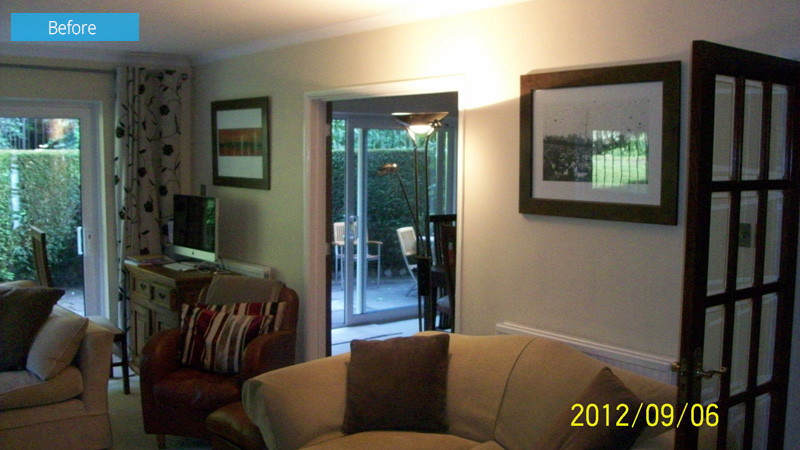
Seen in this photo of the old house is a very typical 1980’s home, with walls separating the various living and dining areas. You can also see that even the furniture is not well arranged.
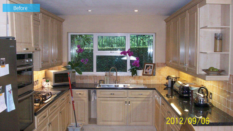
This is the photo of the old kitchen. It does like nice already but it will look better if only it was more organized.
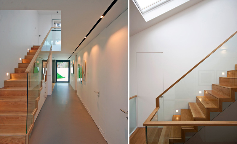
Seen here is the hallway with white walls and wall decors. There is also a staircase in the area with lights on the treads. On the ceiling of the hallway are recessed lights as well. Notice that there is a glass door at the end of the hallway.
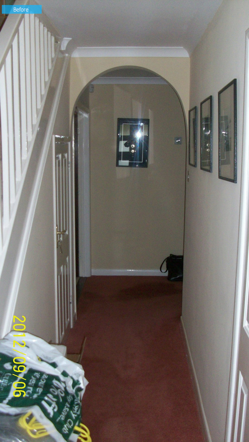
This photo features the original hallway with the stairs on the left. It has an archway which is very classic and the flooring is covered with carpet.
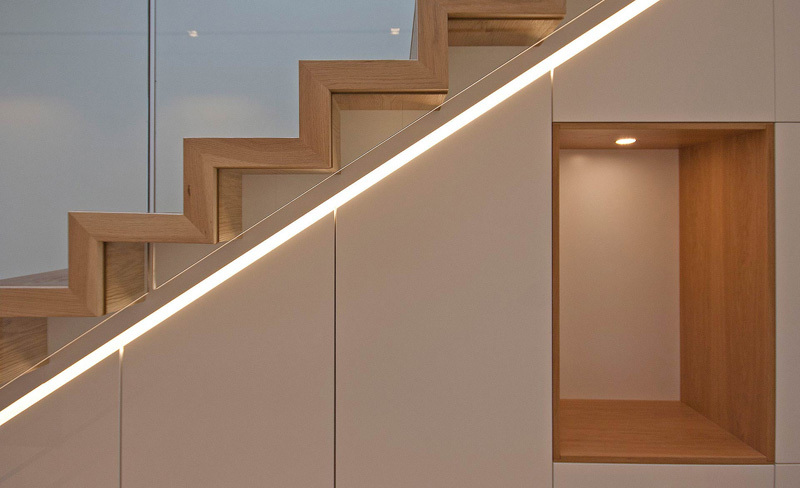
Aside from the lights on the treads of the stairs, it is also lined with lights too just under the steps. Under the staircase is a rectangular storage area with lighting. Such a neat looking staircase indeed especially that it also used glass for the railings.
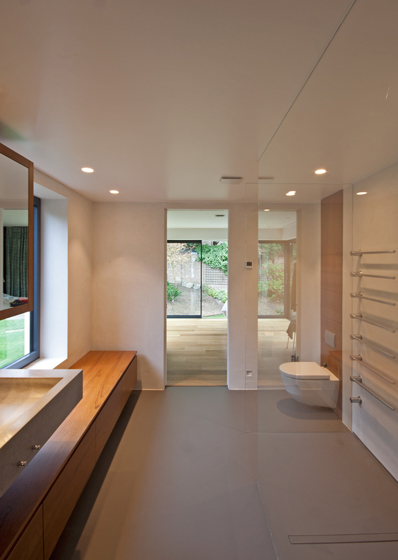
This image shows the bathroom which is not just spacious but also well-design. It has a floating storage bench on one side while the shower area is enclosed in glass. You can also get a glimpse of the garden from here.
Amazing, right? There is indeed a huge difference between the old house and the newly renovated one. Although we can still see some resemblance with the old home, we can still notice that it indeed looked a lot better after the renovation. Which home would you prefer to live? No doubt, you will choose the new one. This house was transformed by Duncan Foster Architects who apparently did a great job because apart from the exterior, its interior was also improved to give the homeowners are better way of living inside their house. It is even more relaxing and is made cozier. Even the color palette is nice as well. I like the idea that they used glass around the house to bring in more light to the home. So, what can you say?