Most modern home these would have that sleek and clean look while making sure that they are functional. But there are some designers who are successful in fusing or combining different design styles to come up with a unique house for their clients. One best example for this is the rustic modern home design in Burlingame, California. As we have mentioned, this is a fusion of modern, rustic, luxurious and even green design.
We won’t wonder why this home is so cleverly designed because it is a collaboration of two teams of brilliant minded individuals- the Toby Long Design and the Cipriani Studios Design. The exterior of the house made use of wood, concrete and cladding tiles. The subtle use of stones in the columns made it look more beautiful. What added to the warm and welcoming aura of this home are the lush green surroundings outdoors and the incorporation of nature in the interior design. We will give you a look into the home’s interior so you could understand what we mean by this.
Another good aspect of this home is its seemingly transparent look as it used floor to ceiling windows. Wide windows allowed natural light to enter the house giving it a breezy and airy feel. There is also a terrace equipped with an outdoor kitchen as well as a seating area where the homeowners could spend their time relaxing while enjoying the serene touch of nature. Well, did we say so much about it already? Why don’t we let the images speak about the beauty we have talking about. Scroll down and have a view of the Burlingame Residence:

With this kind of exterior, no one could resist to get inside this home. It made use of wooden stairs and flooring for the terrace. Also the roof eaves were covered with wooden spandrel making it look totally stunning.
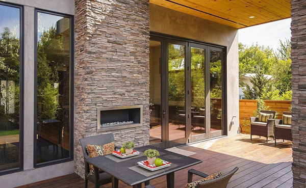
A modern fireplace is placed outside with comfy dining and living areas in the terrace. In this image, you can closely see the beautiful details of the stones.
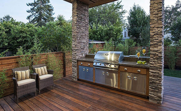
An outdoor kitchen is ideal for families who love to spend time outdoors. The position and location of this kitchen used space wisely.
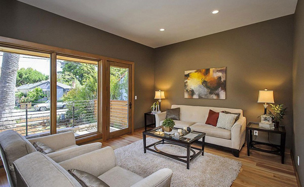
This is just one of the living rooms. This part is located on the elevated area at the left side of the house. The gray walls didn’t hinder to make this place have that cozy feel.
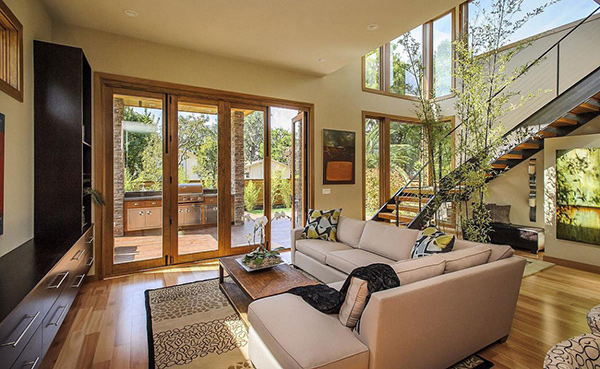
This is the living room that welcomes guests who passes through the terrace. Aside from the lovely carpet and furniture in neutral hues, you can also observe the modular wall system that has plenty of storage spaces.
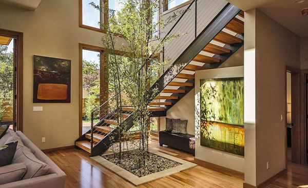
Remember the nature thingy we mentioned in the introduction? This is the part we are talking about. You can see an indoor garden near the stairs. Isn’t this divine?
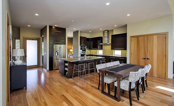
Dining seats in printed black and white give this dining area more life.
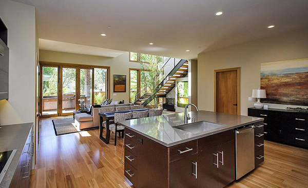
In this view, you could see the kitchen island as well as the living room. This house is quite spacious, isn’t it?
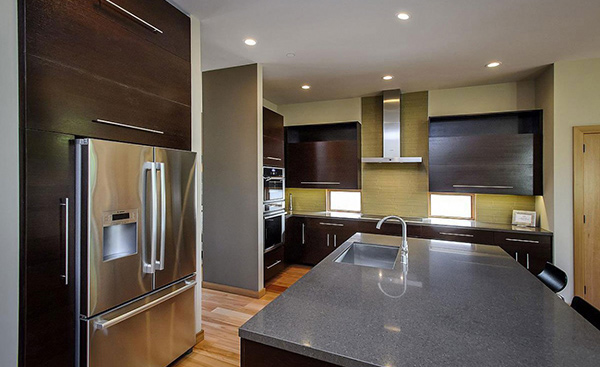
The kitchen is equipped with everything the homeowner needs for food preparation and the ambience with browns make it look more cozy.
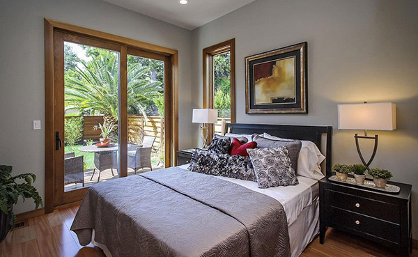
It would really be nice to have a patio outside a bedroom. The interior design of this bedroom is simple but the view from the outside is splendid!
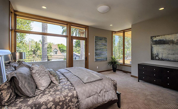
This could be the master’s bedroom having gray prints for the bed cover which is one of the colors used in this home’s interior. You can notice that this bedroom is carpeted unlike the previous one which has wooden tiles for the flooring.
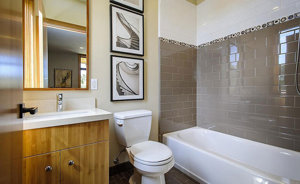
Again, gray was used for this interior. The decorative circles for the wall tiles match the prints we see in the living room and dining room.
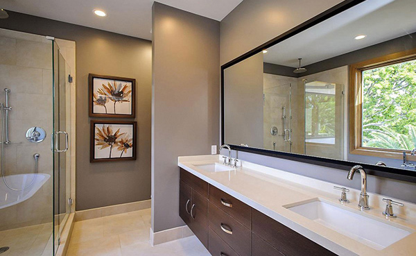
You can notice that the vanity with dual lavatory is designed similar to the modular system in the kitchen and living room. This house was really designed with coherence in mind.
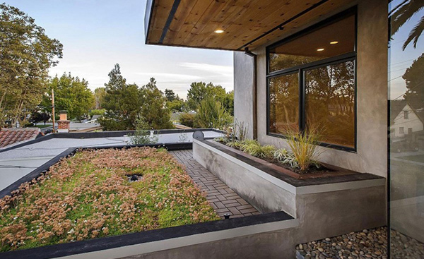
Let us take a look at the outdoor area. Concrete planters were used to match the exterior of the house. The pavers also look so modern.
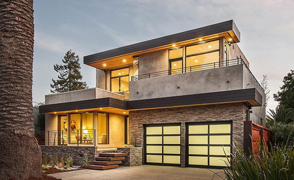
With the large windows, this house would be a head turner in a distance due to the lights that is seen from the outside. This image is a proof that the house is designed to get a transparent look.
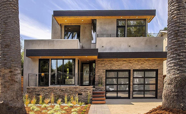
Let us give this house a one last glance by taking a look at the rear part of it. It sure has strong sleek lines in it. Stone was use more on this side of the house.
Isn’t this house lovely? With rustic touch through the concrete and wood in it, it appeared unique but it was made cozy and inviting. You can see that in both the exterior and interior design of the house. The lines in it are simple but the design concept was no doubt cleverly done by Toby Long Design and the Cipriani Studios Design. The collaboration of both design teams resulted into a modern home with a natural feel. They were also able to showcase luxury and beauty in a subtle manner. Can you think of a home that is similar to the Burlingame Residence?