Buildings are created with what the clients need for the structure and at the same time look how they wanted it to be. Just like homes are designed to fit the needs of the home-owners in such a way that pleases them and maybe impress the neighbors. Both ways, the owners will always want to get it their way. From the the external factors, like the the facade – or how they wanted it to look, and how much they wanted people to see – to the interiors, like the furniture and fixtures they wanted, up to the colors of the paint and the curtains they wanted for the house. Like for example the house that we will be featuring in this article, you might recall the saying “looks can be deceiving” from this one. On one side, you will think that the house looks like a one-storey home, but when you take a look inside, you will be impressed to see what the second floor has to offer.
One of the factors the designers had to consider for the house was that it was a corner lot. Both the owners and Jackson Clements Burrows Architects wanted to make most of the house that is shown to the public. The brickwork and webforge of the facade is relative to the ones on the neighborhood which goes back to a lot of history and heritage along Neville Street. As per sustainablity, ‘the house achieves a five-star energy rating through robust detailing and a simple palette of high performing materials’. Take a look at the beautiful pictures of ‘The Red Brick House’ in Harold Street, Middle Park, Victoria, Australia.
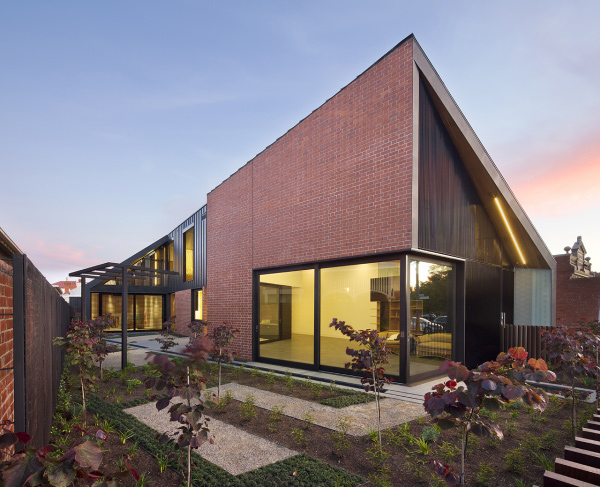
Admire this house’s angle from this side which looks like an inverted V.
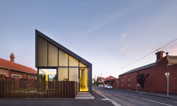
With this picture, you are able to see that the neighboring homes are made of bricks too.
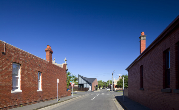
Even from a distance, the creative exterior of this house stands out.
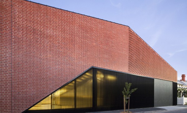
This is the part of the house where the second floor is hidden with bricks.
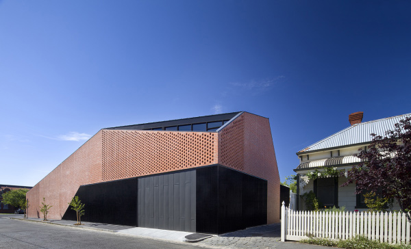
These windows are double glazed and fitted with high performing solar control glass. Amazing right?
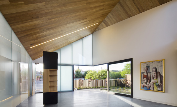
This is living area of the house with wood for the ceiling and glass windows that show the garden outside.
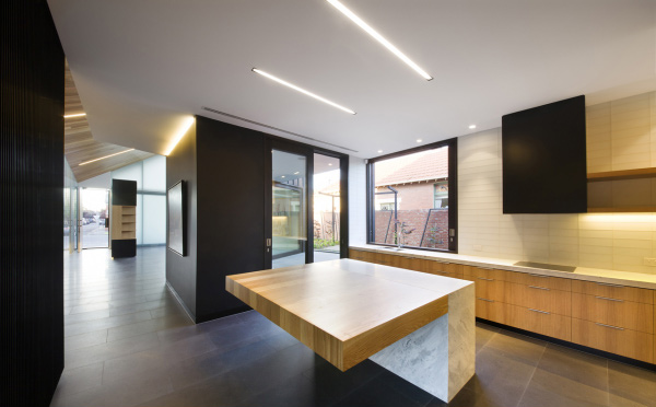
Look at the beautiful island in the middle of the kitchen.
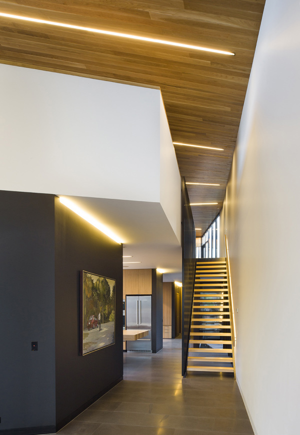
This is the cute stairs that lead to the second floor of the house where the bedrooms are.
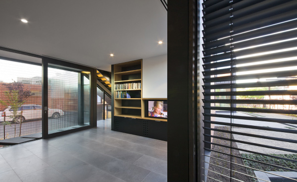
This is the entertainment area where they are able to see the neighbors to the left and road to the right.
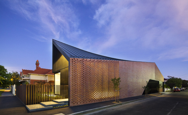
The LED lighting has been used to reduce energy and make the house look extra good during twilight.
The main goal of the Jackson Clements Burrows Architects was to make the house look like a small house for the couple who lives there but at the same time, make room for their children and grandchildren whenever they come to visit. Also since the wife loved gardening, the designer added a long garden on the northern side and a more private one on the other side which gives the home a view from inside the house and for the neighbors too.
Great thing about Jackson Clements Burrows Architects is that they value Green Architecture. Consider the 40,000L basement water tank that collects rainwater that is used for grey water flushing, ponds and provides irrigation for the predominantly drought tolerant landscaping. For more beautiful projects of Jackson Clements Burrows Architects, take a look on their website.