Some homes are designed in a different manner in order to fit into the needs of the homeowners or sometimes to the location. This is actually what makes every home unique because each one would vary depending on the lifestyle and usage of the owners or the family who lives in it. The design will also rely on what is the primary focus of the owners for their home. What we will show you today is a unique home that is built “upside down”. Why is this so?
The Monroe Drive Residence located in Montauk, New York is built “upside down” in order to maximize the ocean views. The public areas are seen on the upper level while the private areas are on the lower level of the house. The house has an open plan layout with the living areas, master bedroom suite and exterior decks are found on the second floor. A floating staircase contained in an oversize open stair connects the first and second levels of this unique home. On the first floor, you can also find a second living room that leads out to the pool area. The kitchen, which can be seen in the upper level, is an informal, highly practical arrangement of pavilions. Come and join a brief virtual tour of the house below:
Location: Montauk, New York
Designer: BergDesign Architecture
Style: Contemporary
Number of Levels: Two-story with basement
Unique feature: The house is designed “upside down” with the bedrooms at the lower level and the dining, living and kitchen at the upper level. It features a floating staircase within a stairs as well as a basement too. Another notable feature is its use of varying exterior walling materials and louvers.
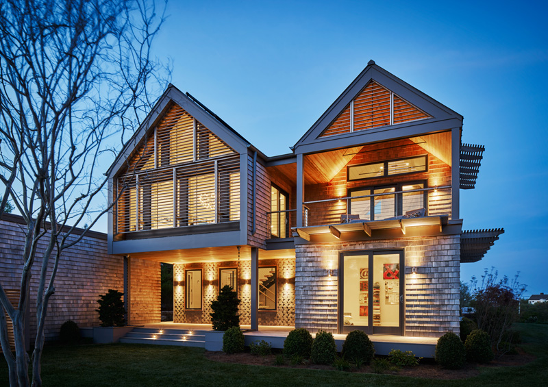
All I can say is that this is indeed stunning. What I love about this exterior isn’t just the beautiful design but also the varying textures in here that we can see in the exterior walls. The lighting looks dramatic and very romantic too!
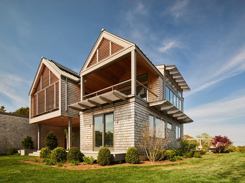
A trellis type canopy is added in the exterior which is inspired by modern and contemporary architecture. It is also a good way to shield the windows from too much glare from the sun which may enter the interior. Note the two gabled roofs too that gives the impression of having two different volumes.
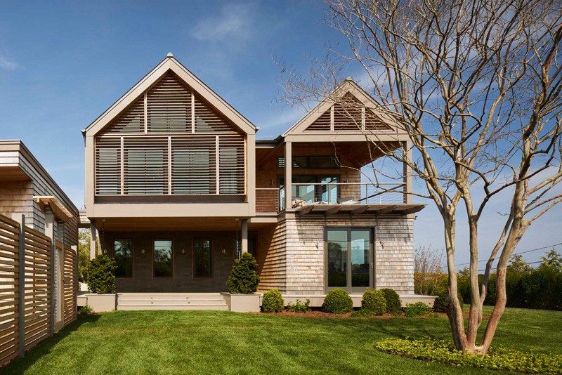
Looking at this house reminds me of some classic homes because f its roof and terrace design but if you look closely on it, it sure isn’t a home from a long time ago because of its wooden louvers as well as glass doors. Even the upper deck is a contemporary style.
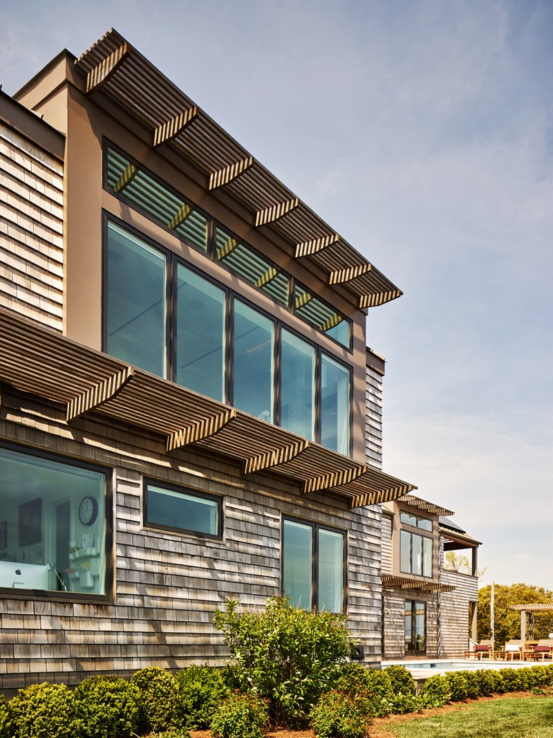
The house used wooden sidings that added texture to the exterior of the home. It also used glass with aluminum framing for the windows. You can notice that the windows on the upper level area larger because public areas are there while the ones on the lower level are for private areas.
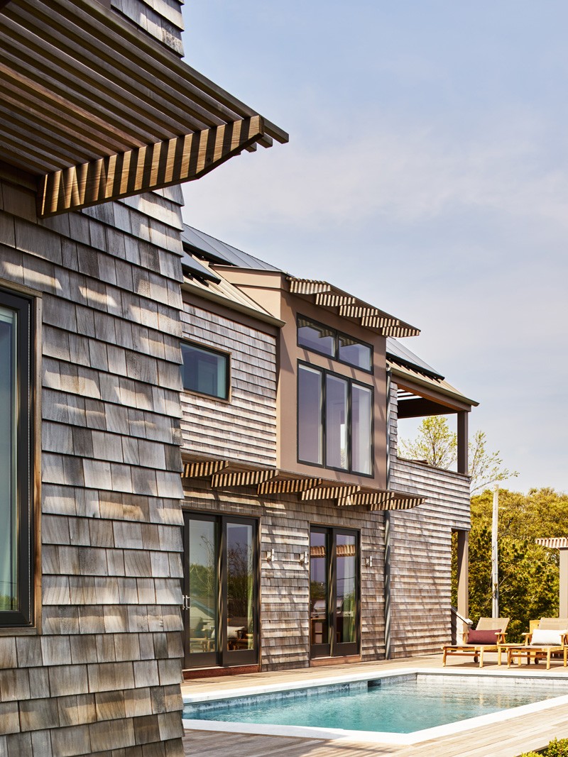
Off the bedroom at the lower level is a swimming pool. It has a geometric design which isn’t that large but is enough to give the family some fun and relaxation.
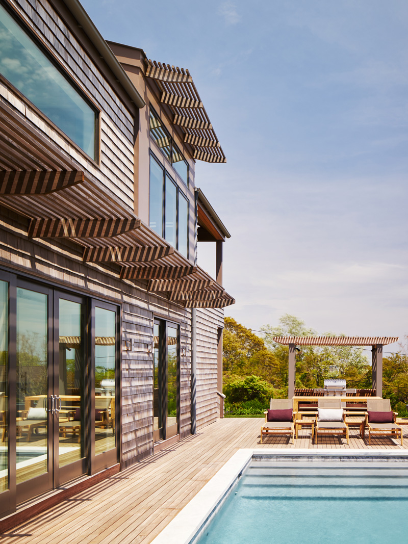
A pavilion houses an outdoor kitchen as well as a dining area where the entire family can enjoy night time barbecues or even day time chatting. There are also lounge chairs with earth-toned colors and some pillows for added comfort.
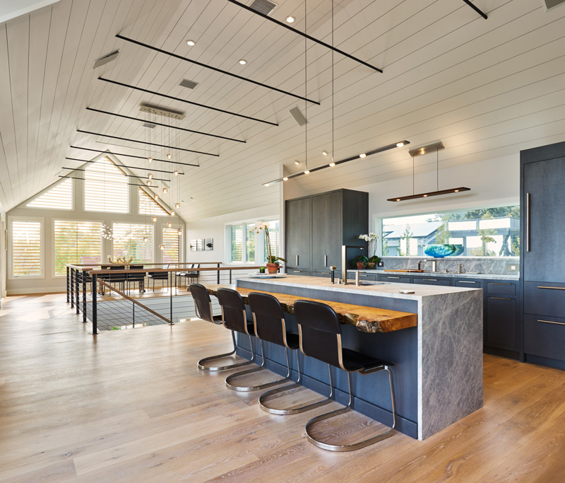
The kitchen’s finishes include metallic charcoal grey cabinets, leather flamed marble counter top and a birds eye maple slab at the island.
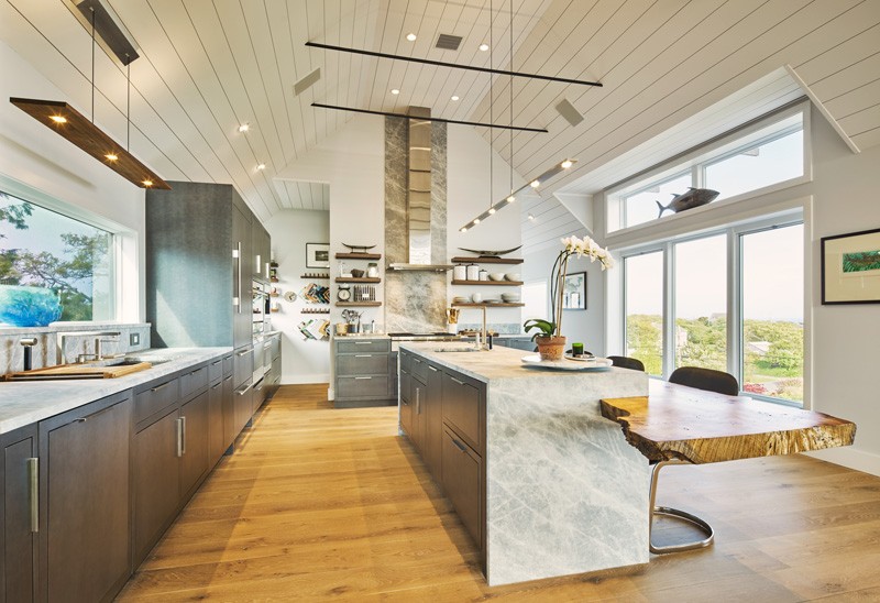
I like that maple slab on the kitchen island! It is indeed a head turner and added a natural touch to the home. The kitchen area is spacious which even looked larger because of its high ceilings and its windows that surround it. Look! There is a fish on one of the clerestory windows!
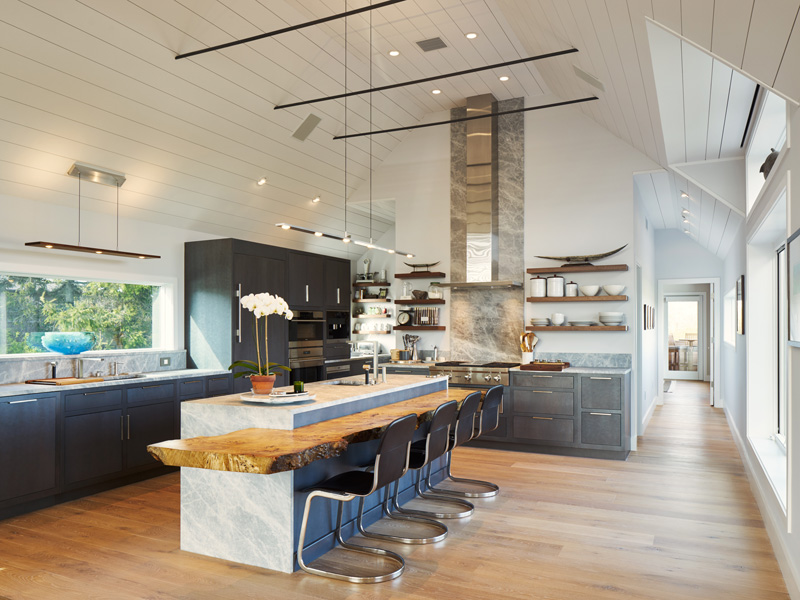
A long hallway is seen here from the kitchen which we are unsure where it leads to. So, let us go back to the kitchen. Take note that aside from the lovely materials and the sleek design, it has decorations too like the ones on the floating cabinets near the range hood, the fish we saw on the previous photo, the flowers on the island and that blue vase near the sink.
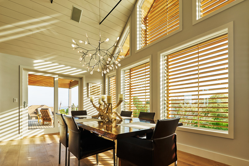
Now this one is the dining area. Remember the louvers in the exterior? Look at the window, this is how the louvers appear from the inside. it could help shield too much sunlight and could add privacy in the area. On the dining table is a candle holder made from driftwood that is complemented by the pendant light just above it. From the dining room, one can go directly to the deck through a sliding door.
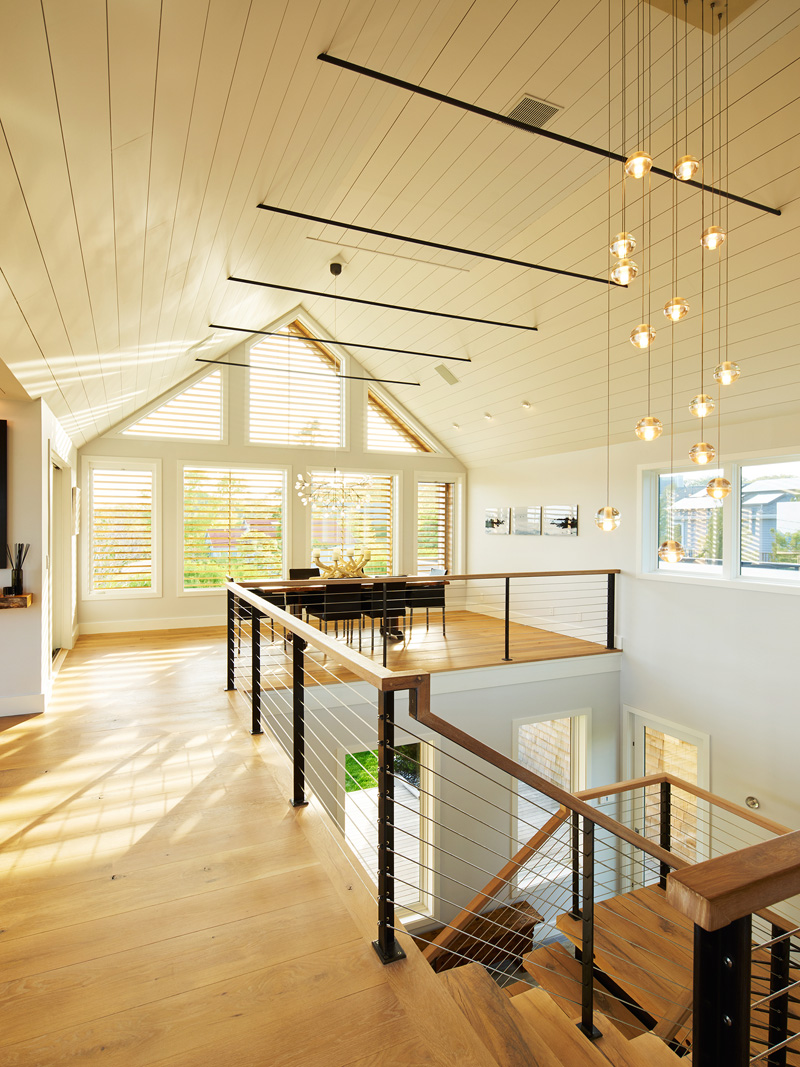
What we can see here is the railings of the staircase that is made from steel and wood. It used steel stringers that gave this space some industrial feel. The wooden staircase is one highlight of the house. You can also see here orb pendant lights that are suspended from the ceiling as well as some windows everywhere in the house. With the large windows, natural light floods into the interior.
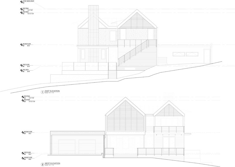
This is the elevation of the house. It is a view of the east and the west part. On the east is the outdoor pool while on the west is a garage.
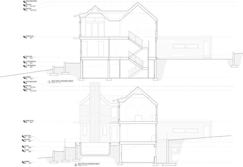
Seen here is the cross-section of the house looking west. We can see the staircase that connects the different areas as well as a basement. I wonder what the basement looks like!
This project designed by BergDesign Architecture is indeed a head turner. Apart from the unique floor plan design, its architecture and interior are very impressive. It looks airy and bright and totally cozy. I could honestly live in a house like this where the bedroom is just off the pool! Hmmmm..I could dip on the pool whenever I want to! Isn’t that amazing? How about you, can you tell me what you love most about this home?