Most of the time, we look at a house as a structure with a roof with a hip design. But not all houses are donning a roof because there are also some that only have roof decks. A roof deck makes the upper area even more useful since it can be an extended space for recreation or even a garden or for other purposes that the owner to intend to use. What we are going to feature today is a house with a roof deck in black exterior design in a modern structure which is an extension and addition to the area.
A contemporary addition was constructed for a home in Orinda, California with a design that has natural light and open modern look. Designer Klopf Architecture worked hand-in-hand with homeowner and designer Tanja DiGrande. The project is a modern addition to the rear of a traditional-style home. On its exterior, steel elements are being used to bring a more industrial modern look which is an addition from the rear area. The exterior also features dark gray stuccoes walls, dark steel railing, and floor-to-ceiling windows. It has a modern box with a receding volume which acts as a backdrop for the house. The structure is receding visually from the original home. Once you are on the roof deck, it is interesting that the owners use a boom and crank in order to bring up food and drinks for entertainment. Isn’t that cool? This idea was created so that the addition will depart from the original style of the home. The addition has a “very minimal, clean, gallery-like modern style against which changing daylight, art, furniture, and of course the people provide the color and motion.” The windows used here allows a view of nature, the original property and as well as the lush area.
Location: San Francisco, California
Designer: Klopf Architecture
Style: Modern Industrial
Number of Levels: Two-storey
Unique feature: A modern contemporary addition with a black exterior and black spiral staircase which brings an industrial touch into it.
Similar House: Victorian Terrace With Contemporary Addition in Melbourne
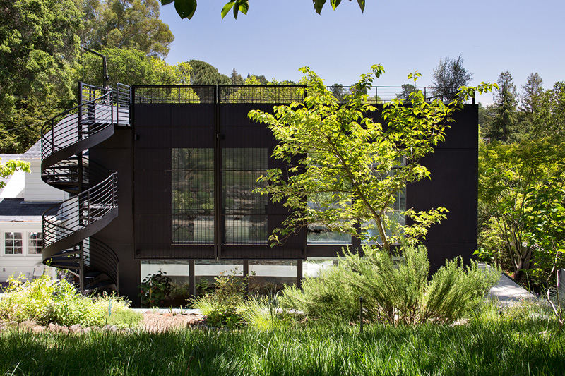
At first look, you might wonder what this space is but as you move closer, you will be able to see that it is actually a house even if it does look different from other structures here as well as from the original house.
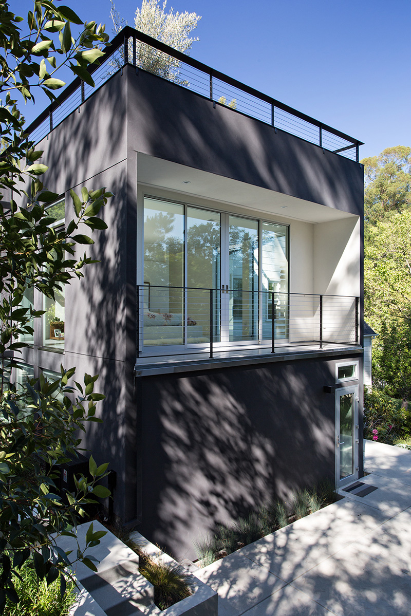
The extension has two levels and a roof deck. On the lower area is a living room while bedrooms are seen on the upper area. There is also a balcony on the bedrooms too.
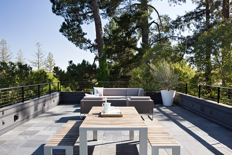
This is the roof deck of the house which is perfect for extended entertainment and relaxation. There are also beautiful wooden and upholstered furniture used here. From the deck, the trees and the verdant green bushes can be seen.
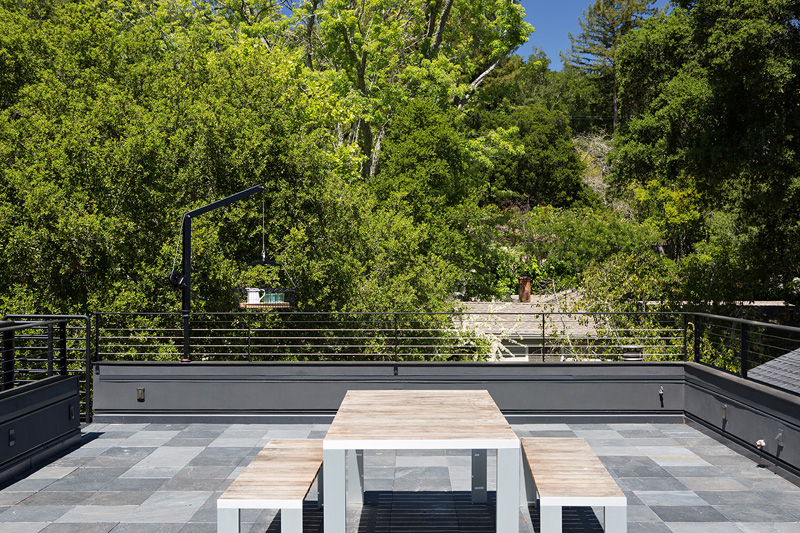
The deck has beautiful flooring in gray which matches with the wooden materials of the outdoor dining set. You can see some industrial sense in here.
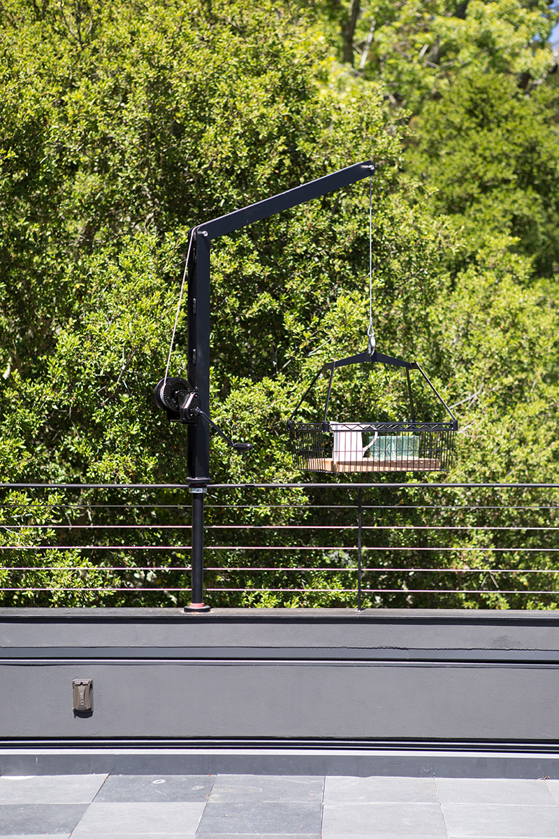
Now this is the fun part. The owners use a crank and a basket to bring food and drinks to the deck. It does save time and energy and adds a lot of fun to those who are on the area. And it would also be exciting to put gifts on it too!
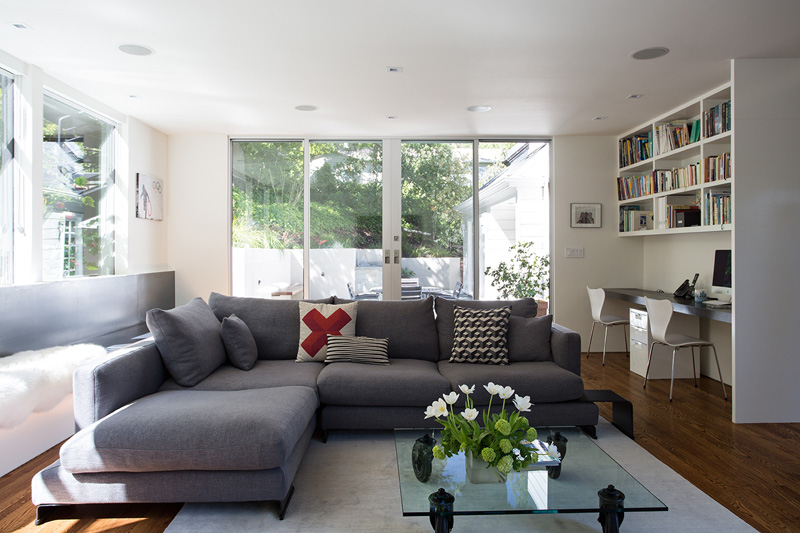
In the interior, the living room has a simple clean-lined design that showcases the couple’s minimal and modern taste. You can see that it used white and gray colors in here.
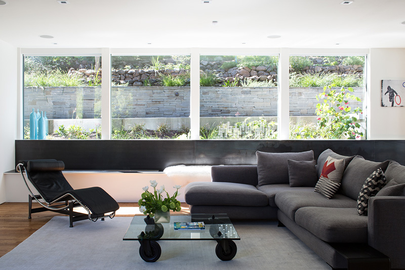
Aside from the gray and white, there are also black colors to add contrast to it. And there are glass windows as well where the outdoor garden can be seen with the stones and grass. It is such a beautiful background from the living room.
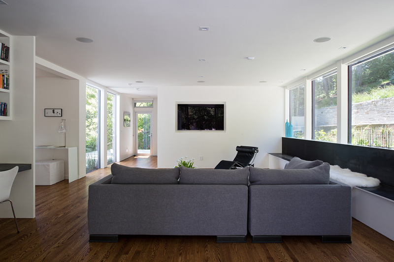
In the living room, you can also see a television on the wall. On its left side is a small working area for the owners. It is a good idea to use wood for the flooring here.
Read Also: Shirley Road House: A Lovely Contemporary Addition to a House in Massachusetts, USA
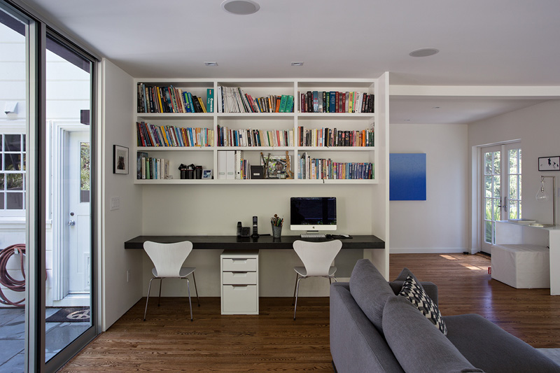
This is the working area inside the house with a mini-library as the books were kept on a hanging bookshelf. Below the cabinet is the working area with a long table and white chairs.
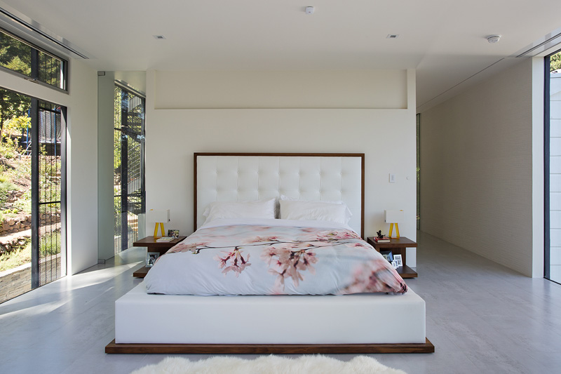
Isn’t this a beautiful modern minimalist bedroom? I so love the print of the bed cover. It adds a relaxing feel to the entire space. Aside from that, the side tables and the headboard of the bed are very gorgeous too.
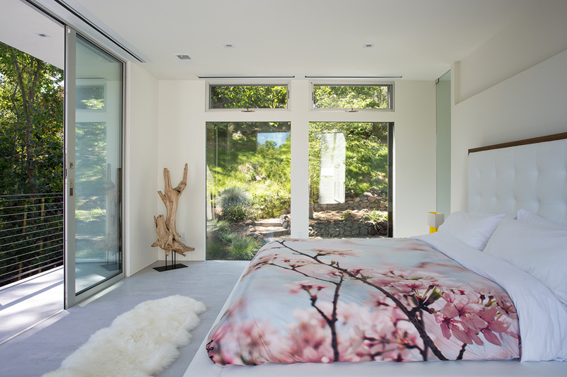
This is a nice bedroom indeed especially that one can seemingly frame the views from the outdoor area where trees, grasses, bushes and rocks are seen. The bedroom also connects to a terrace.
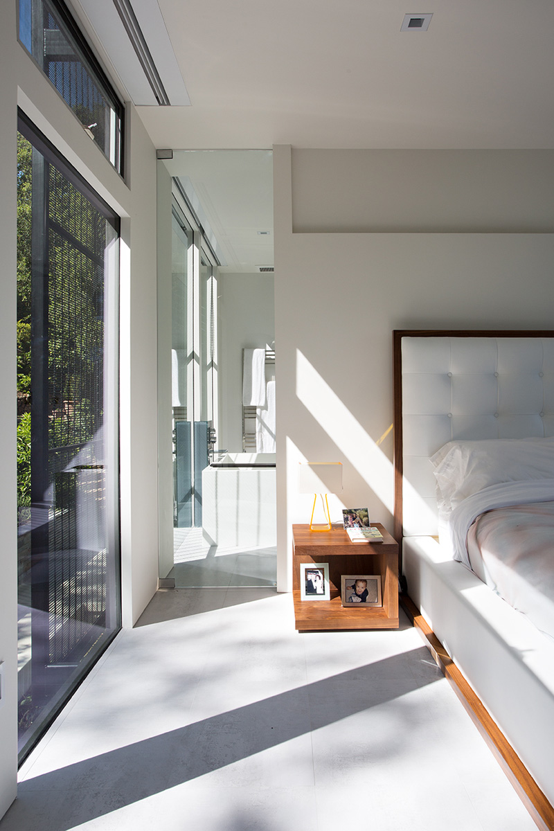
What I noticed here is the glass door that connects the bedroom and the bathroom area. You can also see here a side table made of wood with frames on it.
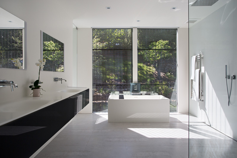
Seen here is the open bathroom that epitomizes the clean, minimal style of the addition. Notice the design of the blinds here too. An orchid sits on top of the vanity in dark gray. It would be nice to take a dip on the bath tub here as one can take a glimpse of the garden.
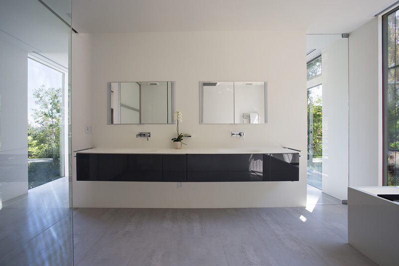
The bathroom is spacious with a long floating vanity in gray. Its finish is glossy which adds sheen to the area. The other parts of the bathroom has also white colors too.
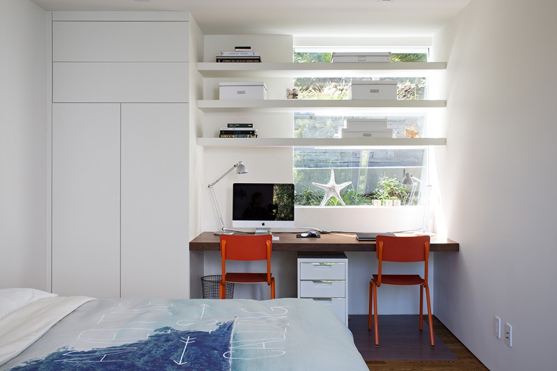
This bedroom is obviously owned by a teenager. It has a subtle ocean theme motif in it whit whites and blues around. I like the design of the covers! And how it used white in the space all over!
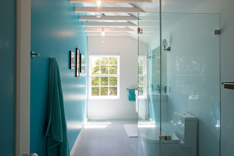
Another bathroom in the house with green and white colors in it. You can see that it used a French window here and there is a gallery of photos on the wall. Aside from that, the shower area is enclosed in glass.
I honestly like the modern industrial mix of this addition especially that it has a black design. Apparently, the Klopf Architecture did a great job with the owner of the house. Their collaboration resulted into a space that is very beautiful and very fun too especially because of how they can bring food towards the area. I also like what they did to the landscaping of this one. And of course, the interiors are very nice with its minimal look yet sophisticated feel. How about you, did you like this space too?