A house design that fits for parents and their adult children with their families is the requirement for House U. The house has one two-storey house for the parents while the other part has two apartments for the children and their families. To connect both spaces, there is a shared outdoor area inserted between the house intended for socializing and family gatherings. This house is built at the Ploce quarter in Dubrovnik, Croatia on a steep site with irregular shape. The lot is divided with a road by the change in land zoning plans. The house is built on the top part allowing the homeowners to get a good view of the Old City and Lokrum Island. The lower area is used as a garden.
Fronting the parent’s house is a pool sunken under the terrace level so that it does not block the view from the living area. There is also a garage hidden from the view of the plot. The house use simple combination of materials that includes natural wood pergola beams that connects the two houses. With this kind of design, House U can be the perfect family house. Now take a look at House U’s modern and minimalistic approach through the images below:
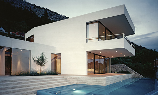
The house design uses sleek lines to achieve a modern look. It is white in color for a minimal approach.
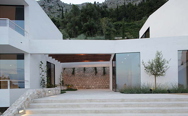
This is the outer seating area that connects the two houses. It has a timber pergola and local stones in it.
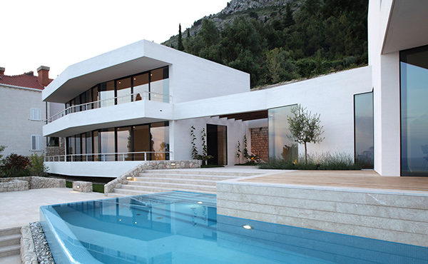
You can see here the apartment for the children with glass walls all around it. Like the parent’s house it has also a modern minimalist design.
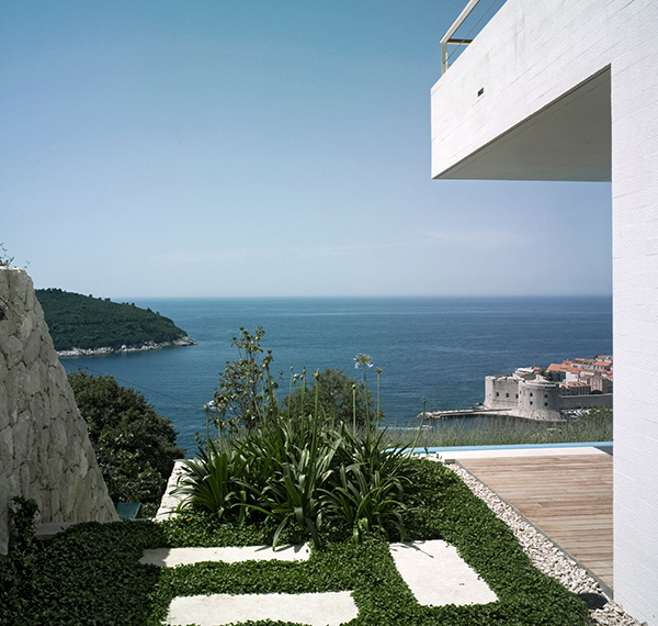
Lush greenery is added in the home’s outdoor area which makes outdoor stay even more relaxing especially with the panoramic view of the waters.
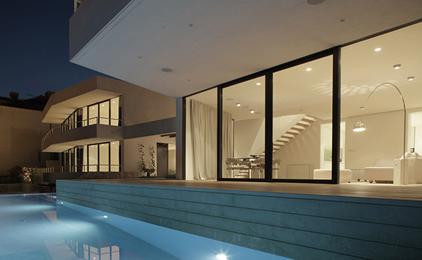
The swimming pool is located in front of the parent’s house and is sunken in the terrace.
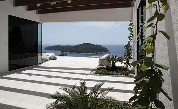
A closer look at the outdoor space used for family gatherings with modern landscaping.
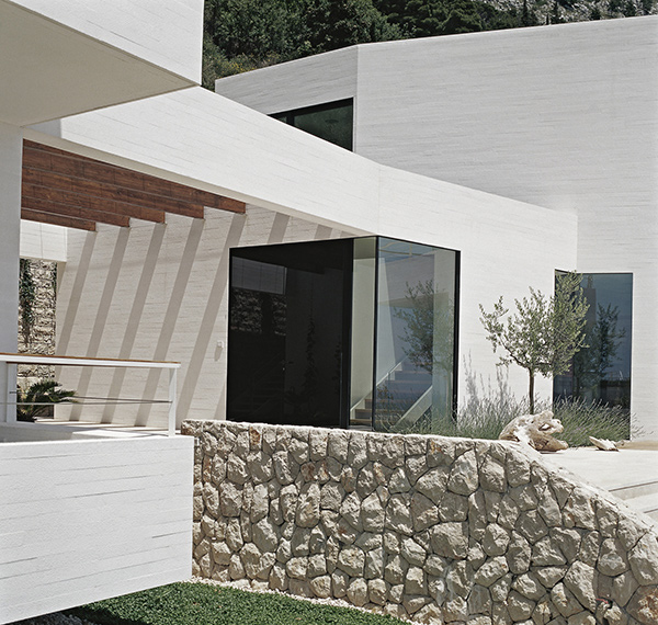
Natural stones are one of the home’s features that the designers are proud of.
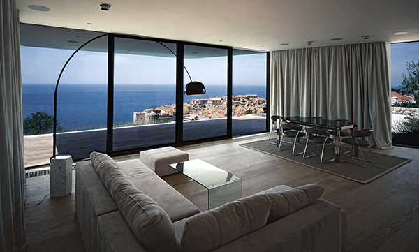
The living room has customized furniture from wood and is designed with a minimalistic approach. The block out curtains could be useful to add privacy.
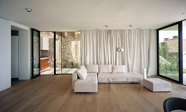
Wooden flooring is used to give the interior a softer touch. It adds to the living room’s modern look.
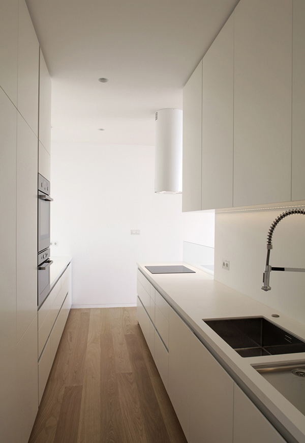
One could be hesitant to work on a kitchen as white and clean as this one! It uses lacquer gloss finished modular kitchen cabinets.
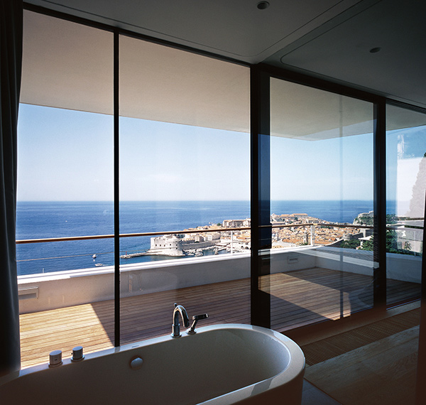
The bathroom is also surrounded with glass walls but of course, one can close it when they feel the need to. You can see a terrace with glass and stainless railings from this view.
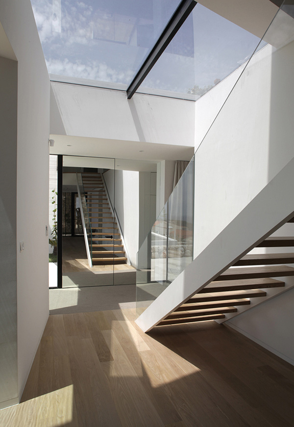
A glass railing for the stairs is indeed beautiful. It matches well with the wooden treads.
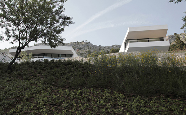
This is the lower part of the house which was intended for a garden. It sure adds beauty to the home’s exterior.
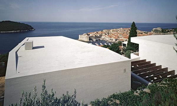
From above, this is how House U looks like. And yes, it kind of resembles the letter U with the two houses and the outdoor area that connects them.
A house doesn’t need to have sophisticated and intricate designs in it. It can also be designed with minimalism in mind but still achieve a high level of sophistication due to its simplicity. Being minimal and simple is not equated to being boring. It can also mean beauty. But then, when we talk about house design, what matters more is not the look of the house but the function of each part of the home. You can only say that the house is perfect for you if it works well with your lifestyle. Considering the family that uses the house, 3LHD Architects indeed achieved a great design.