We all believe that the past is important and that everything we learn from it can be very beneficial for the future. It can also help us with the present things that we encounter. But aside from the personal experiences as part of the past, even the history of a thing or a home can be valued even if it is already renovated or updated. This is what the homeowners want for their home in this house feature we have today. They commissioned a design firm to update their home but didn’t want to lose the soul of the house and so, the architects game them what they wanted.
Du Tour Residence was renovated by Architecture Open Form together with interior design firm FX Studio par Clairoux. The home is located in Laval, Canada which was originally designed in the 1960’s, and has belonged to the same family for decades. Because of that, the family wants to preserve its memories and its history. Because it was built many years ago, we won’t wonder why they are asking for a renovation. But since the family requested that their updated contemporary home will still have “its soul and the memories associated with it,” this is what we can exactly see in the house below. Come take a look!
Location: Laval, Canada
Designer: Architecture Open Form and FX Studio par Clairoux
Style: Contemporary
Number of Levels: One-storey
Unique feature: The interior of an unorganized home is updated into a beautiful contemporary interior with many black colors and wooden features.
Similar House: Before and After: 1980’s Split-Level House Transformation in Canada
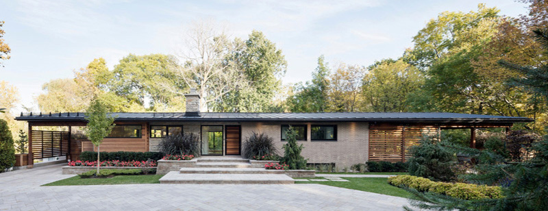
I know that you have already seen many contemporary homes and this is just one of them. Hence, you already have an idea of how a contemporary home looks like.
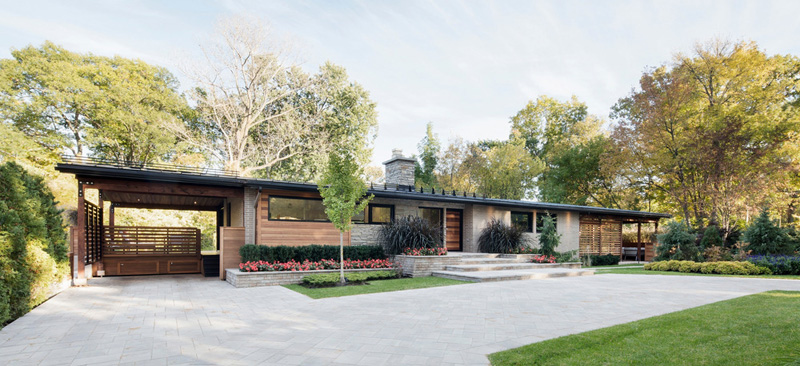
The house is just one-storey but is elevated from the ground. It also has a mix of materials in it from wood to concrete. I like it that it has concrete planters on the exterior which bears flowers and other types of plants that adds to its curb appeal.
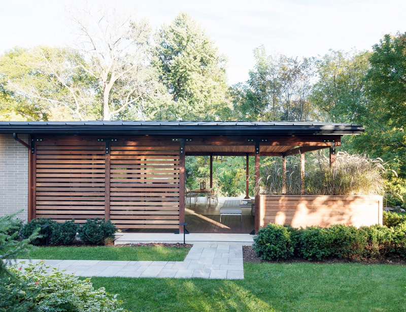
What you see here is one side of the house with the wooden features on it. It looks nice with the concrete pathway outdoors as well as the plants seen around it.
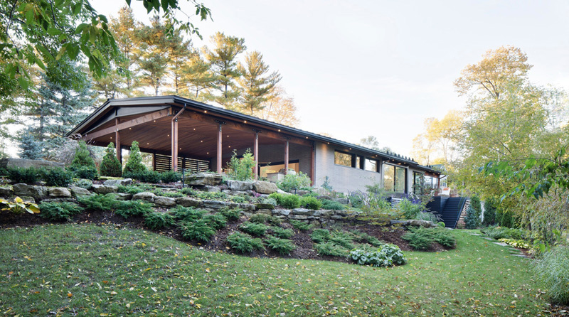
On this side of the house, it has a sloping topography with a beautiful landscaping. Yes, even a challenging location like this couldn’t hinder the beauty of the house.
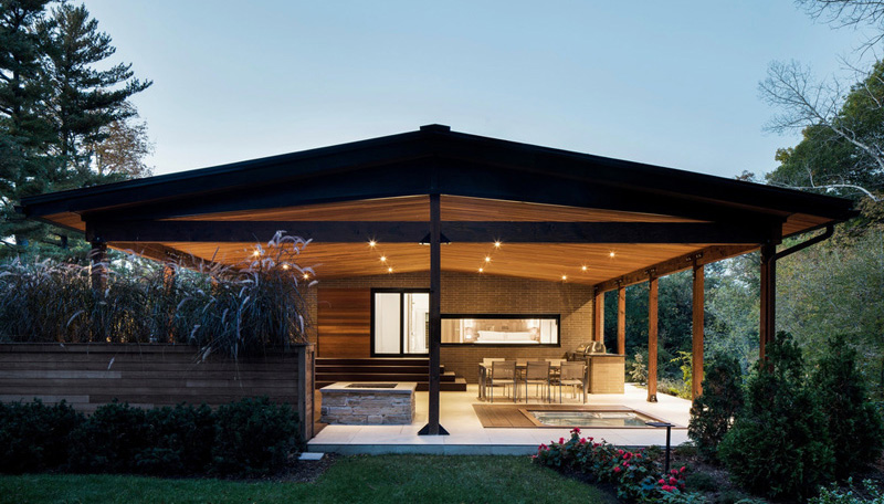
One of the key feature elements of the home is the outdoor covered patio area, located to the right hand side of the home.
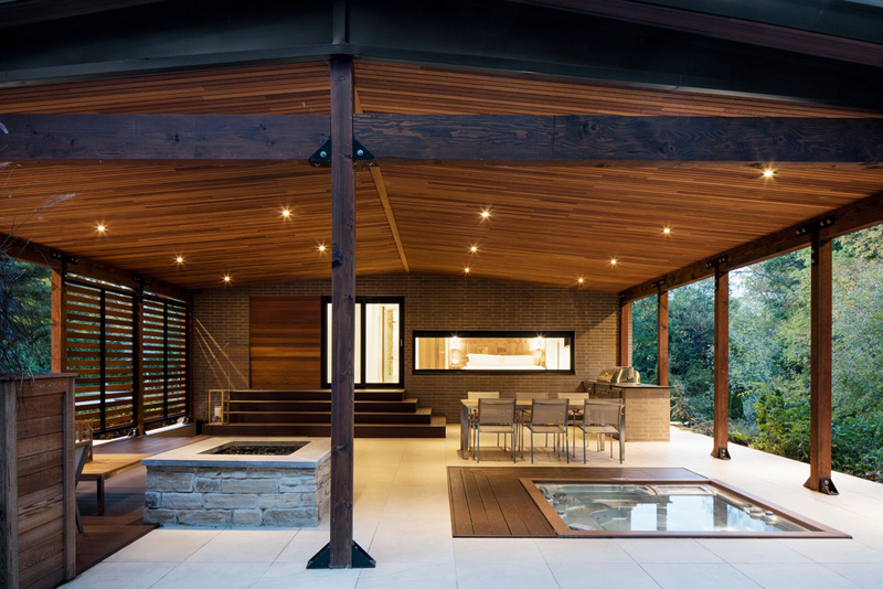
The large patio is perfect for entertaining with an outdoor barbeque area and dining table.
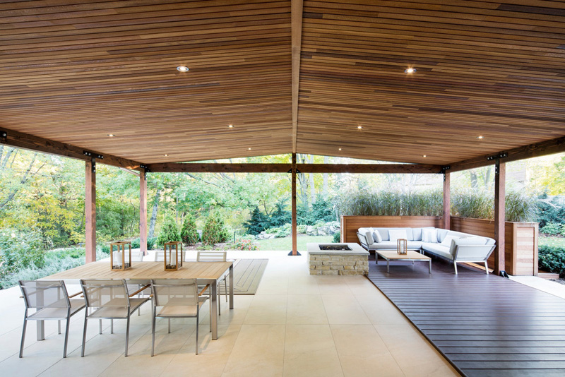
There’s also a spa and a lounging area with a fire pit.
Read Also: Before and After: Updated Interior of Pied-à-terre with Pre-War Character
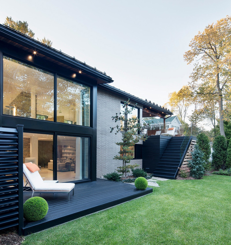
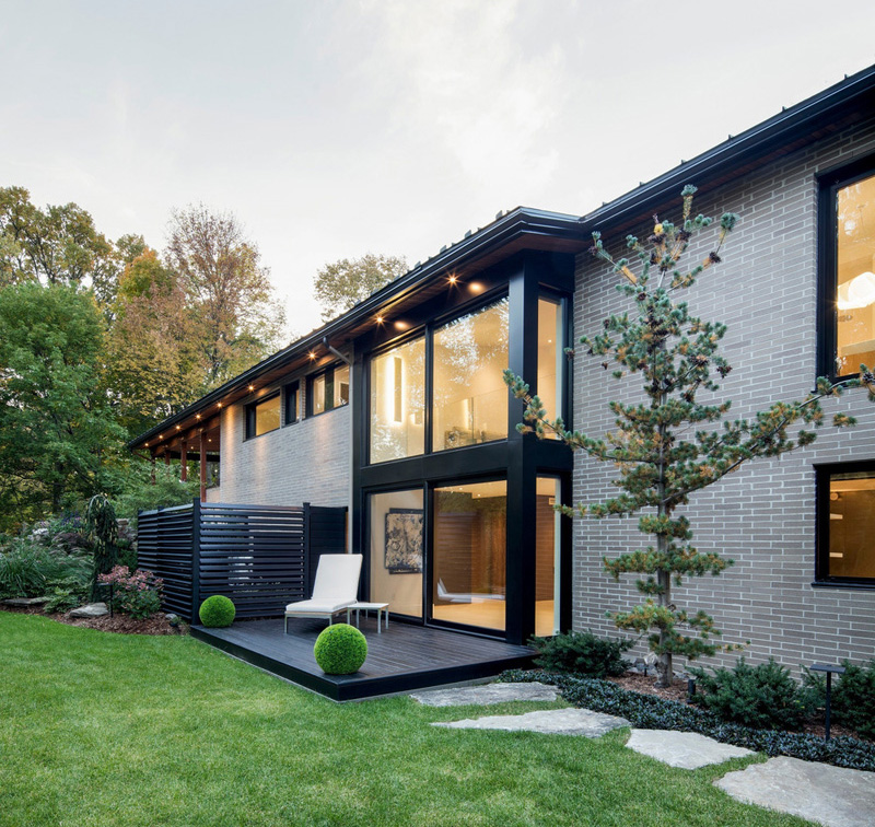
The manicured backyard, with stepping stones, gives you access to the main living areas of the home.
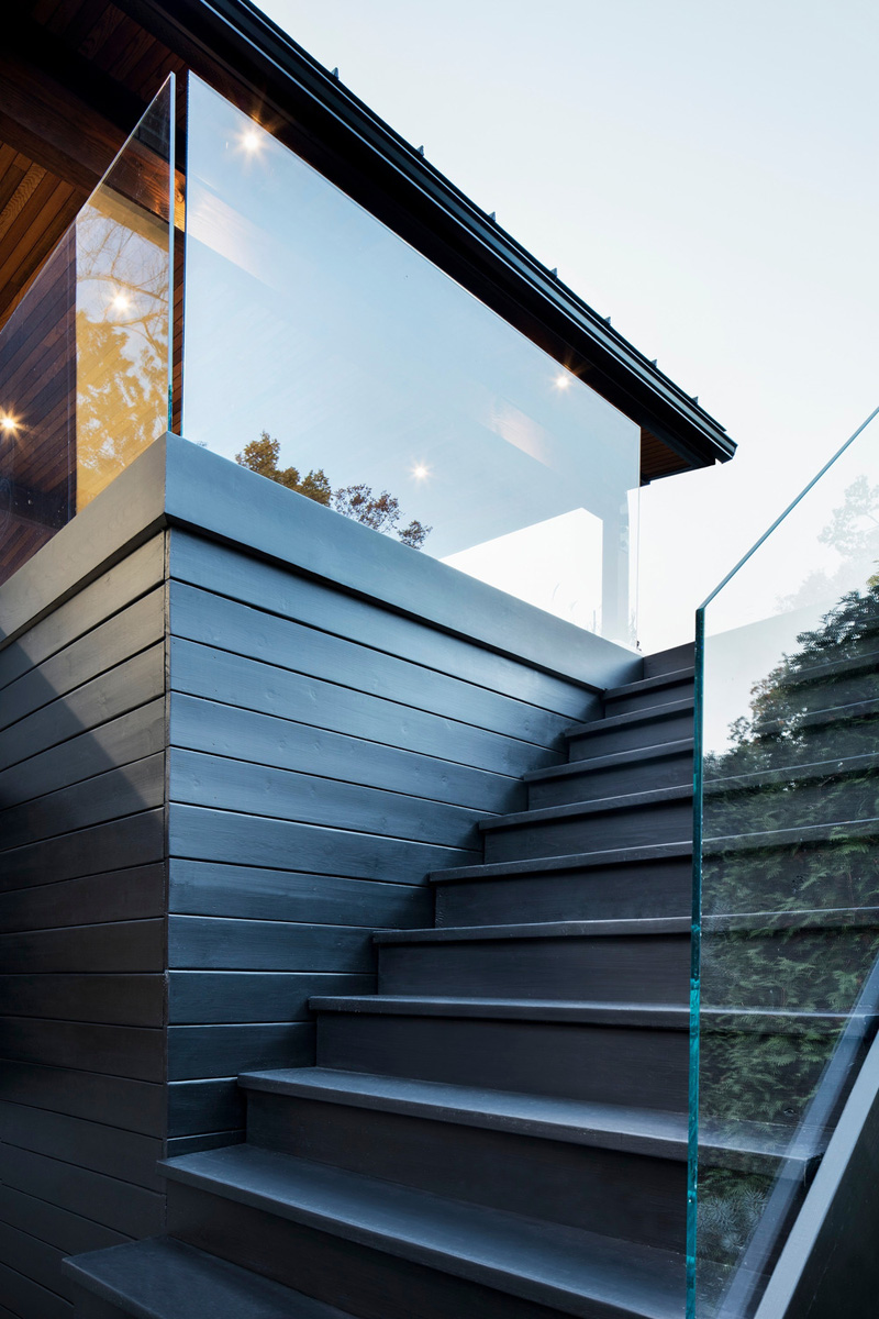
Heading downstairs from the outdoor patio, is the backyard.
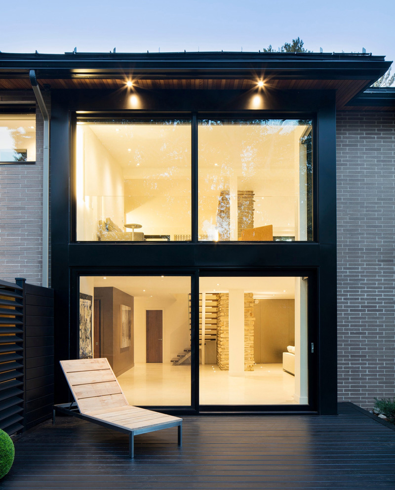
Large windows let plenty of natural light filters through to the interiors.
Before, the bedroom just looked plain but its layout was changed, moving the bed to the opposite wall, where a desk once was. Because of that, the bed is now near the window and there is more free space. Instead of curtains, it used blinds for the new design of the bedroom and a new bed was added in here.
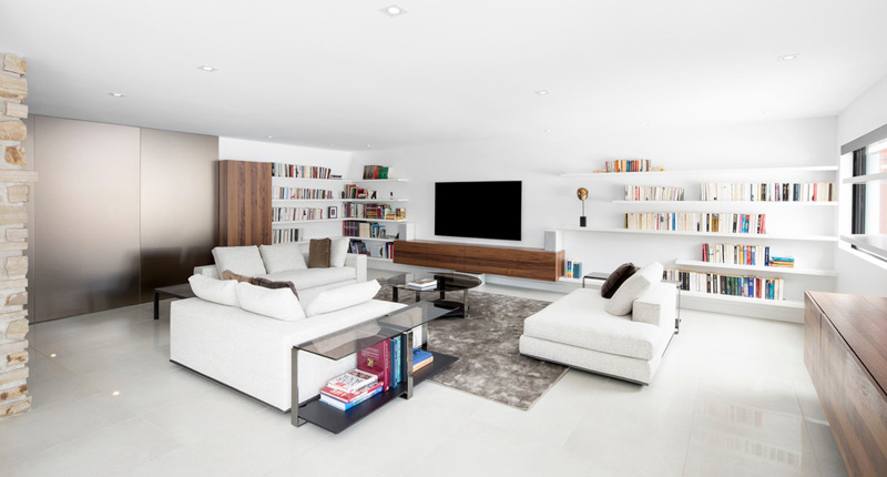
Inside, there’s a large living room with bookshelves lining the walls.
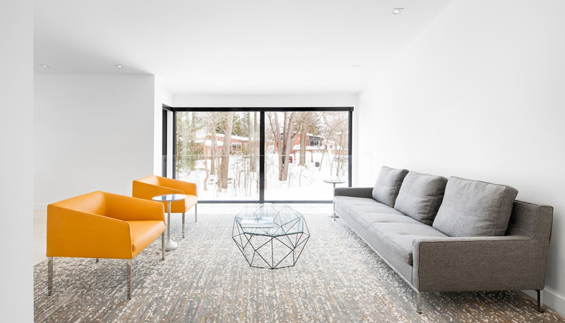
At the top of the stairs, there is a small sitting area with views outside.
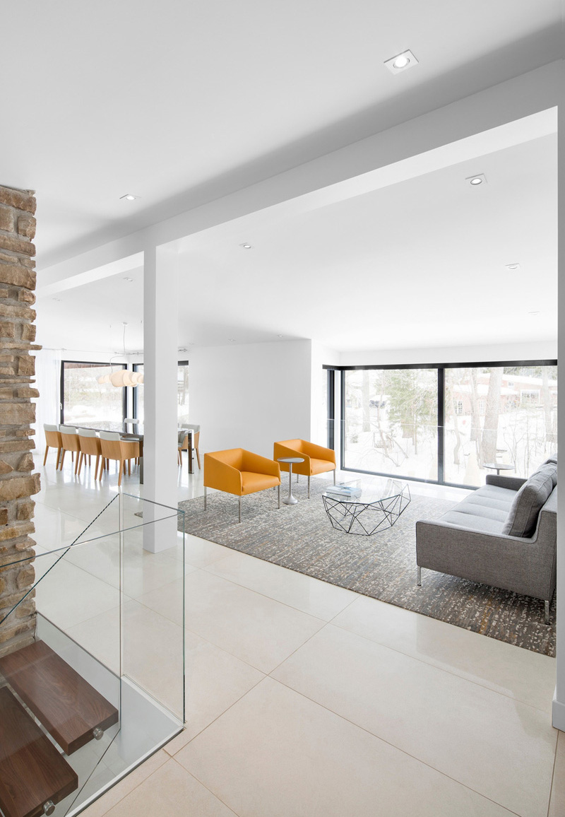
Next to the sitting area, there is the dining area.
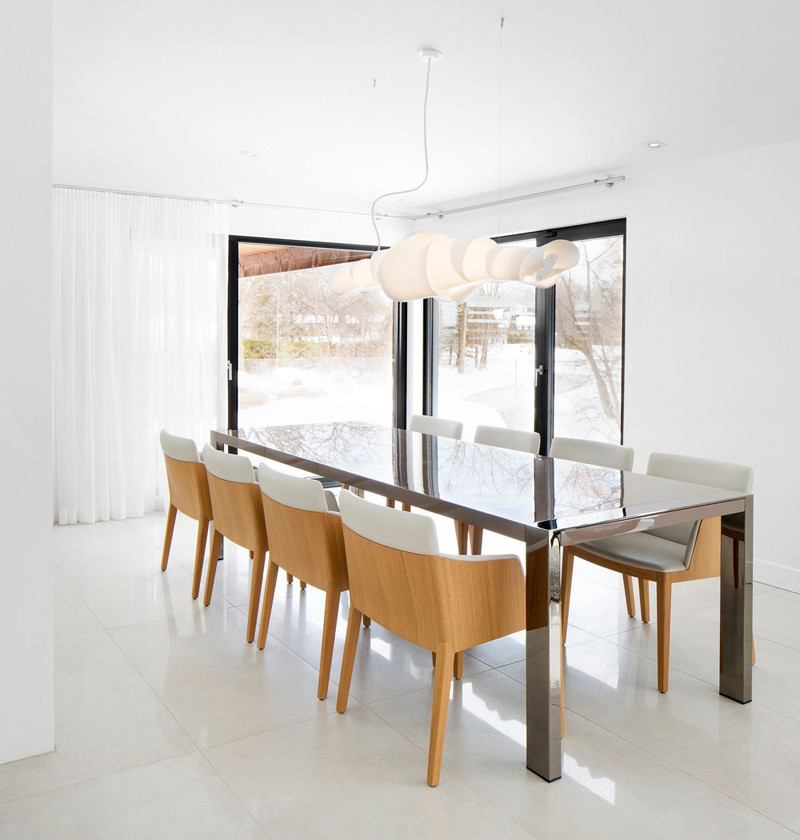
The dining area opens up to the outside with large black-framed glass doors.
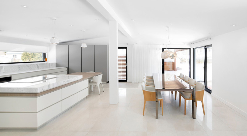
The dining area shares the space with the kitchen.
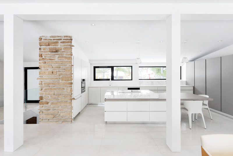
Original stone elements have been kept throughout the home.
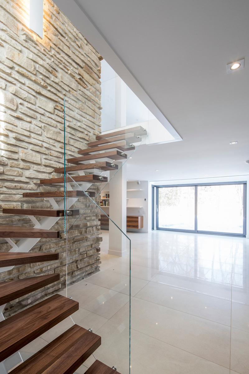
Around the corner from the living room, are stairs that lead up to more living spaces, the dining room, and kitchen.
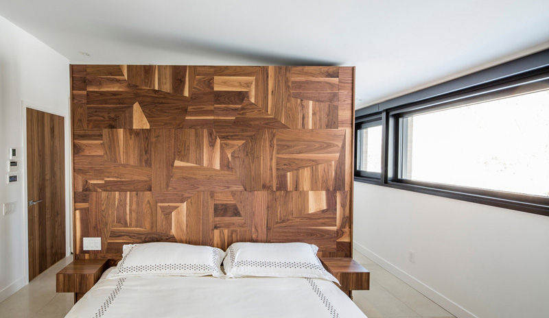
In the bedroom, an abstract wooden headboard has been built, to anchor the bed in the space.
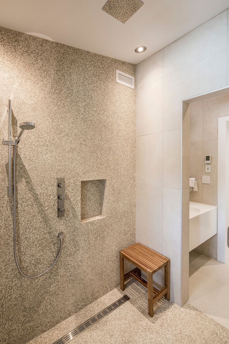
The home also has a large bathroom with rainfall shower head.
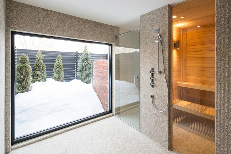
Aside from a bathroom, it also has a sauna which the family can use when they feel cold. Yes, they can indeed get the warmth and comfort they need in their very own sauna.
Isn’t this a nice house? Well, we do not know how the original house looks like but we can say that the house is indeed beautiful. And since the brief of the clients say that they want the home to retain its soul, I am certain that this is what the house exactly shows. This home is designed by Architecture Open Form which has a combination of various materials. I know many of us would love to live in a home and in a location like this. Am I right?