When we talk about apartments, we would think that the floor area is just small and that you can only move a little and you wouldn’t be able to do much about its look. But you are wrong because there are many apartments that were actually able to offer the owners everything that they want in order to live comfortably based on the lifestyle they have. We have to admit it that the design of space- whether it’s big or small- has a great impact to the aura of a home. We have seen many apartments featured here on Home Design Lover and each of them has a different design that is totally adorable. It would even inspired us to decorate our own space and improve its look.
Today, we are going to show you a beautiful apartment located in Rio de Janeiro. Surprisingly, although it isn’t that spacious, it looks really nice. One factor that I like in the area are the colors in it and its brightness. Many also noted how they kept their air condition units because oftentimes, we would come across interiors that have air conditioning units that just hung straight on the wall. Obviously, they look clunky and they don’t blend in and sometimes can even be a bit of an eyesore. But this apartment designed by Yamagata Architecture is different because you barely even notice that there are air conditioning units in the room. The designers put some effort into hiding them like this apartment that we are going to feature today. You will see how they did this through the images below.
Location: Rio de Janeiro
Designer: Yamagata Architecture
Style: Contemporary
Type of Space: Apartment
Unique feature: A beautiful and bright apartment with lovely decors and hidden air condition units.
Similar House: A Classy Transformation of a Warehouse into a Residential House in Australia
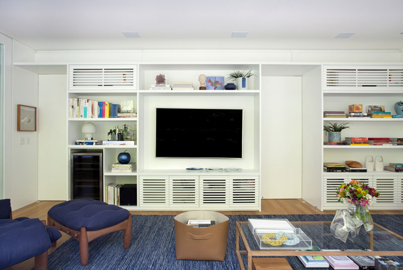
The interior of the house looks really simple but if you examine the elements in it, you will notice that it has cabinet doors with louvers wherein the upper portions actually hide the air conditioning unit.
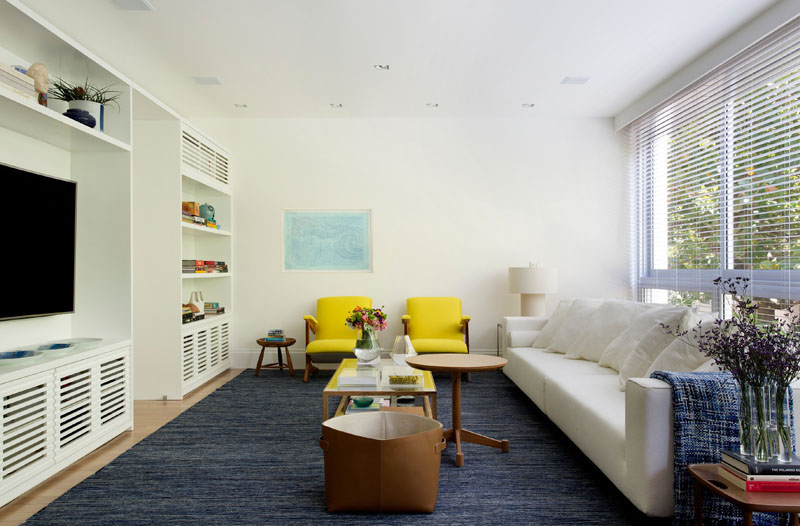
In the living room, the flooring is covered with blue carpet and it has lovely yellow chairs that add accent to it. You can also see that it has a white couch on one side that brings a neat and sweet appeal to the space. Slatted sections allow the air from the AC units to flow, as well as match the cabinetry below.
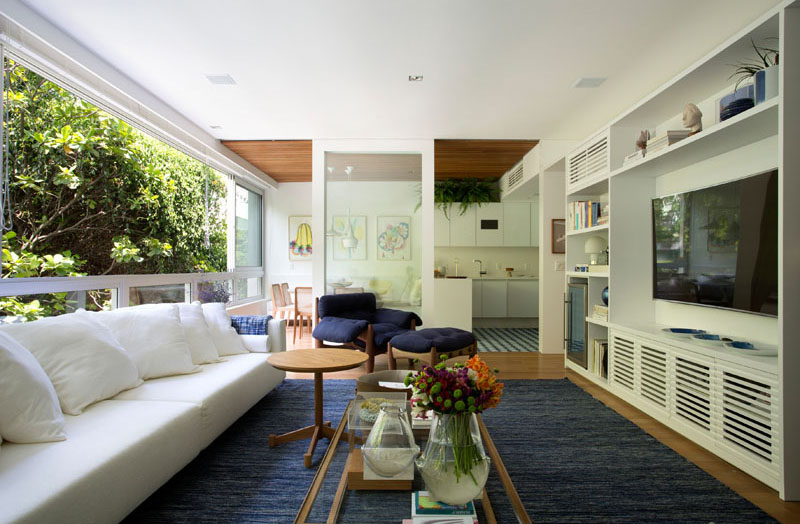
The apartment also has an open layout making it easier to connect the living area to other parts of the house like the kitchen and dining spaces. What made the interior really bright is the sunlight that gets into it from the glass windows one side.
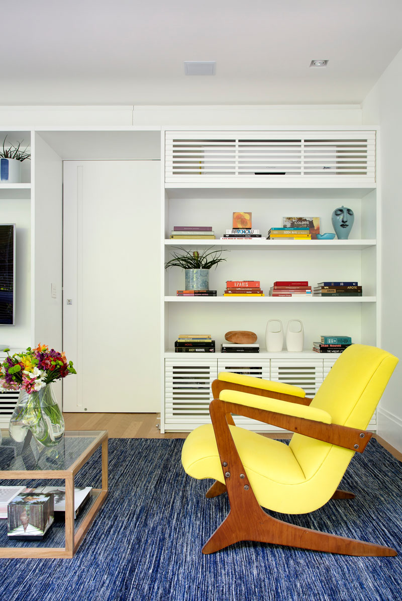
In the living area’s cabinets, you can spot various displays and decorations. Even books were used as decors as well. It is also nice that plants and flowers to brought to the space to make it look more beautiful. The natural appeal of the flowers and plants are certainly refreshing.
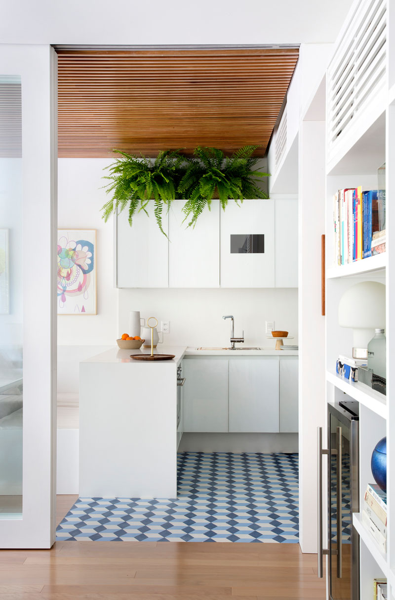
Seen here is the kitchen area which has a printed floor cover with geometric shapes. It does bring a modern appeal to the space as it use white cabinets paired with stainless elements from the faucet and other items in the kitchen. It is also very nice to see some plants on top of the hanging cabinet which breaks the white colors in it.
Read Also: Talisman Building Apartment: Converted Warehouse with Vaulted Ceilings in UK
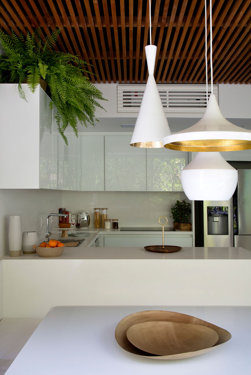
The ceiling of the interior made use of wood which added beauty to the interior and it also brought more natural appeal as well. You can notice that the same look as the living area was carried through to the kitchen in order to hide the air conditioning unit. You can also see here white pendant lights with gold trims which are lovely accents tote space.
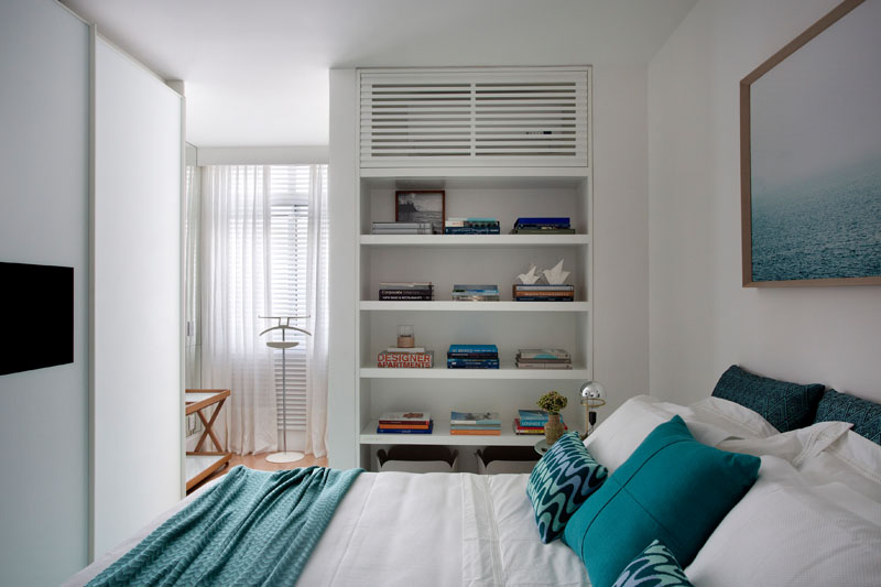
In the bedroom, the air condition unit was also hidden located above a built-in bookshelf. Well, it is obvious that it is indeed the goal of the designers. Also, you can see lovely cool colors in the bedroom as well through the throw pillows and the blanket.
Beautiful interiors, right? What I like about the spaces is the light style and decor. Overall, they look very nice and attractive with all the white colors around it. Of course, there are also pops of colors everywhere and the layout is really nice. Even though we were not able to acquire images of the home’s exterior, looking at the interior makes us realize how beautiful the home is. I also love the idea of just randomly adding decors everywhere in the house without cluttering the space. This apartment is a project of Yamagata Architecture who apparently did an amazing job to it. How about you, what can you say about this space?