We have seen how homes are being renovated that even those that seems to be dilapidated could actually turn into something beautiful and functional- far from what we expected. Yes, it is possible to come up with a home design that is attractive and appealing for a home that is dark, dull and seems hopeless. Remember how trash can be turned to treasure? Same is true with old homes that are built years ago. These homes can still be transformed into something that will fit into the modern living we have these days. If you don’t believe me, come take a look at what we have today.
In Chicago Illinois, there is a neglected 1970’s house that looks like abandoned and was seemingly left to just rot away. If you look at it, it appears like infested with rats and needs a total overhaul in order to fit to be called “home” once again. Obviously, this is what a brave homeowner wanted to do the old house. The Nicholas Design Collaborative was commissioned to do the transformation of the house which I can say could be challenging but not impossible. With that, Nicholas Design Collaborative worked as a designer, builder, and developer of the project. The work was started on the property as a spec house, but the home wasn’t purchased as once since the buyer needed to see the renderings and floor plans prior to the purchase. Two weeks after marketing the property prior to the land purchase, the design of the house was completed and it was ready for renovation. I can just imagine how much work they did to the home from the architecture to the interior. But if you get to see the images of the house, you will surely agree with me that all the efforts they did were all worth it!
Location: Chicago, Illinois
Designer: Nicholas Design Collaborative
Style: Contemporary
Number of Levels: Two-storey
Unique feature: An old 1970s home was transformed into a beautiful contemporary residence with many interesting features especially in the exterior.
Similar House: Before and After: Old House Turns Into a Kid-Friendly Modern Home

I know that when you saw this photo, you didn’t expect that it can look this beautiful after the renovation. In the before photo, you can see that the house is indeed old with a tall concrete fencing which is already covered with dark moss. But now, it looks very gorgeous with its new contemporary design.
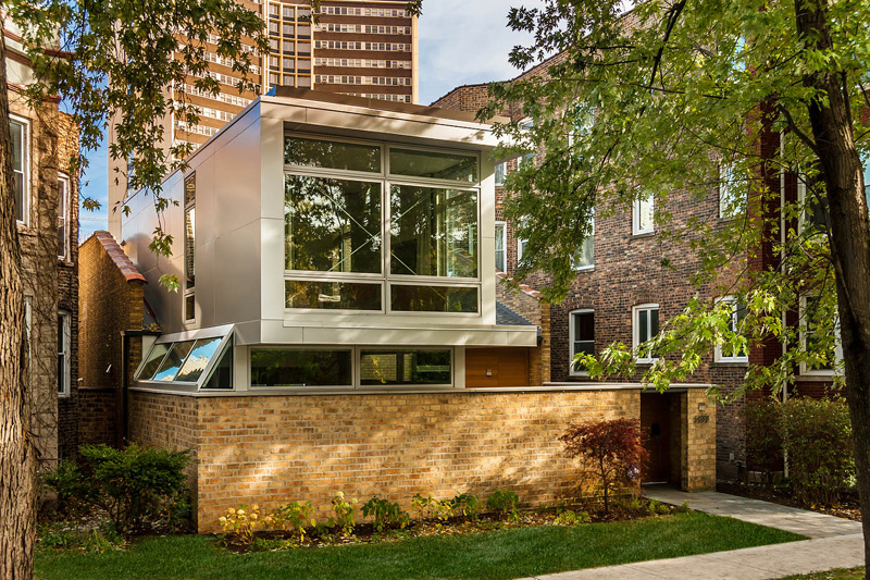
It is either they merely cleaned the old fencing or changed the stone used in it. Whatever they did, it looks a lot better now. Aside from that, the house became taller with an upper level covered in glass windows. But you can still see the firewall of the old home that is retained.
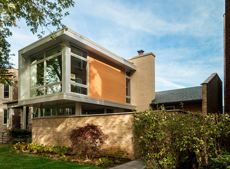
The additional feature of the house in its facade made it look more beautiful especially that it used glass a lovely siding that compliments with the stone used in the fencing.
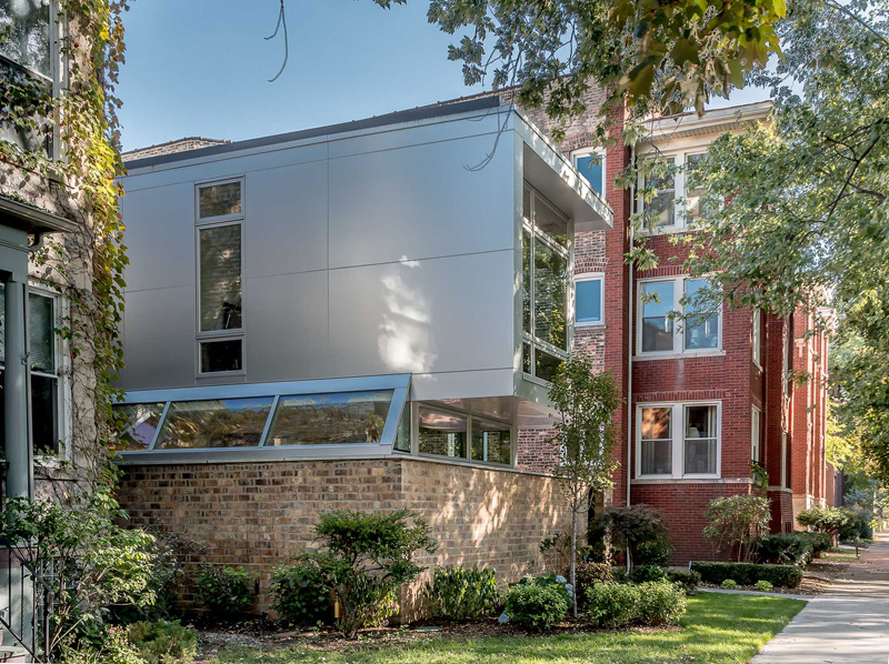
After the property was purchased by its new owner, the designers started updating and adding additional living spaces to the home. They brought the design to the current living standards while making it visually appealing.
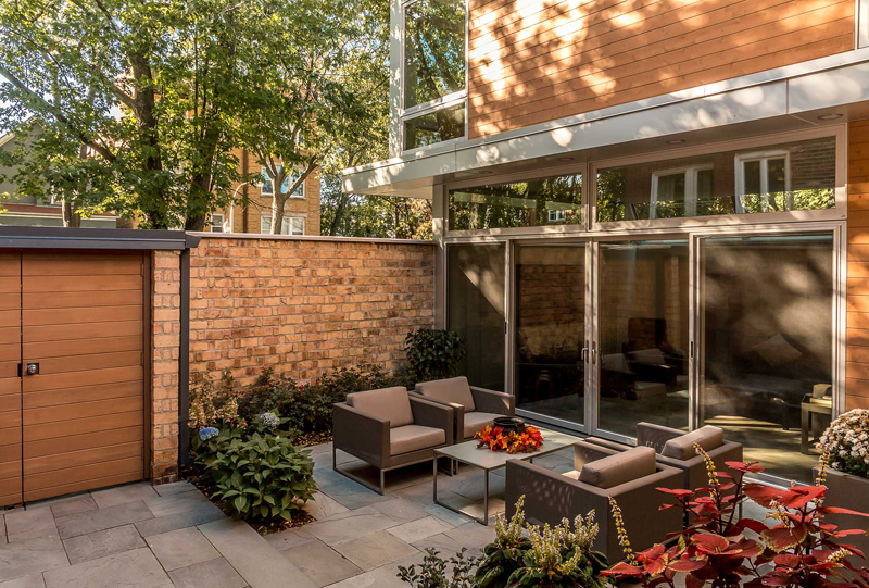
Upon entering the gate of the brick wall, one will see a small front courtyard that seems to invite you to get inside. The flooring is covered in pavers and it has some plants around it to add a relaxing aura to the space.
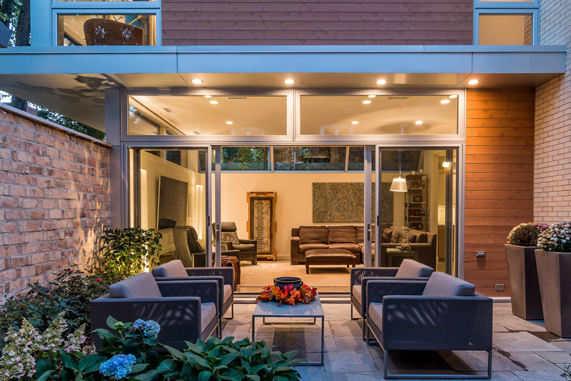
To access the interior of the house, there is a large sliding double glass doors next to the courtyard. This makes it easy for the interior and exterior spaces to become connected.
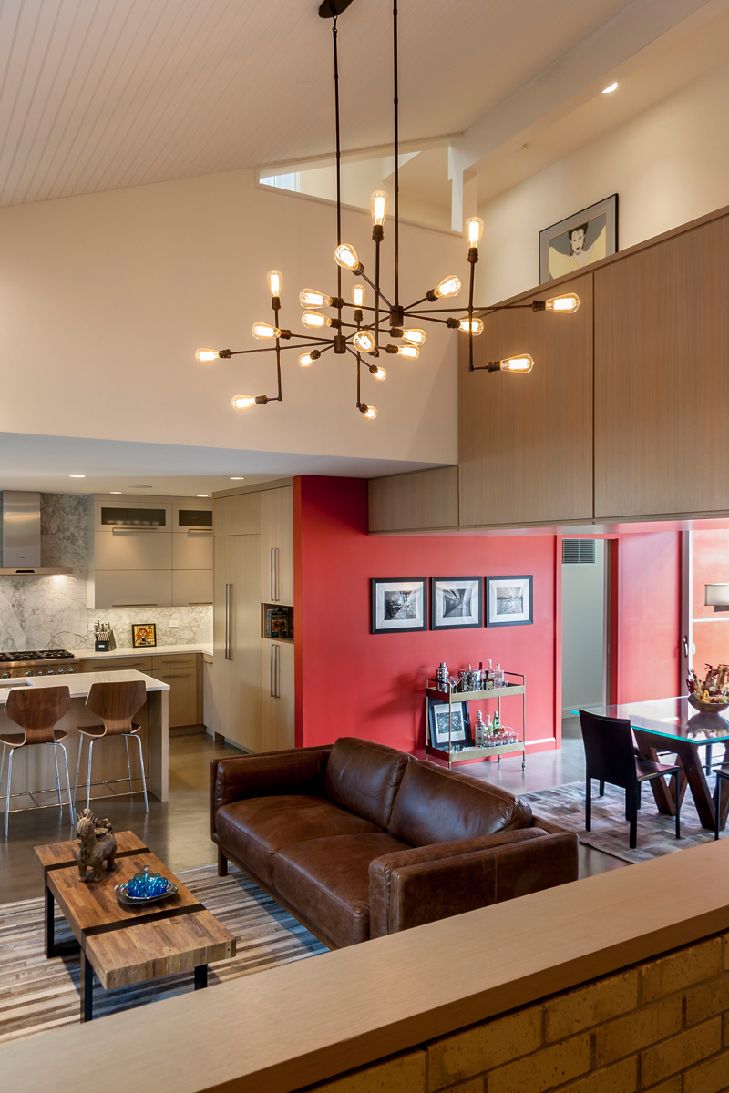
Inside the house, there are some natural materials seen from the furniture. There is also a chandelier that hangs from the double-height ceiling. One wall is colored red that brings some boldness to the space.
Read Also: Before and After: From a 1940s Cottage to a Contemporary Residence
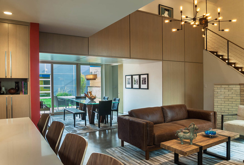
Wood is used for some areas of the interior. Meanwhile, the living and dining spaces make use of rugs to help define the separate areas.
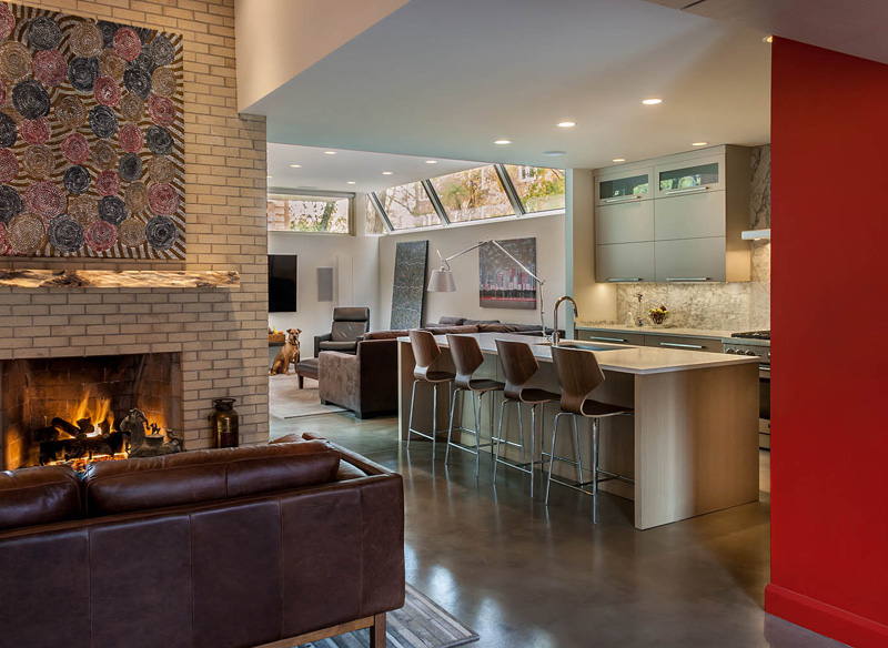
With an open layout, the living, dining, and kitchen areas all flow from one area to another. As if to extend the look of the brick wall outdoors, you can also see that in the fireplace and other parts of the house.
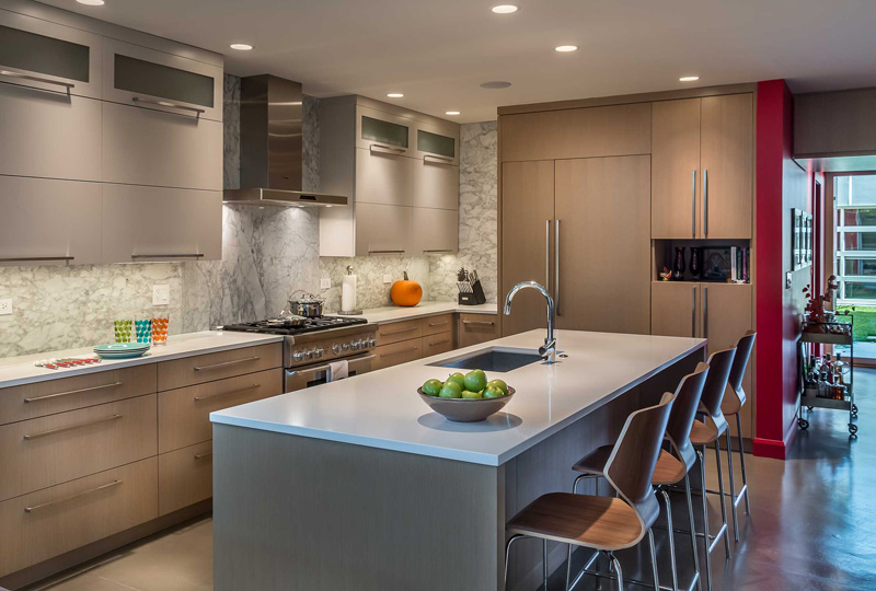
This is the kitchen featuring a large central island with bar seating. Notice the dramatic lights used in it and marble backsplash too.
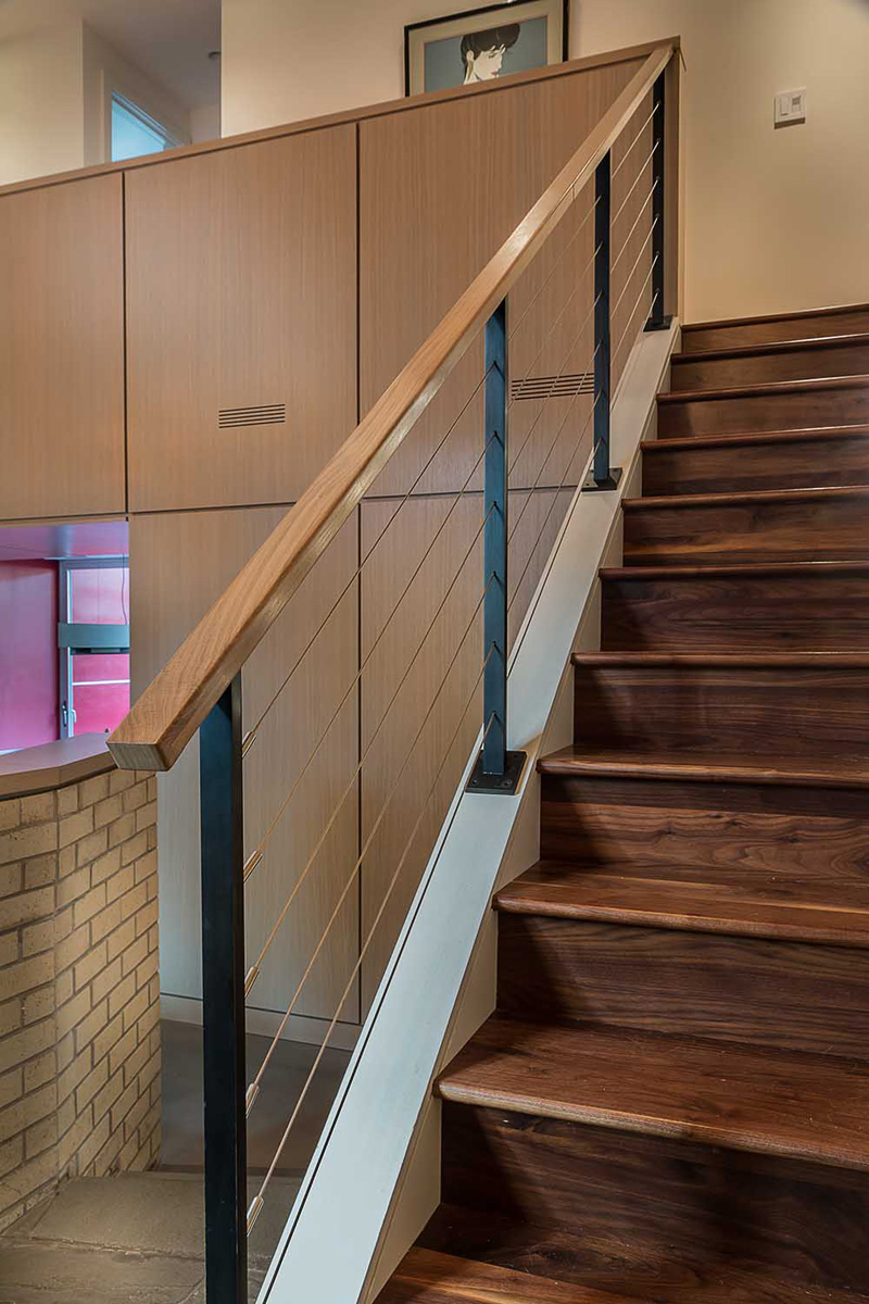
One of the highlights of the house is the wooded stairs that lead to the second floor.
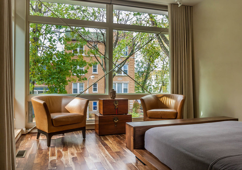
Upstairs is the master bedroom featuring floor-to-ceiling windows that allow plenty of light to flood the room. You can see here that there are leather seatings too similar to the ones found in the lower level.

The back of the home received a colorful update which is far from its previous look with plain gray exterior and old windows. This time, the rear looks very attractive and full of life.
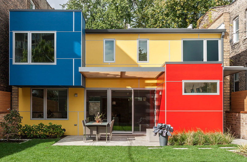
Aside from adding colors to it, depth was also added by creating different volumes. You can also see that the backyard is landscaped with an added outdoor dining area.
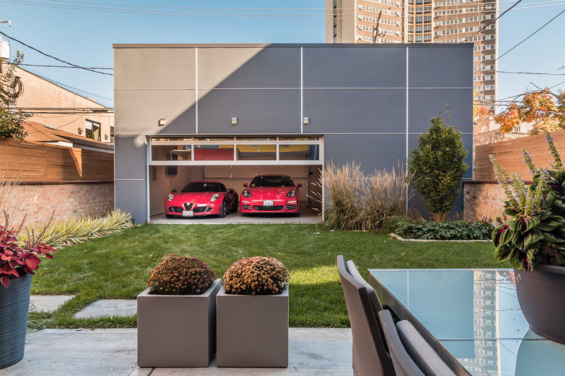
Seen here is the garage is located on the other side of the backyard. This part of the house can be accessed from the rear lane and garden space.
So what can you say? Isn’t this a stunning home? It sure is! Just look at the dark home before, no one would love to live in that. But the new look of the house will surely make you envious of the new home owners. Who would expect that they can get a home with such beauty from a structure that was nearly rotten? Well, everything isn’t done by magic. It is the result of the amazing design and effort by Nicholas Design Collaborative who apparently did a great job for the renovation of this Chicago home. I am honestly impressed with what they did to the exterior but the interior is beautiful too. It was indeed turned into a home that everyone would love to live in. It is now a home that deserves attention after being left to become a dilapidated structure. Another thing that I like here is how different colors were added to the rear of the house which is very much unexpected!