Some homes are indeed unique- or should I say are contained in unique buildings that you will not expect. There are homes that are actually not intended to be a residential building. There are warehouses, churches, factories, and others. We have seen many homes that are like this and we are always impressed every time we see one. It’s because of the amazing design of the homes wherein you will not expect that you can actually make a home from those structures. Well, obviously, it is a great challenge for the designers too.
A historical Dutch church was transformed into a unique loft living space in Haarlo, The Netherlands. It is the Dutch Reformed Evangelism Building in Haarlo that is now a stunning home. The facade, bell tower with clock, the volume and even the details of the roof were retained. Well, the loft is actually “really” a church from the outside. But you will surely be pleased when you get inside. What this project shows us is that a transformation of a church even with limited resources is possible. All that is needed is a smart design and an efficient plan. The concept of the redesign is to “strip, isolate and furnish”. The owners had a fun yet a bit challenging concept of the house with the motto: “Cherish your inner child; remain pure, playing, exploring and a little bit naughty!” The interior with a volume of 1100 m3 wasn’t filled completely with as many rooms as possible in order to minimize the demands and retain the spaciousness of the building.
Location: Haarlo, The Netherlands
Designer: Leijh, Kappelhof, Seckel, van den Dobbelsteen Architects
Style: Contemporary
Number of Levels: One level, loft type
Unique feature: The house is a renovation of an old church wherein the original features of the church was retained. The interior features a red multi-functional staircase. It has a roof garden on a container with an extended pergola.
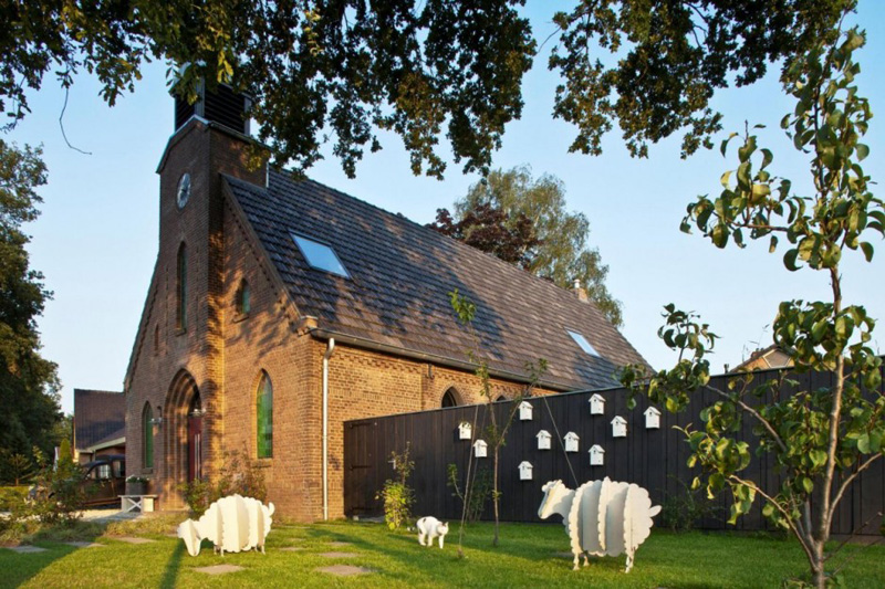
At first glance, you will really think that this place is for worship. But once you see those playful looking sheep, you would think twice! What you can see here are the wooden “lost sheep” that seems to be grazing in the garden. They look really cute!
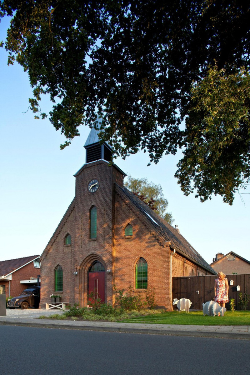
The structure of the church was retained which does really look good and are still of good condition. Even the clock is still there as well as the windows too. Notice that a garage is added on one side of the house.
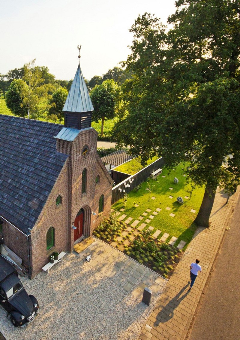
Aside from the beautiful structure of the church, the landscaping is something that is notable too. Even the manner of arrangement of the concrete steps look interesting as well as the plants in the garden. A huge tree could provide shade to the area.
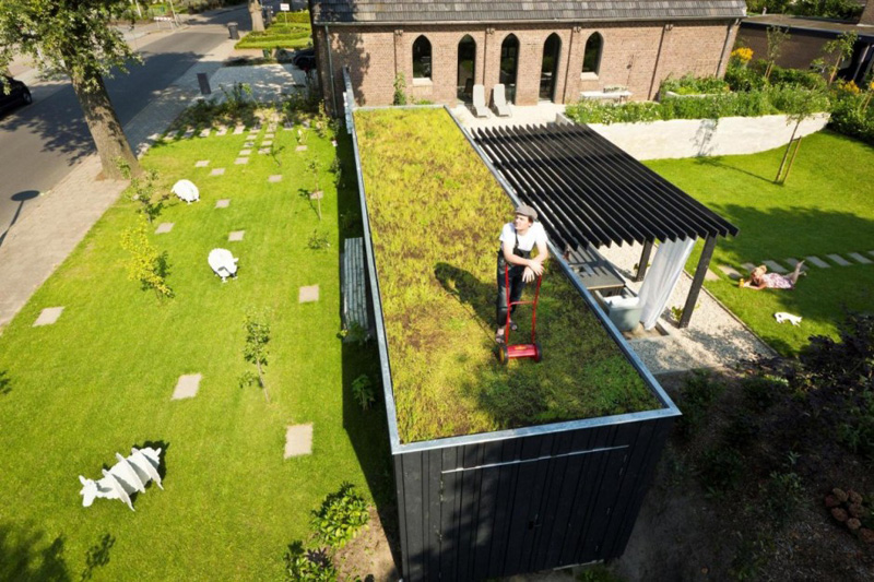
The house has a modern garden with large plastered planters, made by left-over-bricks . There is a herb garden, a vegetable garden, a flower garden and an orchard which is a contemporary nod to the old monastery gardens. A private garden is created above the container while still allowing a good view of the church.
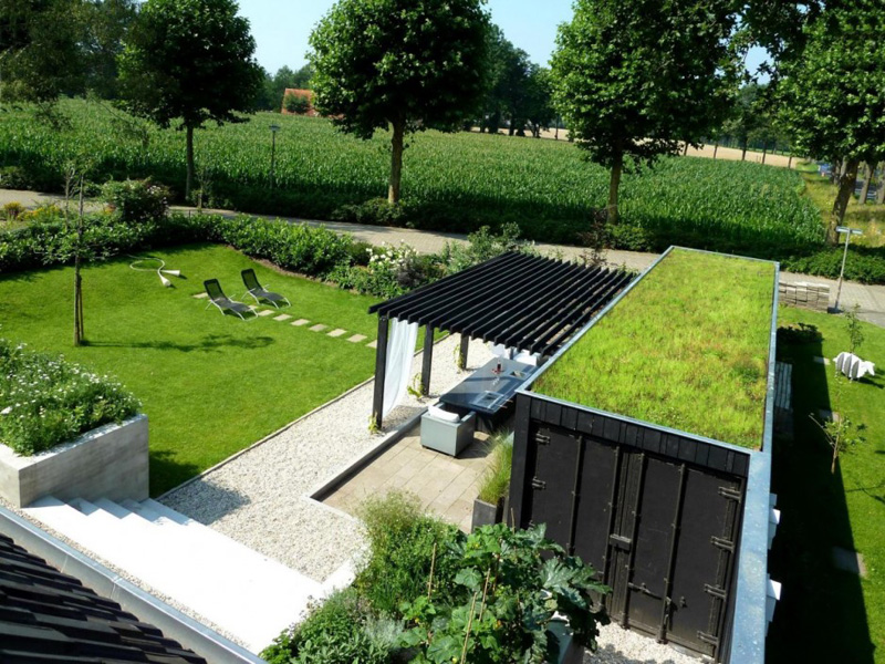
Outside the shed is a porch that is contained in a 40ft container, integrated into the wooden fence and equipped with a green roof. I honestly love this area apart from the main house. A pergola is extended from the container shed.
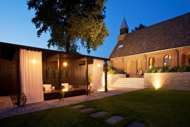
This is how the shed looks like under the pergola. What a romantic place to spend both day and night time parties and just intimate moments with your partner. I’d love to have a space like this one! Even the roof garden container is an amazing idea.
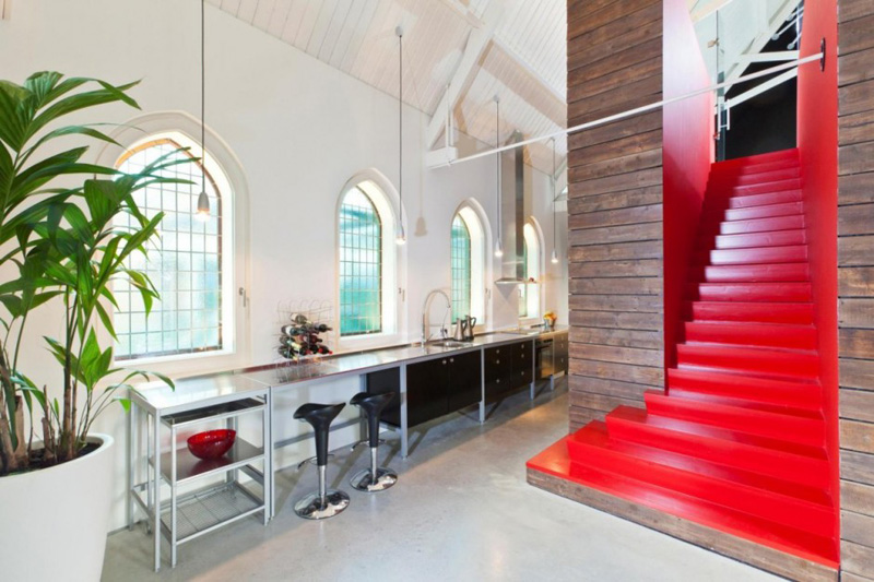
The interior is spacious but the kitchen can be seen only on one part of the home. It used stainless steel for the kitchen’s countertop with a small bar intended for two people. Notice the windows too. They really are church windows but it looks perfectly stunning with that greenish glass on it.
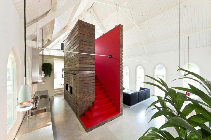
Now let us pay attention to this red stairs that is the highlight of the interior. The multifunctional stairs is called as the “Stairway to have fun” which functions as a stairs, room divider, closet, build-in-kitchen, acoustic element and exhibition wall. I love that this is colored red!
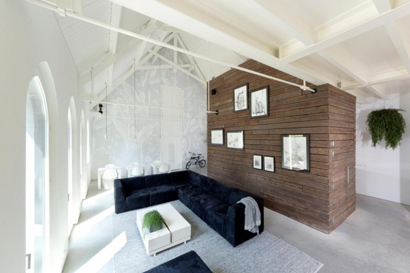
On the other side is a quite living area with an L-shaped sofa in dark blue color. You can also see here the dining room with a wallpaper of angels. One side of the staircase served as a wall for the living area with framed artworks installed on it.
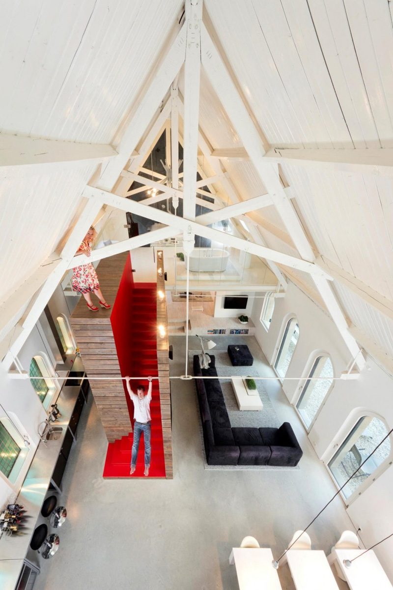
Look at the couple having fun in the house! I didn’t know that the upper area of that wooden wall can actually be accessed! And yes, the steel rod sure is durable because the husband can even swing on it. Should I say, that is an instant “gym” for them too?
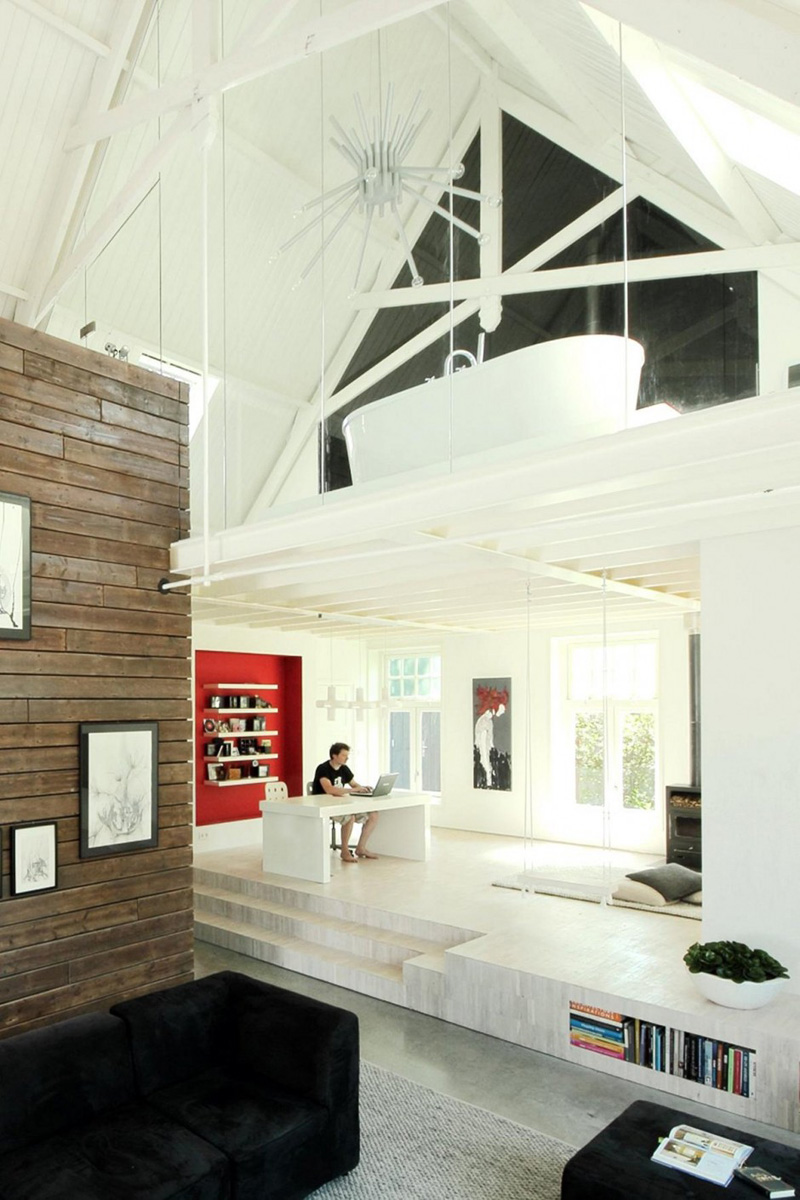
Just below the mezzanine and on the rear side of the kitchen and living area is this elevated work space. It also used red for one wall with floating shelves on it filled with books. You can see that this area is flooded with natural light and has some artistic elements in it.
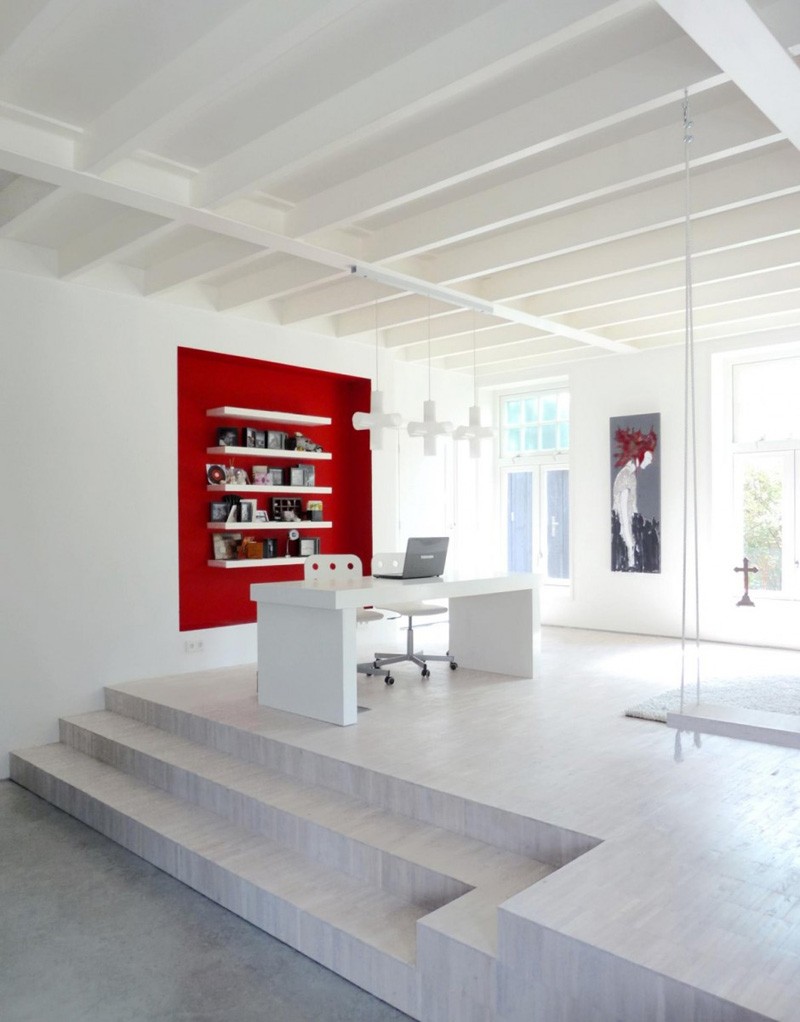
A closer look at the work area which utilized white colors even for the furniture and the pendant lights. Exposed beams from the mezzanine provide a beautiful ceiling to this part of the house.
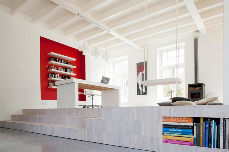
The working area is elevated three steps from the floor. It also has a storage space for books which is a brilliant storage idea! Aside from the workspace, there is also a fireplace here with cushions and a swing!
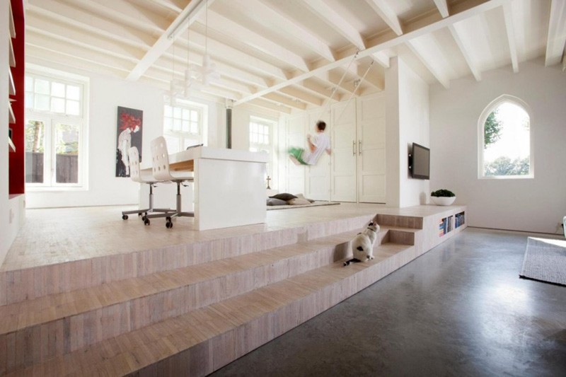
The swing is called the “swinging sister” to add some fun in the home. Well, if they get tired working, they can play on the swing! I have seen other homes with swing too. And it does look very fun indeed! The elevated area connects directly to a bench where they can rest and even read a book!
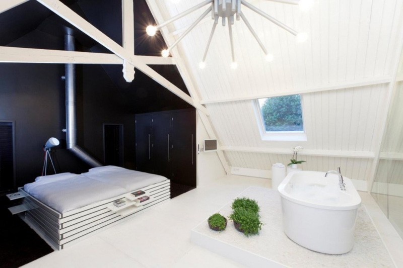
On the mezzanine, you can see the bedroom, a bathroom and a couch. The area is totally intended for relaxing. The design of the bed is lovely too with some extended shelves. I also like the bath area. Over all, I consider this a romantic hub for couples!
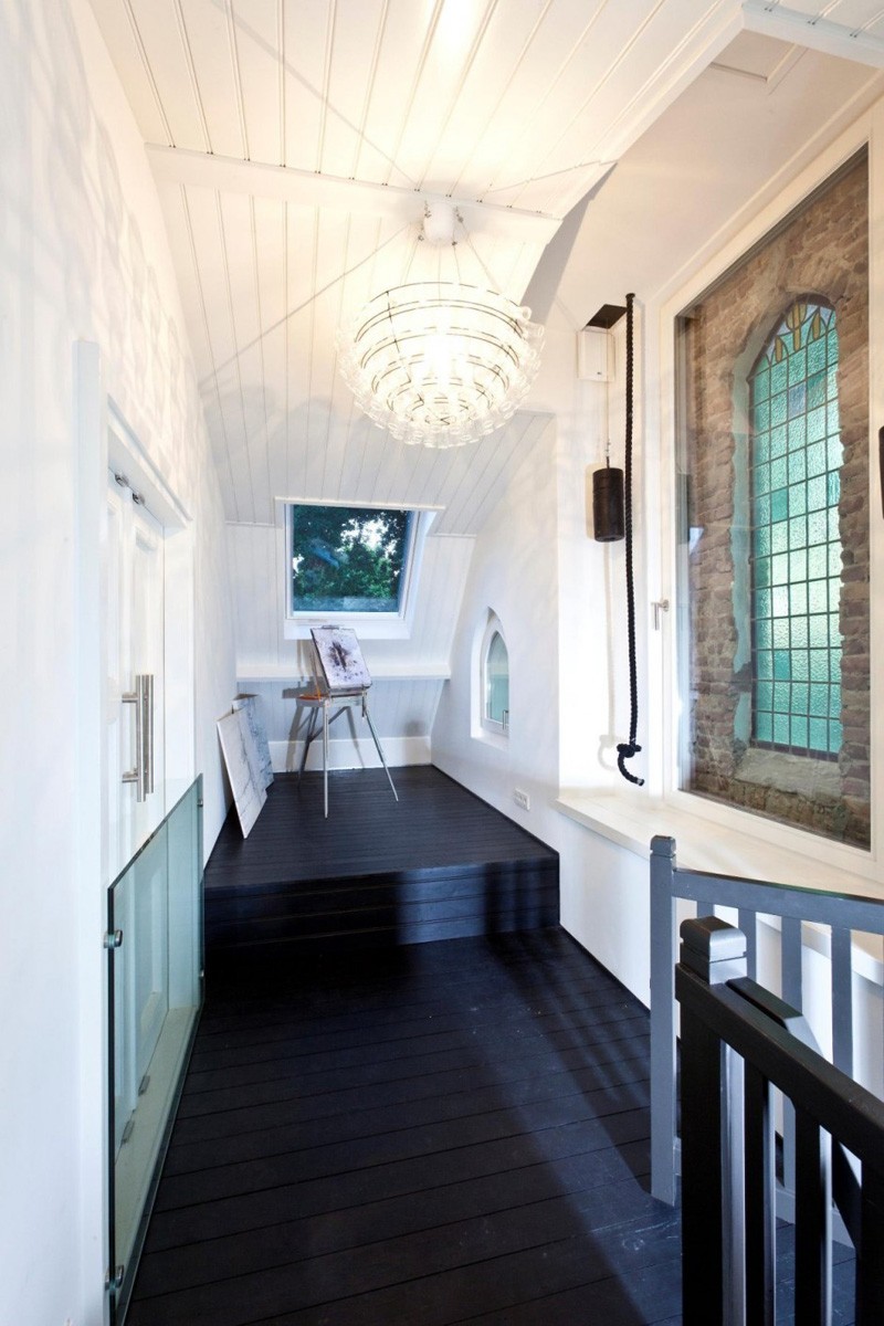
I am not sure where this part is but it looks like it is the foyer if I am not mistaken because of the door. There is a window on this area that provides natural light in here. Notice that little window on the side? Can you tell me what that is for when this was still a church?
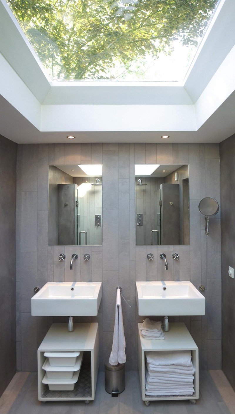
In the bathroom, there is a skylight that floods natural light into it. You can see here two identical bathroom sinks and mirrors. The walls are covered with ceramic tiles in near wood tone.
What can you say about the new look of the church? Amazing, isn’t it? This home “shows great passion, humor, respect, love and creativity” which were reflected in some elements in the house like the swing “swinging sister”, the “KROONluchter” (inspired by the original organ), the “gate of heaven” flanked by a wall of guardian angels, the “stairway to have fun”, the “holy shit” on the toilet, birdhouses with lamp for strange birds that have seen the light and the wooden “lost sheep” in the garden. These features are indeed unique and fun! As a matter of fact, they made the home even more distinct aside from being a church before. This design is done by Leijh, Kappelhof, Seckel, van den Dobbelsteen Architects who really made sure that the desires of the clients will be met and that the design is aesthetically pleasing and functional at the same time! This sure is one of my favorite renovations!