Unexpected and Fabulous Design of the Residencia Mirante in Rio de Janeiro
We cannot imagine how the designer can best connect all the spaces in the house even if it has different levels and with different heights. We can say these designers can brilliantly conceptualize the interiors. Today, we will explore the house designed in Rio de Janeiro, Brazil. This house is named as the Residencia Mirante. This residential house is specifically located in a steep site in a noble neighborhood. According to the designer, they are challenged to renovate the house while they are trying to find a way to connect all the spaces as requested by the owner.
Residencia Mirante’s new layout was led by clients’ new demands of space. According to the designer, the ground level is considered to contain the most social area of the house such as the living room, dining room, kitchen and lavatory. While the upper level has a special space intended for a home office. On the lower part of the house, three levels are dedicated to private areas; it has seven suites the master suite, guest suite, baby’s suite, 4 kids suite and a family room. Let us scroll down the page and see the amazing features of this house through the images below.
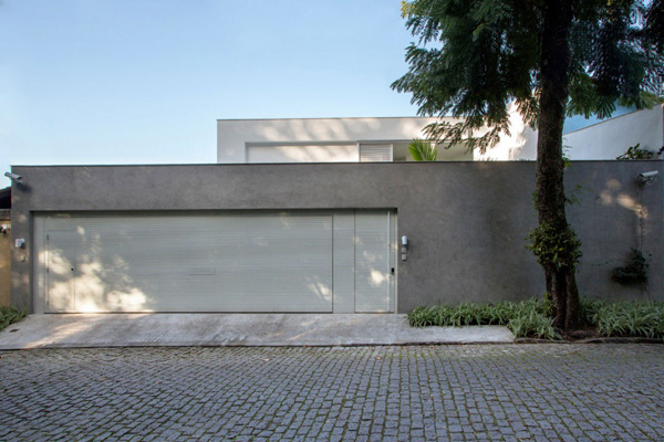 See how the designer display the smooth texture of the garage that contrasted with the brick floor in the exterior.
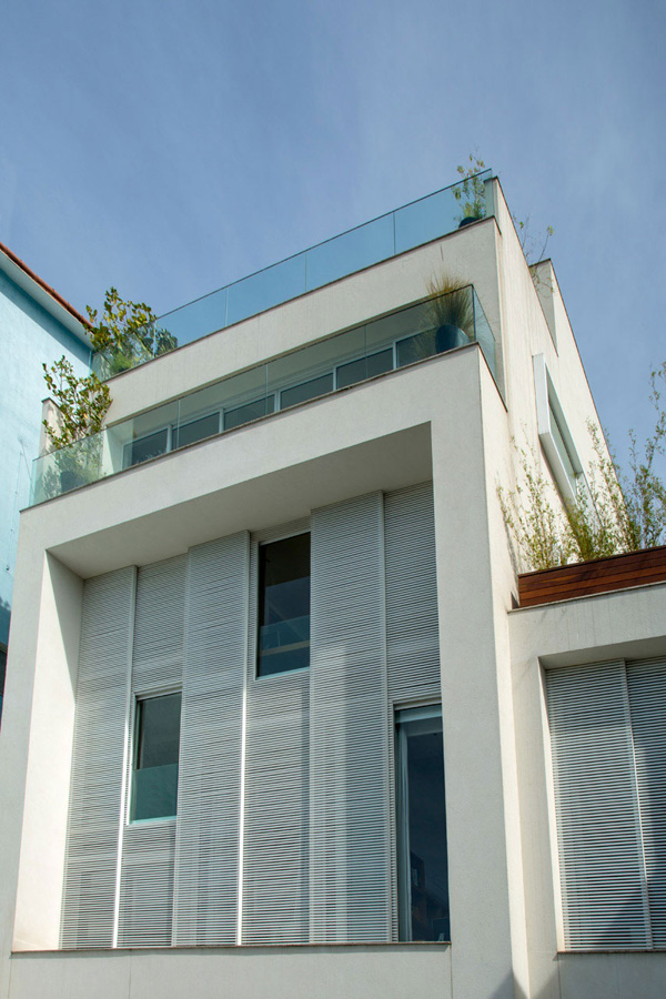 Different levels and volumes of the house are highlighted in these building especially in the morning.
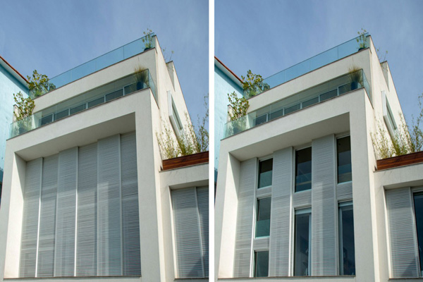 See how the designer carefully planned the appearance of the house building as it open and close the windows.
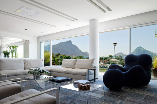 High quality and stylish design of this furniture underline the modern concept of this living room.
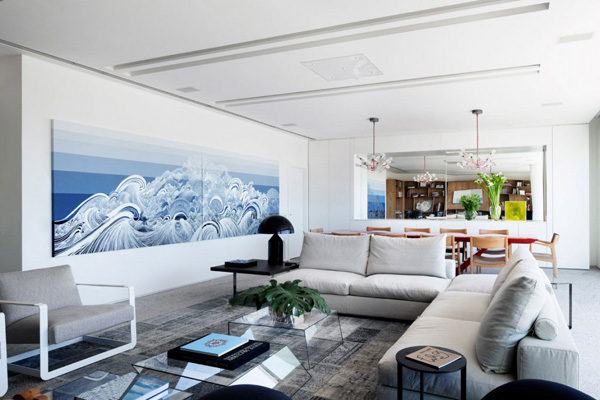 Huge painting harmonized with the extraordinary accessories utilized in this living space.
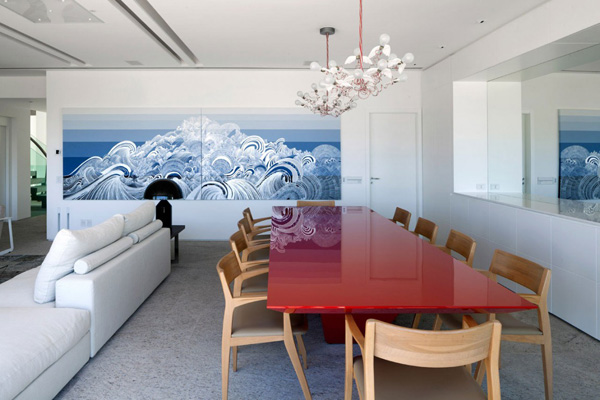 Red table jives with the wooden and modern designed chairs that perfectly complements with the chandelier above it.
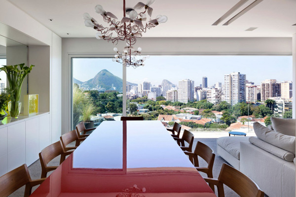 From the dining table, the client may enjoy the panoramic views and the nature.
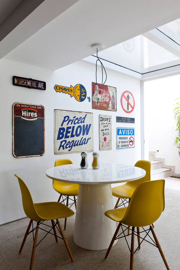 Unique accessories and yellow modern chairs in this white round table introduce a different and modern concept, too.
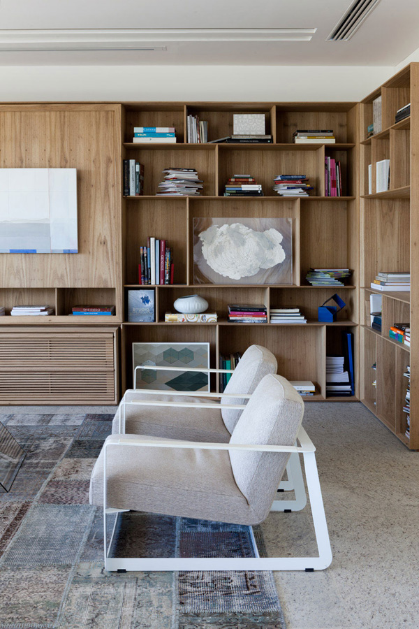 Comfortable seats set in this office space allow the client and its guest to feel at home.
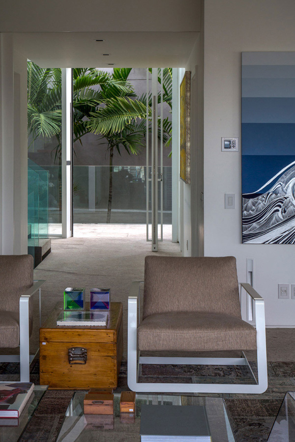 See how the shapes and form of the furniture harmonized with the volume and texture of the building.
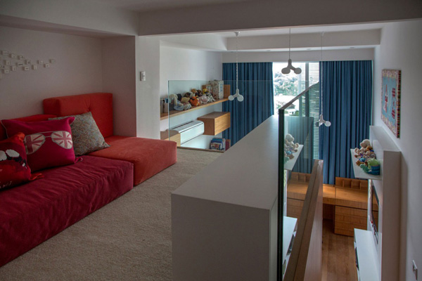 At the upper level of the house is a space where the client can sit down and unwind from stressful office.
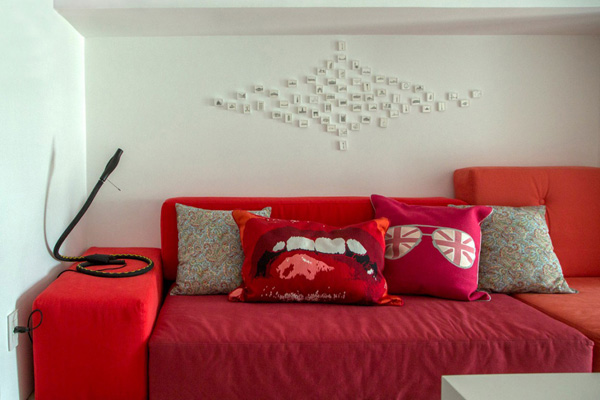 Take a look at the soft and cotton materials utilized in this space that maintains and ensure the relaxing zone here.
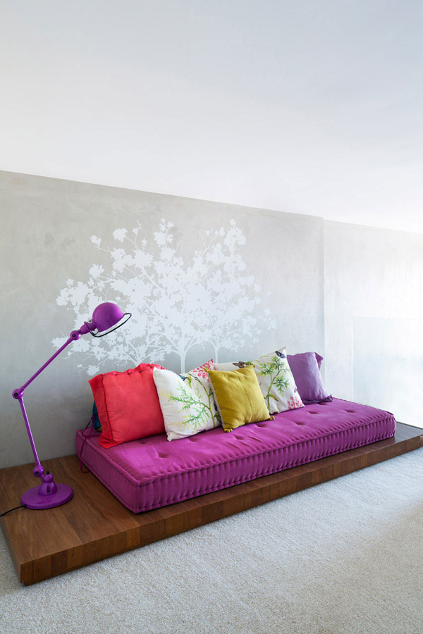 Another space in the house where purple seats and lamp are utilized to ensure comfort and charm here.
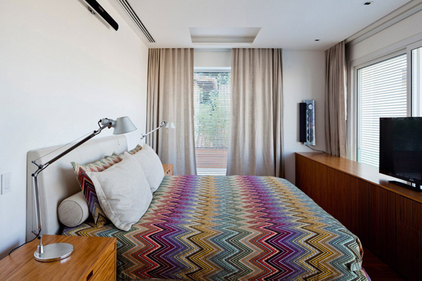 Lines and colors unveil the modern and lovely design of this bed sheet and room as well.
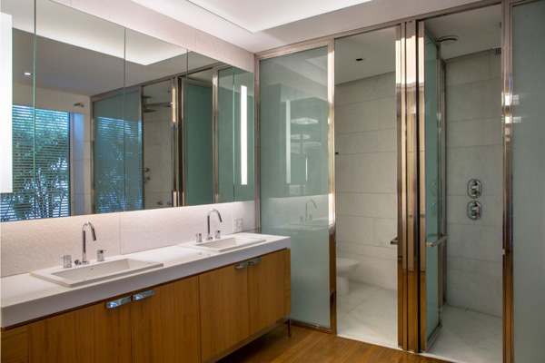 Spacious and hygienic bathroom is also secure here to maintain the cleanliness and stress free zone in the interior.
As you can see the Gisele Taranto Arquitetura took advantage of the pre-existing intermediate level with double height ceiling and created a mezzanine that act as leisure/reading space in the kid’s suites. While on the lowest floor hosts the outdoor area with a swimming pool, a bathroom and a mini kitchen. Personally, I like the different levels of the house and its uniqueness is very catchy. I would love to apply these features in my future house and I am pretty sure that you will also get fascinated with these features, too.


