The U-shape kitchen layout is also known as the horseshoe; this kitchen layout has three walls of cabinets or appliances.
Today, this design has evolved from three walls to an L-shaped kitchen with an island forming the third “wall.” This design works well because it allows a smooth traffic flow and workflow around the island. This type may seem more ideal for kitchen spaces in restaurants or bars because this layout permits for more cooks into a certain space.
Although this type of kitchen layout makes it extra efficient for preparing food and cooking because you can pivot on one toe as you spin around from the refrigerator to the sink and then to the stove.
Like any other layout and design, there are some advantages and disadvantages in getting a U-shaped kitchen, which you will learn as we go through the 15 Contemporary U-shaped Kitchen Designs below, check them out!
317 Hillside, Mill Valley
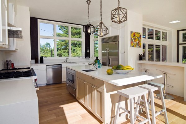
317 Hillside Avenue
This San Francisco kitchen is all but lovely! Tons of working space – one area for the cooking; another area for the washing and cleaning; and another one for storage and eating! All in one white contemporary kitchen!
Arbutus Street
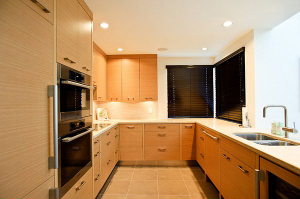
Interior Solutions Design Group Inc.
Another lovely Vancouver kitchen which drew us to our feet because of the great materials used which was highlighted with the fascinating lighting of this space. This area may actually be small but the layout made all the difference.
Art Deco Influence
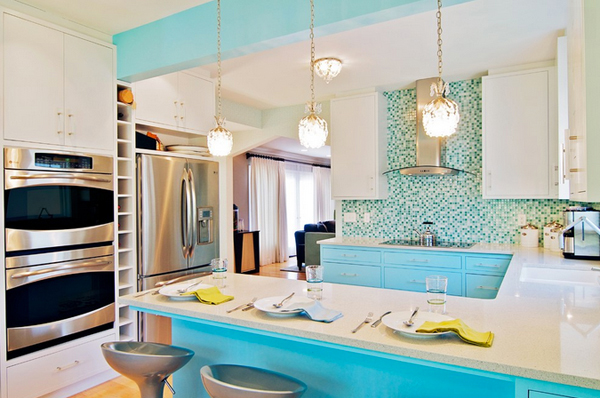
Bright turquoise picked up from the backsplash tiles is continued on the cabinets, giving this kitchen a South Beach Deco style.
Central Austin Residence
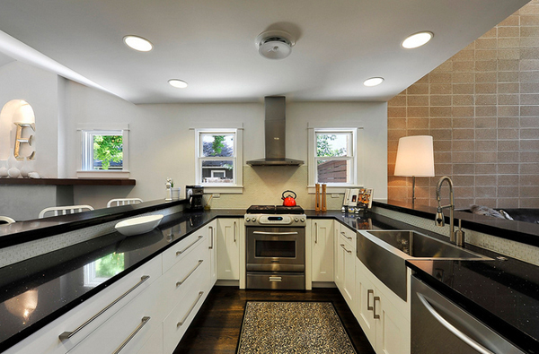
Hatch + Ulland Owen Architects
A narrow kitchen is made more effective and efficient thanks to the U-shaped kitchen layout.
Contemporary Kitchen
Dee David & Co. Kitchens & Baths
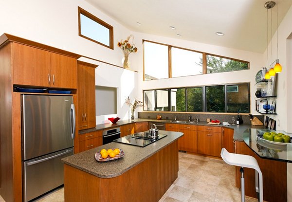
This kitchen may have a shorter U-shaped layout but we can say that it is effective and by adding a central island, the additional space this home needed was definitely provided for.
French Place Cottage
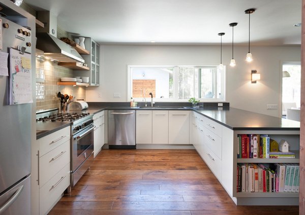
One rather interesting part of this kitchen is the area where you can actually keep your cookbooks you need every time – open shelving is better than adding doors to it for easy access.
Kansas City Contemporary Kitchen
Warehouse 414
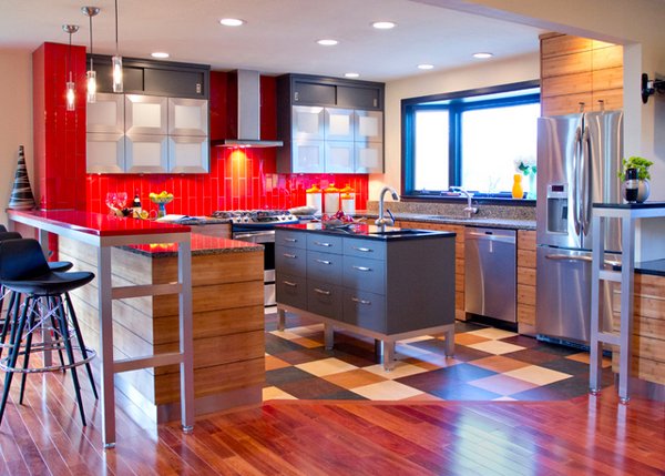
The designer said, “We designed this kitchen specifically for our clients. We had worked with them in the past. Quite frankly doing a facelift of their existing kitchen where we had them installs the fantastic random Forbo Marmoleum floor that is in this photo.”
Kloof
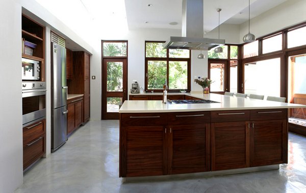
Custom made solid wood kitchen in natural kiaat. Caesar stone surfaces used throughout. The kitchen has very clean lines and great warmth.
Los Angeles Area Homes
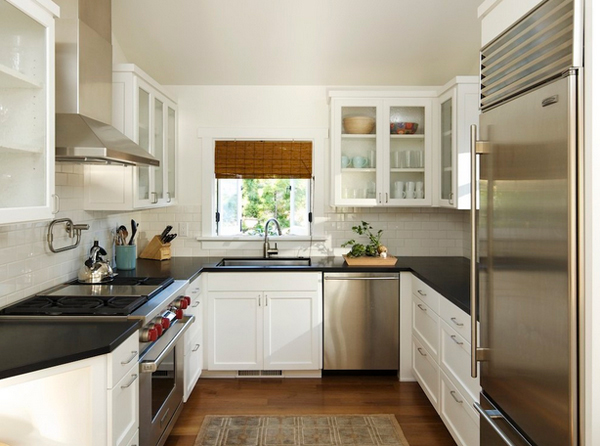
This layout doesn’t allow for direct access from the kitchen to the dining table, or vice versa. And it’s difficult to interact with friends and family while whipping up meals, since most of the room is reserved for the work triangle.
McAffee Farms Residence
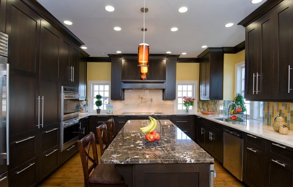
Dark wood looks exemplary for this kitchen space. The cabinets and drawer complement the color of the walls and the lighter shade of the flooring. The layout is somewhat obscured because of the large cabinets above the counters.
NW Portland Town Home
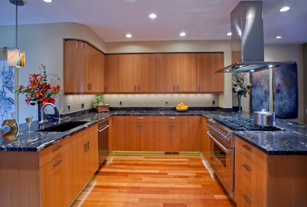
The cosmic black granite used for the countertops is actually fascinating. The color complements with all the wood work in this kitchen – from the cabinets and drawers to the floors. The design is perfect for this kitchen.
Old Riomar 1
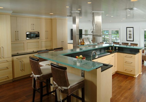
The “U” shaped island in an open kitchen is one of the most efficient. In this remodel, the designer opened up three small rooms to design the kitchen with a dining room.
Shaughnessy Condo Kitchen
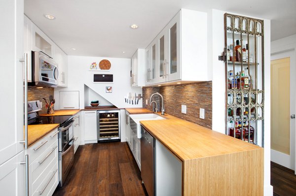
The owners wanted to incorporate something special and fun into their new kitchen. The husband is a fan of fine whiskey, so he designed a spot to keep his best bottles on display. The layout is definitely fit for them.
Valley Road Remodel
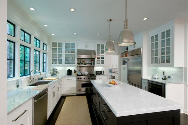
Kitchen designs with windows are always the best. They allow light into the kitchen, especially in the morning which helps in killing bacteria. This kitchen has tons of windows, clean and fun layout with the classic black and white color palette.
Woodchester Ct.
Spaces Inc.
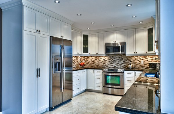
Here is another example of a shorter cut for a U-shaped kitchen layout. White cabinets, drawers and pantry which matches the flooring and complements the backsplash. We love this small kitchen space.
An efficient work triangle makes any kitchen highly functional. The back wall can be devoted entirely to clean-up and an ample landing space on both sides of the range is ideal for meal prep. The pantry and refrigerator occupy the opposite wall, centralizing food storage. With a clear distinction between prep areas and the clean-up zone, a U-shape kitchen is ideal for multiple cooks to work simultaneously. We hope you liked the list of 15 Contemporary U-shaped Kitchen Designs and also check out the L-shaped kitchens we featured just recently – and have fun!