We are very conscious when we choose color theme for our house. We have different choices based on our personality, character and mood. Besides we also consider comfort and elegance in choosing the best color of paint that we will apply in our house. Most people like white for plainness and purity. They believed that when you use white, your house will not just appear as neat and clean but also elegant. Now we will be inspired of how white palette makes a difference in house designs. I am referring to the White House situated in the center of La Rochele, France.
See how the designer renovated the house to fully respond to the client’s demands and requests. As I see here the renovated town house aims to create a flow diagram in both singular and practice. This house has four levels which are built around a central axis. This actually corresponds to the vertical green house in full height. There are designed corridors and balconies in which you can take the full advantage of the entire interior and exterior. Let’s discover more of the different areas of this White House through the images below.
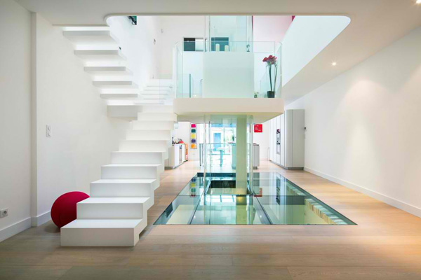
Colourful accessories and furniture are carefully arranged in this area to break the plainness of the white interior.
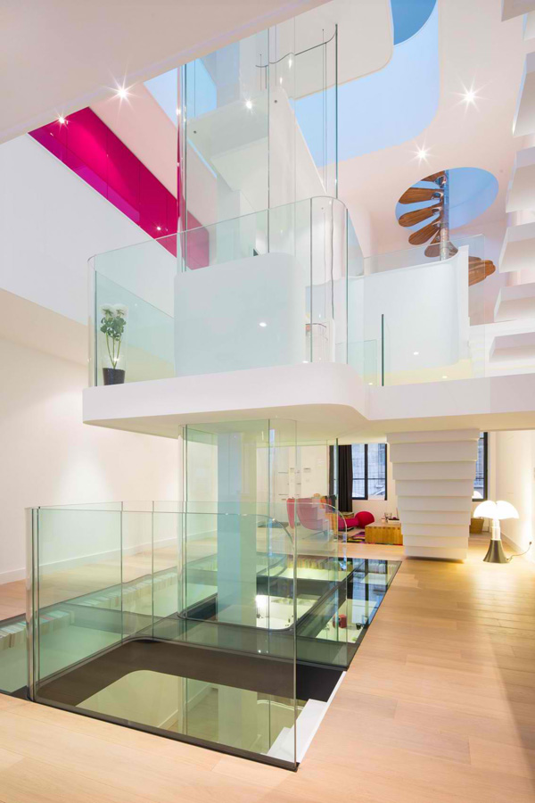
Curves and geometric forms are perceived in this space that unveils the exceptional style and design of this house.
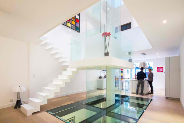
Glass and wooden elements utilized in the interior is very effective to create an astounding indoor.
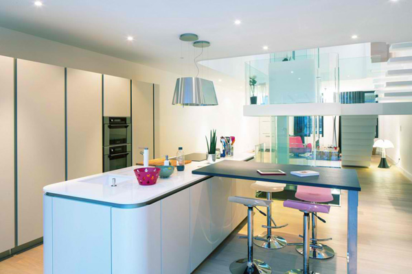
Even in this kitchen the use of trendy and stylish accessories and kitchen wares create a modern kitchen.
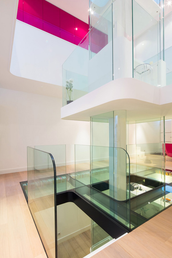
Designer used the glass material to serve as the frame of the stairs which made this stand out.
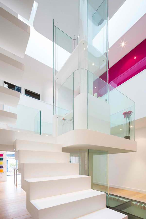
The clean and neat concept of interior is achieved seen in this pure white stairs.
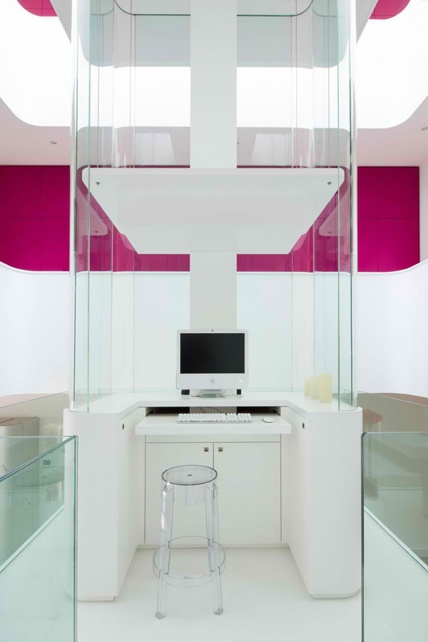
An incredible office area is located in the core of the house that may also catch the attention of the guest.
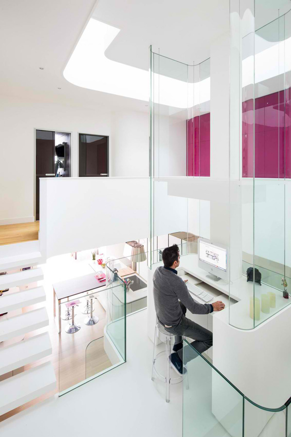
The client may still see the other parts and levels of the house for the glass framed walls used here.
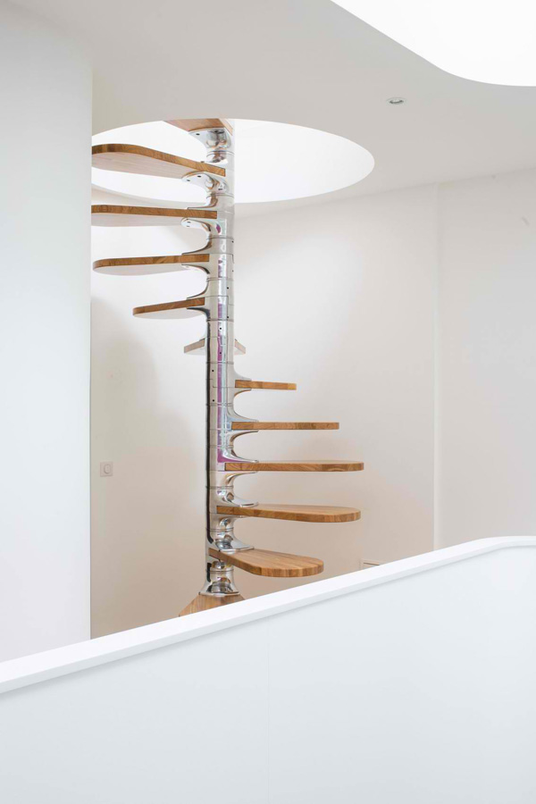
This distinct style of stairs used in this corner is considered to be one of the best features in the house.
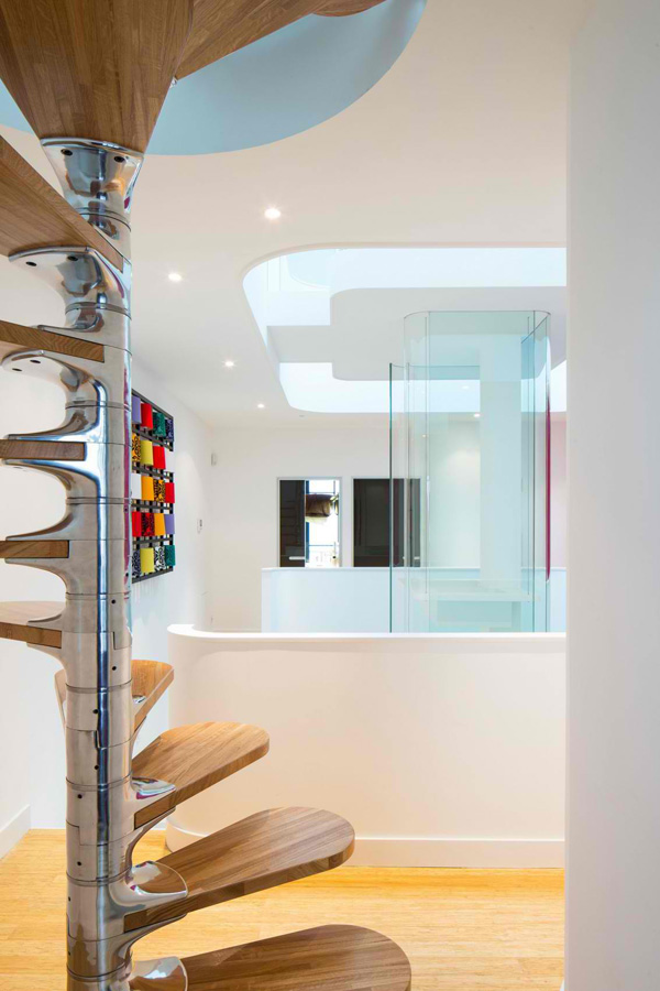
See how the designer plays the different elements of materials in this area to show its great charm.
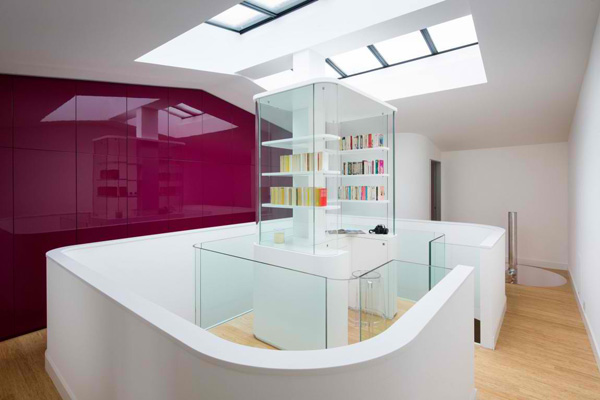
The designer indeed magnificently secured an area for the library and study room in one here.
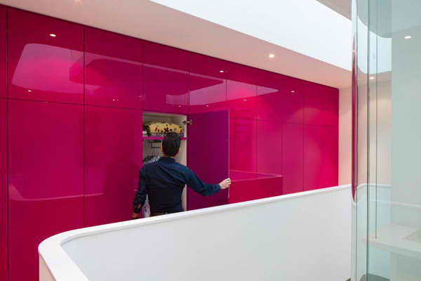
The pink palette applied in this wall expose a very smooth and flawless texture.
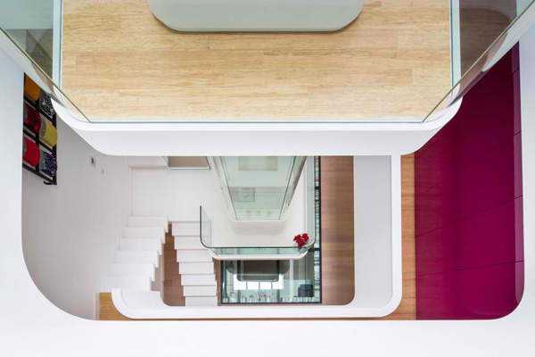
Here you may have the opportunity to take a glance on the different levels of the house.
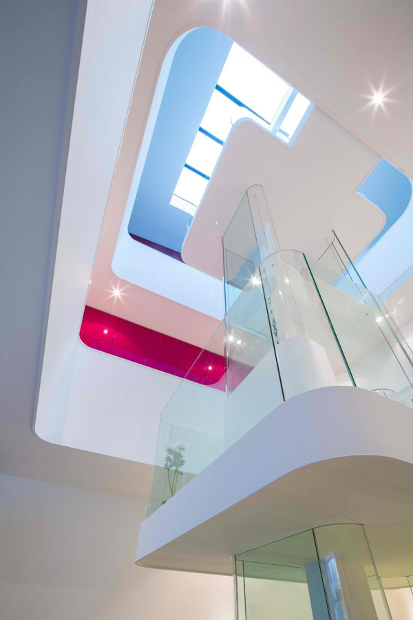
The arrayed LED lights installed in the interior seem like a sparkling star which shows attraction and luxury.
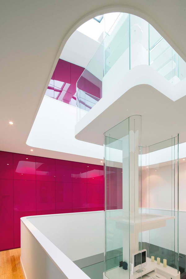
Extraordinary shapes and curves are greatly appreciated here through its glassed frame interior.
As we have observed above, there is a deregulation of space which allows its occupants to enjoy the four storey building. This outstanding town house exhibit the gorgeous and luxurious interior. With that we can say that the Pierre Antoine Compain effectively remodelled the White House. With wit and knowledge in architecture, the designer positively achieved the demands and wishes of the homeowner, right?