Although it is okay to go with the trend, it is also good if you do something unique.
When you are different, you are special. But only a few people are brave enough to be different since it is in the norms of our society to have that feeling of being accepted and wanted.
Same is true with home design. Some designers prefer to work on a design in such a way that it is similar to what others are doing because of the idea that this is what the society accepts.
But in truth, it better to be unique.
Do you also believe in this?
Well, speaking of being different and unique, we are going to show you an apartment in Poznan that has a beautiful distinct interior.
Instead of the usual flat panel cabinets and walls, it added geometric cut-outs in it.
Do you get what I mean?
Well, you can see that in the images below.
Location: Poznan
Designer: Mili Mlodzi Ludzie
Style: Modern/Industrial
Type of Space: Apartment
Unique feature: This apartment renovation resulted into a beautiful interior that features geometric cut-outs.
Similar House: Impressive Lighting of a Black and White Apartment in Moscow
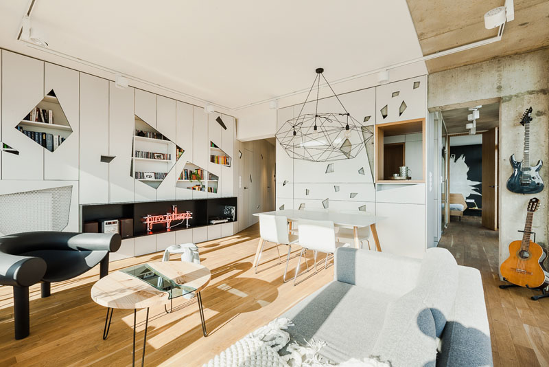
A top floor apartment which overlooks the Poznan, Poland was once a builder grade and unfinished space. But it was transformed into a modern industrial space with bold details. The designers reworked the layout to make better sense and to take advantage of all of the windows around it. The goal was to have glimpses of the view from the moment one enters the apartment.
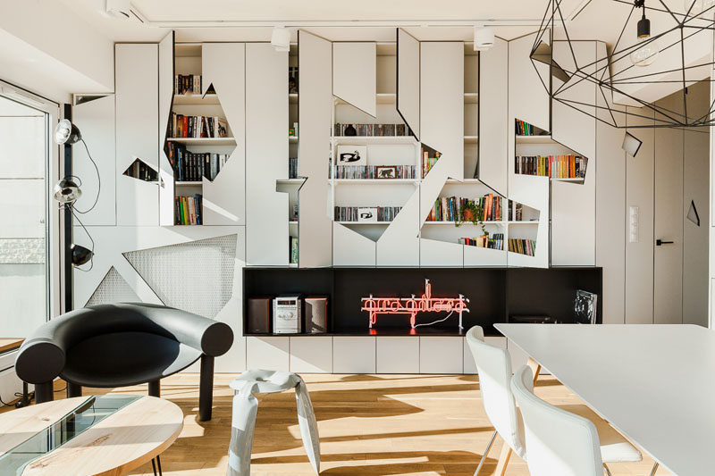
The new layout affords an open living and dining room with uninterrupted window views in the corner of the apartment. Some of the raw, industrial elements were retained that add charm to the space.
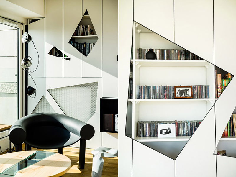
Here is a closer look of the geometric cut-outs. Isn’t it beautiful? The designers added another design layer into the interior by outfitting the built-in cabinets with geometric door fronts.
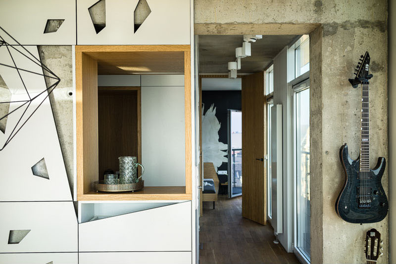
The kitchen, guitar room, and guest room can all be entered from either side. This gives the apartment an open feel and lets light further into the interior.
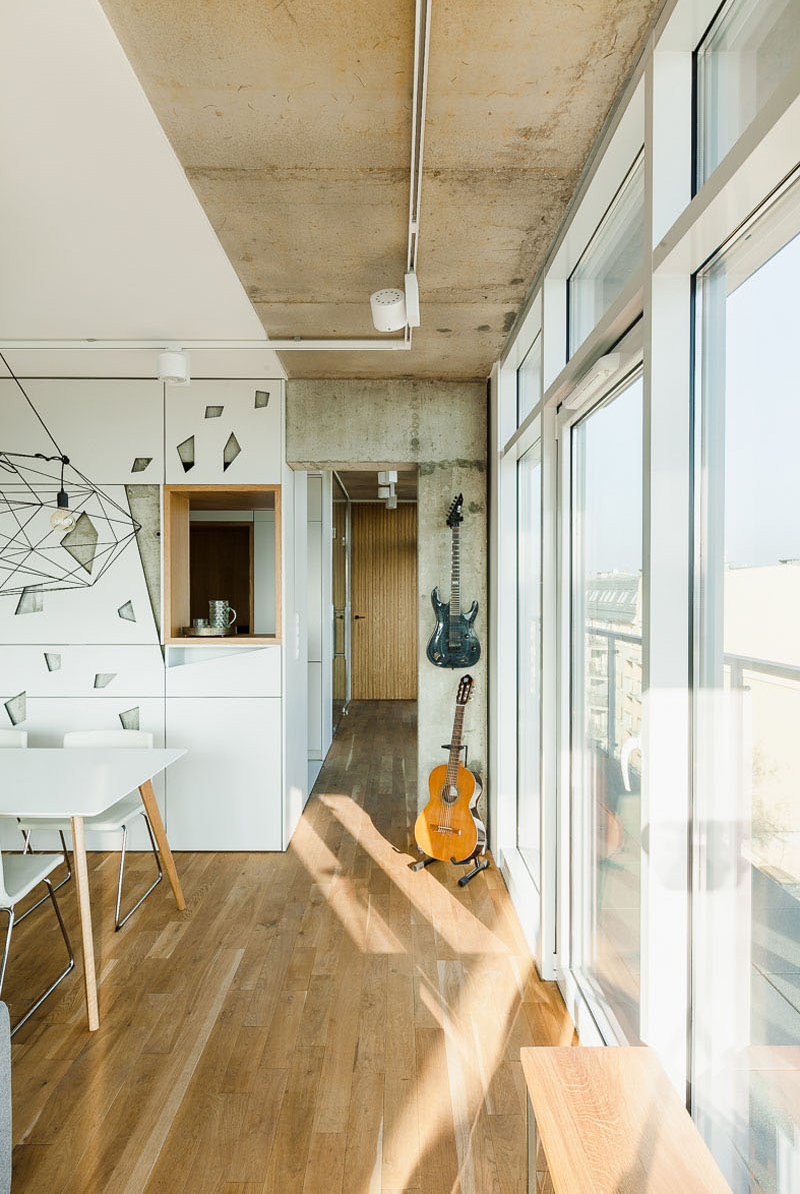
False cabinet doors were added to hide a large concrete wall, with the cut-outs showing glimpses of the wall. A wood lined shelf acts as a serving window from the kitchen to the dining area. You can also see here that there is a guitar on the wall. Although the guitar is stored this way, it also doubles as a decoration.
Read Also: Modern Industrial Loft Apartment in Ukraine
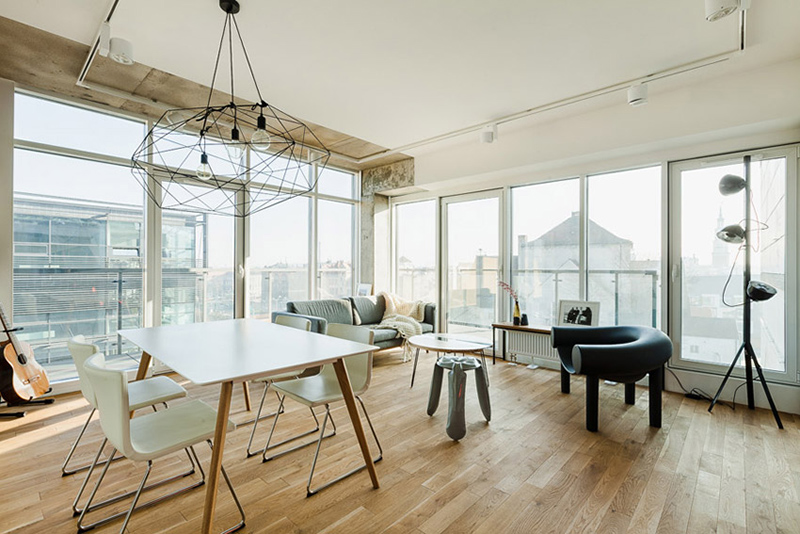
The dining room sits in the same space as the living and kitchen area. The house is surrounded with glass which makes it appear transparent from outside. Notice that there are many geometric features in here which compliments with the cut-outs in the cabinets.
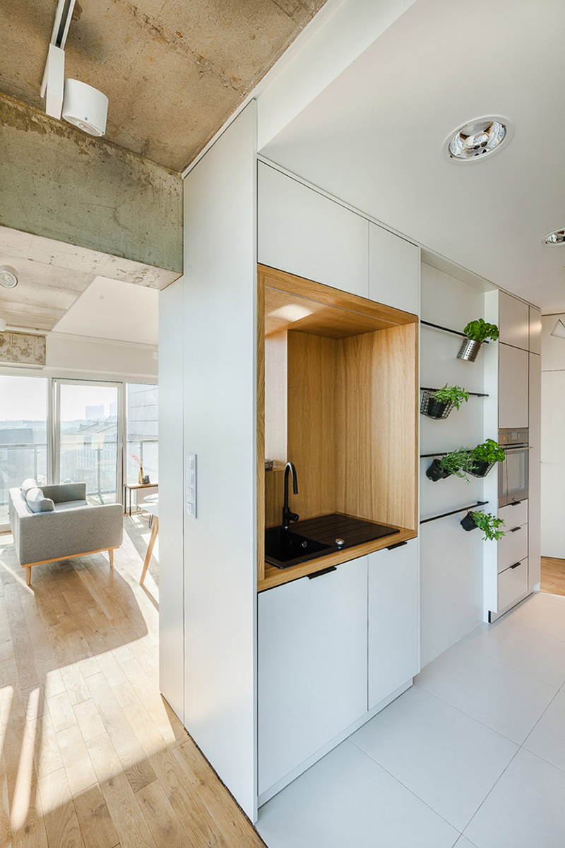
What I like this compact kitchen is that it has everything one needs in order to prepare food, without the need of using a large space. It also has some plants in it which I assume are herbs.
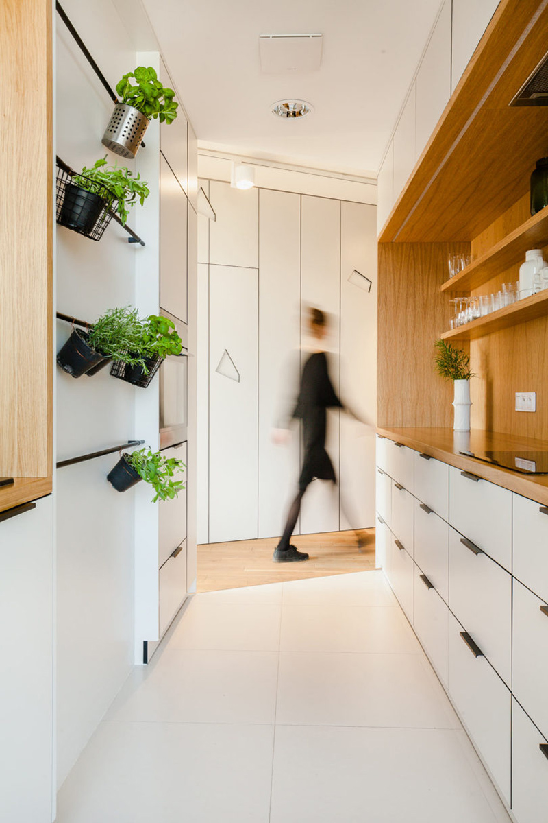
Although small, this kitchen works well for the owners. It has many storage spaces in it like the drawers, cabinets and open shelves. It is also good that it used wood for the shelves.
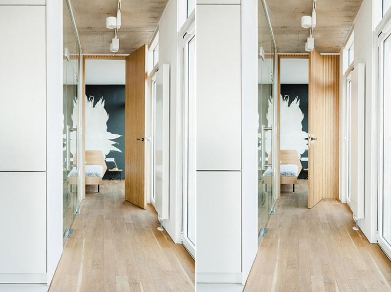
What you can see here is the hallway that leads to the bedroom and other parts of the house. There is also a glass door that opens to the balcony and another one for the main entrance.
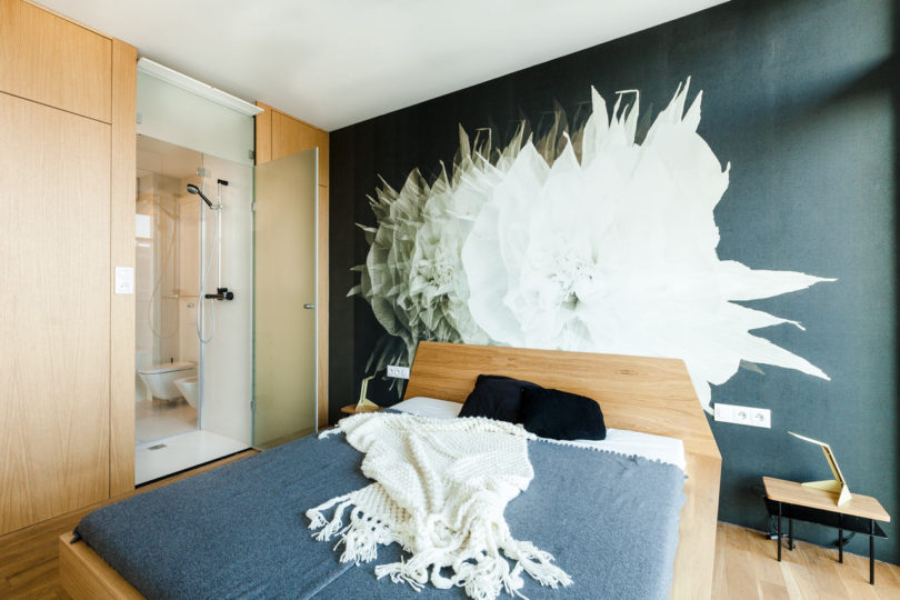
Beautiful, right? Despite the minimal design of the space, the feature wall with a big white flower made it look very artistic. It is also nice that his room used a combination of wood and dark gray.
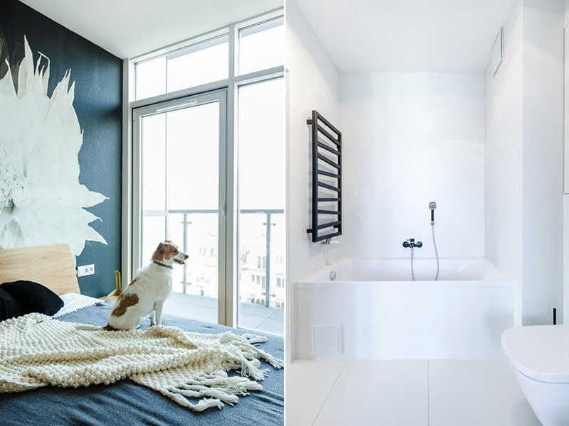
Another look at the bedroom which has a glass door that provides access to the balcony. Also seen in the picture is a white bathroom. This bathroom is also located inside the bedroom as well which features a glass enclosure for the shower area.
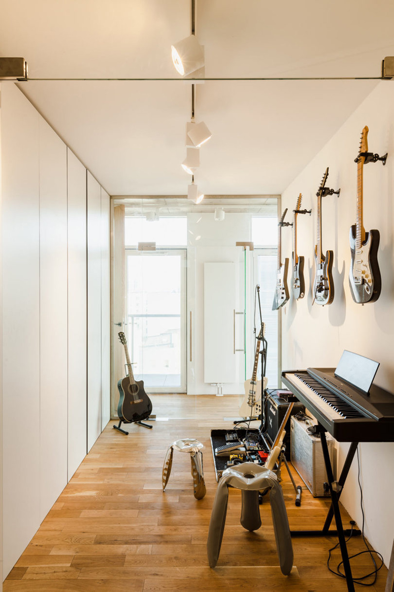
This is actually a study but it functions as a guitar room. To make sure that the views will not be disturbed, two walls made of glass were added to it so the sight lines are kept open.
What can you say about this interior? Isn’t it nice? It sure is! You can notice that Mili Mlodzi Ludzie did a different design to the cabinets by adding cut-outs to it. Others are openings to get some items from it while others have mesh coverings on it. The design of the apartment was enough to complement the natural, lush oak floor and the white, geometric fronts of the building. The whole look exudes a densely exposed view. This way, it connects the interior of the apartment with the city. This interior design is a proof that nothing is wrong with being unique. In fact, many will praise your courage for being different, just like how this Poznan apartment received a worldwide recognition because of its distinct design.