Not at all times that the look of the exterior is the same as that of the interior. It may vary too just like the home renovation that we will feature today. The house is also a fusion between two different things that the owners love. They want it to mirror the historic homes in Boston and the Oregon outdoors where the wife came from. The home is a renovation of a 1950s cottage getting a major update to fit to the needs of the family.
The exterior of this 2,820 square feet (262 square meters) home with 3 bedrooms and 2½ bathrooms was done in a manner that suits the brief and lifestyle of the client. This home in Santa Monica, California is owned by a family wherein the father is from the entertainment-management industry while the mother is a stay-at-home mom after a career in environmental policy, where she looks after 2 young boys. The family found this cottage with a well-kept history and wanted to turn it into a dwelling that would fit the active lifestyle of the family. Some rooms at the rear part of the house were turned into a kitchen, breakfast room, laundry and powder room while adding a master bathroom and closet upstairs. Let us take a look at the before and after photos of the home below.
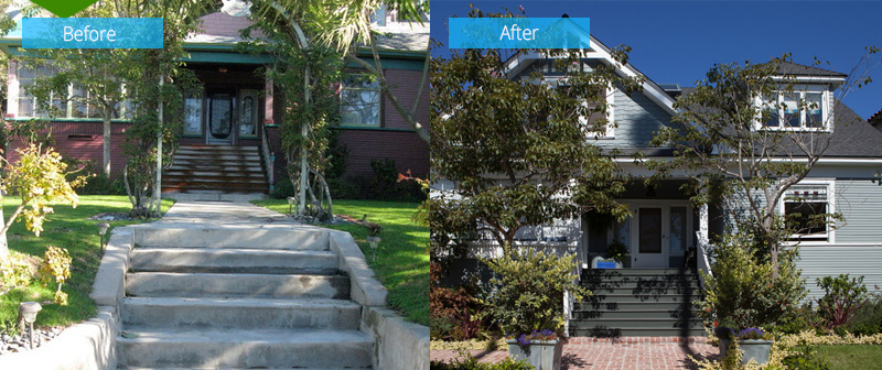
The home has a post-Victorian and pre-Craftsman look which was still intact. According to the designer, they were able to update it without restrictions because it didn’t have any landmark status despite being a historic home. The Luxe family home was actually called Villa Rosa because of its magenta exterior. Now, the house changed its color but the signage bearing the original name of the house was kept. The new home also got a new landscaping from landscape designer Mary Effrom adding some plantings and brick walkway. The porch steps and railings were rebuilt while the home was repainted with chameleon-like quality using grayed blue-green that tend to change its colors during day time.
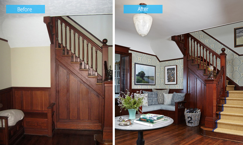
Most of the home’s original millwork was intact and retained just like this staircase. The original Douglas fir floors were merely refinished in the interior. Meanwhile, on the stairs, the original newel post lamp was restored.
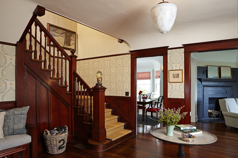
A mix of the couple’s existing furnishings were used in the house combining new traditional items as well as some vintage finds. Interior designer Sasha Emerson did the interior wherein the items were “all done in finishes and fabrics that could withstand the rigors of childhood”. The sisal runner used on the steps is durable and could provide traction for kids who will use it.
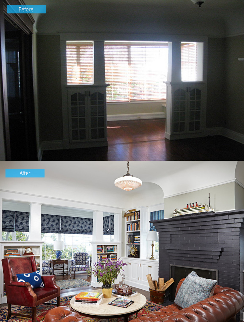
Off the entry hall are built-in cabinets that separate the cozy study from the small sunroom which overlooks the front yard of the home. This area was updated with a new built-in bookcase on the left of the fireplace. The once white cabinets were painted charcoal gray while adding a vintage lighting feature. “The original cove ceilings and built-ins give this house so much architectural character,” Wertheimer says. “Everything new was inspired by what was there.”
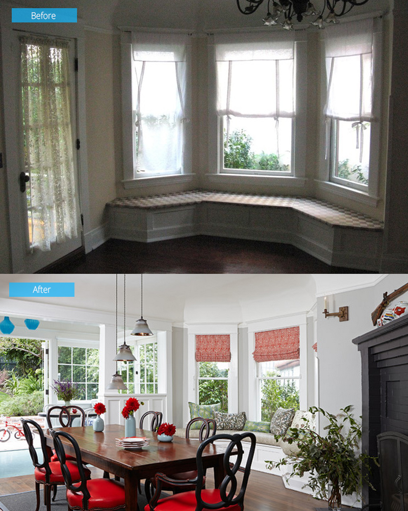
In the dining room, there is a bay window and window seat. There is also a small doorway that leads to the porch was not really very functional. Now, the newly designed dining room opens to a new breakfast room which is part of the kitchen expansion at the back of the house. Red leather upholstery were added to the owner’s old chairs.
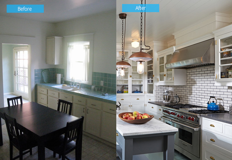
The old kitchen was inefficient and part of some small rooms at the rear of the house. It also included a full bath and laundry. The floor plan was reorganized to create a more expansive kitchen, a new breakfast room, a laundry and a powder room instead of the full bath. The back of the house was opened to the garden through windows and doors. Because the couple loves to cook, the kitchen was the center of the home.
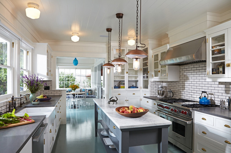
The kitchen used Shaker-style custom cabinetry, honed basaltina and marble countertops, and vintage-style pendants. You can still see some hints of traditional design in it merged with modern style. To keep the kitchen from looking cramped, it used furniture-style island.
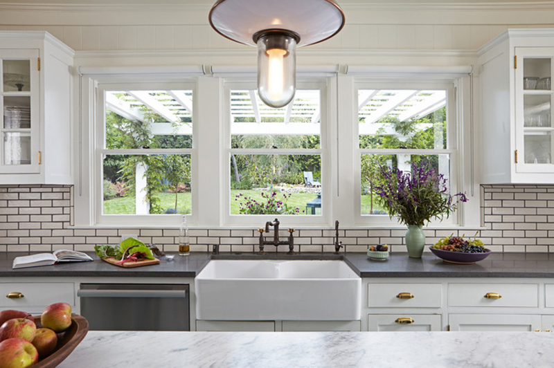
From the kitchen, a window overlooks to the backyard. Outdoors is a garden where vegetable beds, fruit trees and a chicken coop are seen.
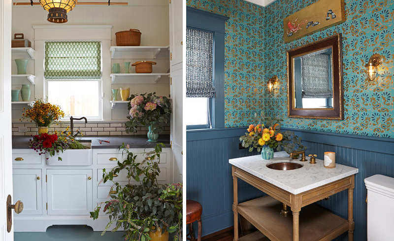
The laundry area and kitchen are visually connected through a glass panel in the door. On the small sink, both hand washables and cut flowers can be handled. It also features a Sheila Maid drying rack that goes up and down from the ceiling via rope and a pulley. Meanwhile, the new powder room has a narrow, V-groove ceiling treatment and wainscoting that mirrors the home’s turn-of-the-century cottage details.
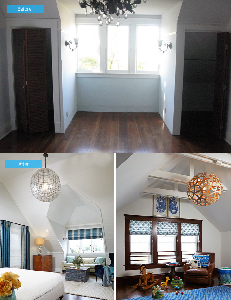
In the master bedroom, two small closets used the floor space while low ceilings that added to a sense of confinement in the area. In the renovated bedrooms, the ceilings were raised to add a sense of volume. The two small closets were removed from the master bedroom creating space for a sitting area. Custom designed sofa and bed were also brought in.
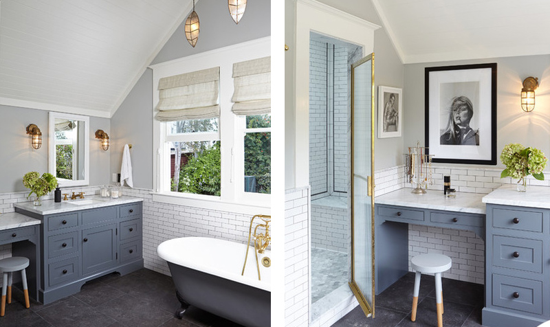
Before, only one bathroom served the three upstairs bedrooms. But the designers suggested adding a master bath and closet. The bathroom features “period plumbing fixtures, Shaker-style custom cabinetry, marble countertops and blue limestone flooring with a sandblasted finish work together to create a harmonious retreat that overlooks the backyard”. There is also a walk-in shower at one end of the new master bath.
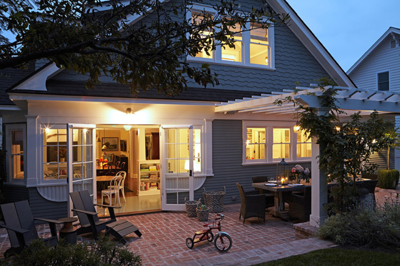
At the back of the house is a new gable which matches with the original architecture of the house. Aside from that, a pergola and brick patio was also added to create an outdoor living and dining areas off the kitchen.
This project is a collaboration between Architect Lewin Wertheimer, builders Campbell Contractors, interior designer Sasha Emerson Design and landscaping by Mary Effron Landscape Design. Now that is an entire team who did the renovation of this old house turning it into a comfortable, cozy and functional home that suits the need of the family! What can you say about the traditional-transitional twist?