It’s been a long time since we last featured a before and after feature showcasing how homes have improved from the previous look. It sure is inspiring to see a home’s transformation. What we are going to show you today is a 40 years old apartment located in Yangming National Park at Mt. Shamao which is famous for its hot springs and scenic landscape. The location of the apartment is blessed with a view of the Mt. Shamao from its windows. But there were walls or columns that obstruct the view to that lovely sight and the apartment also looked like it is falling apart and is very much outdated. Hence, the Chen Residence underwent a renovation and redesign.
Chen Residence is a stylish apartment remodel in Taipei, Taiwan owned by empty-nester grandparents who are very dedicated to their three grandchildren. Their fondness of the natural beauty of the area urged them to buy the apartment. They want to transform the apartment into an open living space so it will look bigger and would allow their grandchildren to play. The apartment is a weekend holiday house for the owners as well as their grandchildren. Let us take a look at the images below where you can see before and after photos too.
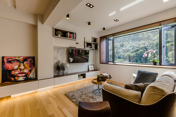
Such a lovely living area indeed with a view of nature just outside the window.
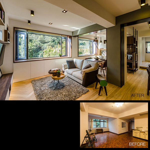
You can see what was changed in the house aside from opening some areas, the flooring looked a lot better now.
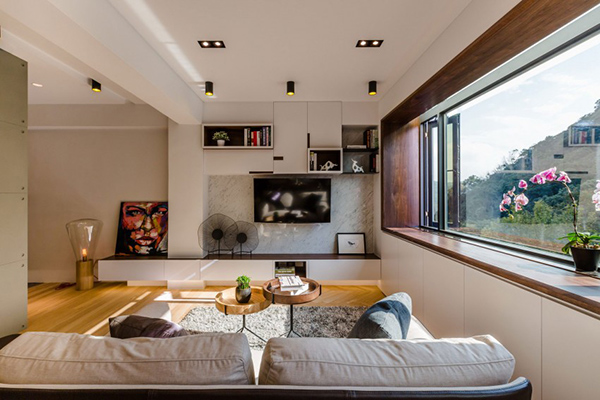
Adding some decors and lighting in the house made it look a lot better.
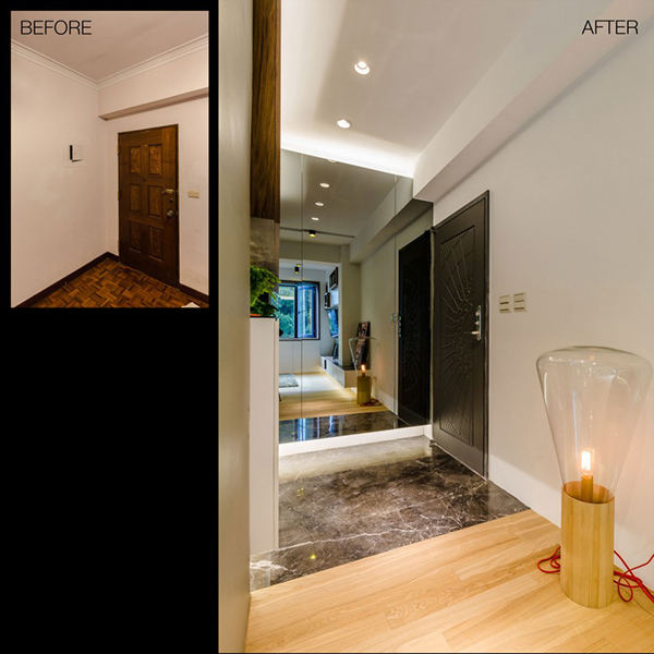
Even the entrance looks beautiful with new flooring and main door.
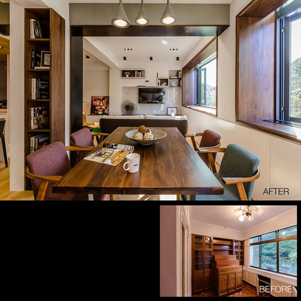
For the dining area, a partition was demolished to create a new open layout.
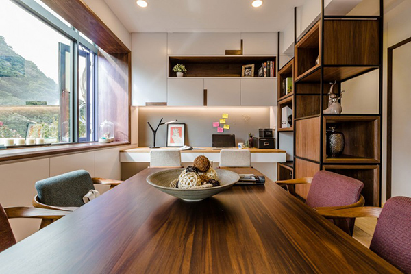
Using wood and white combination for this part of the house made it appear cozier.
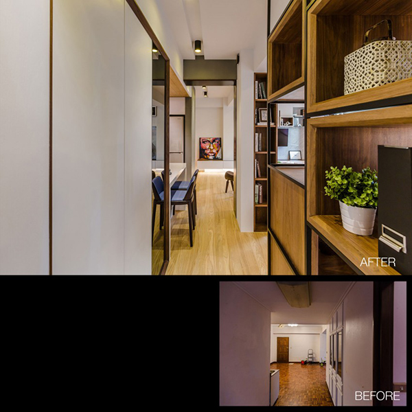
Aside from the floor, the layout as well as the cabinets where changed.
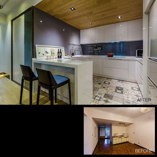
Instead of wood, ceramic tiles of different designs were used for the kitchen area.
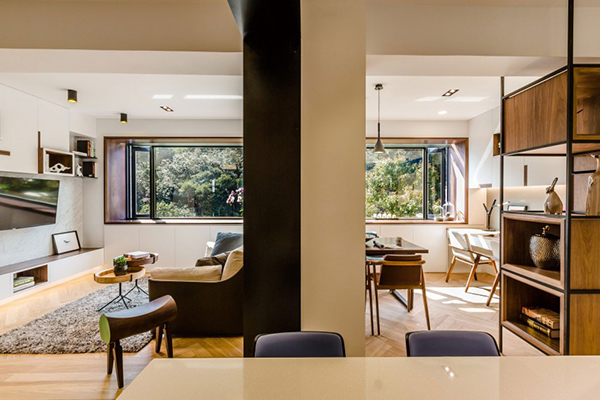
This column was retained in the house which defined the dining and living areas.
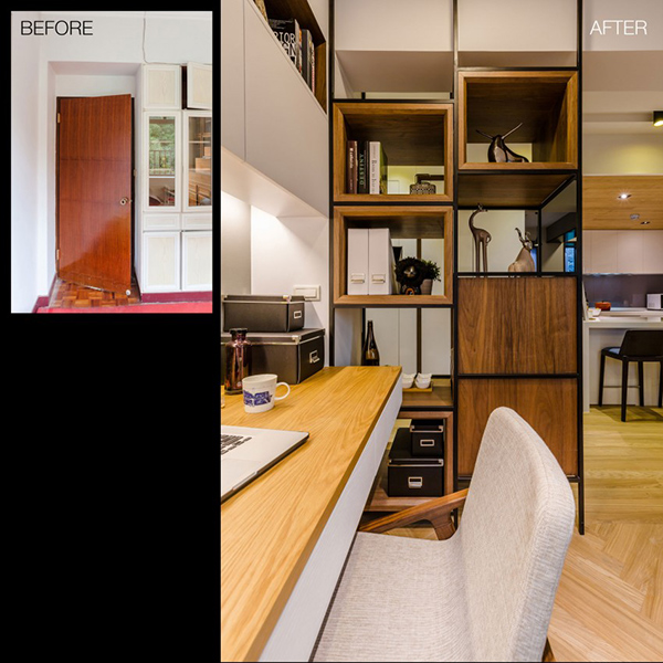
The cabinet’s design was changed from a closed one to a beautiful wooden cabinet with open shelves. A working area was also added here.
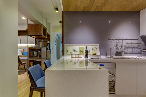
The kitchen has glossy finish in white with a lavender accent wall.
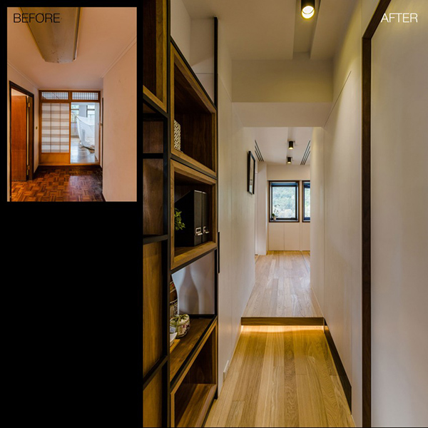
The hallway’s look changed too and it looked a lot better and brighter now.
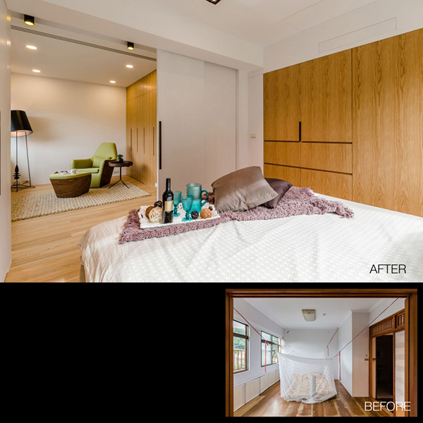
No more mosquito net and a cheap looking bedroom. Say hi to this contemporary bedroom with wooden wardrobe and comfy bed!
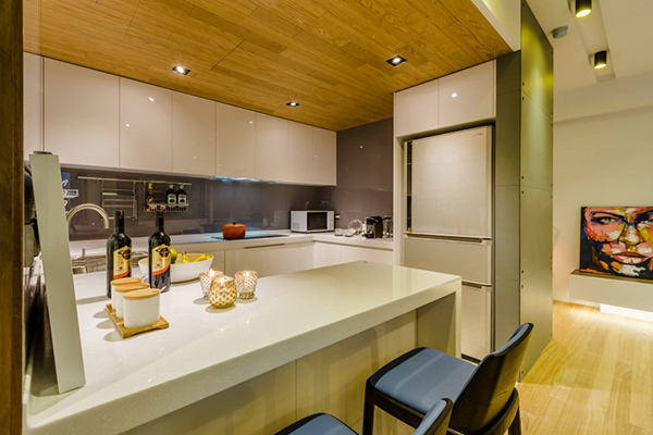
Another look at the kitchen area. Note the use of blue high counter chairs and that refrigerator integrated to the cabinet.

Well, obviously, a great change can be seen in this bathroom! I would definitely prefer to use the new one.
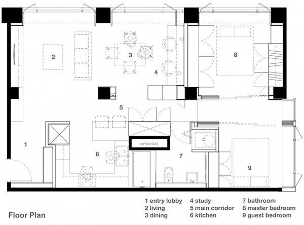
The floor plan of the apartment showing us how the areas were distributed.
Like any other homes that are renovated, this apartment designed by Archlin Studio – fb.com/archlinstudiod, transformed into a stunning space that would be a cozy home for anyone. Yes, the old space was okay but the new space looked even better! It isn’t just beautiful but is also very comfortable too. I like the aura of the new space as well. How about you? What can you say about this home?