An interior’s design is made up of the color scheme, patterns, textures, theme and others. You can see this in the furniture it used for the home as well as on decorations and other items used to beautify the interior. Merely changing the decors has a huge impact to how space would look like. What we will show you today is actually an apartment transformation only that we do not have the before photos.
This modern apartment interior is owned and designed by Chicago based designer, Gabriel Fontes who based out of New York. Monochromatic color palette was used in the interior which unify the space. You can also see natural textures that blend in with the color scheme creating a soft overall aesthetic. A balanced mix of sleek minimalism and a comfortable traditional scheme is featured in this apartment creating a homey feel. It has an open and inviting aura with lots of texture. “Our main goal for our place was to merge the two backgrounds in some way,” says Gabriel, “I think in order for a home to feel welcoming and sophisticated, the people living there need to be comfortable in it and proud of what the home they’ve created.”
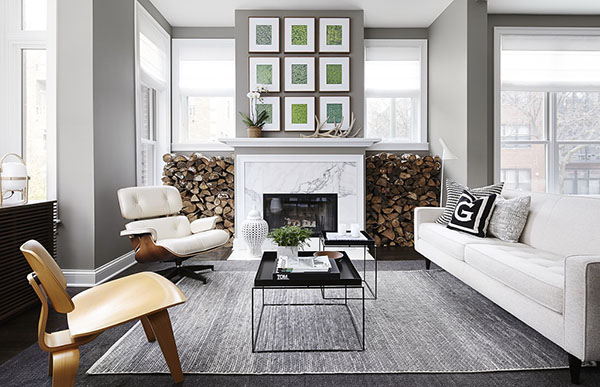
The interior of the house has tones of gray and white. You can just see sutble pops of color from some decorative items.
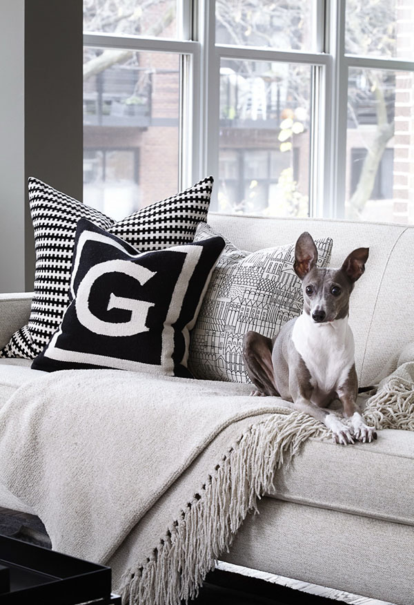
Black and white throw pillow covers look stunning in this monochromatic living area.
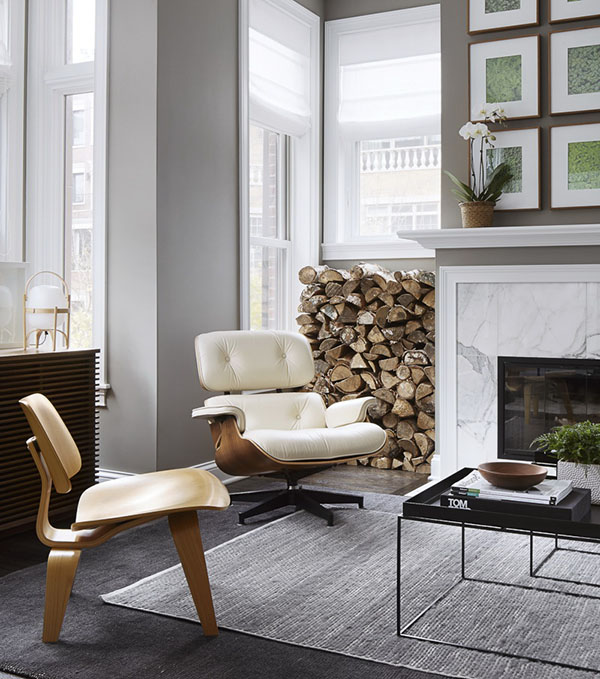
Having two different chairs seem to bring an eclectic style to this space.
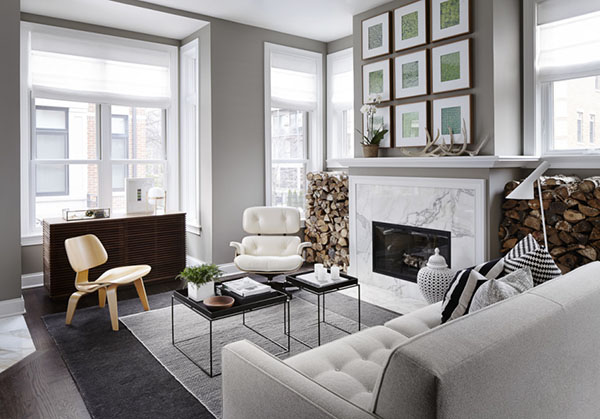
Aside from the furniture and decors, for sure you can notice how they store firewood which actually doubles as a decor too.
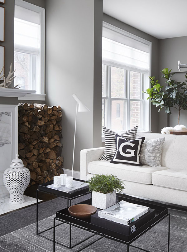
White ceramics are seen not just on top of the table but even near the fireplace too.
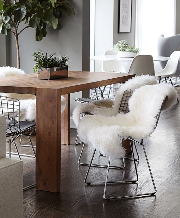
Throwing a furry fabric on top of this industrial looking chair sure made it look very gorgeous!
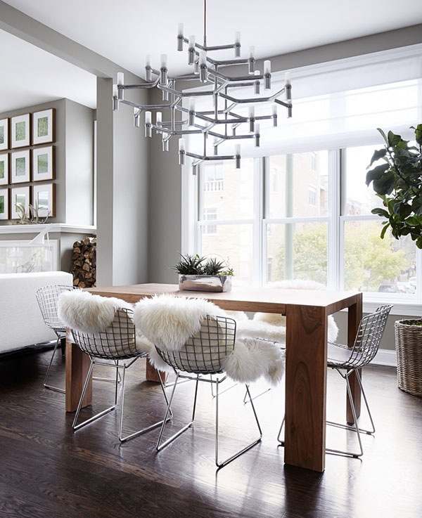
The chandelier has a unique contemporary design that proudly hangs above the dining set.
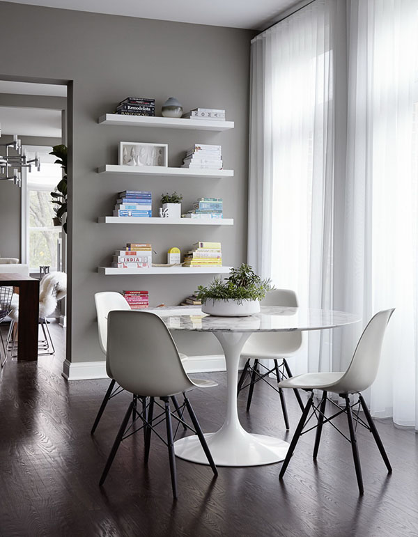
Another are where the owners can chat or even read books with floating bookshelves on the wall.
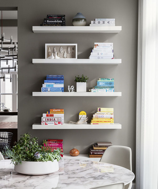
I like the way the books were arranged according to color!
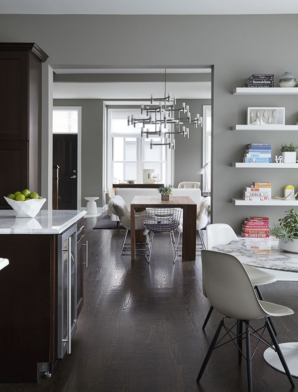
Dark wood flooring was used in the apartment adding a warm touch to the entire dwelling.
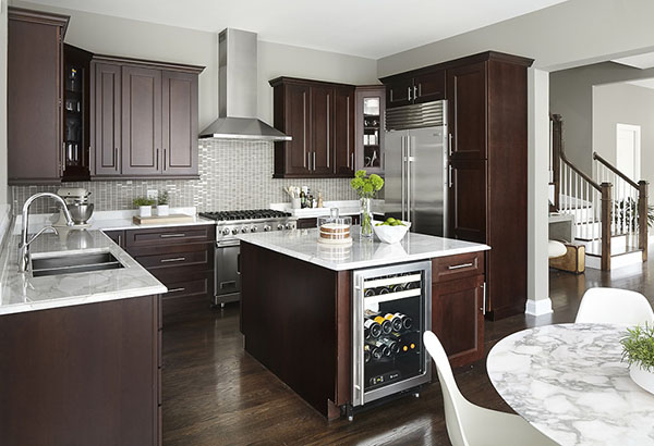
The kitchen has a modern design with modern equipment. The kitchen island is also turned into a wine storage.
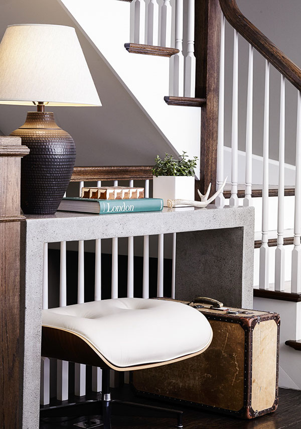
Isn’t this area cute? Right below the staircase is this working space with a subtle vintage touch.
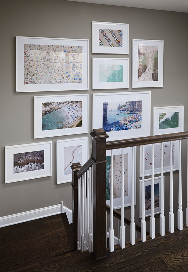
A gallery of lovely photos cover the entire wall near the staircase.
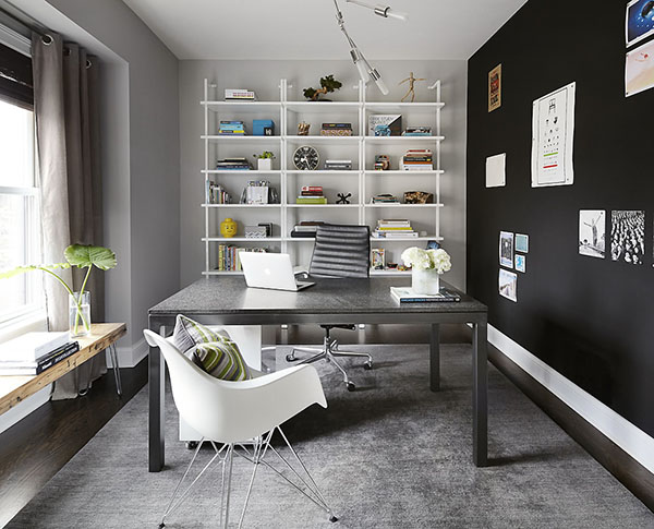
Adding a black wall on one side of this home office makes it look even more artistic especially that the posters could be emphasized.
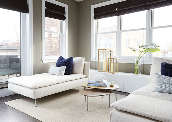
A lounge chair is added in the bedroom which is an additional seating or sleeping area in this private space.
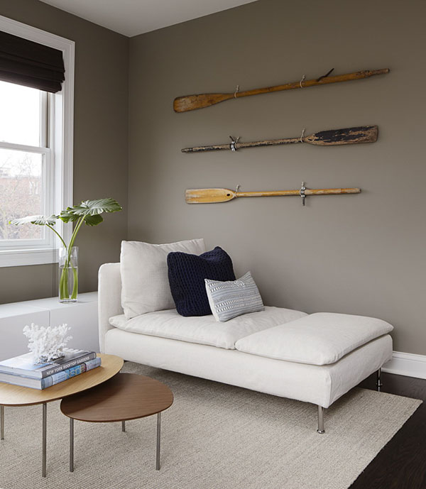
The walls are decorated with wooden oars which I guess are still being used.
Isn’t this a beautiful interior? You can see how serene and warm it looks like with all the furnishings and decors inside it. This one is from Home Polish who indeed did an amazing job in its design. Chicago based designer, Gabriel Fontes who worked for Home Polish was able to upgrade the look of the apartment with functions that suit the lifestyle and needs of the homeowners. What can you see about the design of this apartment? Are there some features that you like or dislike in this one? Please let us know your thoughts in the comments section below!