What could be lovelier than a modern house that is located near the beach? Takapuna House is a modern single family residence situated in Takapuna Beach, New Zealand. It was designed based on four key ideas 1)The retention of the original “bach era” landscape, 2) Linking the buildings on the two sites, 3) Respecting the local scale, and 4) Packaging.
The designers made sure that the green space is retained and extended in the house by linking different sites with a consistent landscape treatment. There are three discrete house forms that have combined plan area and these were linked together. The look of the house are like small collection of containers combined together. Let us see the images below and tell us what you can say about this house.
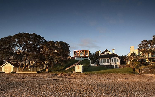
The location of the house faces the beach along a neighborhood. You can see that its modern design is being highlighted from the rest of the houses.
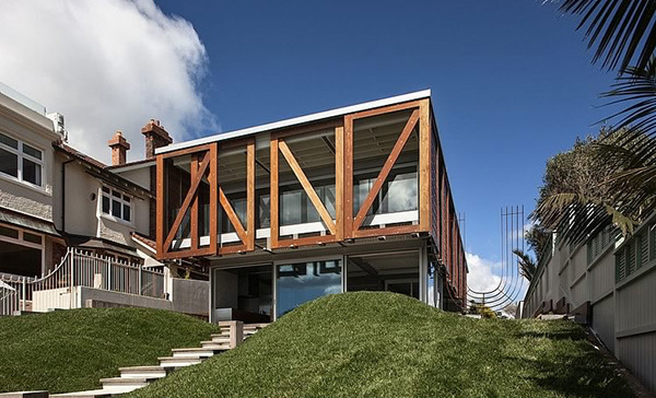
The facade of the house boasts these geometric lines making it appear strong and masculine despite having delicate glass walls on it.
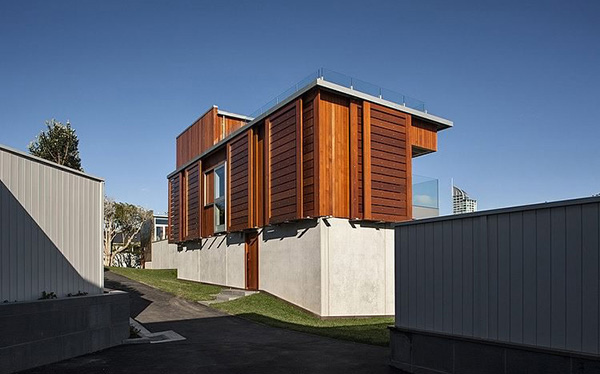
On the other side of the house, you will see its exterior design using some panels that made it appear beautiful in this structure’s stateliness.
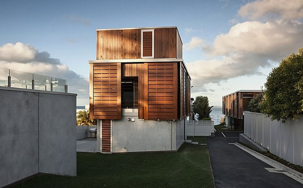
If you look at the window area, you will seem to see layers which is one effect of the wooden sidings used for the exterior.
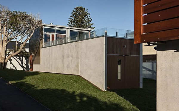
Another side of the house with glass railings on top exposed to the sun and rain.
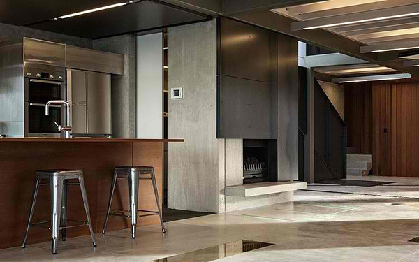
Stainless kitchen equipment are installed in the kitchen. Even the fireplace is very much modern.
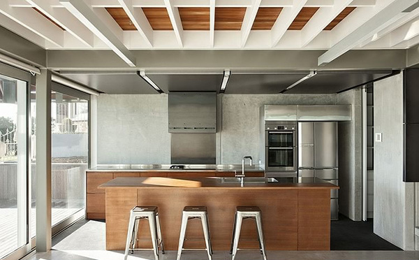
Exposed beams in white somehow balanced the look of this interior which are mostly in gray. You can see here a kitchen with an island made of wood.
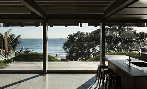
From the kitchen, one could get a good view of the beach through the glass walls.
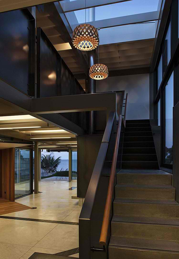
This stairs appear strong to us especially that it has sleek lines and dark gray color.
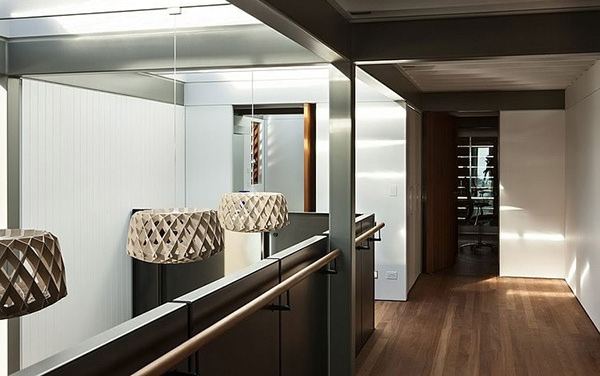
Stylish pendant lights adorn the ceiling with exposed beams on the upper level.
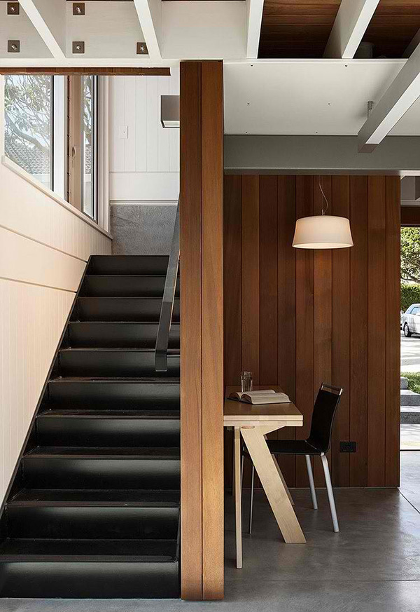
Another stairway with a similar look but this time the treads were black. That study area is a good spot and is a space saver too!
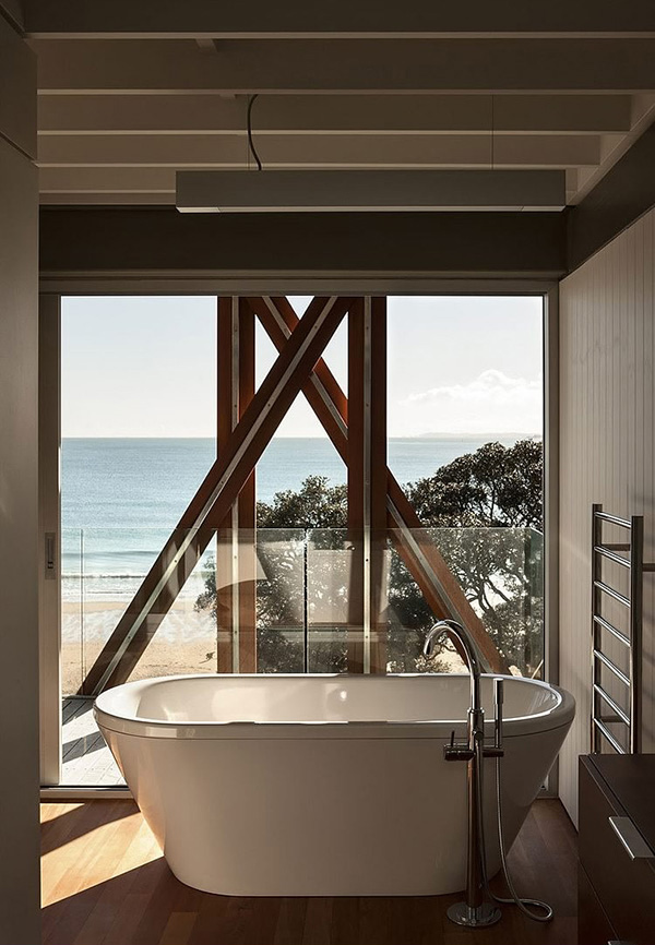
Remember the criss-cross elements in the facade? This is what you can see here from the bathroom of the house.
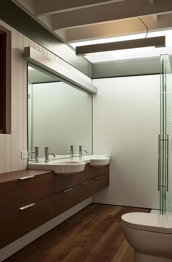
Totally neat bathroom in white. The wooden drawers are not just added appeal but they also provide more beauty to the interior.
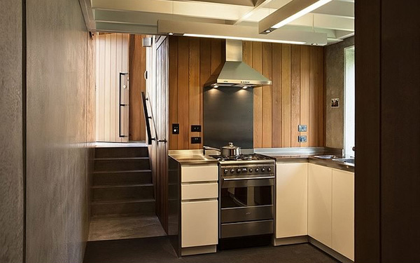
We think this is another cooking area that is at the basement but it does extend the modern look of the kitchen above.
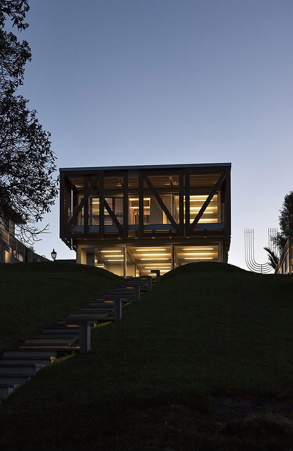
When the lights are on at night, one will feel like climbing to a heavenly abode!
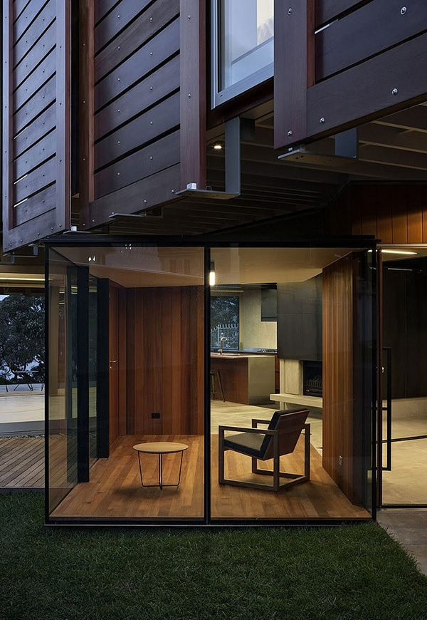
Anyone can surely get a private time here while enjoying the beauty of nature seen through the glass walls in black frames.
Designers from Athfield Architects have worked on three house at No.26-27 William St. and let them share a common platform. They added that “the new houses are notionally thought of as a small collection of containers or vessels. The content of these packages, set back behind robust claddings, are finely detailed and glazed. The houses, or packages, have been placed and arranged so that the cladding conceals the content from the more public approaches and reveals the interiors as one accesses elevations that are interior to the site. This subtle theme is developed further with the provision of folding and sliding able to be manipulated to suit the requirement of the inhabitants.”