I have seen many homes with good geometry in it and that sleek lines that we often see in modern homes. As a matter of fact, there had been many house designs like this that were featured here on Home Design Lover. And I’d guess that we would really be seeing much of homes like this because this design isn’t just light for the eyes but it can also save construction materials too.
The Fold Place is another modern house design comprised of 2,400 square feet of living space on a 20 feet by 60 feet land. It is located in Ottawa’s vibrant Glebe neighborhood in Canada’s National Capital. The house design has open, flowing spaces in which simplicity would make modest dimensions seem bigger. On the second level, you can see a cantilevered bay with crisp lines, layering of planes and contrasting materials. The single storey garage is clad in richly stained pine in contrast to the neutral light-grey stucco of the main volume. The same pine is used on soffits to break up the major volume. Let us take a look at the Fold Place below.
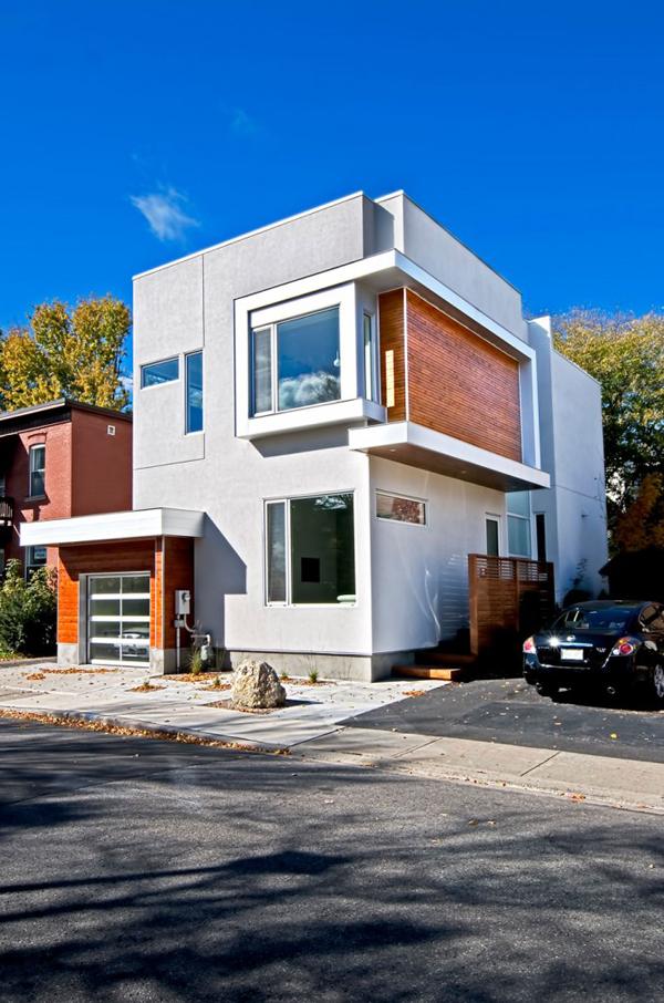
With the geometric lines and planes in the house, it turned out to be a geometric work of art.
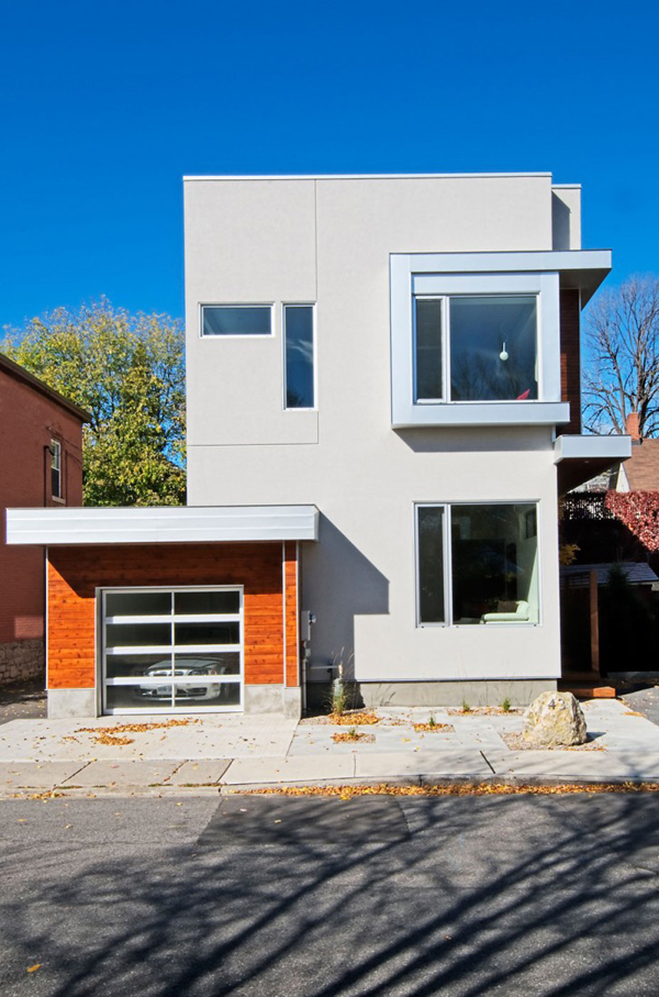
This is the garage area with pines on the exterior.
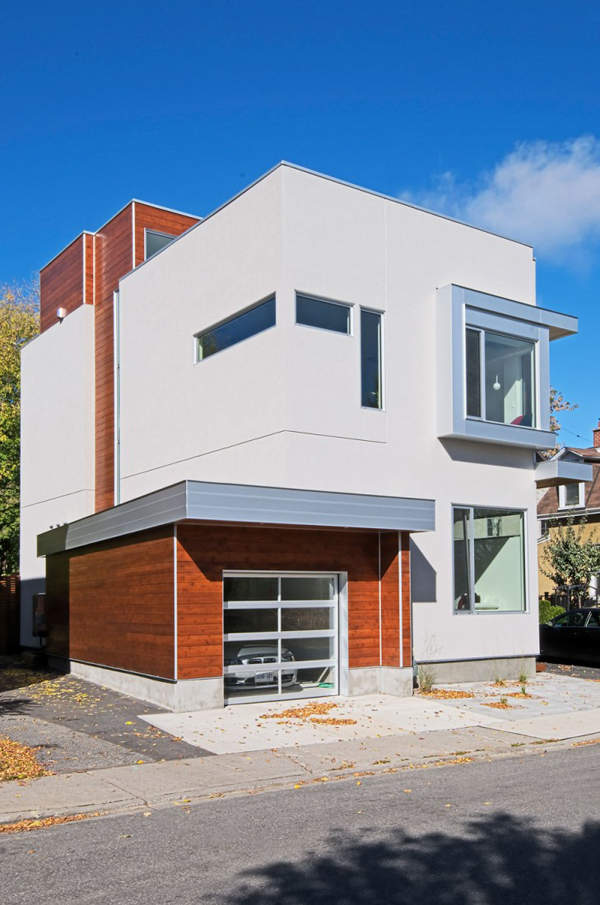
I like the look of pine wood combined with concrete. It made this home totally modern.
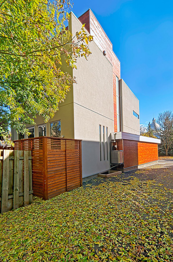
One side of the elevation still looked really beautiful. I guess all the sides are!
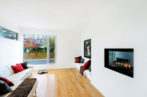
The living room is graced with a modern fireplace. Aside from the sofa, it has a bench built-in the wall too.
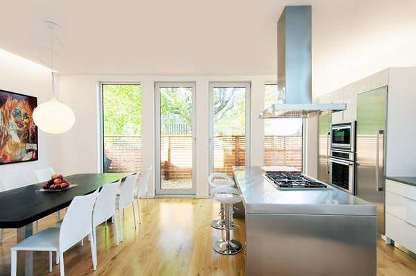
The dining and kitchen area is just beside each other in this small room. But I like how this is being utilized well with all the kitchen appliances.
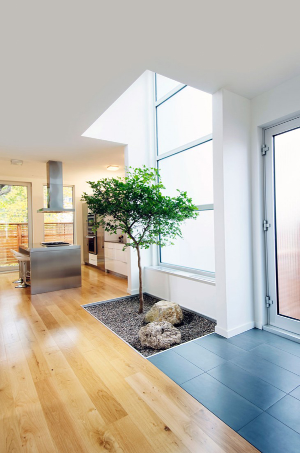
An indoor garden is always pleasing as it bring nature even closer to the home.
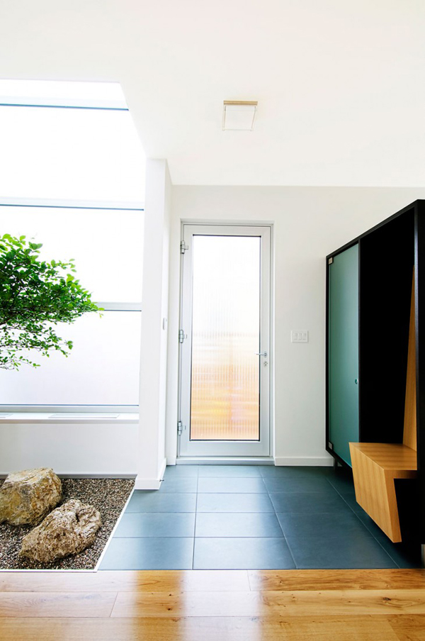
I’m not sure where this door is but of course it is near the kitchen. On the side of it is a storage cabinet.
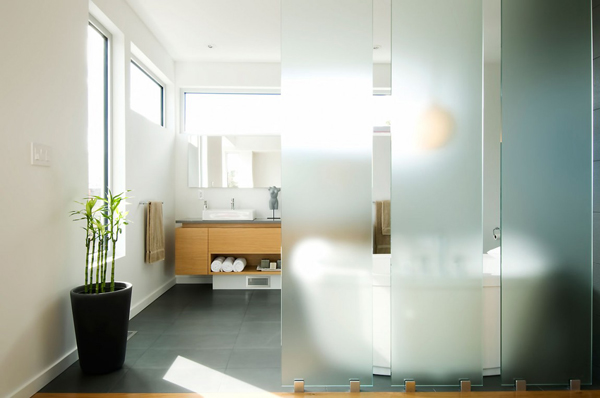
I honestly like the glass partition here. I really looks beautiful!
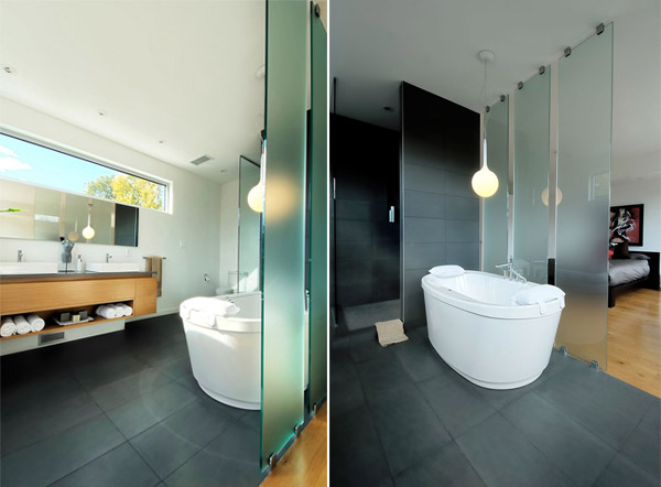
This is the master’s bathroom with the glass partition, a free standing bath tub and a wooden vanity.
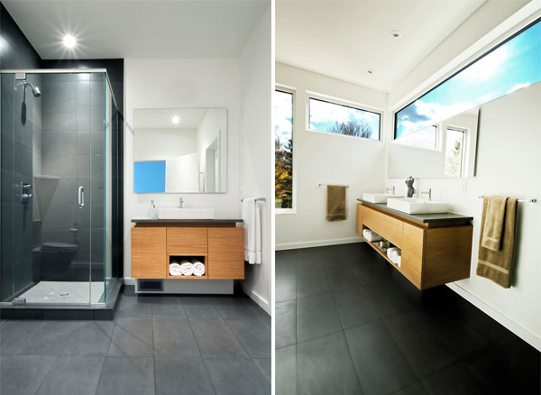
The contrast of black and white in the bathroom gives a more modern appeal to it.
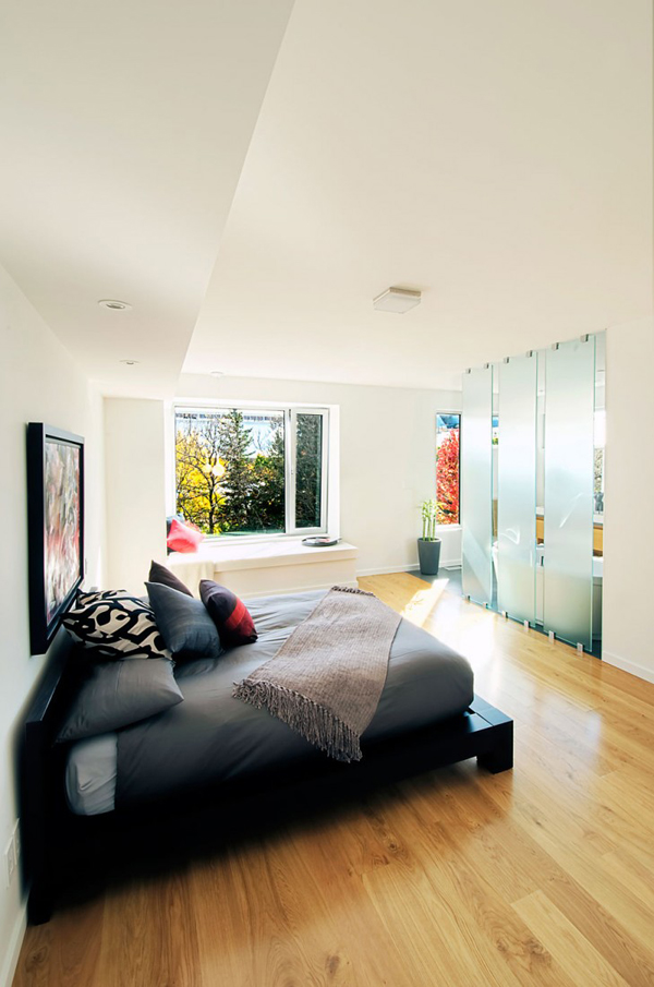
This is the masters bedroom with a bench near the window. It has a minimalist design and is free of any furniture or decors that may crowd it.
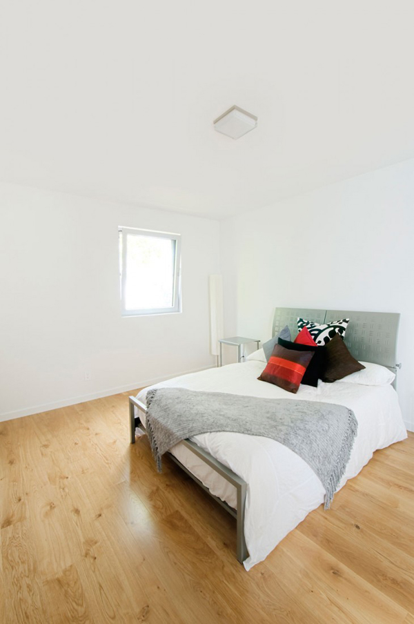
This is another bedroom in the house with white walls and wooden flooring.
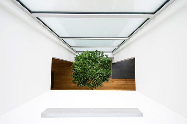
Remember that indoor garden we saw a while ago, this is the upper view of it.
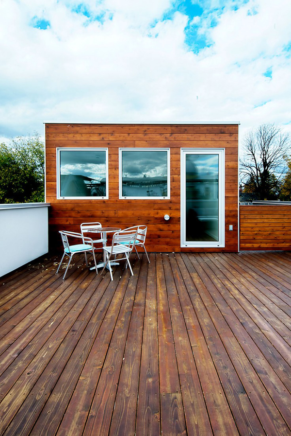
The roof deck used wood for its floor and even for the exterior of this room.
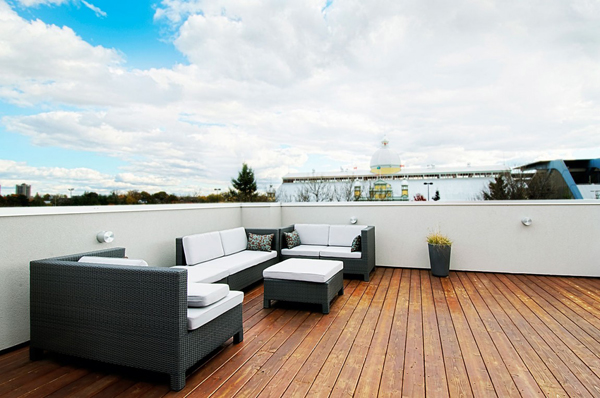
And it is a perfect place to stay especially if you want to relax.
In the exterior, I like the combination of materials and the generous eclectic use of windows. In the interior, I like its open layout and its minimal appeal. Of course, let us not forget to mention the indoor garden. Sure, the Linebox Studio did a good job for this house. The designers were right when they said that the “Fold Place is an urban dwelling for an informal lifestyle that is committed to engaging its community with openness and sass.”