Having a house and an office at the same building? I know it sounds atypical but somehow a very unique idea. If you’re thinking on how possible can this be and if you’re considering the concept, today, we will give you an idea on how to utilize your lots that will give you a functional space. This project is located in the southern part of the city of Buenos Aires, specifically in Parque Patricios. It is named L250 by architects Fernando Hitzig and Leonardo Militello. It has a rough industrial feel to its design but somehow smoother and simple interior.
Since, this locality is promoted as technological pole- wherein structure are available to the students and equipped with all the technologies to follow distance-learning, these characteristics motivated the owner to start the construction of a structure that unfolds into two separate volumes, his home and office for his business. Both buildings have in common constructive and material decisions, however, they show a strong formal contrast. In addition, two volumes meet sustainable conditions; ventilated facades, reuse of rainwater and certified wood. The office provides certain dynamics in materials and forms, the heterogeneity of materials underlies the homogeneity of its dark shades and color. On the other hand, the volume of the family house, the operation is simple and powerful. It is a concrete volume without intermediate structure, achieving free visuals across the entire lot.
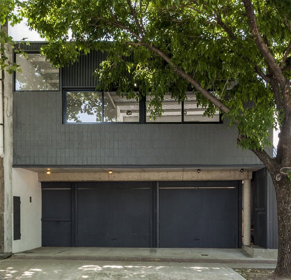
This facade seeks to achieve a simple yet formal operational entrance.
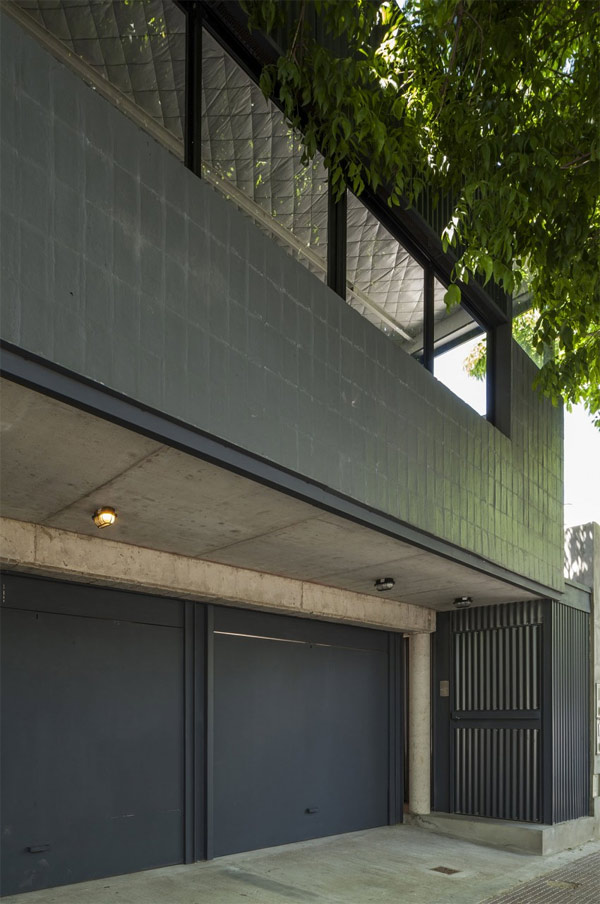
Well-ventilated facades designed with palette of two materials: zinc metal and bricks, giving strong visuals.
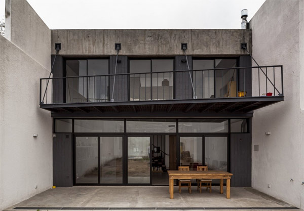
A suspended balcony for some moments of engulfing fresh air.
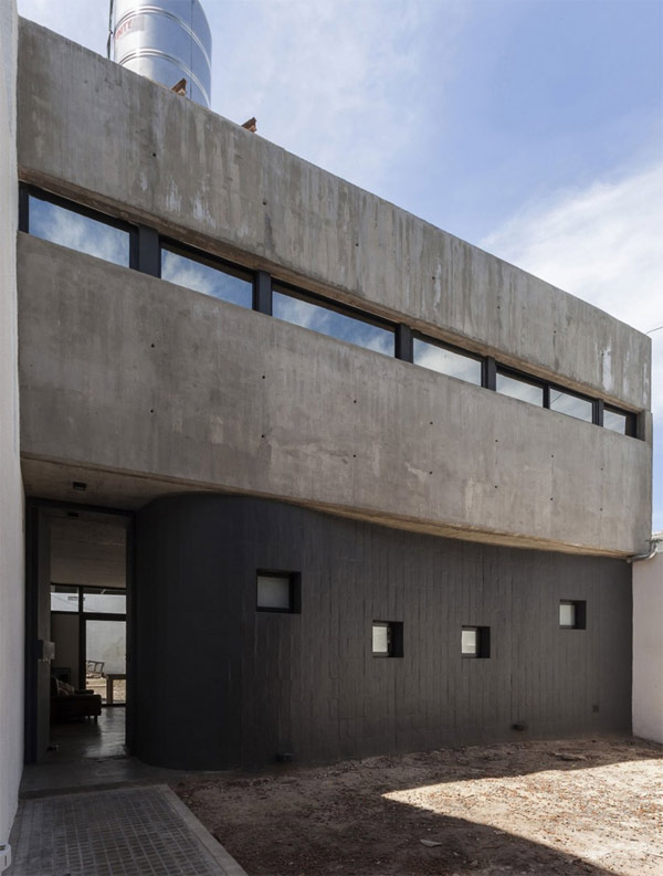
This curved and solid wall built with dark bricks adds sophistication for a planned garden.
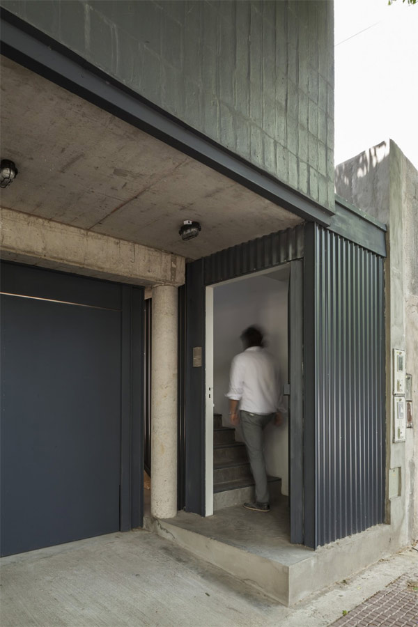
A simply-designed corrugated wall is the entrance door.
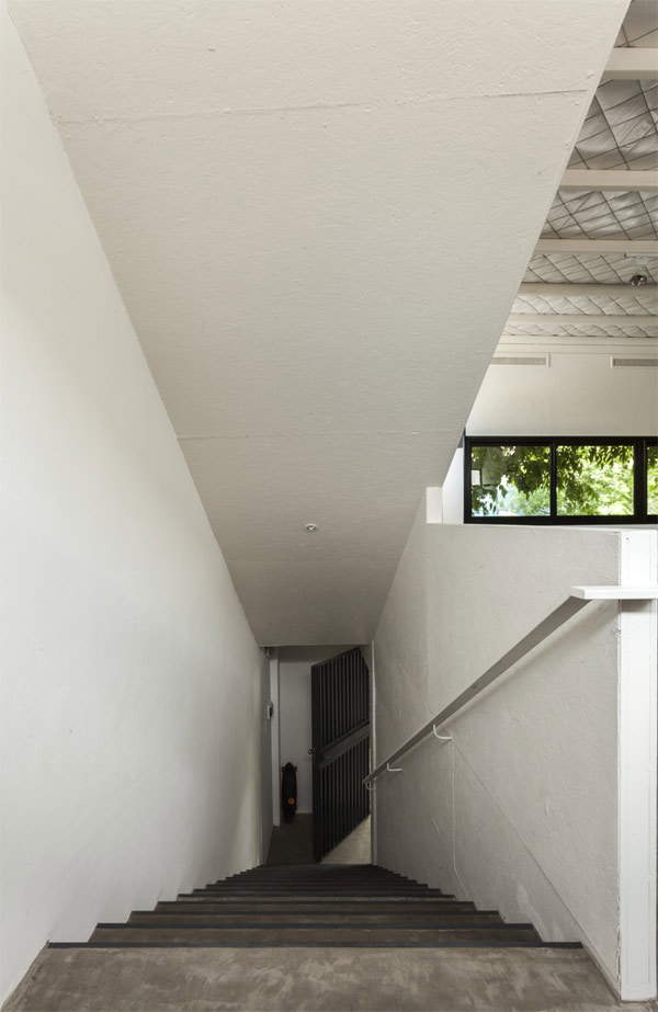
White paints on walls giving a sense of formality and cleanliness.
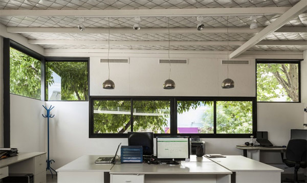
Looks like a nice place to work, multiple glass windows giving vivid ambiance, painted metal bars and unblended roof foils, showing a strong formal contrast.
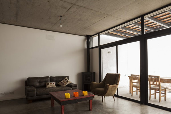
The most simple and very spacious living room I have ever seen.
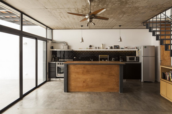
This kitchen is really achieving its “free-from-clutter” concept. May have a rough tones of the ceiling yet an organized space.
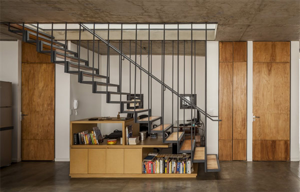
To give off more space, think of areas in your house that can be a good fit for cabinets and storage.
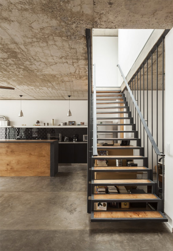
A suspended staircase: a combination of metal and wood, a bizarre trend.
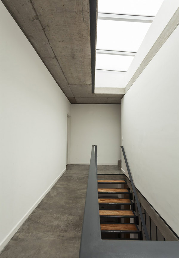
Just as bright as the sky! Giving a warm atmosphere all through the area.
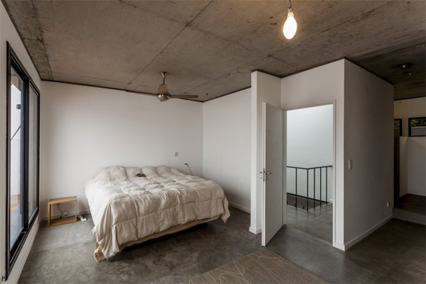
I bet this one’s not for the girls’ bedroom! Simple and plain tones with rough ceiling, matched for boys!.
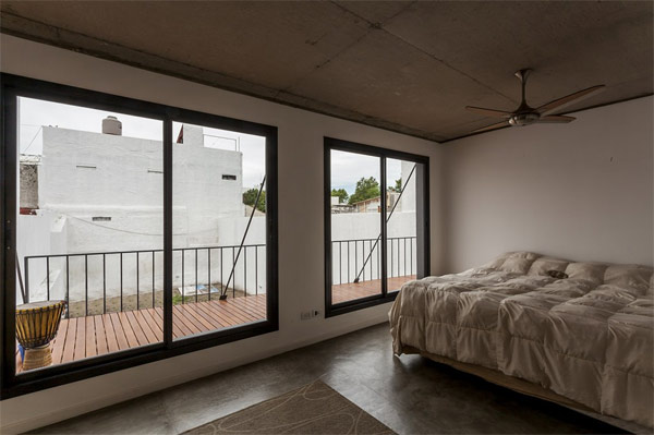
What a nice location for bedrooms. An early morning rise and deep-breathing of air from that balcony.
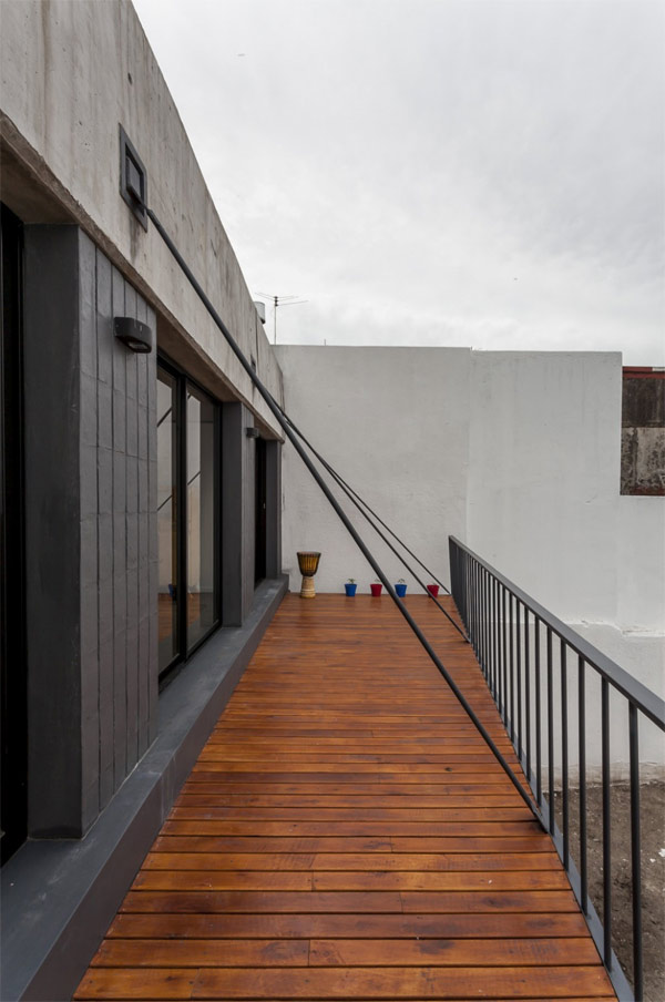
Personally, I would love to have this on my dream house! A space where you can unwind and relax!
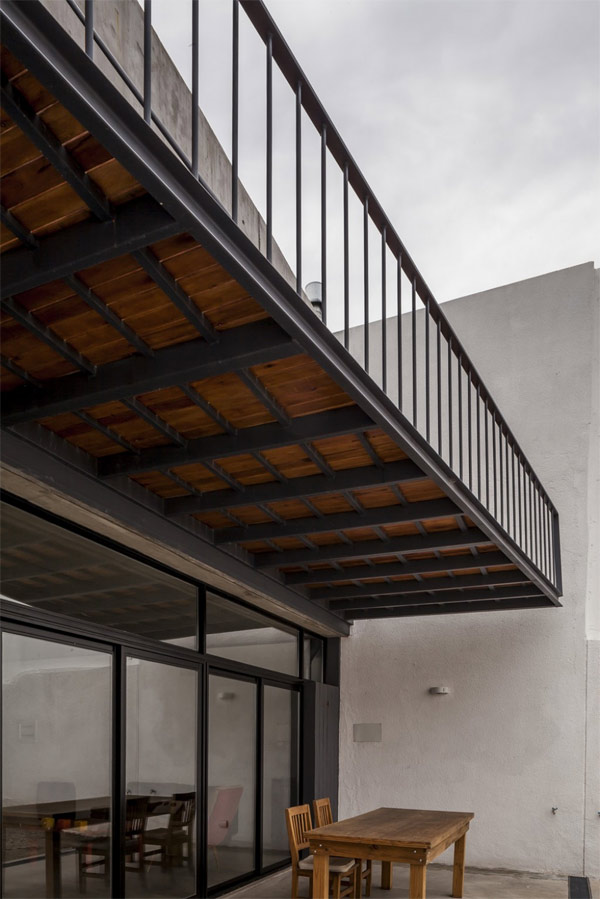
A view from above, this suspended balcony made with woods and metals, truly durable!
To sustain its ecological diversity, this building is equipped with storm water design and water efficiency so that they can harvest water from rain for irrigation and toilets flushing. And for energy efficiency, double glass window for thermal insulation was utilized. Ultimately, the project shows a volumetric contrast, resulting into two very different uses. In spite of that, the project of Hitzig Militello Architectos reaches a balanced dialog between tones and materials that sews both buildings together.