Some homes may look good already especially for those who have just first seen the house. For them, the dwelling may look okay and would already be a good place to stay in. But we all know that it isn’t the case all the time. There are instances when a family yearns for a better place to live in and would need some update and upgrade for their home so it will fit in their lifestyle that may have changed through the years. Some would merely get a better design for their home so it can be more functional.
This is what a family of five wanted for their Mediterranean house in Fort Lauderdale, Florida. They yearned for a more modern style without sacrificing warmth in the area. With that, DKOR Interiors Inc., helped them realize their dream home by adding wood-wrapped accents, luxe surfaces and making the rooms more larger. They also used grays, creams and beiges for the interior’s color scheme.
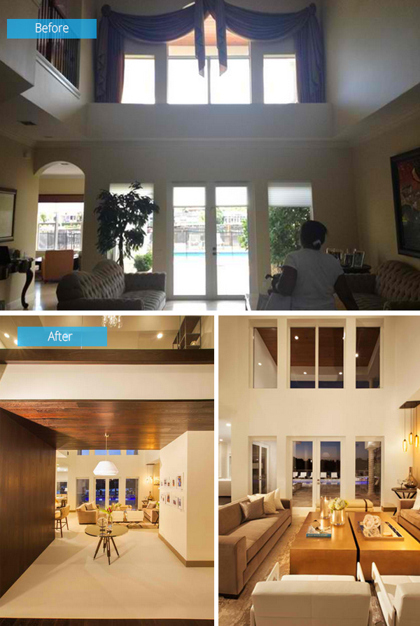
The home looked really outdated especially with the curtains used in it. It tried to look palatial with a weak Mediterranean design. The curtain was removed and the hallway was compressed opening up to a two-story-high ceiling that adds more drama to the interior.
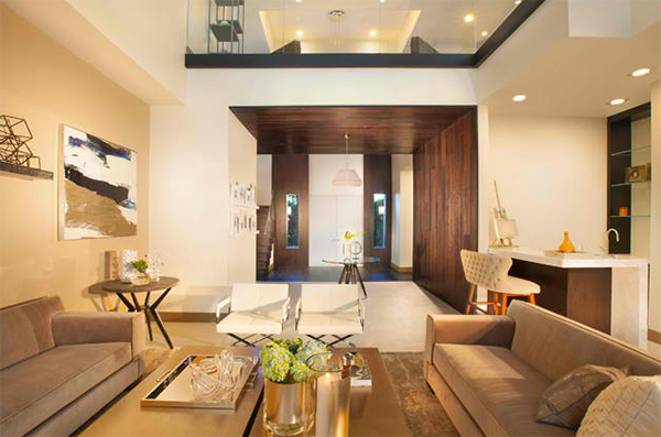
Wood defines the entry adding an additional trim work along the loft’s floor level.
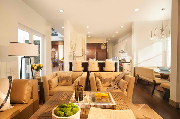
With the open floor plan of the house, it connects to the other areas seamlessly just like how a kitchen is seen from the living area separated by a home bar.
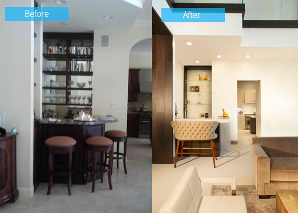
Look at the difference between the original wet bar and the new one. This area shares the space with the formal living room.
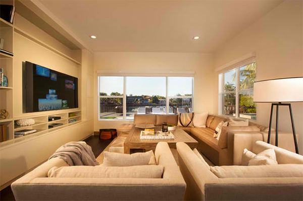
A contemporary style living room has an inviting and overstuffed feel. The furniture will invite you to lounge and curl up in it because of their bulky and big form.
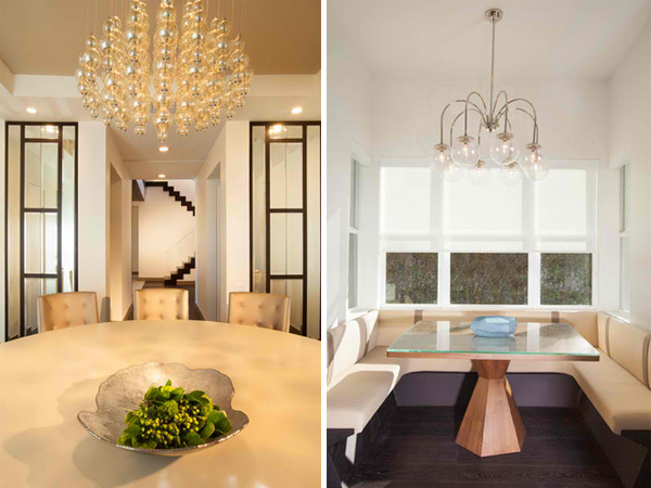
On the left is a formal dining room good for 12 people with a custom round table that fits the room paired with custom tufted chairs for a luxurious look. On the right is the dining nook which serves as a homework area, breakfast area and informal dining area for the family.
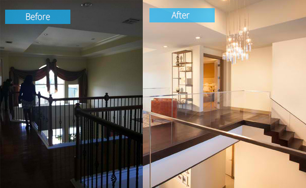
Before, the space looked boring and dull but with the new renovation, it looked more sophisticated. This is the area above the compressed entryway giving enough space for private seating area with views of the waters outside.
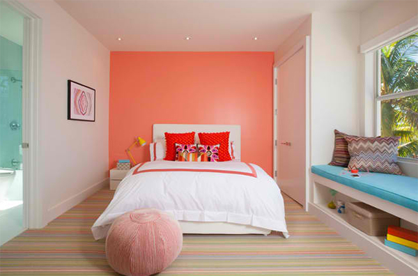
Colors of the daughter’s bedroom were taken from the carpet. And I’m sure you really love how it looked all together.
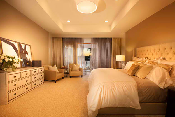
For the master bedroom, neutral tones and textiles were used to give it a very calming mood.
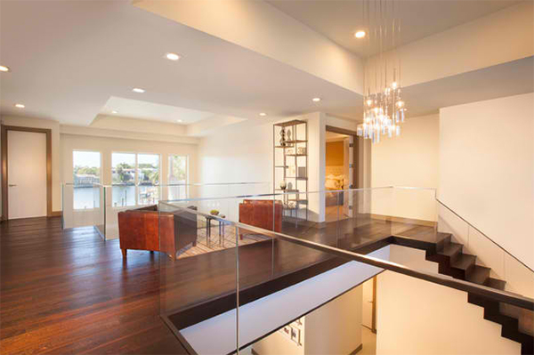
A better view of the area above the entryway were you can see a seating area. The use of glass changed the look of the entire space.
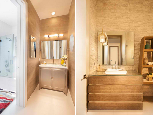
What you see in the left is a vanity area for the boy’s bathroom. On the right, you will see a powder room with gray mosaic stone on the walls giving the space an organic feel.
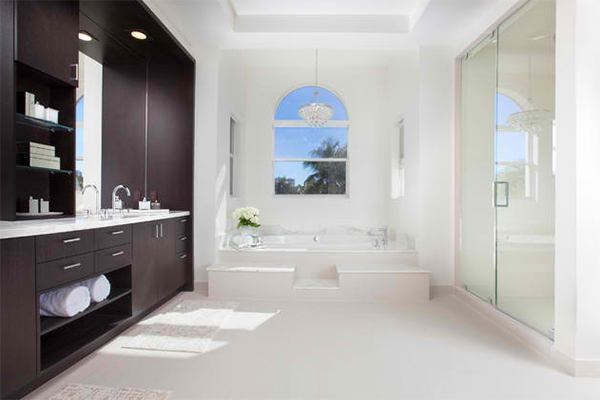
Calacatta marble and dark wood veneer carpentry for the vanity is used for this beautiful bathroom.
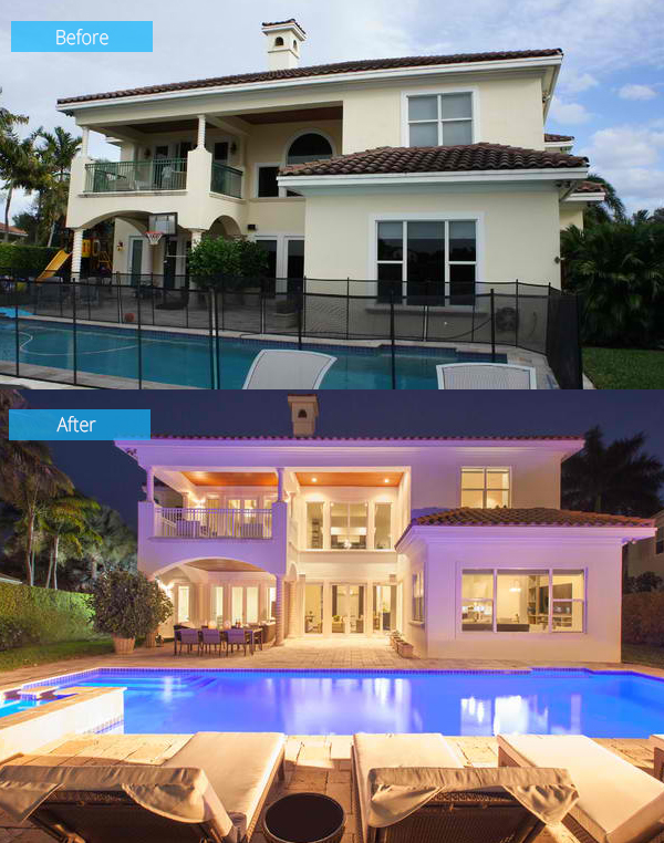
The back facade was changed too. The windows were changed and the pool area’s appeal was increased with dramatic lighting and comfy outdoor seating.
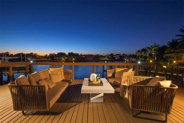
This is a lovely spot to watch the waters. You can see here a concrete table which can be converted into a fire pit during cold nights.
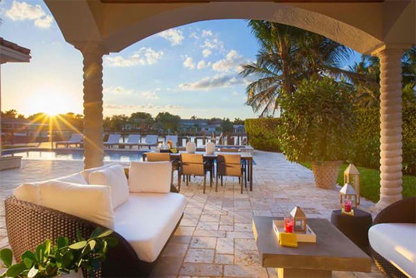
Gray, taupe and tan are used for several outdoor rooms like this covered lounge. An al fresco dining space is also seen here.
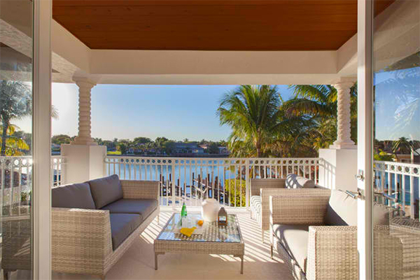
This is the balcony of the master bedroom which gives perfect views of the outdoor beauty.
As usual, DKOR Interiors Inc.- Interior Designers Miami, FL were able to pull off a stunning design of the interior. The once so so Mediterranean home turned into a sophisticated modern home! I like how the windows looked like after the renovation and how it added a great impact to the entire look of the home both in the interior and the exterior. Do you like the new look of this home, too?