Stunning Minimalist Interior of Casa G in Italy
Homes certainly come in various interior designs depending on the taste of the homeowners and how the interior designers will apply the preferences of their client on the actual home. We have seen different home interiors in previous posts here in Home Design Lover but for sure, we didn’t get enough of all those lovely inspirations. So, today, we will feature a home that has a unique interior making it well known because of how the designers from Carola Vannini Architecture worked on the interior renovation of Casa G in Rome, Italy.
“In the neighborhood of Trastevere this apartment has been restyled while preserving the main existing walls distribution. Even though the ancient structural walls have been maintained as they were, the final look has been completely changed thanks to a different use of functional areas, materials and colors,” explained the designers. The interior of the house used good lighting to emphasize its architecture and the volumes of the furniture. The entire apartment used white oak parquet to create continuity and to give the space a warm feeling. Let us take a look at the images of Casa G’s interior below:
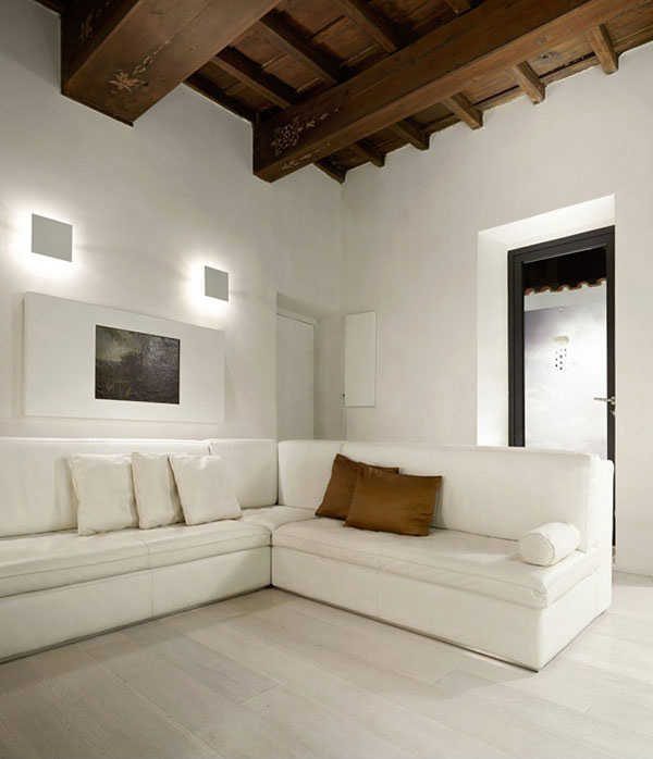
The living room is all white. Even the wall decors are in white and are merely played with lights. But look up at the exposed wooden beams, those ornament carvings are extremely awesome!
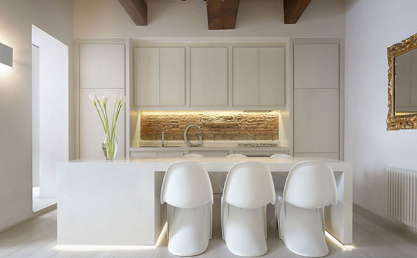
A brick wall on the backsplash with the letter G and some recessed lightings added drama to this white kitchen.
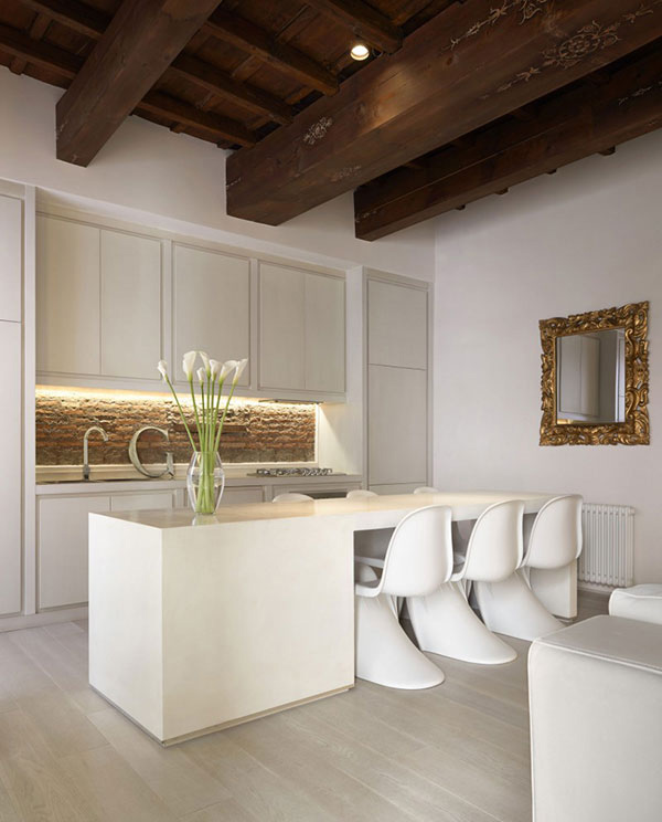
Aside from the backsplash, there are other good features of the kitchen when we talk of decor like that decorative vintage mirror on the wall.
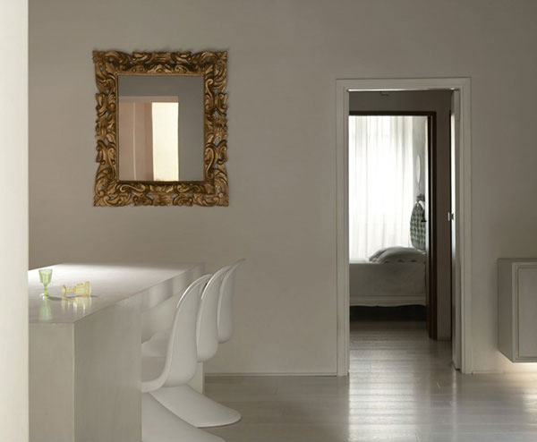
Here is the decorative mirror in gold where you can also get a glimpse of the bedroom which is also in white.
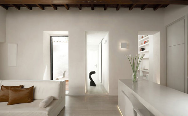
The long white kitchen table is made of concrete and has recessed lighting under it to make it appear like floating.
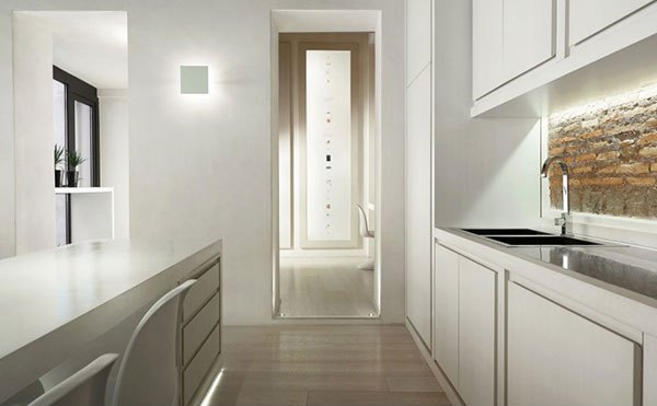
In this image, you can see that square wall light in white. It seemingly blends with the rest of the interior.
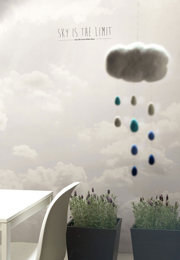
What we do not know is that one side of the dining area is this beautiful minimalist wallpaper in clouds design.
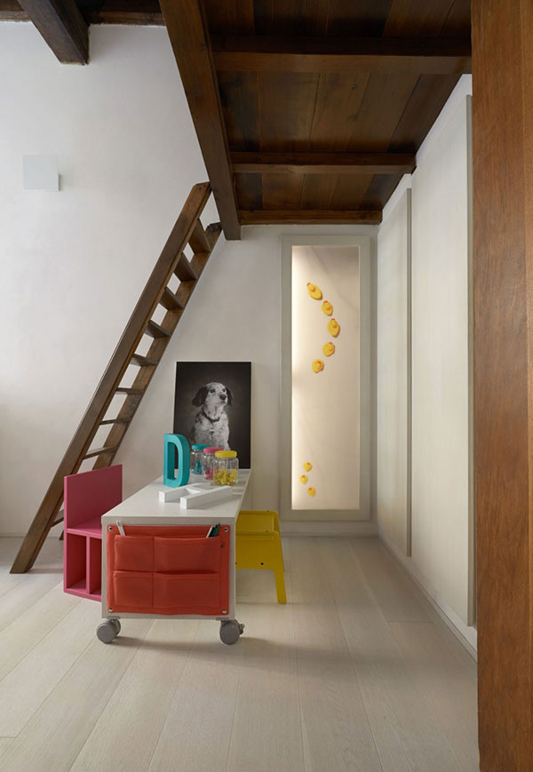
For the kid’s play area, a burst of colors were added in the space but it still looked minimal. We think those ducks on the glass door leading to the bathroom is so cute!
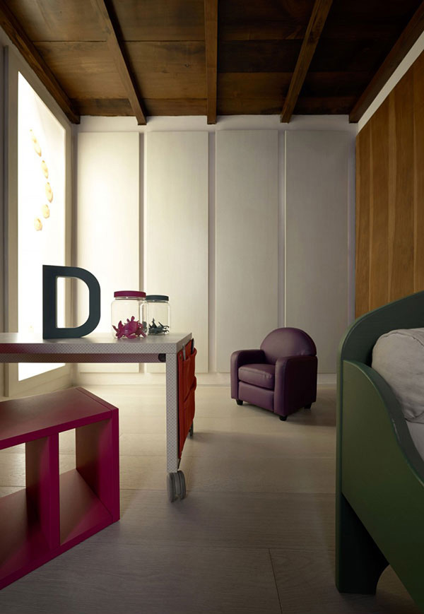
This space has different colors in it but with the sleek designs on the furniture, it remained simple.
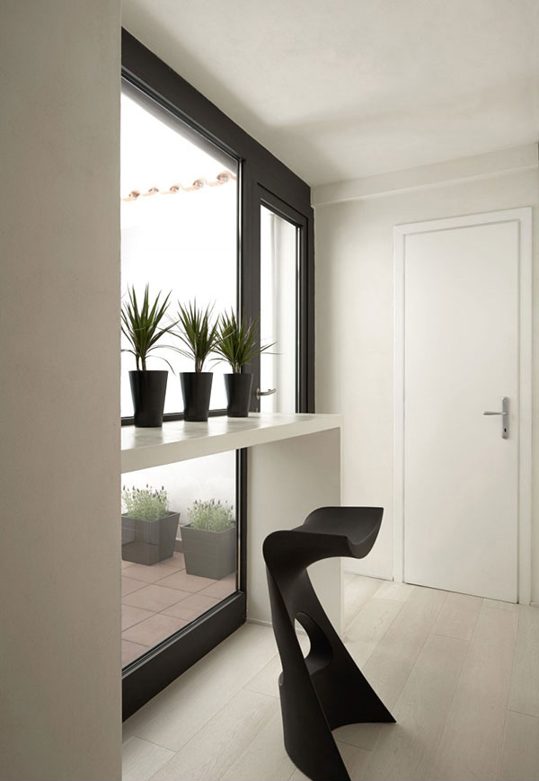
Black and white is seen in this area which features a lovely modern counter-height stool.
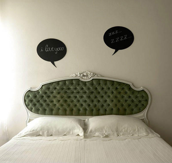
The decorative headboard fitted well to this bedroom but what we like most are those conversation clouds on the wall.
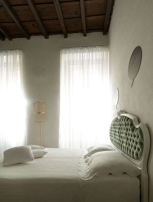
A different angle of the bedroom where you can see large windows covered by sheer draperies.
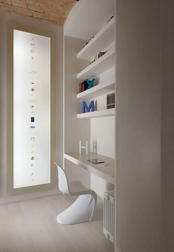
A simple working area that also used letters as decor same as what is used in other areas of the house.
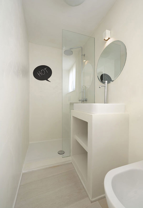
Simple yet functional. This best defines the bathroom with glass partition for the shower.
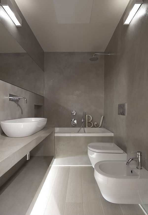
Those letters are there again! They look cute even on the bathtub.
This project was completed this year which shows both modernism and minimalism. The kitchen has been moved into the large day area that also includes both dining and TV spaces. One good feature in the kitchen is the concrete white kitchen table that has recessed light under it making it appear suspended above the floor. It also used back lit plexiglass panels that adds light to the space aside from hiding the large storage areas. Well, we sure found this design by Carola Vannini Architecture pleasant and impressive. Can you tell us what your favorite feature of this house is?


