Seeing homes in white and natural hues is common these days because of the modern minimalist trend. But there are also homes that combine minimalism with chic, country, and a bit vintage-y style. Well, you might wonder how this looks like but your curiosity will end if you’ll get to see our house feature for today. Instead of featuring the entire house, we will look into the interior of an apartment designed and decorated with Scandinavian style.
The interior of this dwelling made use of white in its furniture and in most part of the house. But it added pops of colors through some accessories and wallpaper. The apartment looks calm and serene. Everything is also well-organized while maintaining a pretty ambiance. Now let us take a look at some areas of the house below:
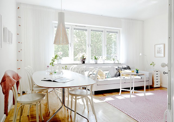
The living and dining areas have white colors around it. The accent of a carpet and a pendant light above the dining area adds more beauty to it.
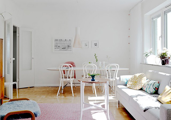
You can see here a different view of the dining and living area. Aside from subtle colors, they added some plants indoors.
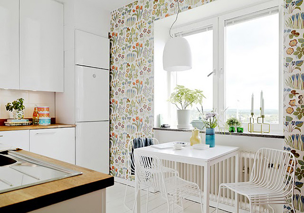
A seating area near a window can be perfect for an early morning breakfast. The furniture also looks simple yet nice.
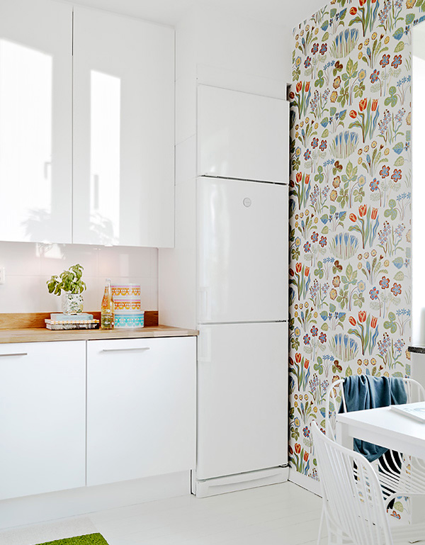
Take a closer look at the colorful wallpaper and the cabinets in the kitchen that are also white.
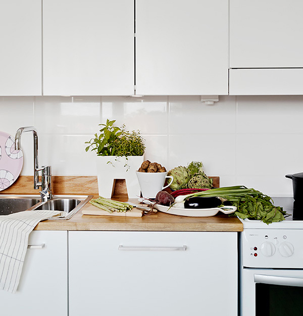
The kitchen countertop is made of wood. It matched well with the white kitchen cabinets.
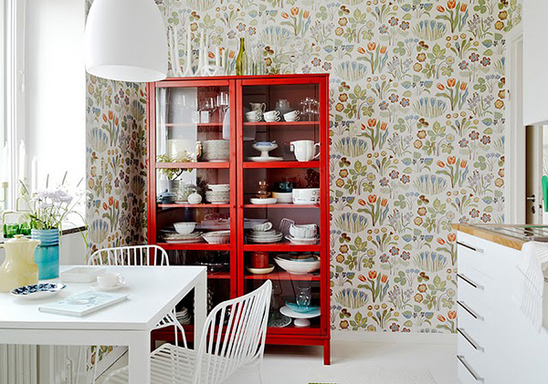
Adding a red dresser with some kitchen accessories inside is a good decor for the interior while it also functions as a storage area.
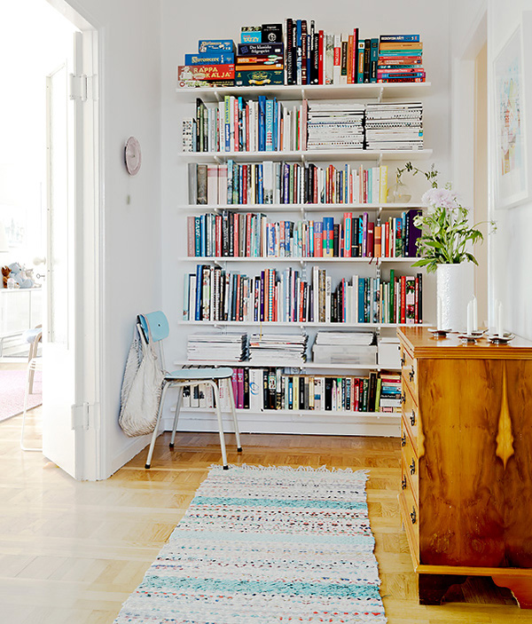
Even magazines and books were creatively arranged in the shelf. It may be crowded but it is still a beauty.
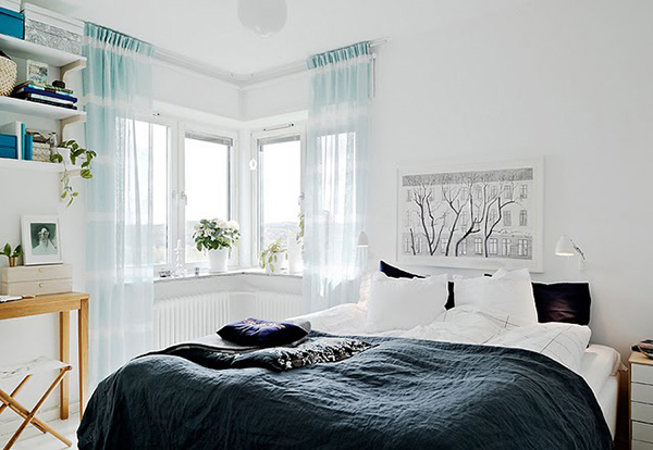
Blue-green was used in this bedroom- darker shade for the bed cover and lighter for the sheer window treatment.
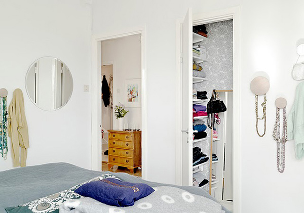
Taking a little peep into the closet where everything is also organized. This room has some gray touches into it.
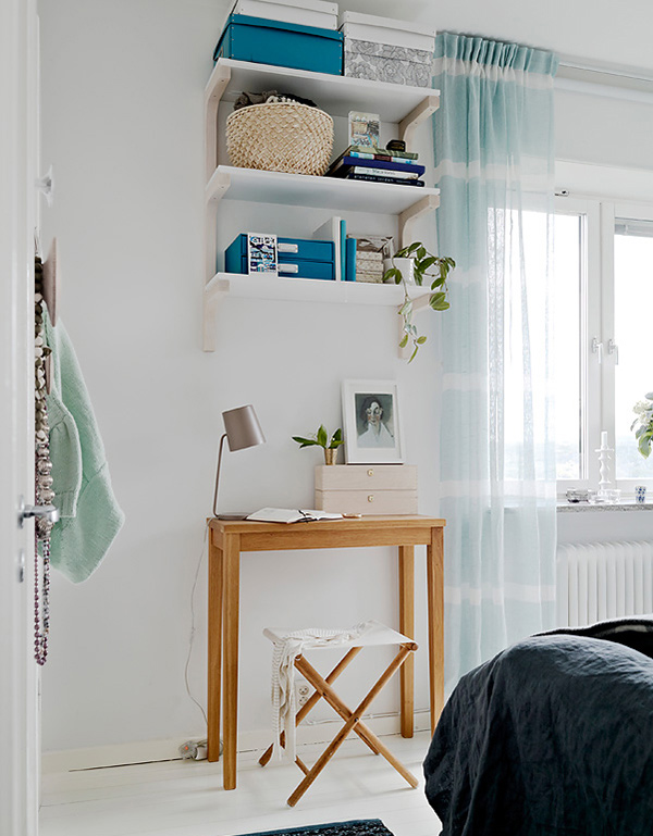
The color blue-green is distributed in the room like how they used those boxes for the shelves.
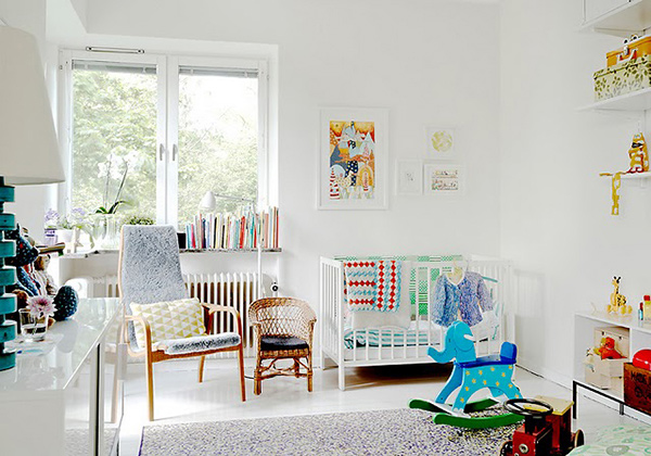
The nursery still looked childish and fun with all the colors in it.
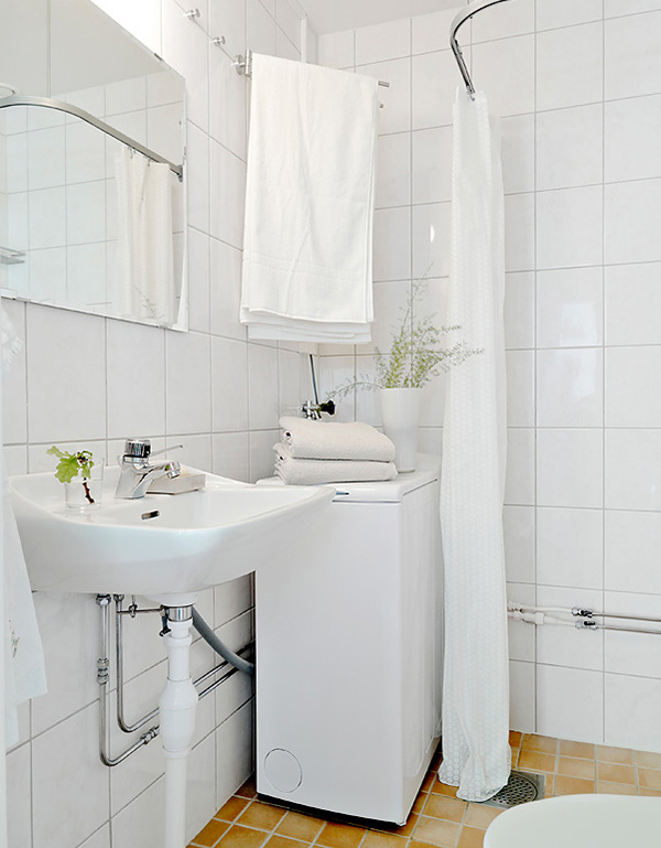
A bathroom in all white color sure is clean and tidy! Adding some plant decors make it appear a lot fresher.
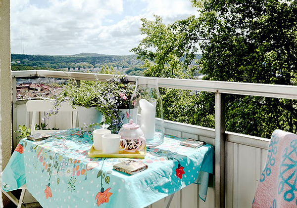
Isn’t this a cute balcony? The way it was decorated makes one feel so welcomed while being able to get a good view of the outdoor beauty.
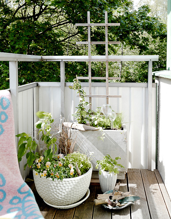
Creative planters designed for a small corner in the house- isn’t this lovely?.
Sometimes, it is okay to tone down a bit from the usual modern and minimal touches. One can actually be more creative and add some whimsical designs to a home while retaining the minimal look. It only depends on how it is done by the homeowners. This apartment was first seen from DecoPhotoBlog and is a sure charmer! Have you thought of designing your home like this one?