Sometimes we think that home designs are just similar to each other, right? You might think that the architecture of homes and even commercial buildings are just repeating.
But if you look closely, each one is actually different from each other. So, don’t get bored. Instead, look even more closely to each house design so you will be able to appreciate its unique features.
Why don’t you try looking at this apartment and check how it differs from the usual homes you see in your area?
For sure, you will notice the modern exterior and the way the roof is designed. Isn’t it unique?
Let us get to know more about this project below.
The Coppin Street apartments are dubbed as the “Richmond six-pack” designed by MUSK Studio. It reinterprets the 60’s era, predominantly three-storeys, brick apartments dispersed throughout inner Melbourne. The apartment is located on a quieter residential street of free standing family homes. Formerly, it was occupied by a single weatherboard dwelling.
But it was made into an apartment with 6 units. Despite that, you will never notice that it is actually an apartment because of its very impressive design in the exterior. Once you get inside the house, it looks even more impressive!
For sure you will love this apartment design. Join us on a brief tour of the house below.
Location: Australia
Designer: MUSK Studio
Style: Modern
Number of Levels: Two-storey
Unique feature: A unique apartment design which appears as a single dwelling.
Similar House: Apartment KG Features Lovely Ceiling Details
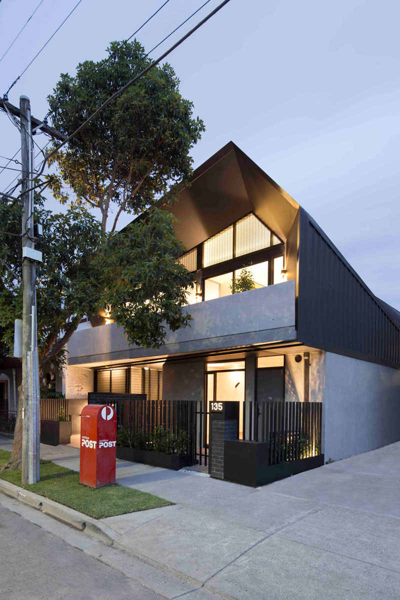
This project consists of five bedrooms units and a single 2 bedroom unit. It has increased engagement with the street and also an improved internal amenity. Instead of car parking, the design of this project proposes bicycle parking with access to public transport.
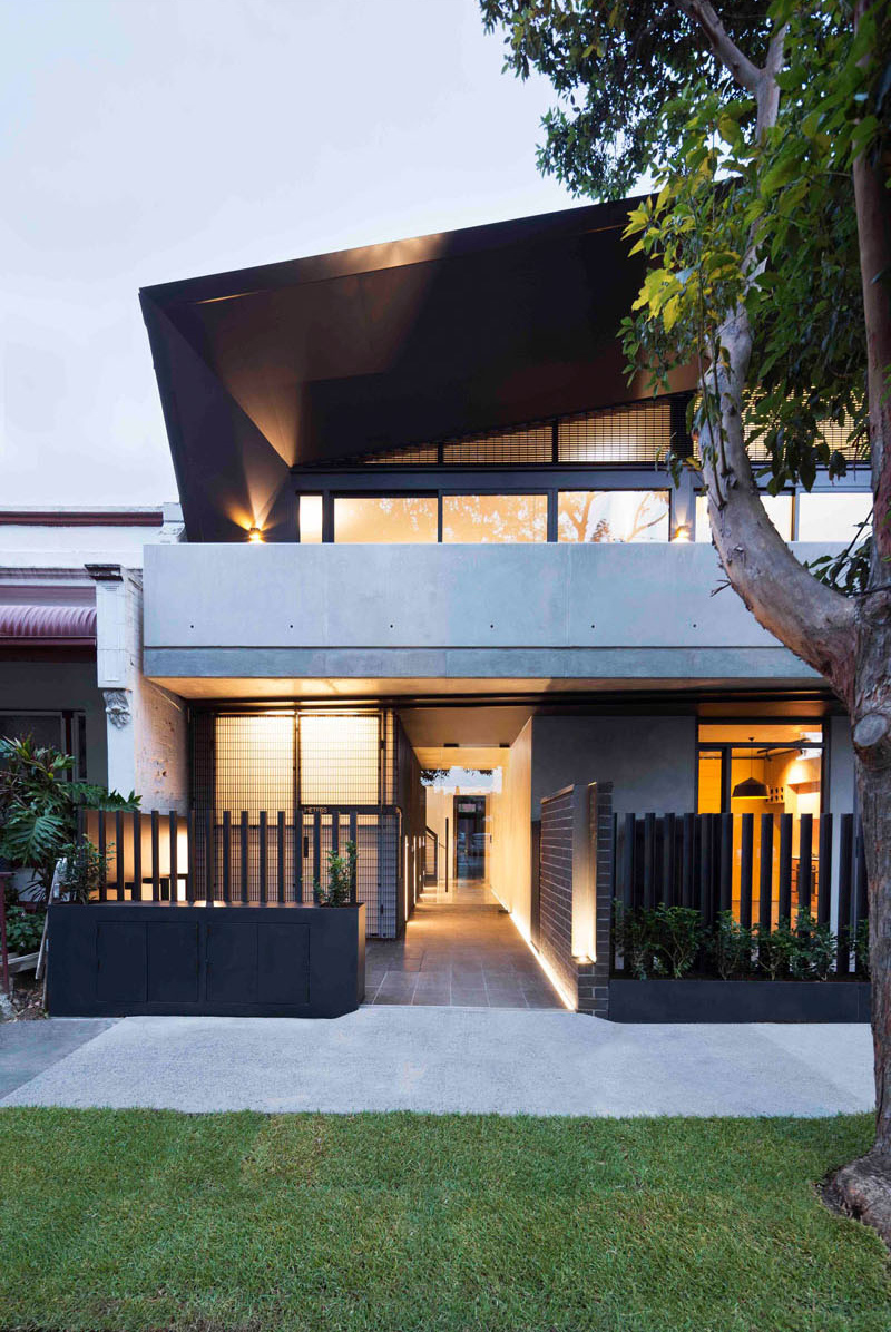
The architecture of the house shows that it made use of different materials from concrete to steel. You can see here that there is a path that leads to the entrance doors of other units.
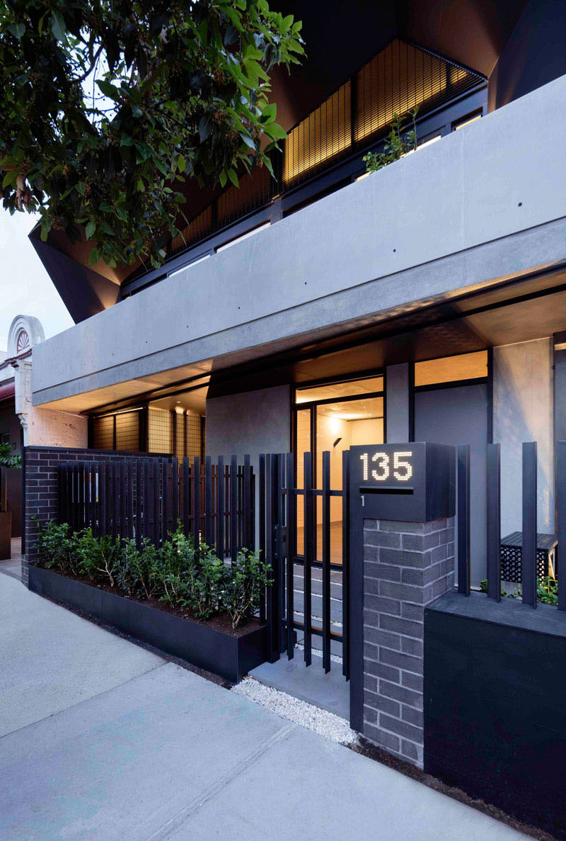
At the front of the apartment building, you can see two entrances, the first on the right-hand side is for apartment 1, while the other entrance on the left has access to all of the other apartments.
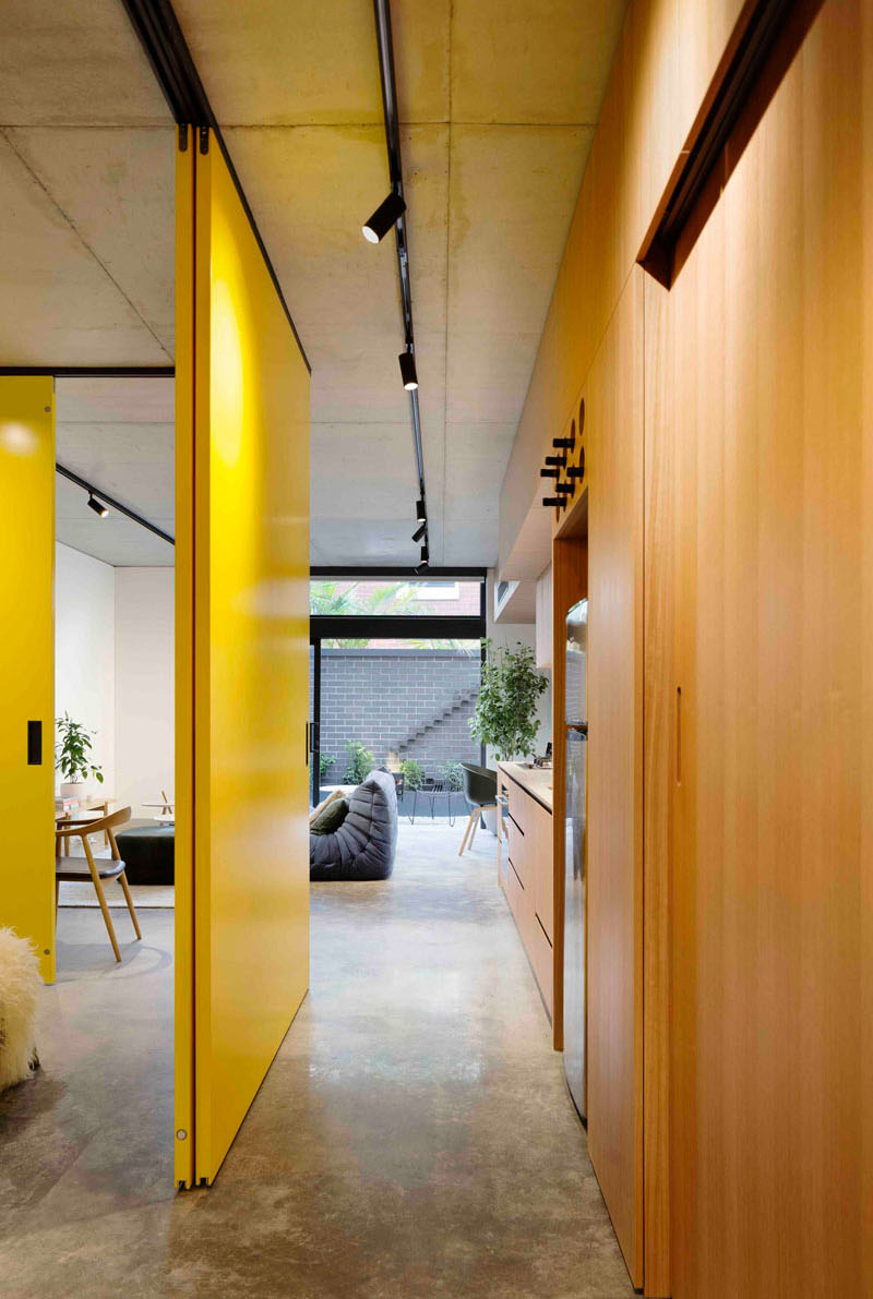
The interior of the house shows a timber batten ceiling contrasts the white concrete floor. Its interior is light and airy and very much inviting. There is also a black wall in the living room that helps to define the space in the large open room. The pops of yellow here reminds me of the Bulgaria Apartment which used the same color everywhere in the home.
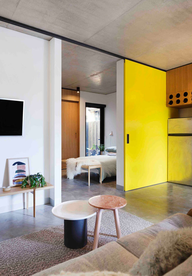
Another look at the interior wherein you can see many wooden furniture in it. The colors in here are very relaxing which makes it look inviting.
Read Also: An Apartment In Maida Vale Features A Hidden Kitchen
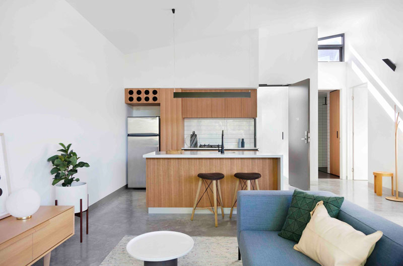
The interiors have been kept bright and airy with the use of white walls and light wood cabinetry. Seen here is the kitchen area which is located just near the living space and the bathroom. I would love to have a kitchen a combination of like this one.
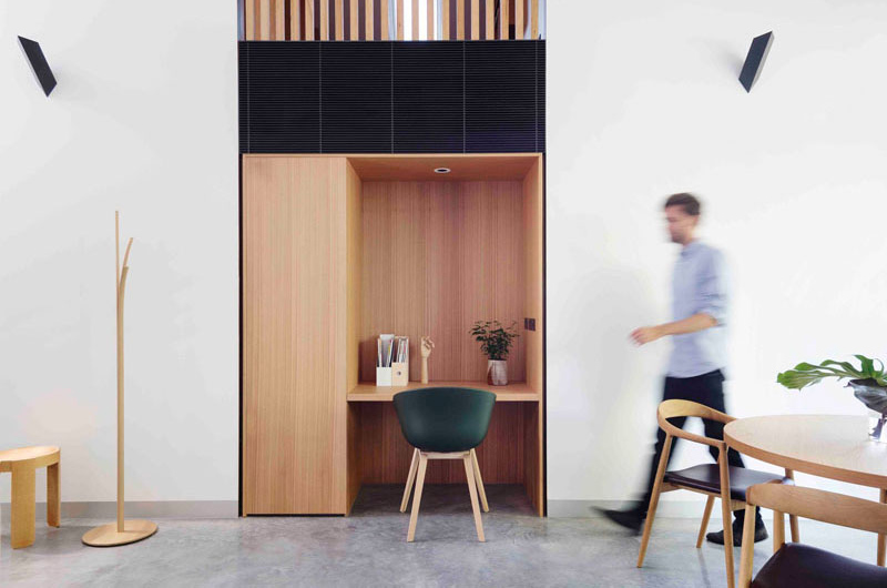
Some of the apartments are larger than others like the one in the picture. It includes a study built into the wall similar to some home offices we featured before.
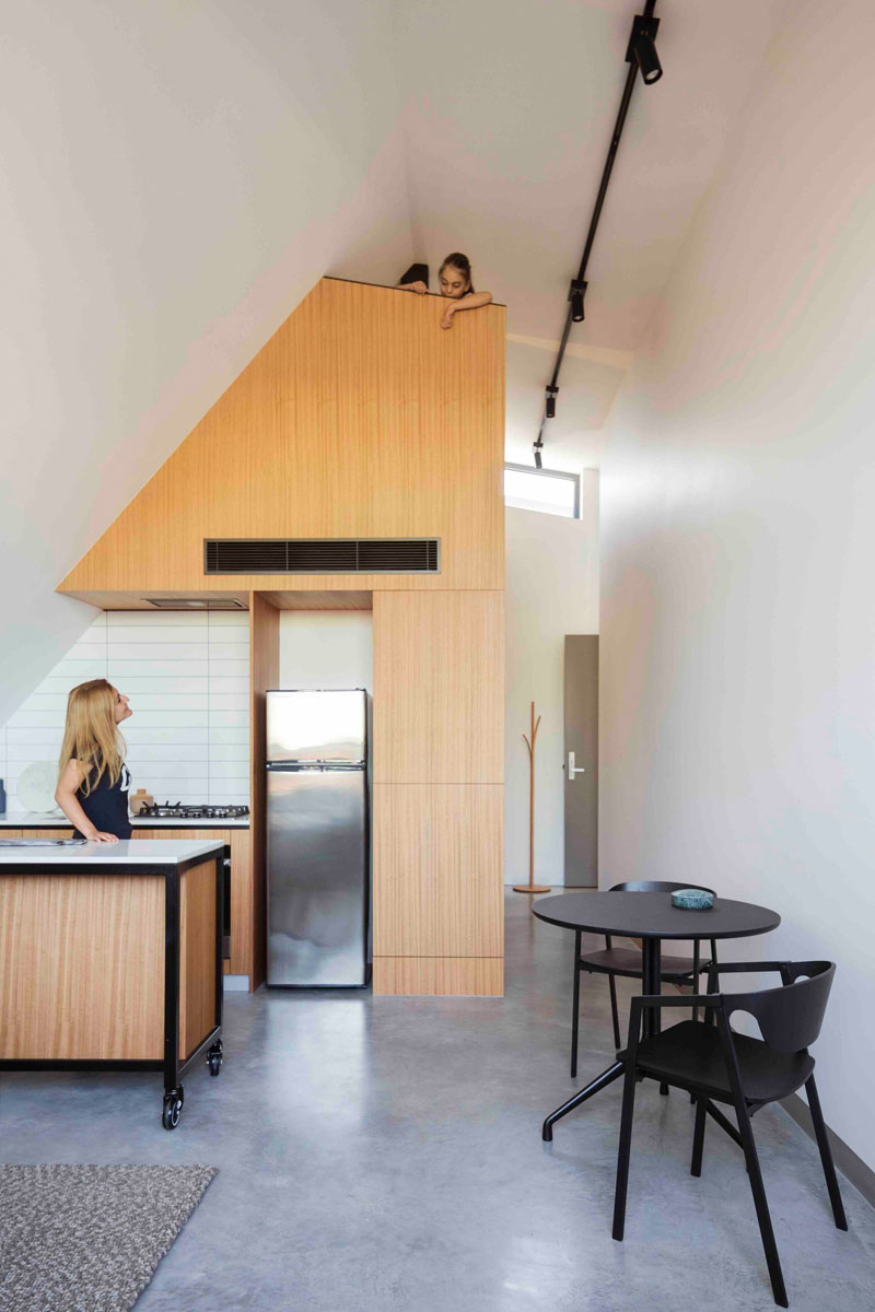
The apartment seen here is slightly different. It features a loft area above the kitchen which is pretty interesting! Just look at how the kids could watch mom from above.
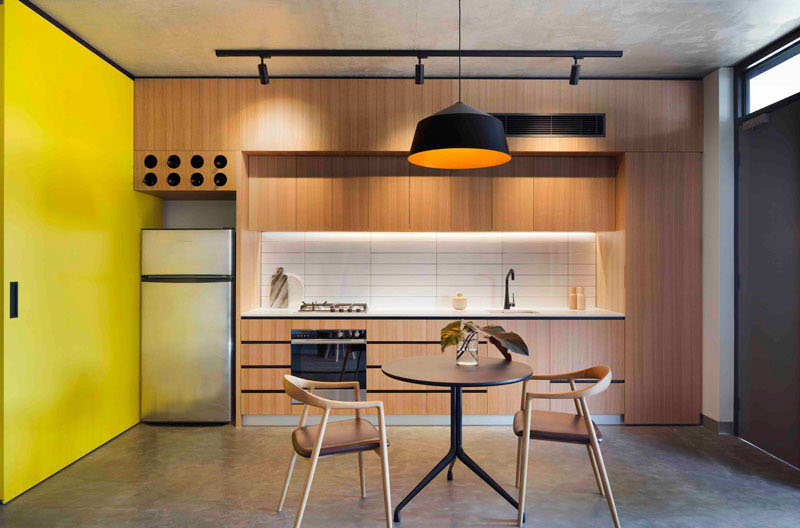
In this apartment, it also features a sliding yellow door. When opened, it reveals the bedroom and the kitchen features a small wine rack above the fridge.
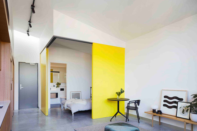
Here’s a look at another apartment. Like the previous one, this also used bright yellow doors that slide open to reveal the bedroom. The living room opens up to a private courtyard which makes this space even better.
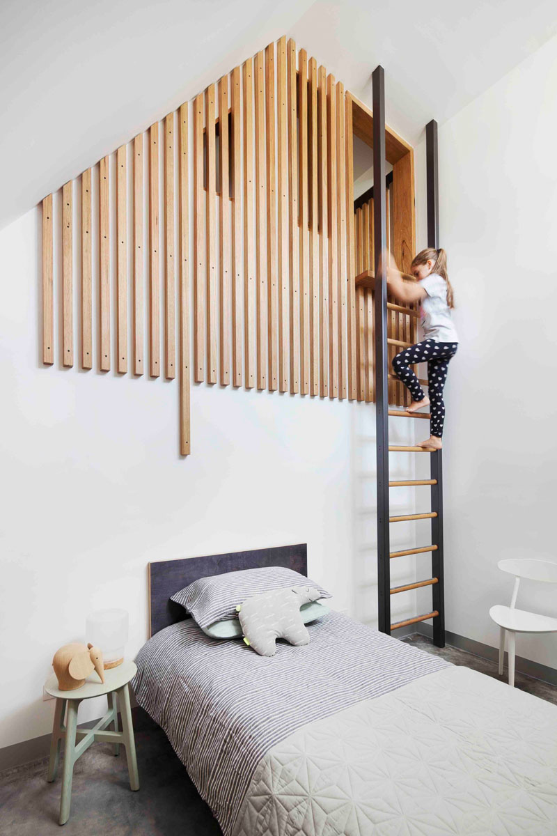
This one is a kid’s bedroom in one of the apartments. This loft area is reached via a ladder. It is interesting that it is partially hidden by wood slats.
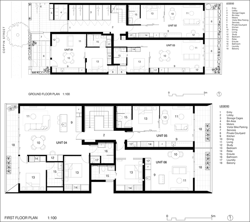
Take a look at this floor plan so that you can have a better understanding of how the apartment looks like.
This house from MUSK Studio has a unique appeal both in the interior and the exterior. The design removes on site car parking, which is a core value of the project, an alternative living option is being provided. The key design objective of the two-storey form of the house was to use the angled roof. This design is derived from a mapping of solar access to the southern neighbor, as a device to wrap the residential units and define the form. As a result, the project addresses the street at the scale and articulation of a single dwelling. Apart from that, I love what they did to the interior of the house especially that they used concrete for the flooring and added many interesting elements in it.